Cherry blossom season is fast approaching in Washington, D.C., with the projected peak bloom at the end of March – early April, according to the National Park Service. What better way to prepare than make maps of cherry blossom trees!
At FedGIS I presented in the ArcGIS Pro: Mapping and Visualization session with Valeria Chavez, and demoed a map of cherry blossom trees around the Tidal Basin in Washington, D.C.

But cherry blossoms appear throughout D.C., not just the Tidal Basin. So, I decided to create an interactive map of the whole city. To start, I created a custom point symbol in ArcGIS Pro and then uploaded it for use in ArcGIS Online. Here’s how I did it…
Sourcing the data
The data was sourced from the National Park Service (NPS) and DC Open Data, and I filtered the data to only highlight trees with the word ‘cherry’ as part of the common name. This means that species that are not Japanese flowering trees are included. Locals and tourists often look for trees with bright pink flowers to take photos of, so I chose to include more options.
It is important to note the NPS dataset is from 2021, so it does not include the recent removal of trees or the addition of new saplings.
Designing the symbol in ArcGIS Pro
I designed a symbol in ArcGIS Pro by stacking multiple shape markers to construct a symbol that looked like a cherry blossom. In the Structure tab of the Symbology pane I added multiple Marker layers, so that I could stack different shapes on top of each other.

In the Layers tab I adjusted each shape marker to be different sizes, shapes, and colors to create a symbol that resembled a cherry blossom flower.

I saved this symbol to a style, so I can return to it any time I make maps of cherry blossom trees.
Sharing as a Web Layer
To use the symbol in ArcGIS Online I shared the cherry blossom feature layer as a web layer.

To learn the process I found this video by John Nelson very helpful. In ArcGIS Online I created a new map in Map Viewer and searched for the new layer in My Content.

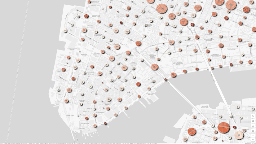
Using single symbols in the map was visually chaotic, and it was difficult to decipher patterns.

Designing the web map
It can be tempting to try to show every single detail in a map, particularly web maps, but cartographic thinking is critical for designing a map that is understandable and helpful at multiple scales.
For the small scale, or “zoomed out”, map I aggregated the data to visualize where there are many cherry blossom trees, versus less. This way viewers can choose a neighborhood of interest to explore in more detail at a larger scale (i.e. “zoomed in”).

As the map zooms in, I changed the scale settings so that the trees become individual points. This helps the viewer locate individual trees in a park or along a street that they would like to learn more about.

I really loved being able to design a custom symbol in ArcGIS Pro, and then export for use in an interactive web map.

Explore the web map of cherry blossom trees in Washington D.C.
The blooming of the cherry blossoms in D.C. is a magical time, and after a very cold and snowy winter I am eager for the arrival of spring.


Article Discussion: