Did you know that Census’ American Community Survey data come with margins of error? Did you also know that you can easily incorporate these values into your web maps to help display the reliability of the data?
What are Margins of Error?
If you’ve worked with some of our feature layers in ArcGIS Living Atlas contain data from the U.S. Census Bureau’s American Community Survey (ACS), you have probably seen fields called “margin of error.” Ever wonder what those are?
First and foremost, remember that the ACS is based on a sample, just like any other survey. When I think of “samples,” I first think of ice cream. A sample of ice cream at the ice cream shop gives us an estimate of the characteristics of the whole tub of ice cream. Do all samples have the exact same amount of chocolate chips? Of course not. Does a sample from the top of a tub of ice cream taste the same as a sample from the bottom of the tub? Maybe, maybe not. Which sample is a better approximation of the taste of the entire tub?

Photo source: Yelp’s page for The Hop in Reno, NV.
Similarly, a survey’s sample gives us estimates of the characteristics of the whole population. We can measure how good those estimates are. Margins of error are an indicator of the reliability of the estimate, an upper- and lower-bound of a range that Census has given us. The estimate is simply the midpoint of the range, or “confidence interval.”
For example, this feature layer of disability status by sex by age gives us an estimate for Florida Tract 120990064.02 of women age 75+ with a disability of 361, and a Margin of Error (MOE) of 158. This tells us that the Census Bureau is 90% confident that the true count of women age 75+ with a disability in that tract is between 203 (361-158) and 519 (361+158). 361 is the midpoint of that range.
. Estimate is 361, meaning with 90% confidence, true count of women age 75+ is between 203 and 519.")
In general, the confidence interval gets larger as your population gets smaller. Your population could get smaller geographically (the range for the estimate of Los Angeles county’s population will be much smaller than the range for the estimate of a tract’s population), or demographically (the range for the estimate of same-sex married couples will be larger than the range for the estimate of opposite-sex married couples).
Why bother using the Margin of Error at all?
By incorporating the margins of error into our maps, data analysts and GIS analysts who inform decision makers can show the full picture of the data in their information products and reports. The Census Bureau has given its data users a gift: a measurement of how reliable each and every estimate is that they produce. Other large-scale surveys publish confidence intervals as well, such as many health datasets, and even political polls.
This blog post presents some options for incorporating the margins of error into your web maps when mapping ACS data. Like with all map making, the option you choose depends on your audience! Option 1 is easiest to communicate to lay audiences who just want the high-level information. Option 2 is best for those who like to see all available data. Option 3 is for ACS power-users who are familiar with margins of error.
Option 1: Suppress Unreliable Estimates
Suppress Using the Reliability Flags from Geoenrichment
It’s often helpful to consider the ratio of the range to the estimate. If the confidence interval or range for a given estimate is very small in relation to the estimate, the estimate is more precise, but if the range is large, the estimate can be imprecise or unreliable.
Some analysts have a strict requirement of a 10 percent cutoff threshold, meaning if an estimate has a confidence interval that is 10 percent or more of the estimate’s value, then they consider it somewhat unreliable. Others have a more lax requirement of 15 percent. Those in the middle might use 12 percent. Esri’s demographics team created reliability flags for demographic estimates available through GeoEnrichment, and a 12-percent cutoff point is used to identify estimates with high reliability.
For example, I added a layer of census tracts from ArcGIS Living Atlas to my map, and I filtered to only show tracts in Arizona. Then I enriched this layer to add the number of households with any retirement income. GeoEnrichment added three fields to my layer’s tabular data: one with the prefix “ACS” which is the estimate, one with the prefix “MOE” which is the margin of error, and one with the prefix “REL” which is Esri’s reliability flag. The reliability flag field take values of 1, 2, or 3: high reliability, medium reliability, or low reliability. I want to filter out census tracts whose estimate of households with any retirement income is highly questionable, so I’ll only map features with a value of 1 or 2. In other words, I want to suppress any features with a reliability flag of 3.
First apply a filter such as the one below:

Be sure the dropdown menu at the top is set to “any” of the following expressions” rather than “all of the following expressions” since we want the records whose reliability flag is either 1 or 2.

I notice that not all tracts have the default orange symbol given. Using the original fields, I can verify that – sure enough – the ones that don’t have a symbol are the ones that had a reliability flag of 3.
Now I can change the style of my features, and configure the pop-ups as I want. As long as the filter is applied, only the records with high or medium reliability will display.
Suppress Using Your Own Threshold for the MOE
If you did not obtain your ACS data using geoenrichment and do not have the reliability flags, you can construct your own by using your own cutoff for the MOE. For example, the disability by age by race layer mentioned earlier only has fields for the estimates and the MOEs. Depending on how strict you want to be in deeming an estimate “unreliable,” choose a cutoff point of somewhere around 8 to 15 percent for the range-to-estimate ratio. A cutoff of 8 percent would be very strict, a cutoff of 10-12 percent would be fairly strict, and a cutoff of 15 percent would be less strict, only removing the most unreliable estimates. Create an Arcade Expression when styling the map and configuring the pop-up and you can customize your suppression logic.
Option 2: Map all the data and display the range in the pop-ups
When configuring your pop-up, use Attribute Expressions to create an upper bound and a lower bound on the fly with Arcade. For example, my upper bound expression is simply the estimate (count field) plus the margin of error (MOE field):
 for the upper bound, used to create the attribute Upper Bound.")
Then insert these expressions into a custom attribute display:

You will then get the pop-up displayed below:
.")
Remember, estimates of zero still have an MOE! Write this into your Arcade Expression for the lower bound:
 to create a Lower Bound attribute. If statement restricts Lower Bound attribute to zero as minimum value.")
This way you will not get any negative numbers displaying as your lower bound. For example, the following pop-up displays a range of 0 to 13, not -13 to 13.

Other examples of items in ArcGIS Living Atlas that display these ranges in the pop-ups are an app of various occupations vulnerable to extreme heat and a web map of detailed Asian American ethnicities.
Need to combine a few fields for your web map and are curious how to compute the margins of error for calculated fields? The Census Bureau has many resources on this very problem. I used their guidance on approximating the MOEs of combined estimates in the maps of occupations vulnerable to extreme heat, in which I had to add the male and female counts for each occupation.
Option 3: Use Transparency to Show the Estimate’s Reliability
I want to show how reliable those estimates are of elderly women with a disability by tract in a way that doesn’t require the person viewing this map to click on every single pop-up. One effective way to do this is by using transparency to visually indicate reliability. In the Change Style options, we can vary the transparency based on an attribute’s values.

We can select the attribute we’d like to use, or in our case, we’ll add a new expression.

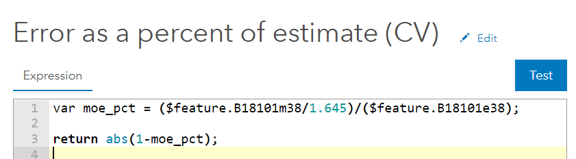
The expression dialogue box appears for us to name and type in our expression. We want to create an expression that shows the range as a percent of the estimate. This video (6 min.) on Census’ documentation pages walks through different ways to do this. We can then subtract it from 1 so that the smallest MOE percentages will appear darker (less transparent) :
Then back to setting the transparency based on attribute values:

I’d like to use a cutoff of 10% (.1), so I’ll have to click “Zoom in” to see that section of the histogram better:

Now those tracts with poor estimates are more transparent than those with more reliable estimates. The transparency appears in the legend underneath the proportional symbols. Configure your pop-up as discussed above, and you get the following map:
 and transparency range in legend (left).")
Many Living Atlas Layers Contain Margins of Error
If you’re working with American Community Survey data in ArcGIS Online, always check ArcGIS Living Atlas first, to see if the variables you want have already been published as part of feature layer. An ever-increasing number of layers in ArcGIS Living Atlas contain data from the American Community Survey, and include the margins of error as fields. Some example topics are household income, educational attainment, ancestry and ethnicity, veteran characteristics, health insurance, language spoken at home, transportation to work, housing unit characteristics, and poverty, just to name a few!
Now that you know some options for displaying the margins of error, I look forward to seeing how you choose to incorporate the MOEs in your own web maps!
For more information about the American Community Survey, see the Esri White Paper or the Census Bureau’s ACS Handbook for Data Users. This blog was updated on 8/28/20 and again on 1/11/21.

Commenting is not enabled for this article.