The New York Times has been compiling cumulative counts of coronavirus cases in the United States at state and county levels since the very first outbreak in Washington state on January 21st, 2020. According to their github page, they decided to make this time series data public to help researchers, scientists and government officials better understand the pandemic. This github repository gets updated daily and has records for each US county with coronavirus cases for each day. You can view the table (in .csv format) at https://github.com/nytimes/covid-19-data/blob/master/us-counties.csv where each record/row represents one single county for a given day. This makes it easier to map how the outbreak spreads in the USA over time using ArcGIS Pro.
At high level, the process is as simple as 1-2-3.
- Download and copy data in a geodatabase
- Join the time series table to US County polygon layer
- Make the layer time aware and view daily changes using the time slider
1. Download the time series data
- Download the following python script from ArcGIS Online
https://www.arcgis.com/home/item.html?id=b42b1e3daf96457b804a1246ee3d4a10 - Unzip it from its zipped format, and open UpdateNYTimesCovid19TimeSeries.py in your favorite text editor.
- Update values for 3 variables from line #9 – #15. These are basically (a) where the csv file will get downloaded, (b) the full path to your file geodatabase or a .sde connection file for your enterprise database and (c) the name of the output table – a default name is provided, change it if you want to.
- Save the file.
- Execute the script using tools like Python IDLE, Visual Studio Code, or directly from the command line.
You must have ArcGIS Pro installed in order to execute this script. - To execute it from the Windows command line:
- Open Windows Command Prompt on the machine where you have ArcGIS Pro.
- Go to python folder e.g.
cd C:\Program Files\ArcGIS\Pro\bin\Python\envs\arcgispro-py3
This is typically where ArcGIS Pro gets installed by default. Change the path if you installed it in a different location. - Type
python "<location_where_you_saved_the_python_script>\UpdateNYTimesCovid19TimeSeries"and hit enter. - In few seconds, the time series csv file will get downloaded and copied as a table in the output geodatabase.
- Since there are some geographic exceptions, you need to download a modified version of US counties data.
- Navigate to https://www.arcgis.com/home/item.html?id=53935d5d1c8540539d290072fcda77c1.
- Click on Open in ArcGIS Pro button on the page.
- The county layer should get added to a map in ArcGIS Pro.
- Right-click on the layer in the Content pane.
- Choose Data | Export Features from the context menu.
- It opens a geoprocessing tool.
- For the Output Location, select the same geodatabase where you copied the New York Times coronavirus time series table (having them in the same geodatabase increases drawing performance).
- Enter NYTCovid19_Counties in the Output Feature Class.
2. Join time series table with county layer
- Open ArcGIS Pro and insert a map.
- Add both US counties polygon layer and the time series table.
- Select NYTCovid19_Counties layer from the Content pane.
- Under Feature Layer, on the Data tab, in the Relationship group, in the Join menu, click Add Join.
- Fill in the geoprocessing tool using the values from the table below:
Layer Name or Table View: NYTCovid19_Counties
Input Join Field: FIPS
Join Table: NYTCovid19_TimeSeriesCases (assuming you didn’t change the default name provided in the python script)
Output Join Field: FIPS - Click Run.
- There is a 1:M relationship, meaning for each county polygon, there are 1 or more records in the time series table.
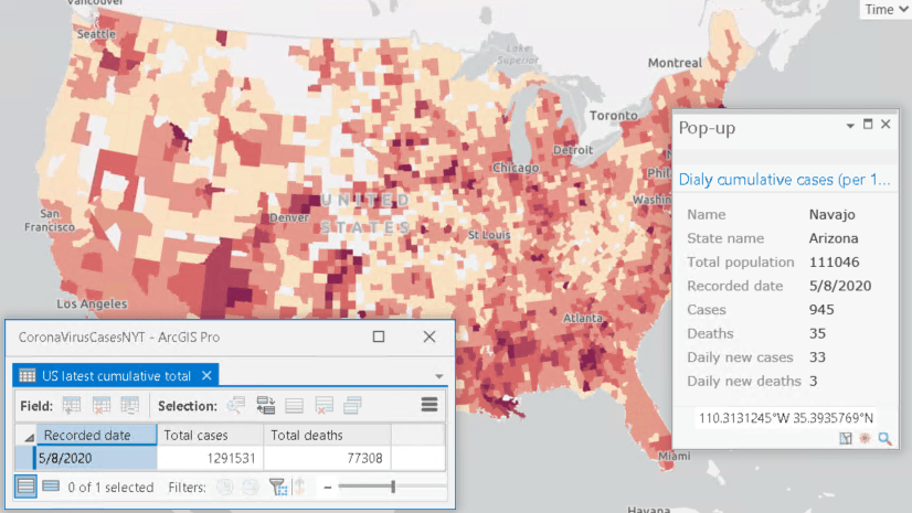
If you click on a county like Los Angeles, you will see more than 1 records in the popup window. - Symbolize counties responsibly.
3. Visualize changes using the time slider
- Open NYTCovid19_Counties layer Properties page by choosing Properties from the right-click context menu.
- Switch to the Time tab
- Select Each feature has a single time field from the Layer Time drop down.
- Choose date as the Time Field.
- Since the data will be update daily (see section at the end how you can keep your version updated), have Data is live feed checkbox checked.
- Click OK.
- It will bring up the Time Slider.
- Under Map, on the Time tab, in the View group, click on Enable Time.
- In the Current Time group, set Start to 1/20/2020 and Span to 1 Day.
- In the same group, click on the Start Excluded to show only 1 day worth of data – in this case, only for the 21st January, 2020. If you didn’t have start excluded, the map will show data from both 20th and 21st January.
- You can click on the Play from the Playback group to animate through time and see daily changes.
Results
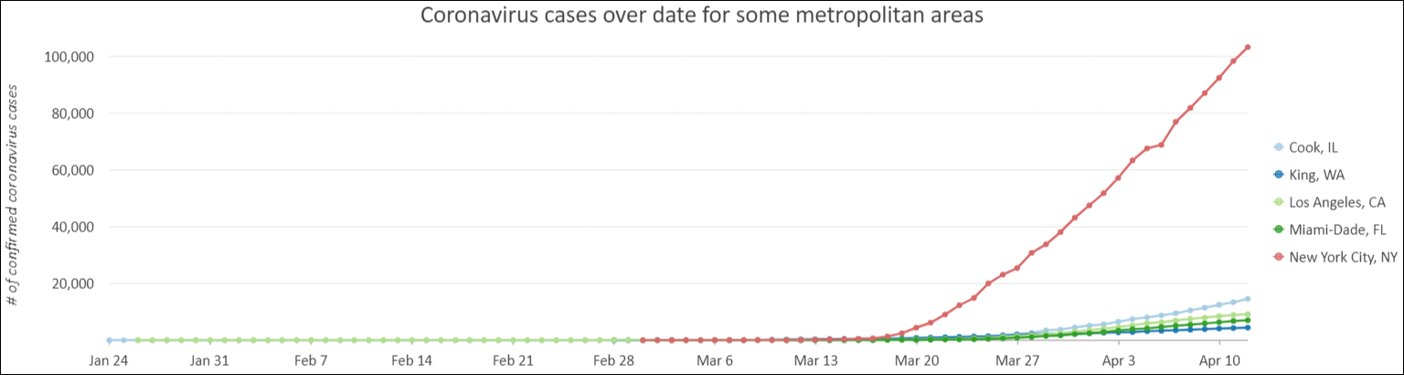
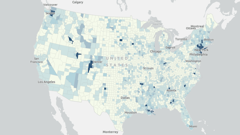
Here are few maps and charts, produced using the New York Times time series data, show how the pandemic has spread since February, 2020.
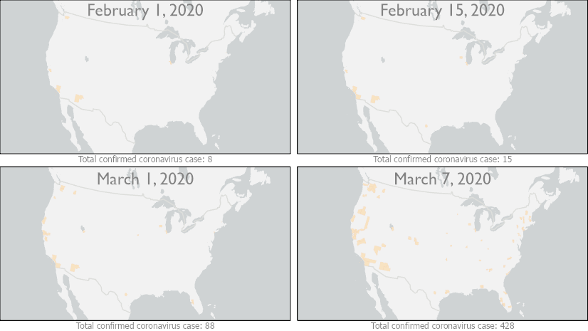
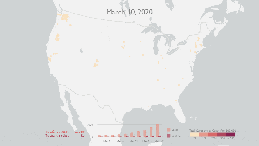
It is clearly visible that not only the pandemic spread across the county, as you see more counties lit up but also number of confirmed cases increased by many folds in those areas. Some of these changes can also be easily represented in charts.
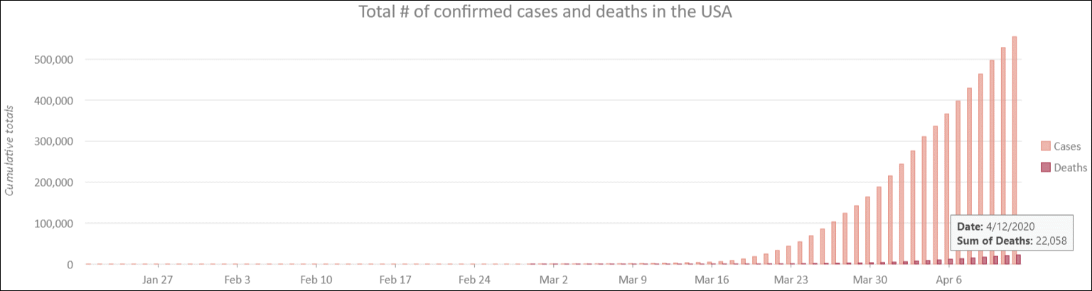
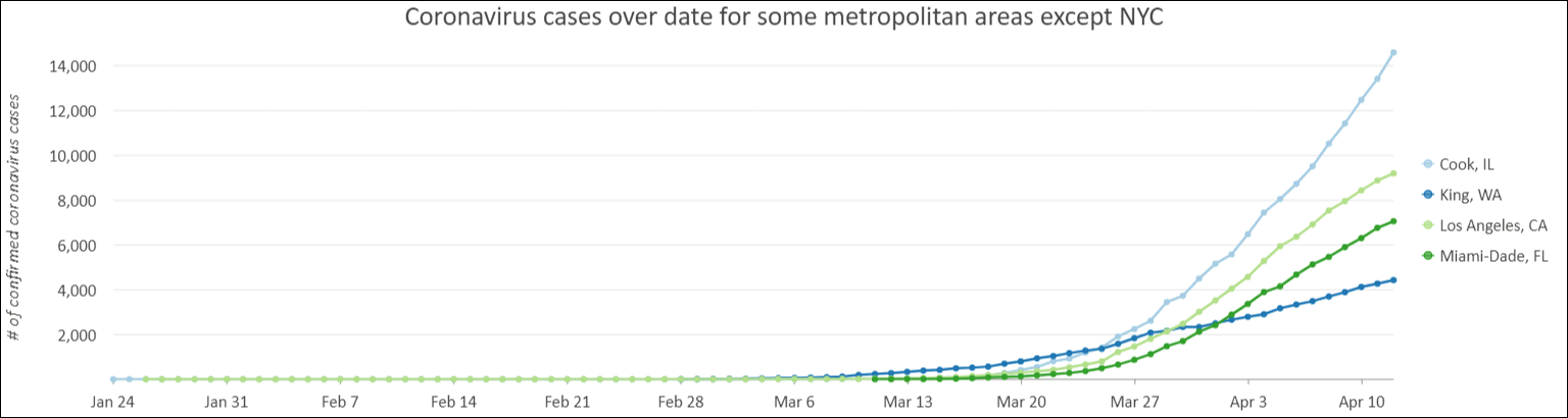
Visualizing time series charts
Charts give option to see result from different perspectives. Charts in ArcGIS Pro can be used to produce some charts like the ones below from the time series table.
How to keep the data updated:
The New York Times has been working tirelessly to update this time series dataset daily. Since it happens only once a day, you can manually execute the python script or use Windows Task Scheduler to update at regular interval even when you are not logged on.
- Open Windows Task Scheduler.
- Right-click on the Task Scheduler Library from the left pane and choose Create a Basic Task.
- Following the wizard to provide it with a name, set the frequency, and select Start a Program in the Action section.
- Click on the Browse… button to select python executable – with typical ArcGIS Pro install, you will find it in
C:\Program Files\ArcGIS\Pro\bin\Python\envs\arcgispro-py3. - Type full path to the python script, you downloaded in step#1, in Add arguments (optional) textbox.
- If you want this task to execute even when you are not logged on, have Open the properties dialog for this task when I click finish box checked.
- Click Finish.
- It opens the task’s Properties dialog
- Choose Run whether user is logged on or not.
- Optionally, choose whether you want to store your credentials or not.
- Click OK.
Can I share?
Yes, you can share your map as a map image layer (aka publish it as map service) to your on-premises ArcGIS Enterprise. Please read my next blog post containing detail instructions.
Few things to remember:
- You must publish/share it by ‘Reference registered data’. If you choose ‘Copy all data’, then for every updates, you need to republish the service.
- For the same reason, it won’t work if you chose to publish to ArGIS Online.


Will this data be coming to the Living Atlas any time soon?
Let me check with the team to find whether this can be made available via Living Atlas. Thanks for the suggestion.
Just an FYI: I finally got a sample map service running with that data and it is accessible publicly.
https://sampleserver6.arcgisonline.com/arcgis/rest/services/NYTimes_Covid19Cases_USCounties/MapServer
here is a blog where I describe how I prepared my data etc.
https://www.esri.com/arcgis-blog/products/arcgis-pro/real-time/working-with-and-sharing-latest-from-live-data-in-arcgis-pro/
Hi – the layer package for the data reads that it was created with Pro 2.6, which none of us have yet because it hasn’t been released? We’re all at 2.5
Thanks David for letting me know. Sorry about that. I will try to fix it as soon as I can.
Just updated the layer package with v2.5. Please let me know if you run into any issue. Appreciate it.
Will do thanks Tanu
Hi Tanu
Great post. I’m not sure how you created the 3D map with total cases and exaggerated extrusions. Would you provide instructions? Thank you!
Manoj
Thanks Manoj for finding this post helpful.
As you know, now that you have polygon features joined with the time series table, the total cases attribute is part of each polygon. All you need to do is to (a) add the layer in a Scene view, (b) may need to move that layer inside ‘3D layers’ category and (c) set the extrusion from the Appearance tab on the ribbon.
here is the help on how to do that: https://pro.arcgis.com/en/pro-app/help/mapping/layer-properties/extrude-features-to-3d-symbology.htm
Tanu
I have the table joined and updated, but there is no attribute for total cases. The current field has cases for that particular day. When I try to make a 3D map is only extrudes based on the cases of the last date. Am I doing something wrong? I am able to make a chart because it give an option to aggregate values, but I see no option to do so in a map. Thank you
Hi Manoj,
> When I try to make a 3D map is only extrudes based on the cases of the last date
Did you make the layer time aware? And using time slider to go from one day to another?
Yes I did that. When you go from one day to the next it shows counties with cases that particular day. It doesn’t show the accumulation of cases for each county. The last day on the slider should be a thematic map with high concentrations in the expected area, but it only shows the case count for that day.
NY Times data are already accumulated. Count for each is actually (count from the previous day + new cases). There are new cases or new deaths.
Therefore what you are seeing is good.
If the data were just new cases for each day, then we’d have to take a different approach.
very helpful Tanu!
lovely work!
Thanks. I’m glad you liked it 🙂
অনেক ধন্যবাদ !
How does this data differ from the Johns Hopkins University feature service? Are they compiling data from similar sources?
Andy,
Are you asking about the Johns Hopkins University Feature Service I used in the following blog?
If so, then that feature service only has the latest updates. There is no data (at least til last week) from the past updates e.g. if you want to go back last week and see what was total count, you won’t be able to do that.
https://www.esri.com/arcgis-blog/products/arcgis-pro/real-time/visualize-us-county-polygons-with-latest-coronavirus-cases-in-arcgis-pro/
whereas NY Times github repo stores count for each day starting from 1/24 .
Please let me know if I misunderstood your question.
I hope that you can help me understand the field mapping component of the Python script. I am trying to adapt to another CSV file but I don’t know what each part of the field mapping string represents (true, true, false, etc). I can sense what some of them are but I am not getting it right because my tables are coming over empty. It worked great with the NYT data but I would like to pull some other files as well. Thank you!
Hi,
here is help document on Field Mapping. https://pro.arcgis.com/en/pro-app/help/analysis/geoprocessing/basics/field-map.htm
i hope this will help, otherwise please let me know.
also is the link to the help on field mapping in script
https://pro.arcgis.com/en/pro-app/arcpy/get-started/mapping-fields.htm
Hi, when I join the data, the results from the county table are Null (Case, Date, etc). Do you know why?
Sorry for the delayed response. It seems like matches not found. Please make sure the field type and values in FIPS field are same in both county and time series tables.
~~~
arcpy.management.SelectLayerByAttribute(tableView, “NEW_SELECTION”, “county = ‘Unknown'”, None)
if int(arcpy.GetCount_management(tableView)[0]) > 0:
arcpy.management.DeleteRows(tableView)
~~~
I had to add this because I recieved the following:
~~~
2020-03-20,Unknown,Kentucky,,1,0
2020-03-20,Unknown,Louisiana,,5,0
2020-03-20,Unknown,Maine,,3,0
2020-03-20,Unknown,Massachusetts,,18,0
2020-03-20,Unknown,Missouri,,1,0
2020-03-20,Unknown,Nevada,,11,0
2020-03-20,Unknown,New Jersey,,3,0
2020-03-20,Unknown,Puerto Rico,,14,0
2020-03-20,Unknown,Rhode Island,,44,0
~~~
my understanding is that when NY Times can’t assign a case to any specific county, they label them Unknown. If you remove them, computing total cases for a given States or for the entire USA will produces incorrect results.
~~~
arcpy.management.SelectLayerByAttribute(tableView, “NEW_SELECTION”, “county = ‘Lac qui Parle’ And state = ‘Minnesota'”, None)
arcpy.management.CalculateField(tableView, “county”, “Lake of the Woods”, “PYTHON3″, ”)
~~~
Changed Lac qui Parle,Minnesota to Lake of the Woods,Minnesota to match feature class
~~~
OBJECTID 1 NAME Lake of the Woods STATE_NAME Minnesota
Line 8820: 2020-03-23,Lac qui Parle,Minnesota,27073,1,0
Line 10119: 2020-03-24,Lac qui Parle,Minnesota,27073,1,0
Line 11541: 2020-03-25,Lac qui Parle,Minnesota,27073,1,0
Line 13138: 2020-03-26,Lac qui Parle,Minnesota,27073,1,0
Line 14863: 2020-03-27,Lac qui Parle,Minnesota,27073,1,0
Line 16693: 2020-03-28,Lac qui Parle,Minnesota,27073,1,0
Line 18625: 2020-03-29,Lac qui Parle,Minnesota,27073,1,0
Line 20659: 2020-03-30,Lac qui Parle,Minnesota,27073,1,0
Line 22791: 2020-03-31,Lac qui Parle,Minnesota,27073,1,0
Thanks for letting me know. I will try to update that in the county layer.
Section 2: Join time series table with county layer is a confusing section since you are joining multiple covid records to a single county. That a 1 to many relationship but a simple join doesn’t handle that. That’s a relate and as much as I’ve gone through, reread and applied a join, it still does not show multiple joined records when selecting a single county with the identify tool. Is there something I am doing wrong in Pro or is there something missing in Section 2?
Hello Todd,
Sorry about the delay.
Yes, you are right – there is a 1-M relationship between the county layer and the table. The only way you can draw features in ArcGIS Pro using attributes from their related records is by joining them first.
May be there is a bug in Pro that prevents you from seeing all records in a popup when time slider is not active.
One thing you can also do is to define a relate between them (in the map or in the database) to see related records in the popup window.
@Tanu Hoque Hi, I’m having trouble running the code.
import arcpy
ModuleNotFoundError: No module named ‘arcpy’ this is the error from Python
Hello Joy,
sorry for the delay. Do you happen to have ArcGIS Pro installed on the machine you are running the script? That seems to the issue here.
some of fields shows after joining data
hiw to sort this error ? thank you.
Tanu,
Excellent tutorial. Can you tell me where/how you got the other data used in your map? It looks like your final map has 4 tables. Additionally, you have a rolling count field showing changes accumulated in the last several days. The NYTimes data does not include population, which will be necessary to symbolize the data appropriately.
Cheers.
Hello Tim,
So sorry for the delayed response.
As per the population data, I believe I have this available here: https://www.arcgis.com/home/item.html?id=53935d5d1c8540539d290072fcda77c1
As per the rolling count etc., I meant to write another blog explaining how I did that. I did say that in https://www.esri.com/arcgis-blog/products/arcgis-pro/real-time/working-with-and-sharing-latest-from-live-data-in-arcgis-pro/. Alas, I didn’t get a chance to write that either. But I do have the script that does that, if you are interested, I can share that with you. Please email me.
best regards.
Hope you can help understand this section of the python code.
In the “outGDB=…” section, what exacly should I place here? I understant it is the path for an existing gdb file. However I’m failing to understant which gdb file, as, at this point, I have no gdb file in my folder.
Thanks in advance for your help.
Sorry Ricardo for the delayed response. I hope your problem is resolved by now.
Just in case, since you don’t have file gdb, you need to create one and use the file gdb path in there.
The script does not create any file gdb.
hope this helps. Pls let me know if you have any question.