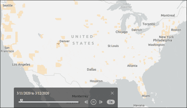
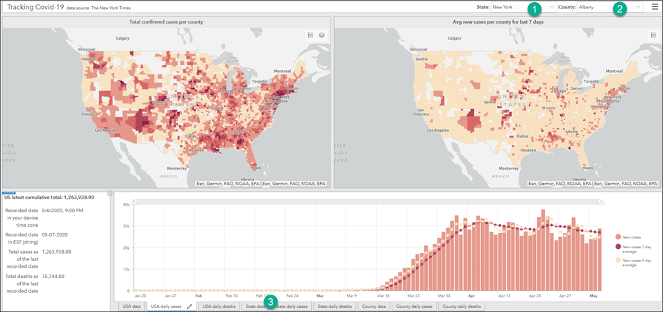
Let’s start by opening a sample web application – Tracking Covid-19 across the USA.
- It shows the US counties with the latest total confirmed cases per 100,000 by default.
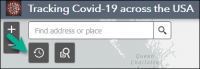
- If you click the Time Slider tool, it will start playing back how the coronavirus has spread across the USA since early March, 2020.
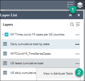
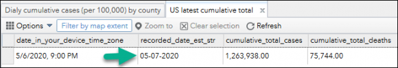
If you open this app tomorrow or the day after or even a week later, the map will still give you the very latest as of that day. Click on the Layer List tool, and select View in Attribute Table option for US latest cumulative total table to see the last time the data was updated, and the total confirmed cases and deaths.
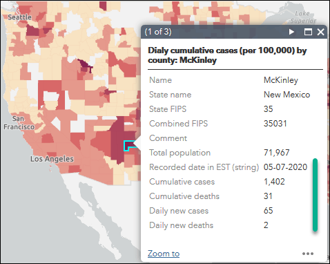
You can also get the latest data for any county in the popup window when the Time Slider tool is closed.
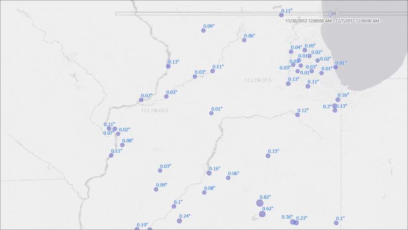
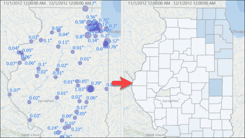
Coronavirus is not the only case under which we want to have an app like this; tracking hurricanes, monitoring the water level along rivers, earthquakes, etc. are few examples where data gets updated regularly.
So, how did I achieve this?
First of all, this web map is powered by a sample map service. The authoring and sharing as a map service was just a one time task in ArcGIS Pro. And it was done in a way that:
- the map service always generates maps and tables with the latest daily new data, and
- no one needs to interrupt or intervene as the tables get updated daily with new data.
Let’s take a look at what I did as a response to inquiries about this directed towards my previous blog.
Let’s get some data
We will use the New York Times coronavirus data. If you already have it, that is great! Otherwise, use steps from my last blog post to get data, and make sure to keep it updated daily.
Once you follow the instructions, you will have:
- A feature class for the US counties
- A table containing time series data. There are multiple records for each county.
Basically, a one-to-many relationship exists between the feature class and the table.
Step 1: copy data to an enterprise database
- To accomplish what we want, data needs to be moved to an enterprise database such as PostgreSQL, SQL Server, Oracle etc.
- If not already copied to an enterprise database, use Feature Class to Feature Class and Table to Table geoprocessing tools to copy both the County feature class and the table with the coronavirus records.
- If you don’t have enterprise, you can download and install PostgreSQL, SQL Server Express or Oracle Express Edition for free.
- Optionally, you can make it a geodatabase.
- In case you have to use file geodatabase, please see the section at the end of this blog. The solution requires multiple layers, and does not provide seamless user experience.
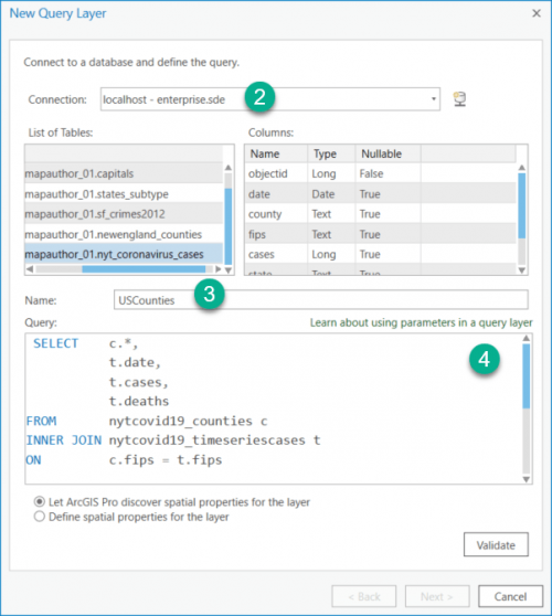
Step 2: create a query layer
- Choose Add Data | Query Layer option on the Map ribbon.
Help link: Create a query layer—Query layers - Select a database connection.
- Provide a name, such as “NYTCounty_Covid19”.
- Enter a SQL like the below
SELECT c.*,
t.date, t.cases, t.deaths
FROM nytcovid19_counties c
INNER JOIN nytcovid19_timeseriescases t
ON c.fips = t.fips
Note: make sure the table names and field names are matched with what you have in your database.
At this point, the SQL statement simply defines and joins two tables, and if you were to validate it and go ahead with creating the layer, you will see a feature layer with multiple records for each county. Multiple polygons are overlapped for each county. We don’t want that, so we need to restrict it, returning only records matching time span set in ArcGIS Pro Time Slider. We will do this by adding a where clause with a relatively new but very powerful range parameter. (Please note: we really don’t need to have a range parameter to make this a time aware layer, but we do need it for Step 4 below and some advanced capability that I will discuss in my next blog).
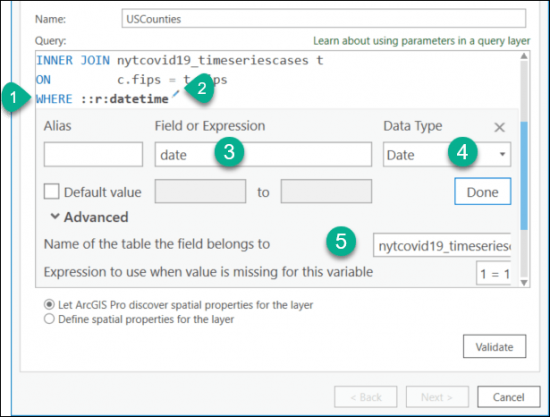
Step 3: add a time range parameter
- Add the following line at the end of the SQL you added in the previous section.
WHERE ::r:datetime - Click the pencil icon.
- Enter date in the Field or Expression textbox.
- Choose Date from the Data Type drop down.
- Expand the Advanced section and enter the table name where the date field belongs.
A range parameter of Date data type automatically gets used to make the layer time aware. At that point, you can use time slider to see counties with data within the selected time window.
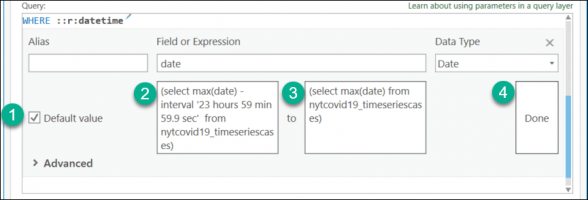
Step 4: set default values to draw counties with their latest data
- Check Default value check box, if it is not already checked.
- If you use PostgreSQL database, enter the following SQL expression in the first text box. Otherwise, see the notes section below.
(select max(date) - interval '23 hours 59 min 59 sec' from nytcovid19_timeseriescases) - Enter the following SQL expression in the second text box.
(select max(date) from nytcovid19_timeseriescases) - Click Done.
These default values get used when the Time Slider is not enabled or used. Therefore, when the time slider is not in use, the layer will use these default values to retrieve the latest data from the table – and you will see a map showing the current state. To get the count for each county for any given day, you can enable time slider and slide to that date.
Notes:
- Please make sure the field and table name used in the MAX() function in #3 and #4 are matched with what you have in your database.
- Make sure you have a set parentheses around both expressions.
- Expression provided in #3 is specific to PostgreSQL database.
Here are comparable expressions from other databases: - Oracle:
(select max(date) - interval '23' hour - interval '59' minute - interval '59' second from nytcovid19_timeseriescases) - SQL Server:
(select max(date) - dateadd(second, -59, dateadd(minute, -59, dateadd(hour, -23, max(date)))) from nytcovid19_timeseriescases) - In #3, I could have used a simple expression like
current_date - interval '1 day'andcurrent_daterespectively, but there are two reasons I didn’t use them:
(1) I am hoping for the day when we are out of this pandemic and the New York Times will stop updating this data, but I would still like to see how bad the situation was based on the last counts, and
(2) The machine hosting the database is running on the cloud and the time zone set on that machine is in UTC, whereas data collected in this table are in Eastern Standard time. Using current_date might not return any result due to time zone differences and depending on the time of a day the data gets updated by the New York Times.
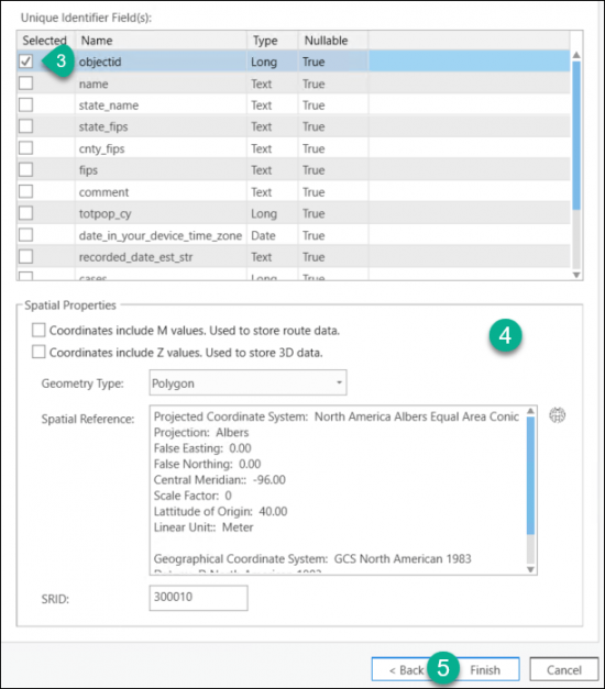
Step 5: validate and finish creating a query layer
- Click Validate.
- Click Next.
- On the next page, have objectid field checked from the Unique Identified Field(s): list.
- The Spatial Properties section should get populated here. If not, you might need to go back and check the SQL which might not be returning any features. This section requires the SQL statement returns at least one feature to retrieve these properties.
- Click Finish.
Step 6: symbolize and use time slider
- You should see a new layer with the default Single Symbol symbology is added to your map.
- You will also see the Time Slider appears but it is not in use. As I mentioned above, since the Time Slider is not active, the layer is using the default values to retrieve records from the table.
- Also, if you open the layer’s Properties page and switch to the Time tab, you will see the layer is already made time aware using the range parameter defined in the SQL. The time extent is also computed automatically.
- Click Data is a live feed check box.
- While there, I’d follow the best practice, and set (a) the Time Zone to Eastern Time (US & Canada) and (b) check Adjust for Daylight Saving.
View latest data:
- Open its attribute table and take a look at values in the date field.
You will see all of them are from the last day the data was collected. In my case, it is 5/9/2020 as of the publishing date of this blog. - You can click a county and see the latest results for that county in the popup.
- You should symbolize the layer with something other than the Single Symbol symbology. When you do, it will use the latest data to draw all counties.
View data from any other date
- On the ribbon, click the Time tab.
- In the Time Zone group, set the time zone to Eastern Time (US & Canada) and have Adjust For Daylight Saving checked.
- Since it is a daily data, have Time Snapping checked and set the Time Snapping Interval to Days in the Snapping group.
- Enter 1 in Span: text box in the Current Time group.
- This should enable the Time Slider, set the Start: to 1/20/2020 (or whatever the earliest date you have in your table) and End: to 1/21/2020.
- At this point, you should see only counties that have any confirmed cases as of 1/21/2020.
- If you open attribute table, you will only see records from those counties with records from 1/21/2020.
- Click the Play All Steps button on the ribbon in side Playback group or on the Time Slider to see how the virus spread across the USA over time.

Step 7: share your map as a map service
- If you want to share this on your enterprise portal, on the Share tab, in the Share As group, click the Web Layer drop-down arrow and click Publish Web Layer. Then choose Map Image box under Layer Type on the Sharing pane.
For more on information, read Share a map image layer for help. - Publishing it as a map service on a stand-alone server requires adding an admin server connection. Right-click on that connection and choose Map Service from Publish menu item.
Refer to Publish a map service to learn more. - Make sure you choose Reference registered data under Data on the sharing pane.
Step 8: consuming the map service in a web map
- Go to your portal or arcgis online Map Viewer.
- Click Modify Map from the top right corner.
- Click Add drop-down and click Add Layer from Web.
- Enter your map service URL in the URL text box on Add Layer from Web dialog.
- Click Add Layer.
- Since the map service is time aware, map viewer brings up the time slider. You can use that to play through all steps.
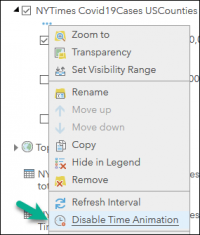
- To see the latest state, just like what we did in ArcGIS Pro, we need to deactivate time. Click … right underneath the layer in the Content pane to bring up the context menu, and click Disable Time Animation.
- Save the web map and use that in any web application.
Showing latest data off file geodatabase
- You need to make a duplicate copy of the county layer with joined attributes.
- For the first layer, apply the following definition query to always show the latest:
<date_time_field> = (current_date - 1) - Make the second layer a time aware layer.
- You need to toggle these layers visibility to visualize either (a) the latest state or (b) play back over time.
Coming up next:
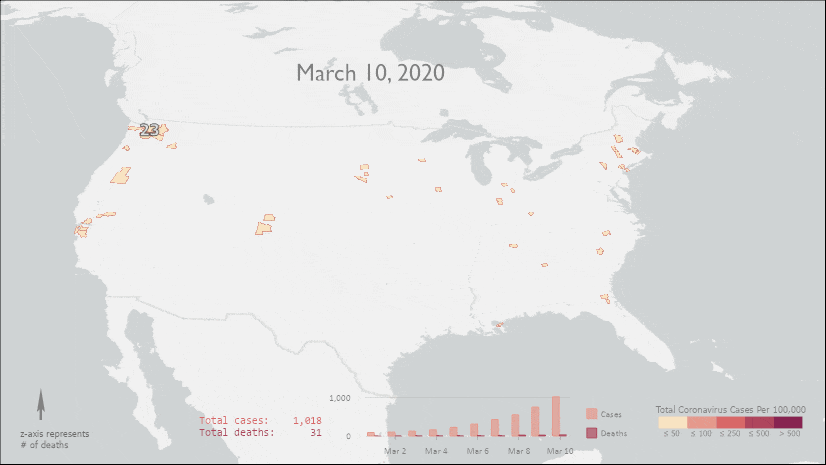
As you might have noticed, the web map has few additional attributes and tables coming from the back-end map service such as daily counts for counties, also aggregated to states and counties, plus 7 day and 4 day rolling average. These additional attributes were not part of the original New York Times data; instead, they were computed from the original dataset by taking advantage of database functionality and ArcGIS Pro capability.
In my next blog post, I will discuss how I prepared such data and shared it as a map service so that a dashboard application, like the image below, can be created. In the meantime, you can take a look at a sample one here: https://arcg.is/0Ojyyv.
Also, please take a look at the content of the map service: https://sampleserver6.arcgisonline.com/arcgis/rest/services/NYTimes_Covid19Cases_USCounties/MapServer.

Article Discussion: