The New York Times has been compiling cumulative counts of coronavirus cases in the United States at state and county levels since the very first outbreak in Washington state on January 21st, 2020. According to their github page, they decided to make this time series data public to help researchers, scientists and government officials better understand the pandemic. This github repository gets updated daily and has records for each US county with coronavirus cases for each day. You can view the table (in .csv format) at https://github.com/nytimes/covid-19-data/blob/master/us-counties.csv where each record/row represents one single county for a given day. This makes it easier to map how the outbreak spreads in the USA over time using ArcGIS Pro.
At high level, the process is as simple as 1-2-3.
- Download and copy data in a geodatabase
- Join the time series table to US County polygon layer
- Make the layer time aware and view daily changes using the time slider
1. Download the time series data
- Download the following python script from ArcGIS Online
https://www.arcgis.com/home/item.html?id=b42b1e3daf96457b804a1246ee3d4a10 - Unzip it from its zipped format, and open UpdateNYTimesCovid19TimeSeries.py in your favorite text editor.
- Update values for 3 variables from line #9 – #15. These are basically (a) where the csv file will get downloaded, (b) the full path to your file geodatabase or a .sde connection file for your enterprise database and (c) the name of the output table – a default name is provided, change it if you want to.
- Save the file.
- Execute the script using tools like Python IDLE, Visual Studio Code, or directly from the command line.
You must have ArcGIS Pro installed in order to execute this script. - To execute it from the Windows command line:
- Open Windows Command Prompt on the machine where you have ArcGIS Pro.
- Go to python folder e.g.
cd C:\Program Files\ArcGIS\Pro\bin\Python\envs\arcgispro-py3
This is typically where ArcGIS Pro gets installed by default. Change the path if you installed it in a different location. - Type
python "<location_where_you_saved_the_python_script>\UpdateNYTimesCovid19TimeSeries"and hit enter. - In few seconds, the time series csv file will get downloaded and copied as a table in the output geodatabase.
- Since there are some geographic exceptions, you need to download a modified version of US counties data.
- Navigate to https://www.arcgis.com/home/item.html?id=53935d5d1c8540539d290072fcda77c1.
- Click on Open in ArcGIS Pro button on the page.
- The county layer should get added to a map in ArcGIS Pro.
- Right-click on the layer in the Content pane.
- Choose Data | Export Features from the context menu.
- It opens a geoprocessing tool.
- For the Output Location, select the same geodatabase where you copied the New York Times coronavirus time series table (having them in the same geodatabase increases drawing performance).
- Enter NYTCovid19_Counties in the Output Feature Class.
2. Join time series table with county layer
- Open ArcGIS Pro and insert a map.
- Add both US counties polygon layer and the time series table.
- Select NYTCovid19_Counties layer from the Content pane.
- Under Feature Layer, on the Data tab, in the Relationship group, in the Join menu, click Add Join.
- Fill in the geoprocessing tool using the values from the table below:
Layer Name or Table View: NYTCovid19_Counties
Input Join Field: FIPS
Join Table: NYTCovid19_TimeSeriesCases (assuming you didn’t change the default name provided in the python script)
Output Join Field: FIPS - Click Run.
- There is a 1:M relationship, meaning for each county polygon, there are 1 or more records in the time series table.
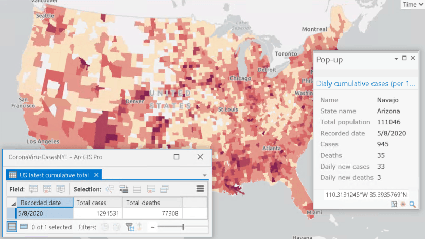
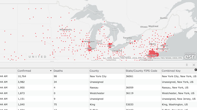
If you click on a county like Los Angeles, you will see more than 1 records in the popup window. - Symbolize counties responsibly.
3. Visualize changes using the time slider
- Open NYTCovid19_Counties layer Properties page by choosing Properties from the right-click context menu.
- Switch to the Time tab
- Select Each feature has a single time field from the Layer Time drop down.
- Choose date as the Time Field.
- Since the data will be update daily (see section at the end how you can keep your version updated), have Data is live feed checkbox checked.
- Click OK.
- It will bring up the Time Slider.
- Under Map, on the Time tab, in the View group, click on Enable Time.
- In the Current Time group, set Start to 1/20/2020 and Span to 1 Day.
- In the same group, click on the Start Excluded to show only 1 day worth of data – in this case, only for the 21st January, 2020. If you didn’t have start excluded, the map will show data from both 20th and 21st January.
- You can click on the Play from the Playback group to animate through time and see daily changes.
Results
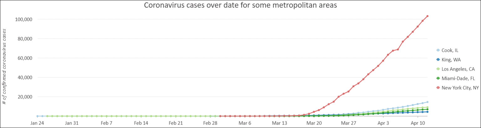
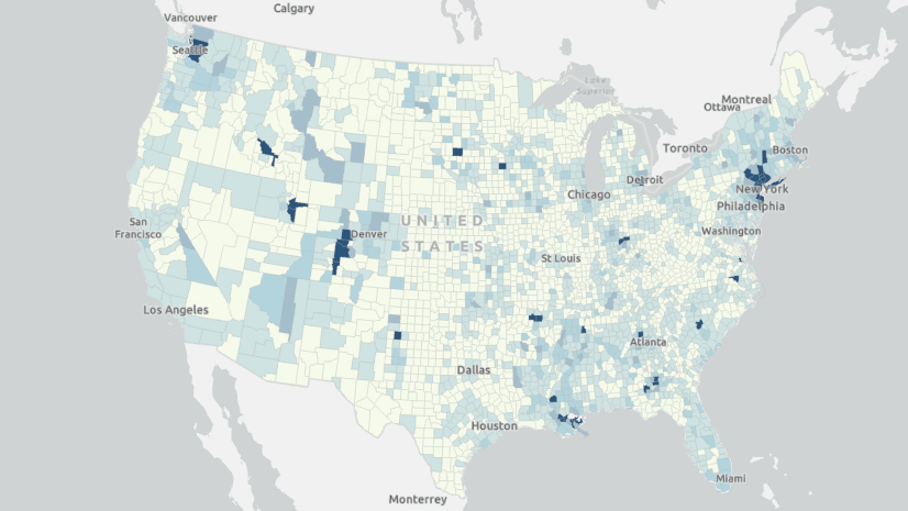
Here are few maps and charts, produced using the New York Times time series data, show how the pandemic has spread since February, 2020.
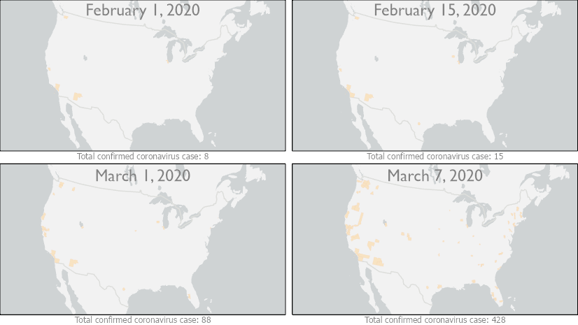
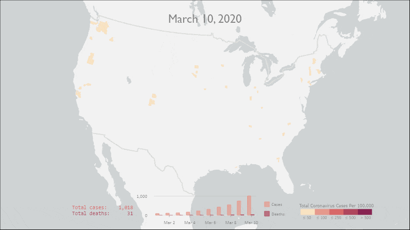
It is clearly visible that not only the pandemic spread across the county, as you see more counties lit up but also number of confirmed cases increased by many folds in those areas. Some of these changes can also be easily represented in charts.
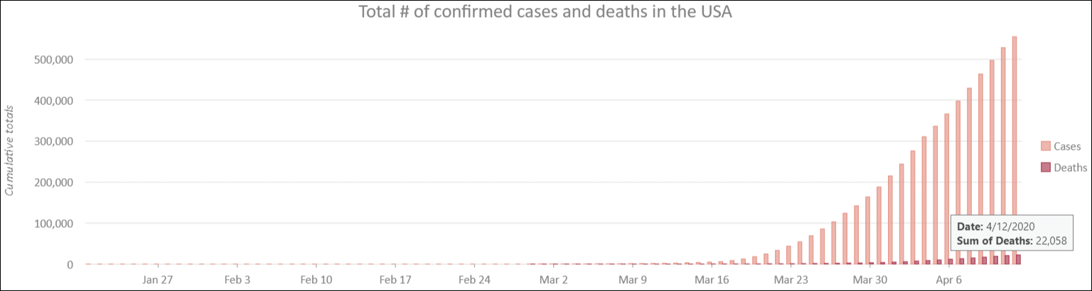
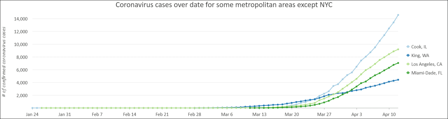
Visualizing time series charts
Charts give option to see result from different perspectives. Charts in ArcGIS Pro can be used to produce some charts like the ones below from the time series table.
How to keep the data updated:
The New York Times has been working tirelessly to update this time series dataset daily. Since it happens only once a day, you can manually execute the python script or use Windows Task Scheduler to update at regular interval even when you are not logged on.
- Open Windows Task Scheduler.
- Right-click on the Task Scheduler Library from the left pane and choose Create a Basic Task.
- Following the wizard to provide it with a name, set the frequency, and select Start a Program in the Action section.
- Click on the Browse… button to select python executable – with typical ArcGIS Pro install, you will find it in
C:\Program Files\ArcGIS\Pro\bin\Python\envs\arcgispro-py3. - Type full path to the python script, you downloaded in step#1, in Add arguments (optional) textbox.
- If you want this task to execute even when you are not logged on, have Open the properties dialog for this task when I click finish box checked.
- Click Finish.
- It opens the task’s Properties dialog
- Choose Run whether user is logged on or not.
- Optionally, choose whether you want to store your credentials or not.
- Click OK.
Can I share?
Yes, you can share your map as a map image layer (aka publish it as map service) to your on-premises ArcGIS Enterprise. Please read my next blog post containing detail instructions.
Few things to remember:
- You must publish/share it by ‘Reference registered data’. If you choose ‘Copy all data’, then for every updates, you need to republish the service.
- For the same reason, it won’t work if you chose to publish to ArGIS Online.


Article Discussion: