The Time Series Clustering tool identifies clusters of locations in a space-time cube that have similar time series characteristics. This tool was released in ArcGIS Pro 2.2. In ArcGIS Pro 2.5, we updated this tool to include three different ways to cluster the time series: Value, Profile (Correlation), and Profile (Fourier) modes. Also starting from Pro 2.5, a new pop-up chart is available to show each time series by clicking on your location of interest. In Pro 2.6, the tool performance has once again been significantly improved. For instance, using a machine with 16 GB RAM and analyzing the global temperature space-time cube (this cube is used in this article) with 85,000 locations and 1,332 time slices might run out of memory in 2.5 and now it is accomplished in just 4 minutes in 2.6. Here we demonstrate how the newly updated Time Series Clustering tool can partition your time series data based on three criteria, and show the types of questions this tool can help answer.
Selecting the right characteristic of interest for your question
The Characteristic of Interest parameter you choose depends on how you would like the Time Series Clustering tool to cluster patterns in your data. The Value mode focuses on grouping time series at similar value ranges while the Profile (Correlation) mode looks for data with similar shapes over time. If you are interested in not only the overall shape but the extent of the fluctuation of your time series, the Profile (Fourier) mode is likely the better option.
In the first part of this blog article, we illustrate the use of the Time Series Clustering tool with Value and Profile (Correlation) modes, by analyzing the global distribution of COVID-19 cases by world country and by U.S. county over time. Specifically, these modes help you to tackle questions such as:
- Which countries are alike in terms of the number of daily confirmed COVID-19 over time?
- Which countries have flattened the curve of COVID-19? Which countries are currently experiencing the surging of cases?
- How about the trends in the U.S. by county?
In the second part, we demonstrate the use of the Time Series Clustering tool with the Profile (Fourier) mode to explore the variance within time series data. This approach is useful to answer questions like:
- How can we identify climate zones based on seasons and the variance of temperature?
The data used in this blog article
All the space-time cubes used in this blog article can be downloaded from here.
- COVID-19 confirmed daily cases (1/22/2020 – 6/25/2020) at the country level across the world. The data source in a CSV file format is on ourworldindata.org. If you are interested in how to convert a CSV file into a space-time cube, please refer to Time Series Forecasting 101 – Part 4
- COVID-19 confirmed daily cases (1/22/2020 – 6/25/2020) at the county level across the US. The data source is on usafact.org. Please check out Time Series Forecasting 101 – Part 1 for the detailed steps to convert this file into a space-time cube.
- Monthly mean temperature (1990 – 2010) across the world. The data source in a multidimensional raster format is on psl.noaa.gov. This blog (Explore your raster data with Space Time Pattern Mining) walks you through the steps to convert this kind of multidimensional raster data into a space-time cube.
Part 1.
Which countries are alike in terms of the number of daily confirmed COVID-19 over time?
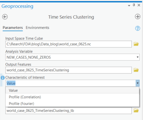
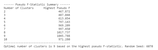
To answer this question, open the Time Series Clustering tool under the Space Time Pattern Mining toolbox, and in the parameters, choose a space time cube with COVID-19 daily cases by country over time as your Input Space Time Cube and select Value as the Characteristics of Interest. After running this tool, those countries with similar numbers of confirmed cases over time will be grouped together. You can either provide a specific number of clusters you want to create based on your knowledge, or let the tool find the optimal number for you. If you don’t provide a cluster number in the tool, the tool searches from 2 to 10 clusters. For each number of clusters, the tool clusters the time series 10 times using different random seeds, and records the largest. Therefore, there will be one largest pseudo-F statistic corresponding to each of these 9 possible numbers of clusters, and the tool will choose the cluster number which has the highest pseudo-F. A higher pseudo-F represents a better clustering result as it means there are a smaller within-group difference and larger between-group difference.
In this case, we didn’t provide the numbers of clusters, and the tool finds 9 as the optimal number of clusters. You will see the pseudo F-statistics profile in the messages like Figure 2 below by hovering over the progress bar. The result of clustering could change if you use different random seeds because of the randomness of K-means and K-medoids which are the internal algorithms of this tool. However, if there are obvious clusters within your data like this COVID-19 cases data, while the assigned cluster ID might shuffle, the clustering result should be stable.
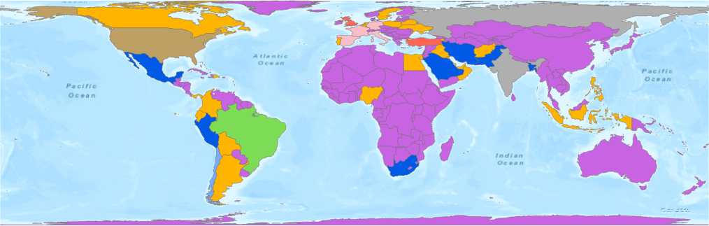
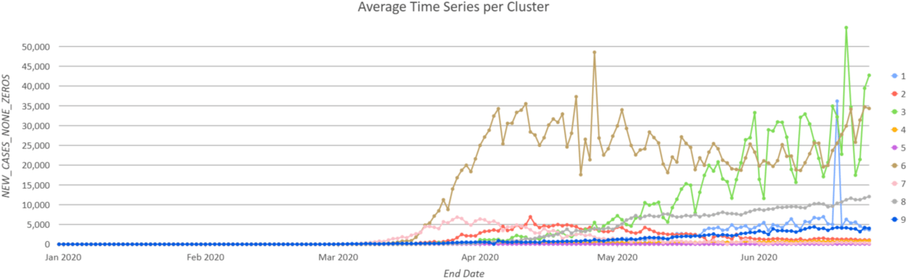
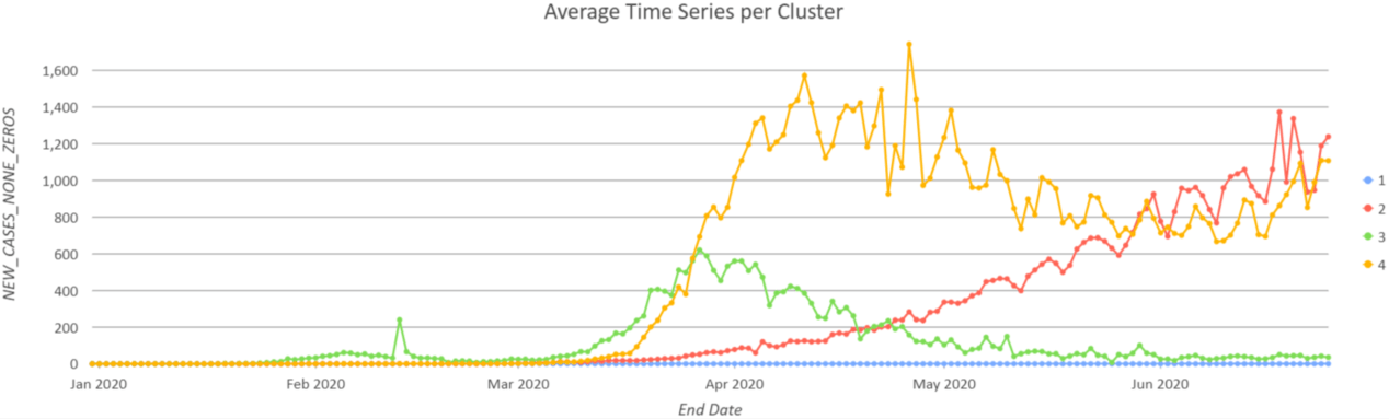
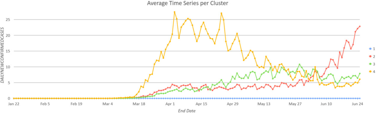
Since the colors on the map (Figure 3) and on the chart (Figure 4) are consistent, you can read the map output and the chart together to interpret the results. From the map, you can see many countries are in Group 5 (purple color) because their daily cases stay relatively low through June 25th. The U.S. (earthy yellow color) is clustered into its own group because the number of confirmed cases has been significantly large since April. The Average Time Series per Cluster chart represents the average values at every time step within each cluster, which helps you to see the general pattern of a group. For instance, the pink line in Figure 4 represents the temporal pattern of many countries in Western Europe, where their case numbers reach about 7000 per day during late March and early April and then begin to decrease.
Which countries have flattened the curve over time? Which countries are experiencing the surging of cases now?
How we can flatten the curve of COVID-19 is the question governments and decision makers are seeking the answer to. To solve this problem, one thing that we can do is to find what countries have successfully flattened curve and learn from them. Clustering based on value in the previous section cannot answer this question because the scale of the population is so different. Two countries with the same curve shape can be in different groups due to the difference in case numbers.
If your goal is to partition the time series data with similar shape into the same group, instead of using Value as the Characteristics of Interest, you should choose Profile (Correlation) as your Characteristics of Interest. After choosing this option, the tool calculates the correlation between each pair of time series, and two time series are regarded as similar if their values proportionally increase and decrease at the same time. In other words, no matter how different the number of confirmed cases the two countries have, they will be in the same group as long as their cases went up and went down simultaneously.
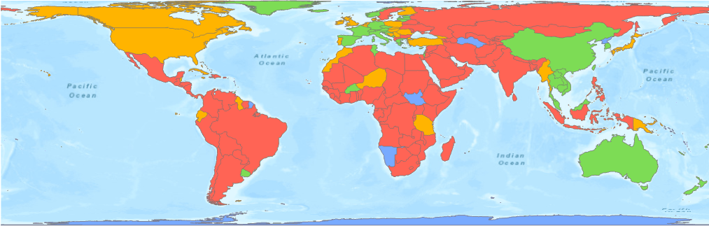
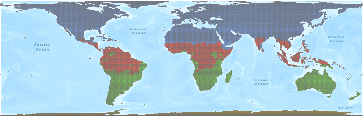
Figure 5 and Figure 6 are the clustering results using Profile (Correlation), with the countries across the world clustered into 4 groups. Most of the countries in Asia and in Western Europe are in Group 3 (green color), the group with flattened curves; countries in North America and Eastern Europe are in Group 4 (yellow color), the group reaching a plateau; and the countries in South America and Africa are in Group 2 (red color) with an exponentially growing curve. Countries without any COVID-19 data are in Group 1 (blue color).
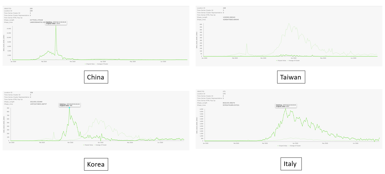
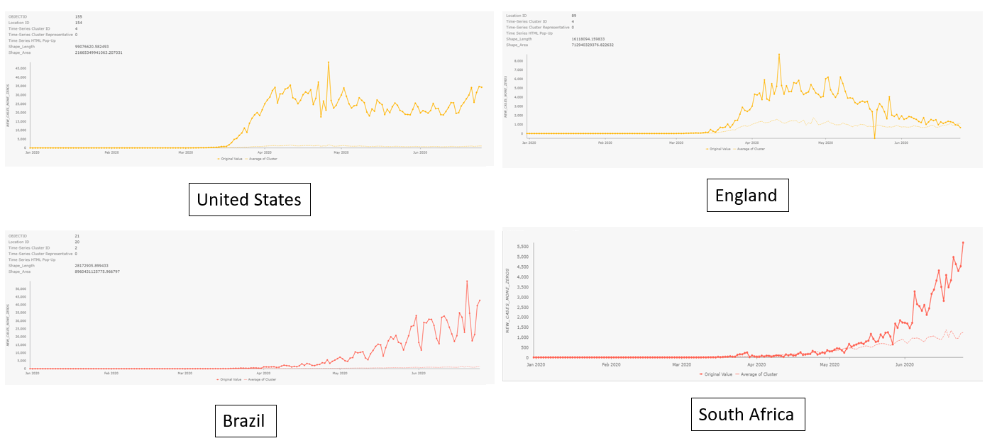
If what you are interested in is the curve of a specific country not the average of each group, you can just click the country and there will be a pop-up chart showing its time series (the solid line is the time series of the location, and the faint line on each chart represents the average time series of each cluster). The charts below are pop-up charts of various countries.
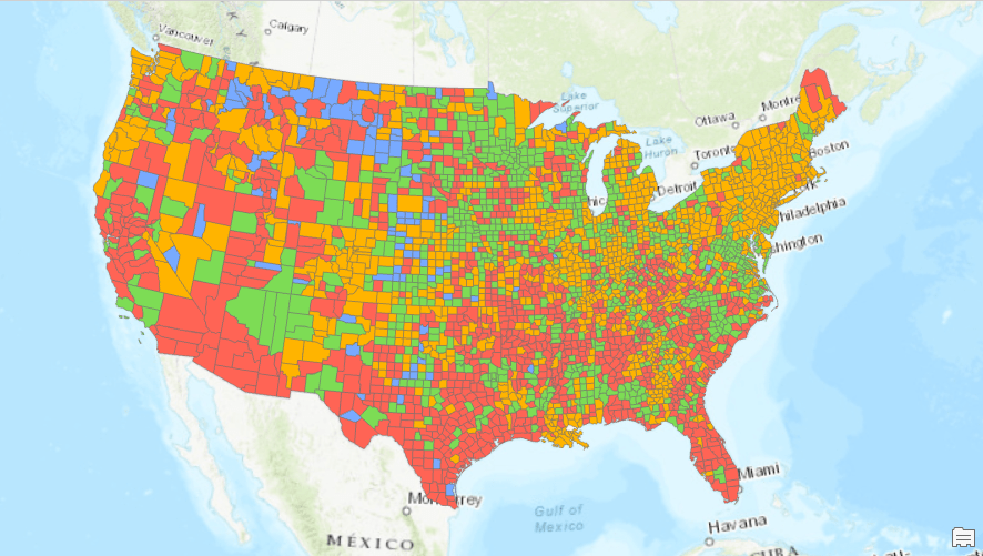
How about the trends in the U.S. by county?
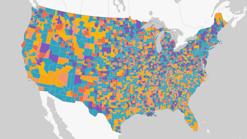
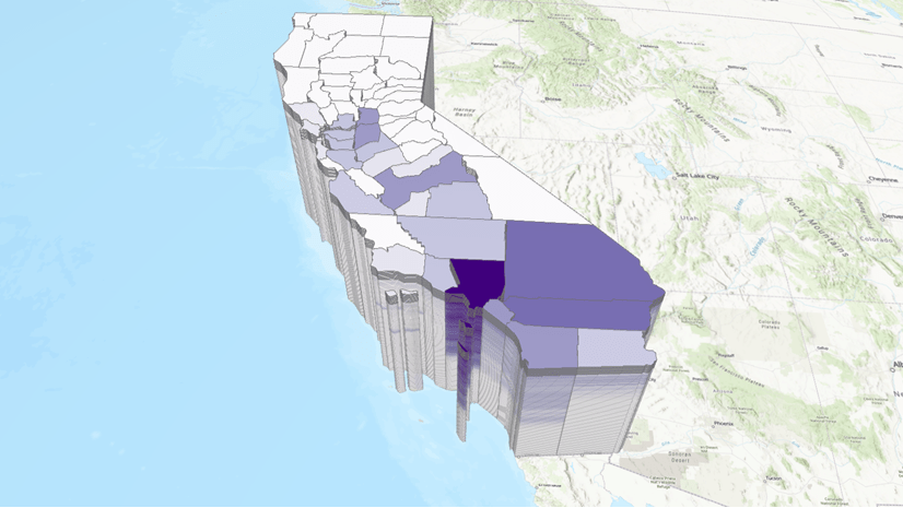
You can apply the same analysis on the U.S. data to see the patterns in COVID-19 cases. The clustering results in Figure 7 and Figure 8 show there are four different curve shapes in the U.S. counties. Those with an early peak are in Group 4 (yellow color) including Seattle in King County and New York. Counties that have plateaued are in Group 3 (green color), and the counties with surging cases are in Group 2 (red color) including Florida and Texas.
Part 2.
How can we identify climate zones based on seasons and the variance of temperature?
Let’s switch gears to other kinds of questions. Sometimes, you want to differentiate your data not only based on the shape but also the extent of fluctuation. Identifying climate zones is one example. Temperature is one important element that must be included when dividing climate zones. We need to identify zones based on their seasons and the intensity of the temperature change over the seasons.
When you choose Value as your Characteristic of Interest for this type of data, the places with higher average temperature over seasons are in the same group, and the places with lower average temperature are in others. If you choose Profile (Correlation) as your Characteristic of Interest, you end up with two obvious groups, one on the Northern Hemisphere and the other on the Southern Hemisphere. You can distinguish seasons but not the variance of temperature.
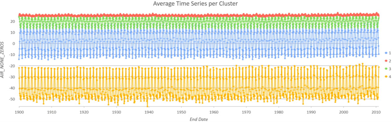
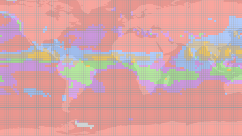
To answer this question, choosing Profile (Fourier) as the Characteristic of Interest is recommended. The Fourier algorithm decomposes a time series into sine and cosine functions, so it is able to capture time series with different frequencies and extents of fluctuation. Figure 9 and 10 show the results when we cluster monthly temperature from 1990 to 2010 into 4 groups. Areas around the Equator are in Group 2 (red color) because their temperature remains stable over the seasons. That is to say, the variance of temperature is small. Areas in the Northern Hemisphere and Southern Hemisphere are in Group 1 (blue color) and Group 3 (green color) respectively since their seasons are opposite. Also, the temperature in the Antarctic goes up and down sharply through seasons. Therefore, it is separated from other areas in Southern Hemisphere and is grouped into Group 4 (yellow color).
After you run the Time Series Clustering tool, the clustering result is written both in Output Features (the map output) and in your Input Space Time Cube. Therefore, you can use the Visualize Space Time in 2D tool to easily re-generate the same clustering result along with a pop-up chart of each location. Figure 11 below is what you will see in the Visualize Space Time in 2D tool. More information about Visualize Space Time in 2D can be found here.
Conclusion
Humans by nature are looking for meaningful groups and finding similar patterns. This is how we recognize our world. However, patterns in data, especially time series data, are often too complex to be clustered by the human eye. Time Series Clustering techniques were developed to tackle this and have become increasingly popular in the domain of data science and machine learning.
It is simple to apply Time Series Clustering to your temporal data in ArcGIS Pro, so we recommend this tool as the starting point of your time series analysis workflow. This tool helps you to identify outstanding locations with a different pattern from others, which you may want to further investigate. This tool also helps you to choose the proper model for the Time Series Forecasting toolset, which can be the next step in the time series analysis workflow. Take the COVID-19 daily new cases in the US for example. If we were to apply forecasting with a Curve Fit Forecast, we should use an exponential curve to fit those counties in red color (Figure 7 and Figure 8) while those counties in yellow color (Figure 7 and Figure 8) are more suitable be fitted with a parabolic curve. You can read more details in Time Series Forecasting 101 – Part 3
To help you evaluate the time series analysis, the metric of Pseudo-F, which is an internal cluster validation method, has been built into this tool for evaluation. You can also consider applying other external cluster validation techniques (e.g. V-measure) that are available in other libraries and software to evaluate your analysis results.

Hi @Cheng-Chia Huang,
maybe a little mistake with two graphics for Italy…
Cheers
Stefano
Thanks for pointing that out, Stefano! Just updated the second chart.