Using the latest version of Justice40 data available through ArcGIS Living Atlas of the World, a previous blog post showed the process of creating a web map that displays the racial makeup of communities eligible for federal investments. The analysis of the data showed that over 50 percent of American Indian/Alaskan Native, Hispanic, and Black people in the U.S. live in census tracts considered disadvantaged and qualifying for Justice40 funding. This finding highlights the disproportional burden borne by people of color in the United States—but how do we explain the disproportionate representation of minorities in disadvantaged neighborhoods?
Residential segregation—the degree to which a minority group resides in neighborhoods geographically separated from those in which the majority racial group is found—has been shown to be a primary explanation for the inequalities among neighborhoods in the United States (Omi and Winant, 2014, Wilkes and Iceland, 2004, Massey and Denton, 1993). This segregation has significant implications for minority groups’ integration into society at large. In fact, Massey and Denton (1993) identify racial segregation as the key structural factor in the geographic concentration of poverty, as it so frequently confines people to areas with poor schools, low home values, high crime, and low educational aspirations, undermining their social and economic well-being.
Is there a correlation between disadvantage and racial residential segregation? More specifically, is the disproportionate representation of Black Americans in disadvantaged neighborhoods associated with their residential segregation from White Americans?
To answer these questions, you will create a web map that displays the spatial distribution of Black/African American and White residential concentrations using the latest version of Justice40 data available through ArcGIS Living Atlas of the World. This information will provide insight into the patterns of racial inequalities in our neighborhoods and provide common understanding across organizations and businesses to effect positive change.
This blog post will guide you through the process of creating this map—using ArcGIS Pro, ArcGIS Online, and Arcade expressions. You will accomplish this task in five steps using the Justice40 feature layer and its data tables:
- You will create a new field in ArcGIS Pro and calculate an Index of Concentration at the Extreme (ICE) score for each census tract.
- You will make a chart to show the distribution of ICE score averages for communities identified as disadvantaged and not disadvantaged according to Justice40 criteria.
- You will test the statistical significance of this association using ArcPy, a Python site package that provides a useful way to perform geographic data analysis.
- You will visualize the data in ArcGIS Online Map Viewer using Counts and Amounts (size).
- Finally, you will create informative pop-ups that will show an ICE score and list of disadvantage categories for each census tract. These pop-ups will help those viewing the map learn more about the spatial distribution of Black/African American and White residential segregation in the United States.
You can also view the final product: Justice 40 Ice Scores web map.
1. Calculate an Index of Concentration at the Extreme (ICE) score for each census tract in the United States.
To measure residential segregation, construct a racial residential index using Index of Concentration at the Extremes (ICE), which is an indicator of spatial social polarization and accounts for both ends of the spectrum (most and least advantaged) in a single measure. ICE reveals the extent of concentration at the extremes of deprivation and privilege within a census tract. A value of −1 describes an area where 100 percent of the population is in the most disadvantaged group, a value of +1 describes an area where 100 percent of the population is in the most privileged group. In line with previous research (Chambers et al., 2019; Bemenian and Beyer, 2017; Larrabee Sonderlund, 2022), you will construct a racial residential index that sets privileged/disadvantaged extremes as the number of White and Black residents, respectively, using this equation: Per census tract i, Ai is number of White Americans, Pi is number of Black Americans, and Ti is total population with information on indicator (race) assessed.
ICEi = (Ai − Pi) / Ti
Use this equation to calculate ICE scores for each census tract in the U.S. To do this, open the Justice40 feature layer in ArcGIS Pro and rename the layer. Add a new numeric field named ICE scores to the attribute table and calculate the score by subtracting the number of Black Americans from the number of White Americans in the tract and dividing that by the total population in the tract.
Here’s a view of the equation in Arcade used to calculate the new field, along with a view of the new field:

2. Create a chart to show the distribution of ICE score averages.
To answer the question of whether there is a correlation between disadvantage and racial residential segregation, you will first show the distribution of ICE score averages for communities identified as disadvantaged and not disadvantaged and then test the significance of the findings in the third step.
For a compelling visualization, show the distribution in a chart. Create a chart by right-clicking the layer in ArcGIS Pro and clicking Create Chart > Bar Chart.


Configure the chart to display mean ICE scores for disadvantaged and not disadvantaged tracts numbered as 1 and 0, respectively.
Here is the chart that displays average Index of Concentration at the Extremes (ICE) Scores by Census Tracts’ Disadvantage Status:

Looking at this chart, you see that the average ICE score for census tracts identified as not disadvantaged according to Justice40 criteria is 0.63. This indicates that these communities are more likely to be majority White and residentially segregated from Black Americans. For disadvantaged communities, the average ICE score is 0.19, suggesting that residential segregation between Black and White populations is lower in disadvantaged communities.
3. Test statistical significance of this association using ArcPy.
Are these findings statistically significant, though? To answer this question, you will test group differences in average ICE scores by conducting an ANOVA test, a statistical test that is used to determine if there is a statistically significant difference between two or more categorical groups by comparing variances across the means of those groups.
You will do this by inserting a new notebook in ArcGIS Pro and using ArcPy, a Python package that allows you to perform geographic data analysis. Here is the view of how to open a new notebook in ArcGIS Pro and Python codes for importing ArcPy and conducting an ANOVA test of group differences in average ICE scores:


You can view the codes to execute ANOVA test in ArcPy in this Github file.
Running this test in ArcPy, you find that the difference in average ICE scores between disadvantaged and not disadvantaged communities is statistically significant (p ≤ 0.05, F= 18437.3). The higher the F-value in an ANOVA, the higher the variation between sample means relative to the variation within the samples.
Going back to the question of whether there is a significant difference between disadvantaged and not disadvantaged neighborhoods as identified by Justice40 in terms of their racial residential segregation patterns, the answer is a statistically significant yes. This finding is nuanced though. The segregation of Black Americans and White Americans is much more noticeable in not disadvantaged neighborhoods.
4. Visualize the data in ArcGIS Online Map Viewer using Counts and Amounts (size).
To visually explore the information prepared in ArcGIS Pro, you’ll now open the map in ArcGIS Online Map Viewer. With the calculations on the map, you can see that racial segregation of Black Americans and White Americans is much more prevalent in census tracts identified as not disadvantaged.
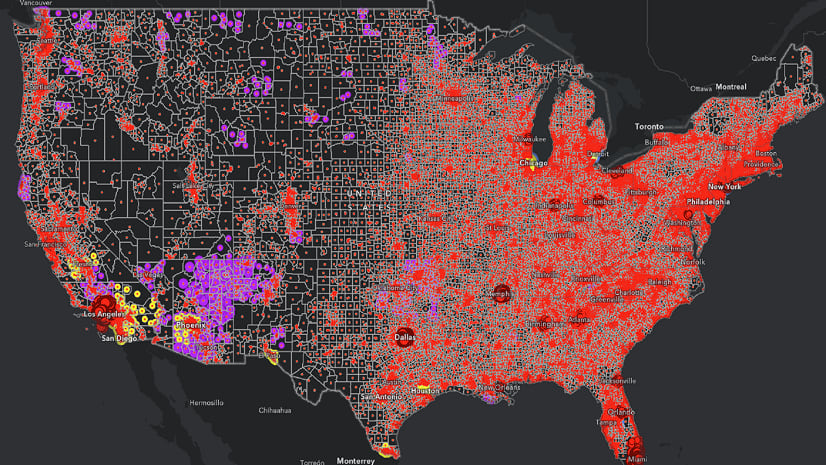
For example, in the picture below, you see that the selected neighborhood in Butler County, Pennsylvania, is not identified as disadvantaged and has an ICE score of 0.98, indicating a high level of White segregation from Black Americans in this neighborhood.

Style the map using the Counts and Amounts (size) map style. The map presents the Index of Concentration at the Extreme (ICE) scores, which range from -1 for extreme Black/African American concentration to 1 for extreme White concentration. The Counts and Amounts (size) style uses color-coding and graduated symbols to display the ICE scores, with large red circles indicating high Black concentration and large blue circles indicating high White concentration. Pop-ups for each census tract in the U.S. and its territories—including American Samoa, Guam, the Northern Mariana Islands, Puerto Rico, and the US Virgin Islands—provide the ICE scores and a list of disadvantage categories.
5. Create informative pop-ups.
When you first opened the map in Map Viewer, the pop-up displayed only default information: the ICE score of each tract the viewer clicked. You will configure the pop-up to provide a bit more context. Set the Title field as the GeoID, so it will display the census tract number. Then add two fields: the ICE score and the list of disadvantage categories (you can view the Arcade codes for “list of disadvantage categories” under Attribute Expressions in Pop-ups). Finally, add a text field at the bottom of the pop-up with a link to Justice40 categories in case viewers want more information.

Conclusion
Once you have created this map, viewers can use it to explore the correlation between racial residential segregation and disadvantage. Pan, zoom, and click census tracts on the map to learn about the degree to which Justice40 categories of disadvantage prevail—or not—in areas of extreme residential concentration. As the map creator, you can use this type of workflow to analyze segregation of White Americans from other groups as well.
Observing how the geographic distribution of different populations relates to their disadvantage or privilege in society can help local governments to make plans to support equitable communities. Businesses can use the information from this web map to better understand the communities in which they operate and identify where and to whom they can contribute more equitable community outcomes.


Article Discussion: