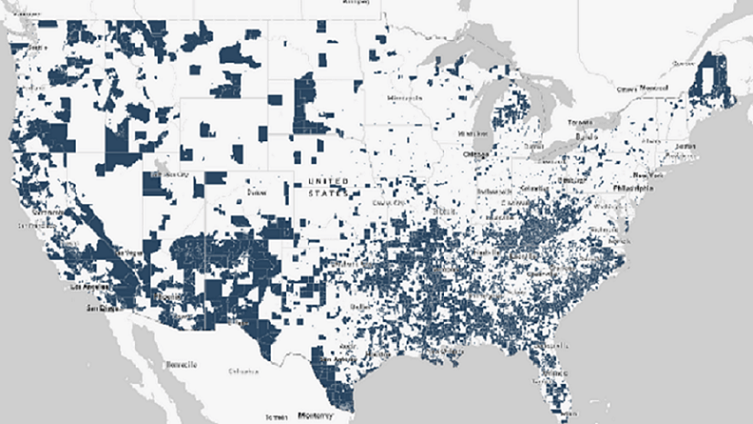
Policy makers and development organizations have long used GIS to inform decisions about assisting disadvantaged communities. But such decisions rely on accurate, actionable data—how do we know where the most disadvantaged communities are in the United States? Thanks to Esri’s recent release of Justice40 Tracts from the Council on Environmental Quality (CEQ) into ArcGIS Living Atlas of the World, we can now see the geographic distribution of disadvantaged communities, according to Justice40 Initiative criteria, in the U.S. and its territories.

A previous blog post, A snapshot of disadvantage in the United States, provided a broad picture of the geography of disadvantage in the U.S. and offered an overview of the Justice40 Initiative. In this post, we will take a closer look at the most disadvantaged American communities and highlight the socioeconomic context of these communities through a comparative analysis of their Tapestry segment profiles.
We’ll first use a web map and its data tables to determine the most disadvantaged areas in the country. Then we’ll create comparison infographics for these communities in ArcGIS Business Analyst Web App. Finally, we’ll analyze the Tapestry profiles displayed in the infographics to learn more about the demographics and socioeconomic conditions in these communities.
Identifying the most disadvantaged communities
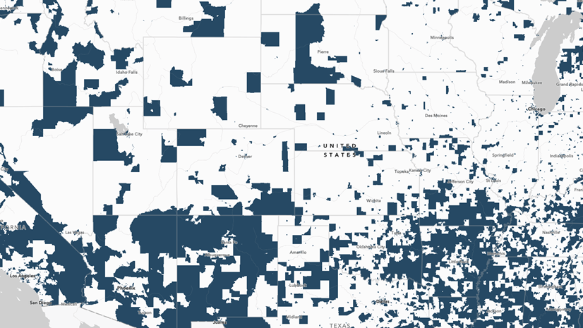
This web map of Esri’s Justice40 feature layer provides information about communities in the U.S., based on the initiative’s categories of disadvantage. To identify the most disadvantaged communities, as shown below, we first opened the web map in ArcGIS Business Analyst. We then filtered the map’s data to show only the census tracts in the U.S. that met all eight categories of disadvantage according to Justice40 Initiative criteria, including climate change, clean energy and energy efficiency, clean transit, affordable and sustainable housing, training and workforce development, remediation and reduction of legacy pollution, and the development of critical clean water and wastewater infrastructure.

After filtering, the resulting attribute table shows five census tracts in the United States that meet eight categories of disadvantage according to Justice40 Initiative criteria.

Next, using the layer’s attribute table, we check the total population counts for these census tracts. Because two of these five tracts have a total population of 189 and 92, respectively, we will narrow our focus to the other three tracts on our list, which are located in Jefferson County in Alabama, Sacramento County in California, and the city of St. Louis in Missouri.

Now, let’s take a closer look at the socioeconomic context of these disadvantaged communities.
Using Tapestry Segment profiles to explore socioeconomic context
Having identified our communities of interest, we’re now ready to take a deeper dive into analyzing their characteristics. An intuitive way to explore the social and economic context of these disadvantaged communities is to run a comparative infographic in Business Analyst Web App. Business Analyst includes dozens of informative infographics in its gallery, which can be run for any site with the click of a button. With an Advanced license, you can also build your own infographic templates from pieces of other templates, which is what we’ve done for the purposes of this article. We built a simple infographic called Socioeconomic Profile (SES Profile) that includes a Tapestry Segment panel and some other key demographic measurements.
We’ll create a site for each of our tracts and then choose our Socioeconomic Profile infographic template. Using the Run Infographics workflow and clicking Run side-by-side for all, we can view the information comparatively.

Here is the comparative infographic created using a set of key sociodemographic indicators and Tapestry Segments for each of these disadvantaged communities:

While Tapestry segment profiles are widely used for business purposes such as marketing, the rich socioeconomic and demographic information they provide make them invaluable for understanding the social and economic context of disadvantage. The Tapestry Segments panel shown in our infographic not only demonstrates the dominant market segment for each of our communities but also provides a view of the socioeconomic context by presenting information on racial-ethnic composition of the location, household types, education, income, and employment.
For example, looking at the Tapestry segment profile of the community in St. Louis, Missouri, we learn that the dominant Tapestry segment for this community is City Commons and 60 percent of the community is classified as such. In addition, we learn that in this community, the predominant race is Black, the most common household type is single parents, and that most people in this community have a high school diploma only. This information highlights the need for, as well as the urgency of, policy interventions and economic investments in this community.
Furthermore, attached to the dominant market profiles, full segment profiles are provided, which present a more detailed and comprehensive socioeconomic view for each community.

Looking into the full segment profile of the community in St. Louis, Missouri, we can learn about the economic, demographic, racial, and ethnic profiles of City Commons in a comparative context. For instance, we learn that the median income for this segment is $18,300, which is one-third of the median income for U.S. households. The Race and Ethnicity tab further suggests that African Americans are residentially segregated in this community segment.

Additional findings from our infographic show that unemployment in this community (19 percent) is more than three times higher than the U.S. average (6 percent).

This highlights the chronic levels of joblessness in this community, which William Julius Wilson, professor of social policy at Harvard, calls the primary cause of the decline in disadvantaged neighborhoods in his book, When Work Disappears: The World of the New Urban Poor.
In addition, all three communities have a significantly lower percentage of households using computers.

This finding is especially critical in light of the age profiles of the people living in these communities. For instance, our report shows that the people of St. Louis are young–the largest group shown in their age pyramid panel is 25–29.

Lower levels of computer usage among this group suggest that these young people lack necessary resources for educational and socioeconomic mobility. Together, these findings suggest that people in these communities are deprived of skills necessary to obtain and keep jobs. Professor Wilson contends that addressing the problem of joblessness may be the solution to socioeconomic problems in disadvantaged communities.
Another notable finding from our infographic is that those living in the tracts we’re studying in Jefferson County and Sacramento County are significantly older compared to the people in the tract in St. Louis: the largest groups in the age pyramids are 55–59 and 60–64, respectively. Given that these communities also have a significantly higher percentage of households with people with disabilities, policy interventions easing the burden of disability would greatly benefit people living in these communities.

Together, the findings from our infographic, including the comprehensive socioeconomic information provided by Tapestry Segments and sociodemographic indicators, can be used by policy makers to better understand the socioeconomic context of the disadvantaged communities and transform their programs according to the Justice40 Initiative.


Article Discussion: