The time series forecasting technique helps us understand the past and predict the future. Time Series Forecasting toolset including Curve Fit Forecast, Exponential Smoothing Forecast, and Forest-based Forecast has been released in ArcGIS Pro 2.6. Since then, we have gradually enhanced the Forest-based Forecast tool with new functionalities in ArcGIS Pro 2.9 and 3.0 to respond to users’ requests. This article includes two parts. The first part introduces the recent enhancements we added to the Forest-based Forecast tool. The second part demonstrates how to integrate the Forest-based Forecast tool into your analysis workflow using an ArcGIS notebook.
Part 1 – new functionalities
Please check out this video to get a quick look at the new features in the tool and we will share more details about the new capabilities in this article.
From univariate to multivariate
Starting from ArcGIS Pro 2.9, users can choose to add other explanatory variables to the forecast model. In other words, instead of building a univariate forest-based forecast model, now we can choose to build a multivariate forest-based forecast model. To understand how the multivariate models is built, you can refer to our document.
Let’s use the COVID-19 death prediction in each county across California as an example. Previously, we can only forecast the future daily new death of a time series based on its own historical data. Now, other variables such as new confirmed cases, holidays, fully vaccination rates, and booster counts can be incorporated into the modeling. Please check Figure 1 to see how to add Other Variables. As the result shown in Figure 2, we notice that the forecast of death counts in the following 14 days are not only based on its own previous observations but also accounted for other variables.


Adding meaningful explanatory variables usually improves the foresting result. As the Figure 3 below, the average forecast RMSE is 0.27 and the average validation RMSE is 0.75 when using the univariate forest-based forecast model. They become 0.22 and 0.70 respectively when using the multivariate model. Both the forecast RMSE and the validation RMSE become lower when other explanatory variables are added to the forecast model.

We can also choose to create an Output Importance Table which comes with a Time Lag Importance Chart (Figure 4). This chart is extremely useful because it opens the black box of this machine learning algorithm and helps us to understand the relationship between the multiple time series variables. The x-axis shows all the time lags within the time window, which is 14 days in the example shown in the video. The values of the x-axis represent how many days before the forecast, so they go back in time as you move from left to right in the chart. Different colors of bars represent each variable, and the higher the bars, the more locations find this variable as one of the most important explanatory variables at the specific time lag.

The light green color represents the 7 days moving average of the daily new death. The 3 highest bar in a light green color shows that the previous 3 days of daily new death count were the most important predictors of today’s new daily deaths for most of the counties. The dark green color represents if that day is a federal holiday. The dark green bar appears 13 and 14 days back, which implies that the counts of covid-19 death are highly affected by the holidays 2 weeks back from the day. The dark blue bars show the confirmed cases impact the death count in the following 5 days or around 2 weeks. The light blue bars which represent the fully vaccination rate appear at different time lags. It indicates that the impact of the vaccination rate was spread out across various time lags. Interestingly, the booster counts were added to the models but were not shown in this chart. This means that no place considered it as top 10 percent of important variables in this forecast model. To reveal more important variables, we can provide a larger number for the Importance Threshold (%) parameter in the tool.
From local models to global and cluster-based models
In ArcGIS Pro 3.0, the new enhancement is the capability to define the Model Scale. Previously, the tool can only build a forest-based forecast model for each individual location, which means that a model always trains and forecasts using information from only one location. This works well when the time series at each location is long enough and so unique that what happened at other locations won’t help to forecast what will happen at this location. However, when the time series is short, there is not enough information to train with. Besides, it tends to get overfitting if the training data is only from itself. Therefore, we provide two more choices to define the model scales: Entire cube and Time series cluster. These two additional options enable us to incorporate other locations into the model and reduce the issue of overfitting. Three available model scale options are shown in Figure 5. Please check the document to see how we build these three models.

Let’s use the Covid-19 daily new death data again to demonstrate that scaling up the model improves the forecasting result. Figure 6 shows the parameter setting for 1. univariate forest-based modeling (time series cluster as the model scale), 2. multivariate forest-based modelings (time series cluster as the model scale), 3. univariate forest-based modeling (entire cube as the model scale), and 4. multivariate forest-based modeling (entire cube as the model scale). When the model scale is Time series cluster or Entire cube, the average forecast RMSEs become 0.32 to 0.35 (Figure 7), while the average forecast RMSEs is 0.22 and 0.27 when using Individual location as the model scale (Figure 3). The higher forecast RMSE indicates that scaling up the model helps to avoid the issue of over-fitting. We also notice that the multivariate forest-based forecast model with time series cluster as the model scale performs the best. It has the highest forecast RMSE (0.35) and the lowest validation RMSE (0.66).


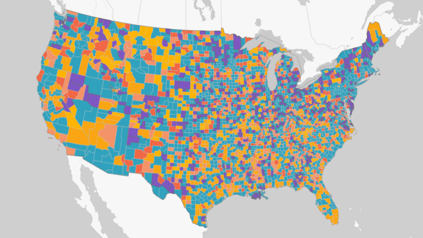
This is because different counties in California have various time series patterns of Covid-19 deaths. By applying Time Series Clustering analysis, we group the counties with similar patterns together. As the time series clusters shown in Figure 8, Los Angeles County with far more deaths is grouped into its own cluster. Most other Southern California counties are in the second-largest group of deaths. Other counties that had fewer death counts and smaller variance of changes over time are in the two other clusters. Then, when we train the model using a dataset with similar values or patterns, the model won’t be confused with contradictory signals in very different places.

A new methodology to calculate the confidence interval
Another important enhancement is that we introduced a new way of estimating the confidence interval of the forecasts. Before ArcGIS 3.0, the 90 percent confidence intervals for each forecasted time step are calculated using quantile random forest regression. The predicted values from each leaf of the forest are saved and used to build up a distribution of predicted values, and the 90 percent confidence interval is constructed using the 5th and 95th quantiles of this distribution. This method leads to an overestimating issue when the confidence interval for the second forecast step is calculated by adding the lengths of the confidence bounds of the first and the second forecasts. The confidence interval tends to become huge when forecasting too many time steps ahead.
To address this issue, the tool now calculates the confidence interval via the validation result. Specifically, the tool estimates the standard error of each forecasted value based on the validation RMSE (Figure 9), and creates the confidence bounds 1.645 standard errors above and below each forecasted value. To learn the math behind the scenes, please refer to our documentation.

Part 2 – Integrate your time-series analysis workflow
The second part of this article will demonstrate how to evaluate the performance of time series forecasting results and easily combine the Forest-based Forecast tool with other tools using ArcGIS Notebook. To download the input space-time cube and the ArcGIS notebook, please click here.

Figure 10 is the analysis workflow that can be completed in an ArcGIS notebook and the workflow includes 4 steps. Step 1 is to run Describe Space Time Cube tool on the space-time cube that we plan to forecast the time steps. Describe Space Time Cube which is released in ArcGIS Pro 3.0 is located in the utility toolset under the Space Time Pattern Mining toolbox. This tool describes a cube and returns its content and characteristics in a Geoprocessing message, which helps us to check our cubes so that we can confidently conduct other analyses. We can also choose to save a characteristic output table which can be used in a Model Builder or a script to create a smooth space-time analysis workflow. To have a quick understanding of the cube’s location, we can choose to save a spatial extent output.
In this case, we have a space-time cube from one of my colleagues. I know that it might contain population counts in the US and I want to confirm whether this cube is suitable for forecasting the population growth in 2029. After running the Describe Space Time Cube tool in an ArcGIS Notebook (Figure 11), we are able to look into this cube. By checking the output Message shown in Figure 12 and Figure 13, and the spatial extent shown in Figure 14, we are confident that this cube is the right one. The time extent is from 1969 to 2019 and the number of time steps is 51 in total, which is long enough for a valid time series forecasting (Figure 12). The raw variable stored in the cube, “POPULATION_SUM_ZEROS” is exactly the variable that we need. Also, this variable has been applied to Time Series Clustering analysis, which indicates that we can build a forest-based forecast model for each time series cluster later (Figure 13). Additionally, it is perfect that the spatial extent correctly covers Continental United States (Figure 14).


Step 2 is to run 3 model scales (Figure 15) and evaluate their performance by comparing the validation RMSEs (Figure 16). The lower the validation RMSE, the better the forecast model. As we can see here, building a random forest model based on the entire cube and each time series cluster does improve the results.


Now we have run the Forest-based Forecast tool 3 times and have saved the 3 output cubes in a workspace folder. Let’s move on to Step 3. In addition to these 3 forecast cubes, we may want to bring in other cubes created from different test runs and select the best forecast result for each location using the Evaluate Forecast by Location tool. To identify qualified cubes that can be used together for Evaluate Forecast by Location tool, the Describe Space Time Cube tool comes in handy because it checks all these attributes for all the cubes in my workspace folder. Step 3 shows how we can describe all space-time cubes in a folder and collect those cubes that meet a specific criterion (Figure 17).


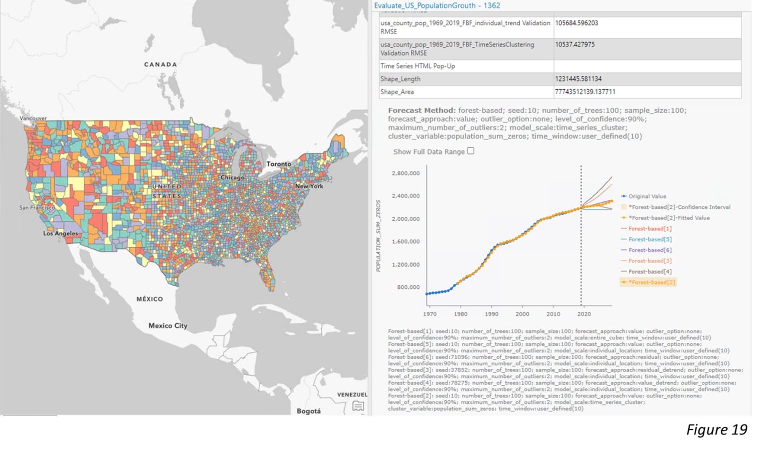
After checking through all the cubes, we are confident to move forward to Step 4. Figure 18 demonstrates how to put all qualified cubes into the Evaluate Forecasts by Location tool. The tool selects the best forecast result of each location based on the lowest Validation RMSE (Figure 19).

To conclude, in this article, we show the new enhancement of the Forest-based forecast tool. Now it is able to incorporate other explanatory variables, as well as adjust the model scale. These new features give us the flexibility to build the model and get better forecasting results. We also show how a time series analysis workflow can be smoothly completed through an ArcGIS notebook.


Commenting is not enabled for this article.