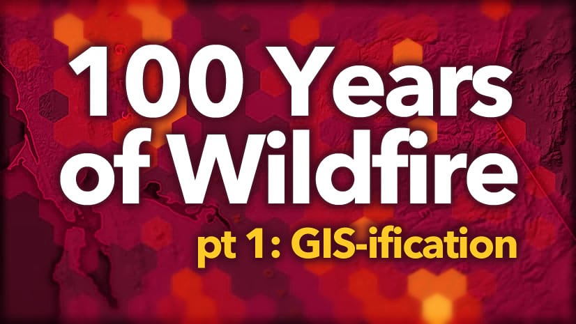
Pt 1: GIS-ification
Pt 2: Cartograph-izing
You’re back?? You made it through part 1? Well I tip my hat to your patience and stalwart cartographic enthusiasm. While spelunking in the throes of that analytical portion of the 100 Years of Wildfire map I invoked the tired old iceberg analogy. As one does.
The good news for you is, in keeping with the well-worn iceberg reference, this blog post will be like 10% of the ice as compared to the 90% analytical ice. So let’s skate through this, shall we?
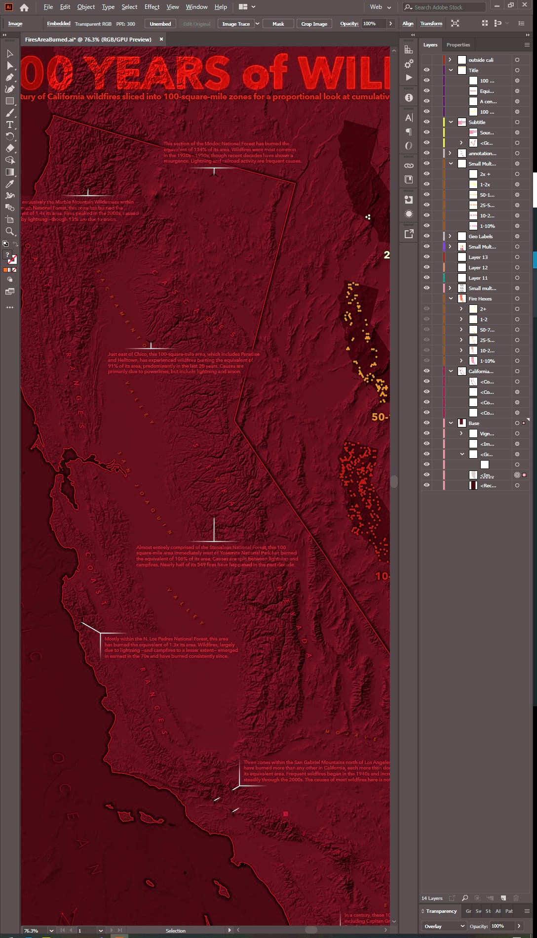
Here is the map I’ll be walking through in this blog post, in case you just skipped part 1 and dove right into the design work…

Color
Here is the main layer we’ll be working with. A hexagonal tessellation with a century of fire data proportionally aggregated into each cell. This is the default color scheme it got in ArcGIS Pro. Pretty nice, actually, given the theme. But defaults are just placeholders, patiently awaiting your thoughtful consideration.
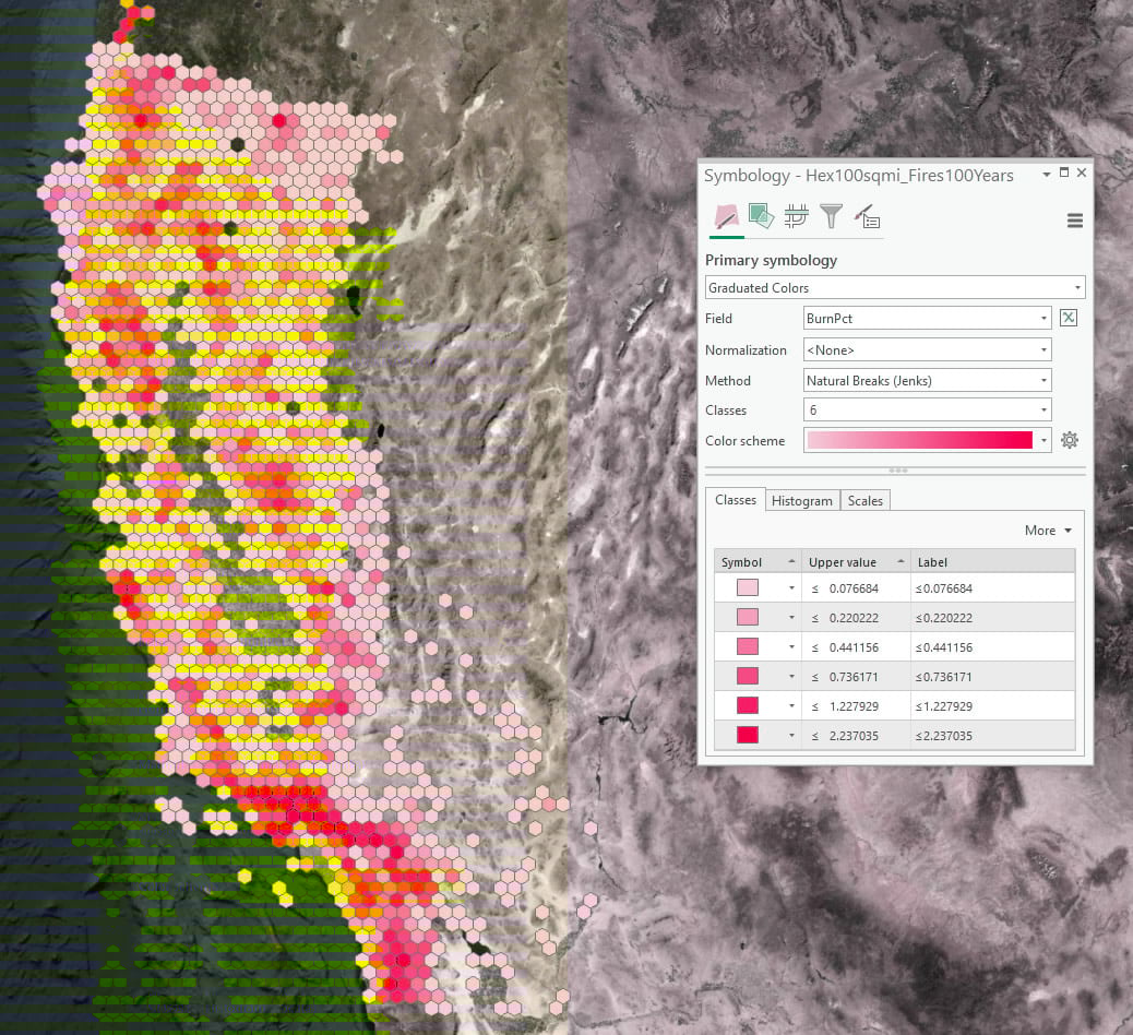
Clicking that color gradient opens up a droplist of other options. But you can also custom make whatever color gradient you like, which rules. At the bottom of that droplist of gradient options is a button called “color scheme editor.” Grand adventure awaits within. I know that this map’s eventual background/basemap tone is going to be dark. In thematic mapping contrast drives meaning, so I want low-data areas to blend with the background and high-data areas to be visually distinct from the background.
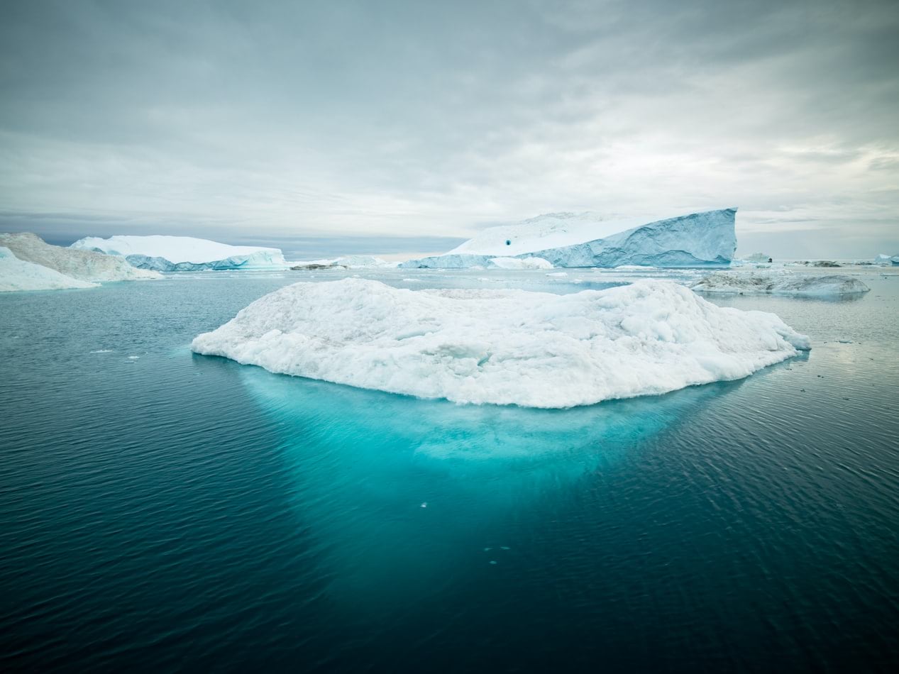
Using red in a thematic map, or any data visualization, is a tricky business. Red is loaded with meaning and is a trigger color associated with danger and alarm in most any culture and should be used only with considered intention. It also can be problematic from the perspective of accommodating those with color-vision deficiencies. In the case of this map, I know that I’ll not also be keying the color green to data, so viable interpretation for color-vision deficient readers won’t be an issue. And while I don’t necessarily want the tone of this map to be alarmist or insensitive, the association of varying levels of heat represented by a warm color scheme (which includes reds) is too strong of a natural mapping to forsake. See how odd it is to see cool-blue colors used for fire up in this blog post’s banner graphic?
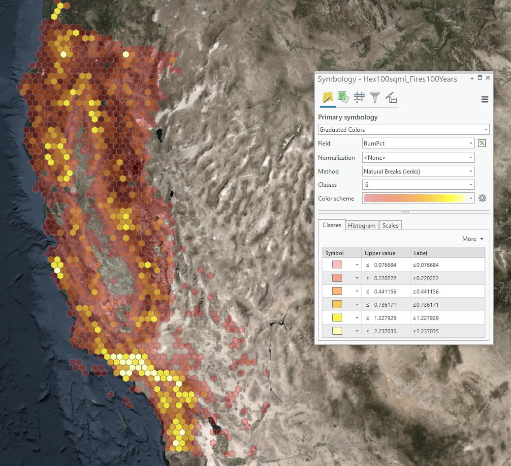
As such, I’ll assign low-fire areas a nearly-transparent deep dark red color (low contrast with background) while the white-hot fire epicenters get a fully opaque yellowish, nearly white, color (high contrast with background).
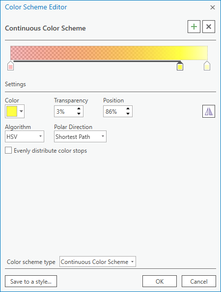
You can see how effective the range of transparency is when applied to the data. Transparency is another visual variable (in addition to hue) that helps us assign variable prominence to a phenomenon. For what it’s worth, ArcGIS Pro’s ability to apply transparency to individual steps in a color gradient might be my very favorite feature.
Range Breaks
This map is visualizing the cumulative proportion of each cell that has burned in the past century. A percent. The default range break technique for a graduated colors map is the Jenks Natural Breaks algorithm. If you know that you are comfortable mapping range breaks that aren’t conveniently Equal Interval, then Natural Breaks is a pretty good start. But I almost never leave it at that. The Natural Breaks robot does a really nice job of looking for a balanced visually meaningful segregation of the data range into segments but it doesn’t care how readable or well-rounded those breaks numbers are. This can be important in a map when you want to be able to state simply the range breaks in a concise legend. Take a look at the values that Natural Breaks gives us…
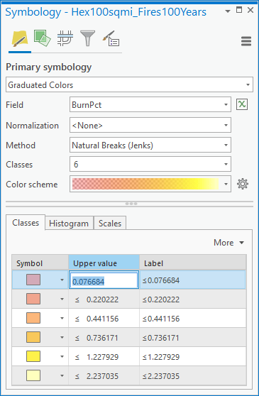
It seems silly and fastidious, but imagine looking at those numbers and trying to internalize them as relatable steps in intensity. Their arbitrary-feeling specificity will read oddly in a legend. Compare that to a map that instead uses very similar, but more familiar, proportions:
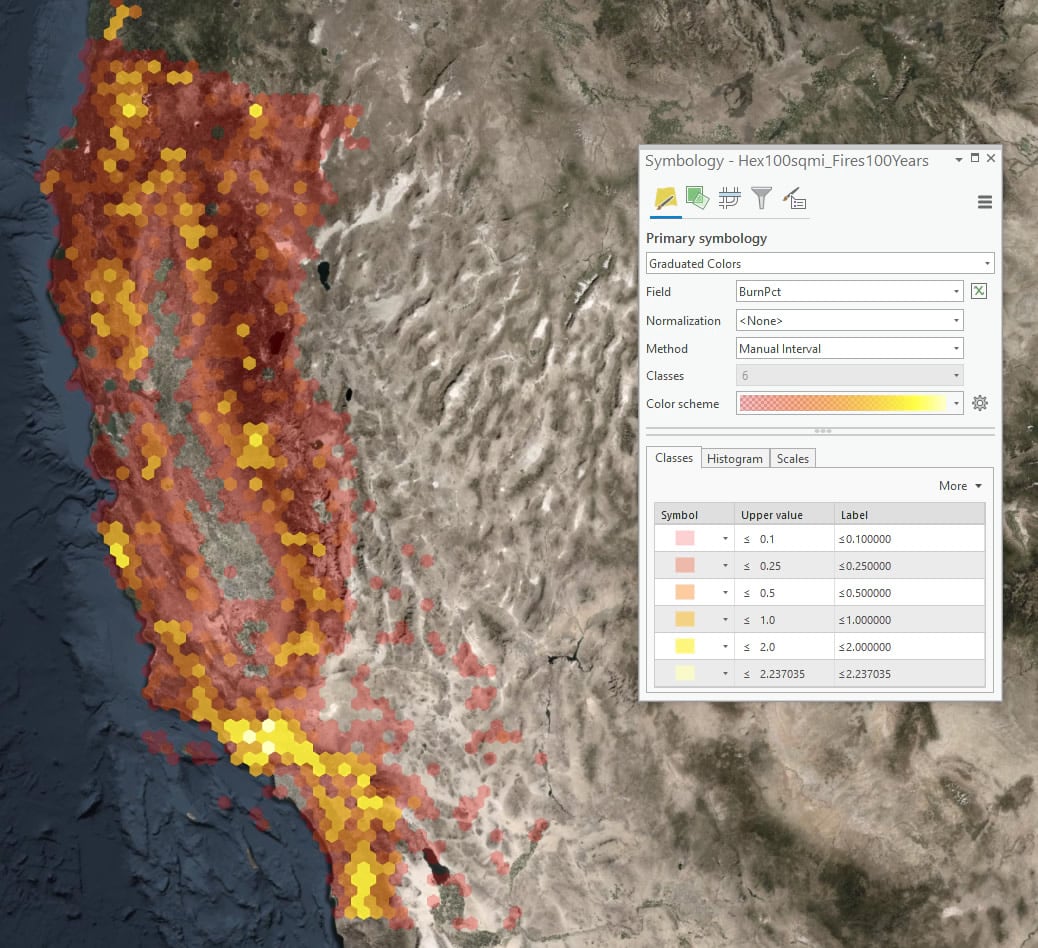
0-10%
10-25%
25-50%
50-100%
100-200%
200% +
These are much more conceptually familiar values. Even though they aren’t Equal Interval values, encountering these familiar proportions on a map will feel natural while maximizing (thanks Natural Breaks) the visual variability of the data range. You can manually apply these tweaked range-break values right in the list of classes (change the value and hit “enter”).
Outline Busting
You’ll notice that the default symbology for graduated colors includes a thin gray outline. This is a reasonable default but for this map I want no outline. Do I have to dig into the symbol of each of the six ranges and remove the outline individually? No way! There is a super handy feature called “Format all symbols” that lets me do that wholesale. It’s available in the class list’s “More” menu…
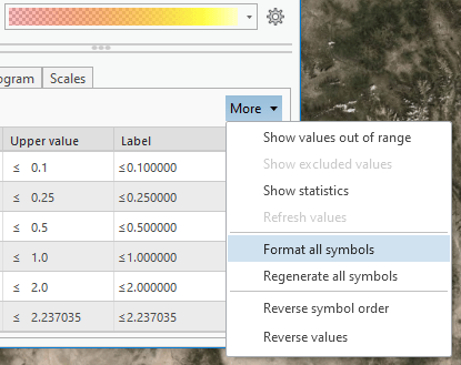
…letting you choose “no color” for the outline and even set the width to 0, just to be sure.
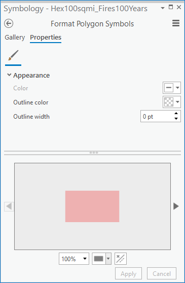
The result is a simpler, cleaner, outline-free version of the graduated colors layer.
Contextual Layers
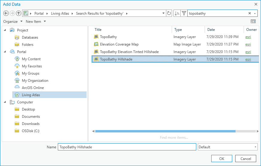
I want to provide topographic context for these fires, but didn’t want the full complexity of imagery. So I’ll opt for a hillshade background, which I can later colorize into a dark receding tone. The TopoBathy Hillshade image service (managed by the unstoppable Rajinder Nagi) from Living Atlas is a wonderful and easy option that looks gorgeous at any scale. Adding layers from Living Atlas into Pro is simple. And there are LOTS of layers to peruse.
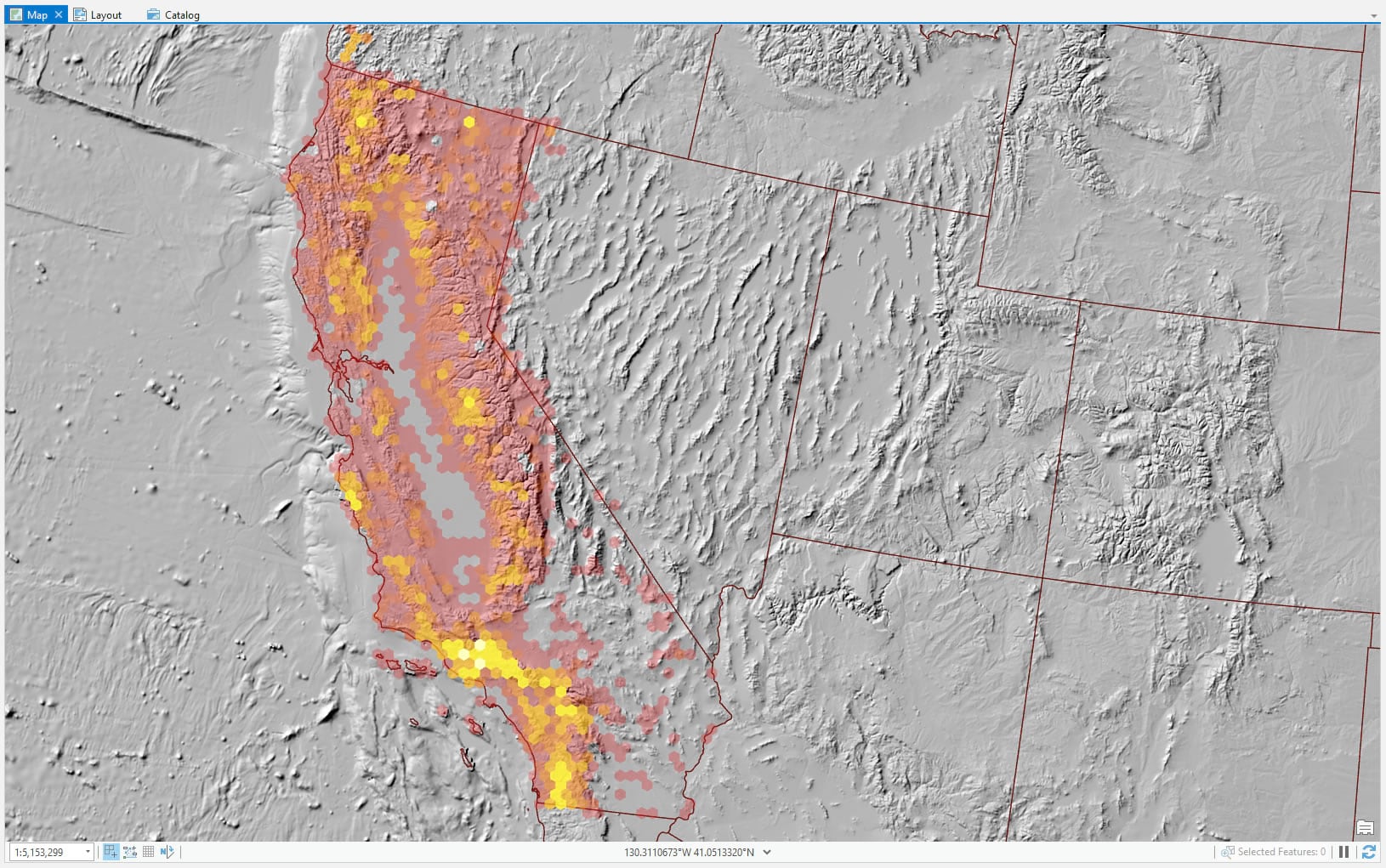
A single hillshade layer is an excellent alternative to a thematic map if you want the benefit of locational context and texture, but you don’t want all the complexity of imagery (even…Firefly imagery). The default grayscale color scheme is fine in this case because I know I’ll be using it as a blend mode input in Illustrator in the next step. One last layer of context I’ll add in is state boundaries, from the eminently helpful Natural Earth. I’ll use these as a subtle reference for California and also as a land/ocean visual demarcation.
Export as AIX
At this point all of my geographic assets are in place and it’s time to try out the new AIX export option make in conjunction with the formidably-named ArcGIS Maps for Adobe Creative Cloud. I’ve tried it out once before but want to give it another shot. Could I have achieved all of the design elements in ArcGIS Pro without having to go into Illustrator? Yes, I could. But I want to be able to be a helpful resource for organizations with federated teams that partition GIS work and Design or Cartographic production and this is a simple opportunity to round out that experience. With the Maps for Adobe extension installed, and added to Illustrator, I can export my ArcGIS Pro layout as the intermediary AIX format.
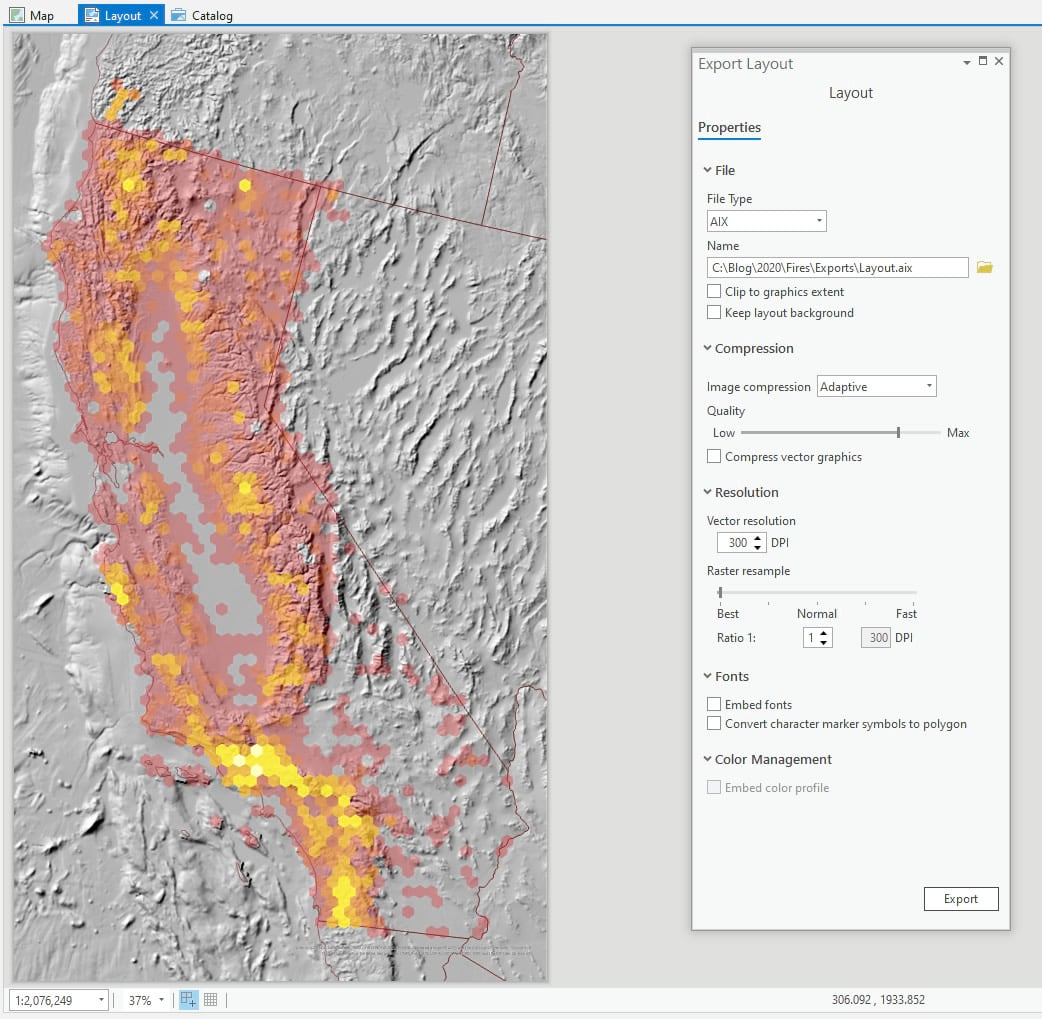
Which, when I open in Illustrator, maintains all my layers and structure and names and symbology. It’s a wonderfully faithful vector/raster representation of my map, ready for any manner of design adventure.
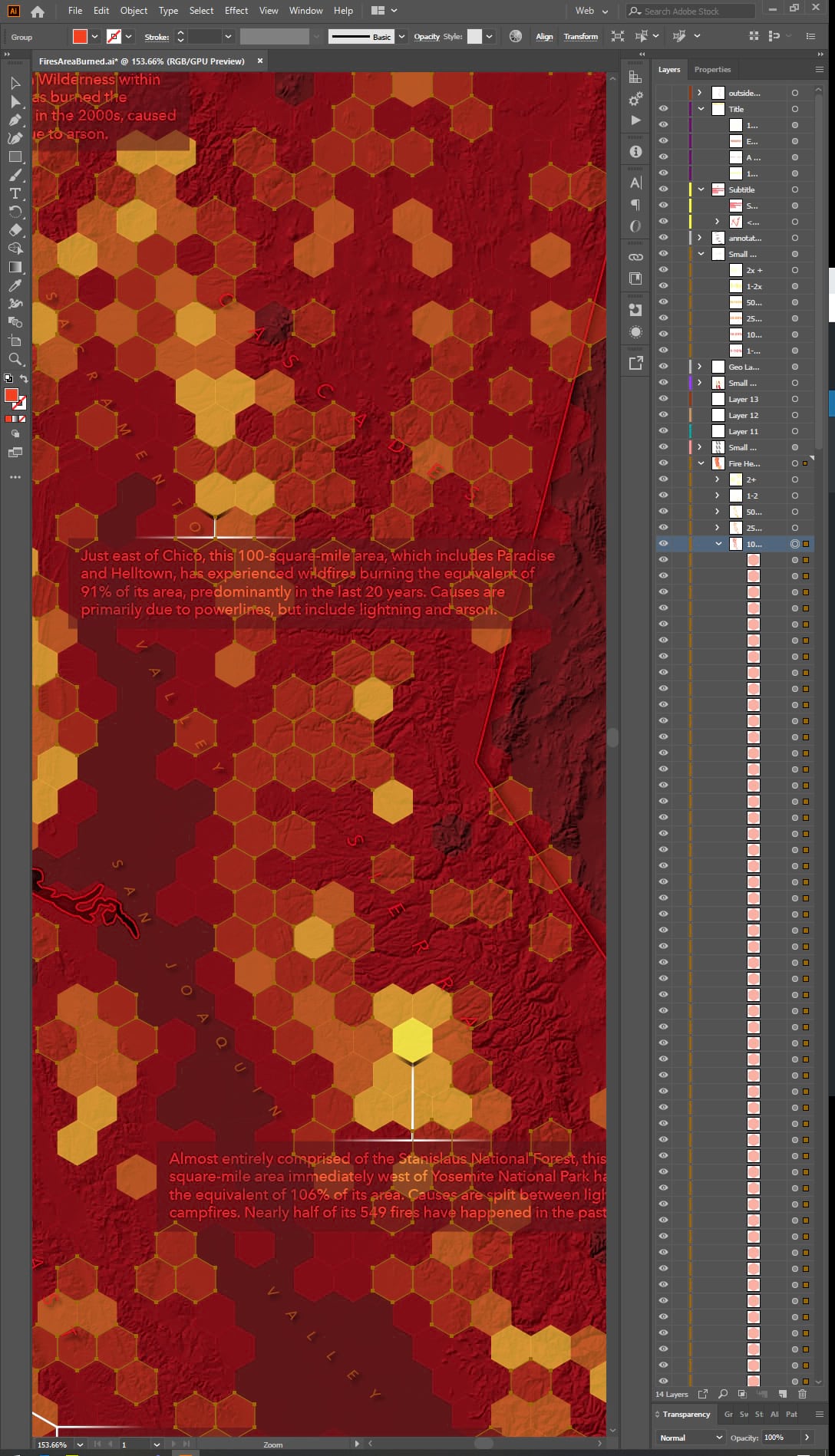
I’ll take the opportunity to play with curved labeling and dropshadows. A little thing I’ll try that’s lots of nerd-fun which is to push the shadow of each label away from the bright spots of the fire data layer. To make it look like the brightness of the fire layer is pushing the shading out from it. Fun, huh? Anyway, I can go on an on but you get the gist!
So if you are the GIS hero in your Adobe-centric organization then you are free to hand off the ball at this point or continue on with the cartographic exploits in this different domain. Maps for Adobe accommodates all sorts of workflows.
Thanks for following along and all the best in your own cartographic adventures!
Love, John


Article Discussion: