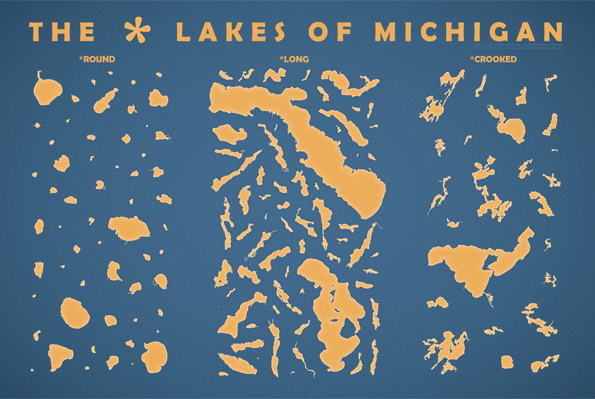
Here is a poster (36″x24″ aspect ratio, download and print or whatever if you are so inclined) showing the lakes in Michigan that happen to be named “Round Lake”, “Long Lake”, and “Crooked Lake.” Just let the eponymous nature of the nomenclature wash over you.

I mean, it makes sense and all, but golly.
WHY
I was curious, that’s why!
–begin unrequested personal/professional rant–
I learned some years ago (the hard way, slowly) that when I suppressed my curiosity in the name of deadlines, or what I perceived as rigid requirements documents, or a general feeling of not-enough-timedness, I gradually grew dissatisfied and restless in my sterile work, the fine abrasion of following rote orders rounded over the sharp corners of innovation and joy. When you follow up on a hunch, or poke around with an idea (and float it as an alternative or subtly brew it into your projects), and in general let your sense of wonder tug a bit harder at your keystrokes, your work will reflect an ever-growing and more versatile skill set. Your value as a thinker and maker will flex with added versatility. And your sense of satisfaction will have a fueling effect on the caliber and efficiency of that “rote” work. If you ignore the rest of this blog post (I wouldn’t hold it against you) remember this little sermon.
–end–
Anyway, I’ve spent a fair bit of time at a lovely little lake named “Long Lake.” A charming body of water that is, indeed, much taller than it is wide. Once that name was on my radar, it seemed to me like there were a dozen other lakes in Michigan with the same name. Fortunately, that’s a pretty easy thing to fact check given a luxurious vector layer from the Mitten State map nerds and a few definition queries. It turned out there were 64 of them. I was astounded. So I opened the DBF file in Excel and made a pivot table to isolate other commonly-used shape-origin names. Round Lakes (58 of them) and Crooked Lakes (24 of them) abound.
HOW
The graphics and layout capabilities of ArcGIS Pro have allowed me the luxury of doing pretty much all of my cartography right in place. But sometimes you have a project that requires something purely graphical or part of your workflow involves handing off map content to a graphic design team. Whatever the reason, sometimes you (or whomever) just need to fire up Illustrator. The “AIX” export format in Pro makes that mega simple. Here’s a quick walk-through.
It all starts with the data, and the State of Michigan has a great open data hub. What else would you expect? I searched for lake polygons and found a heaping pile of detailed lake features, which I greedily downloaded and opened in ArcGIS Pro.

Ah, what a thing to behold. I love Michigan. And so do you.

–begin unrequested projection adoration rant–
Time out. Let’s just briefly splash (wink) into the fascinating world of coordinate systems for just a moment, shall we? This is, after all, the ArcGIS blog and not the Adobe Illustrator blog so I think we can all agree that I have a bit of latitude (wink) to nerd out, however briefly, on projections for just a moment. Ready?
This is a poster of lakes for visual comparison, so it’s important to me (and you, by extension) that they be projected in a system that does a fair job at keeping their relative scale nominally consistent. I’m not a monster…in this very specific sense…so I chose the Michigan GeoRef coordinate system. This is such a great projection. Michigan is an oddly-shaped place. Not the whole shaped-like-a-hand-thing (which I make maximum use of with my highly portable and waterproof map of Michigan I keep attached to my wrist at all times) but because it is comprised of two discrete peninsulas that extent in opposite orientations. So rather than a single line of tangency that runs east-west (which would work for the Upper Peninsula) or north-south (which would suit the Lower Peninsula) or a system like State Plane that carves a state into separate regions that can’t be combined for analysis, Michigan GeoRef, awesomely, draws a diagonal projection axis through the sate . The maximum difference in apparent length of a 10,000 ft lake at the center and a 10,000 ft lake at the edge is 4 feet. Imperceptible for this application, and a compromise I happily accept.

–end–
Ok, where were we? Oh yeah, isolating lakes with those shapey shapey names. So, next it was a simple matter of opening a definition query and isolating those round, long, or crooked lakes.

Each group of lakes I exported separately as an AIX file. An AIX file is the intermediate format that, if you have the ArcGIS Maps for Adobe Creative Cloud plug-in (or, if you’re into that whole brevity thing, you could call it Maps for Adobe, but this is a corporate blog post so while I’m not terribly formal, I should at least be correct) installed, lets you work with your ArcGIS Pro maps in Illustrator. It does a dynamite job of transcribing the symbology of Pro features to its approximation in Illustrator. A bridge between two words. And the layering is nice and tidy (Remember digging into a seemingly infinite nest of clips? No more, my friend!). Don’t do this old thing anymore.

The result was three individual files. See?

I opened all three in Adobe Illustrator and copied them into one document, keeping them in separate grouped layers.

In the overall expanse of Michigan these lakes are tiny little blips. This wouldn’t do for the planned layout (an abominable manual arrangement), so they needed to be scaled up. First, I selected the lakes in each group, and centered them horizontally and vertically. Then I scaled them all up in one go so they all scaled together for consistency; no longer in their true geographic positions anymore, but I’ll be darned if I’m going to lose relative scale. Amen?

Then it was just a matter of graphic design tomfoolery wherein I manually positioned the lakes in a nice arrangement, gave them some offset paths to replicate waterlines, and added a title. That’s it! Here’s that poster again.

I hope you enjoy this curious little layout and its reflection on the pervasive and wonderful influence that the spatial dimension has on our everyday thinking. And if you like it, I hope you print it out and enjoy its physical incarnation. There is likely a GIS data portal provided by your state, as well, so there’s nothing stopping you from making similar posters of your own. Except for Ohio. I don’t think Ohio has any lakes. Heck of a river, though.
Part 2: 2-Be Continued
Stay tuned for part 2, wherein I’ll get a little more nerdy with the GIS puzzling that this sort of project inevitably inspires. And I’ll also provide another poster for you to download if you see fit. I haven’t made it yet but now that I’ve announced it the pressure to deliver is ON! Wish me luck, friends!
Love, John

Article Discussion: