It’s that time of year (as it was last year and the year before) when geographers cozy up to zoom chats with spatially-minded friends, replete with our finest topographically-themed virtual backgrounds, our Lego assemblages meticulously arranged within view, and only our most coveted geography tomes visible on the bookshelf (plus a handful outsider works like the Farside Gallery or knitting books sprinkled in to best reflect our multifaceted interests).
Have you ever looked at a globe and thought…”You know, I think I could someday somehow craft up a sort of globe. I mean, why not; you carve up some canoe-shaped gores and just like put them together or something.”
I have.
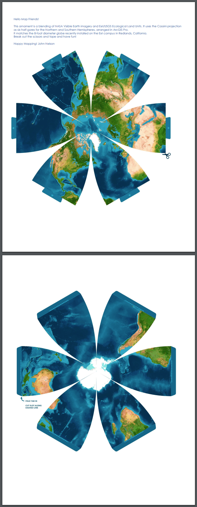
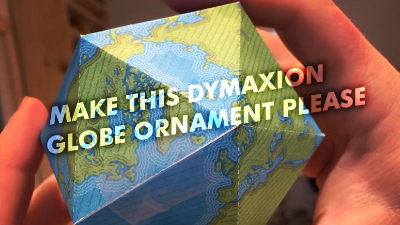
Well behold, now we can all print out some 2D gores and gingerly tuck them into a 3D form! Download the craft template here—we’re all in this together now.
Crafty Bits
Here are some snapshots of my assembly process. If I can do it, you can do it better…
I printed the pages on cardstock. We have kids so there is always a healthy stack of cardstock paper lying around (if we were to ever run out it would be like Lord of the Flies). Regular print paper will work too, it will just be a bit more…delicate. Also, I used an exacto knife because I have one but I did a couple with scissors too and it went just as well.
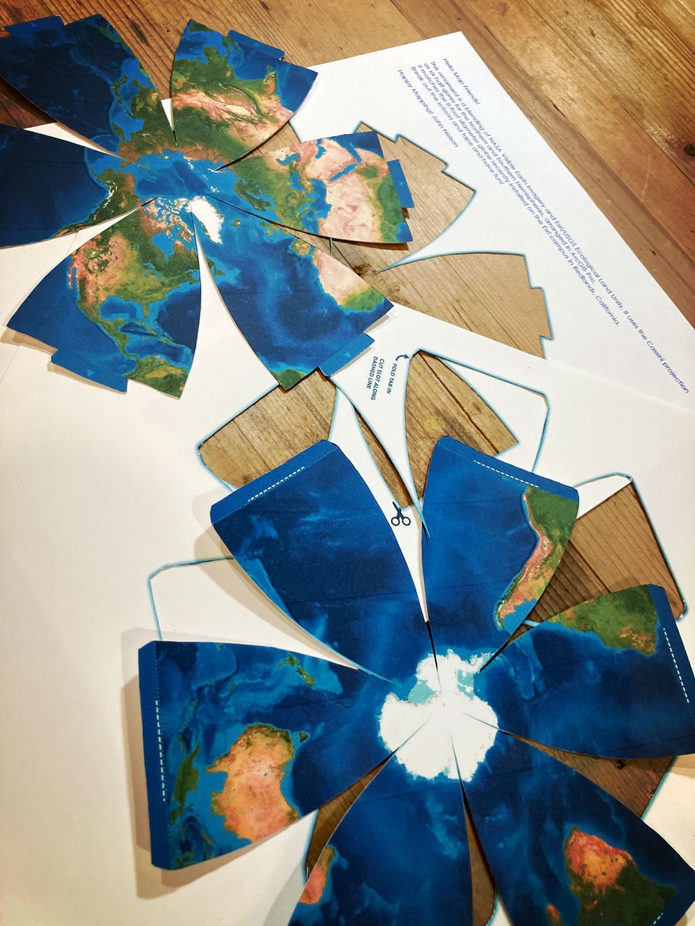
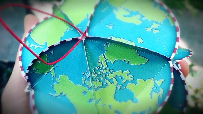
After those charming little gore-lobes were extracted from their papery bonds I began folding them in. This part went surprisingly well; I thought I’d be fighting it and howling barbaric yawps deep into the night but it went together in a few minutes. I started by taping the ends of the lobes together (touching the equator together, taping inside), then ran a quick set of stabilizing tape bits along the mid-latitudes.
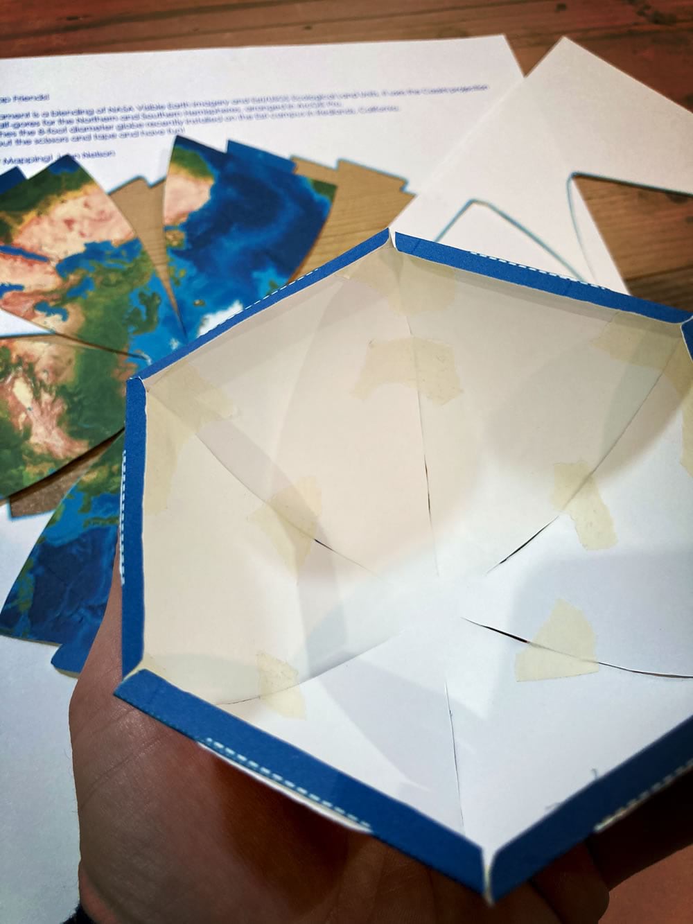
Same for the other hemisphere. See that white strip of paper edge along the seams? Me too. If you are a better crafter than me, you’ll run a blue marker along the cut edge of the paper before assembly. I am filled with regret, but will forgive myself in time.
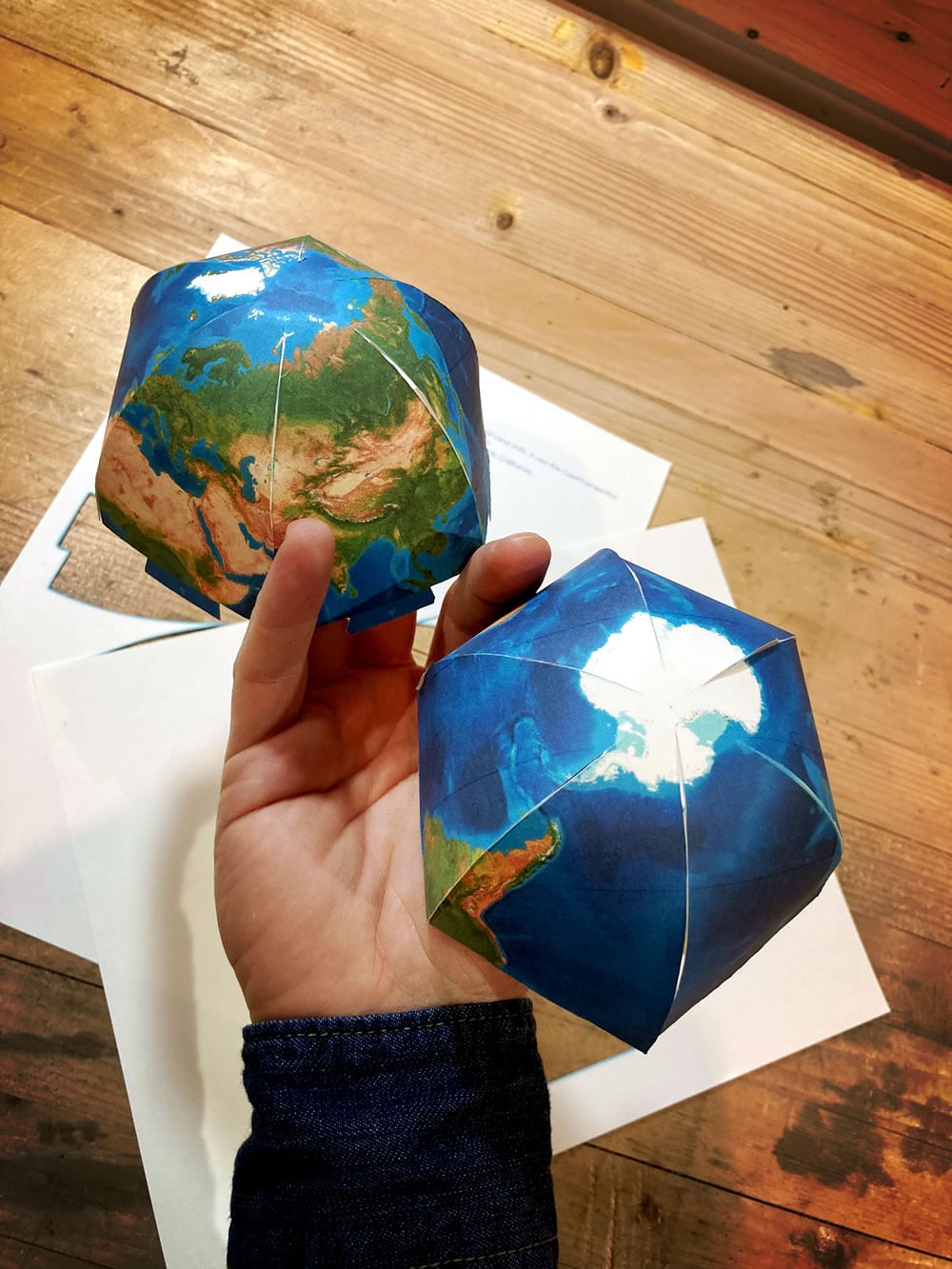
Ok, this part was a joy. I was not prepared for how well the slots would fit and there was a satisfying little snap when the two hemispheres came together. I hope it goes that well for you.
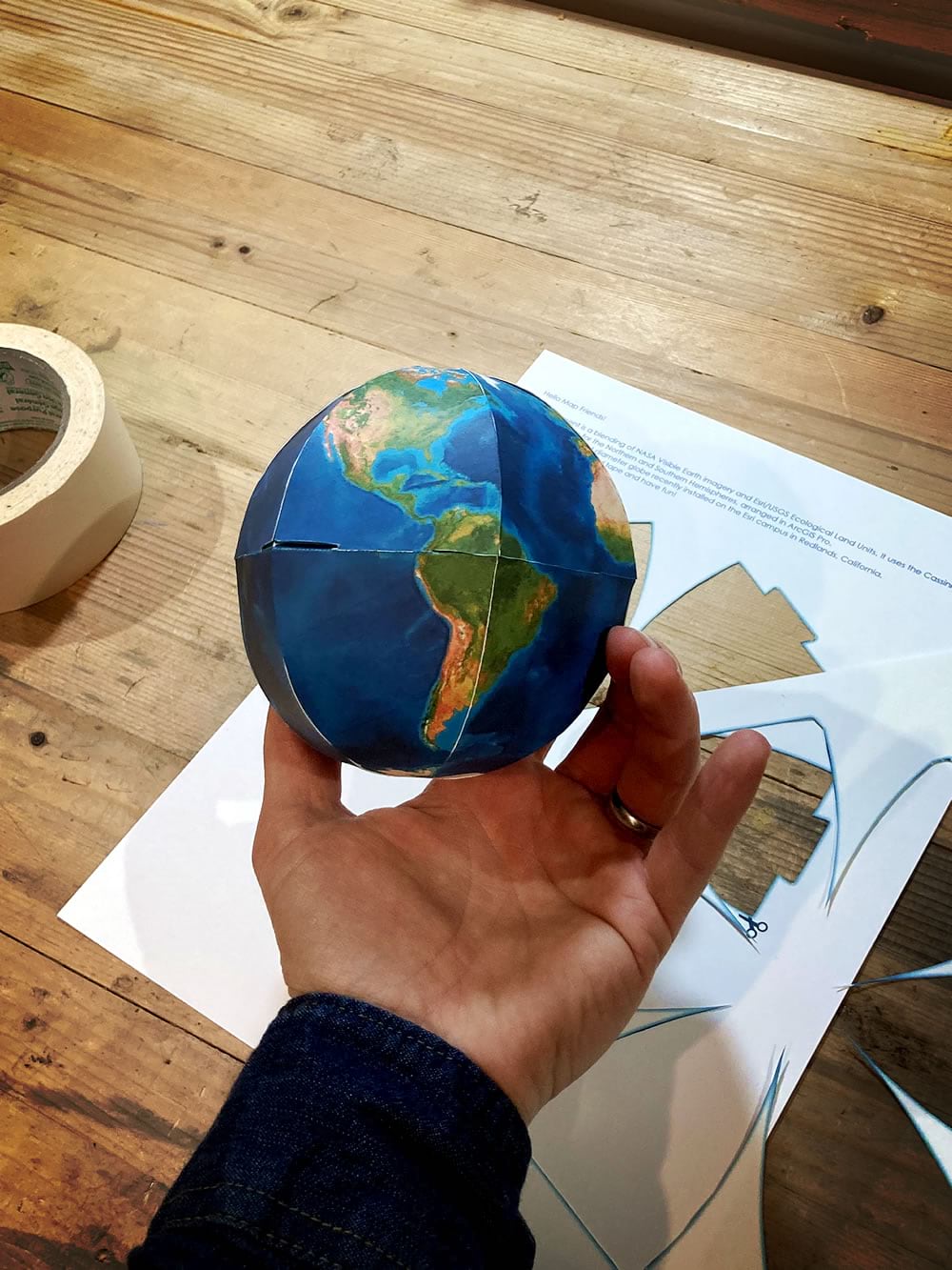
You can’t tell in the pictures but my globe came out a bit oblong. Sort of like a rugby ball. Oh well, I’ll just say it was an aesthetic choice.
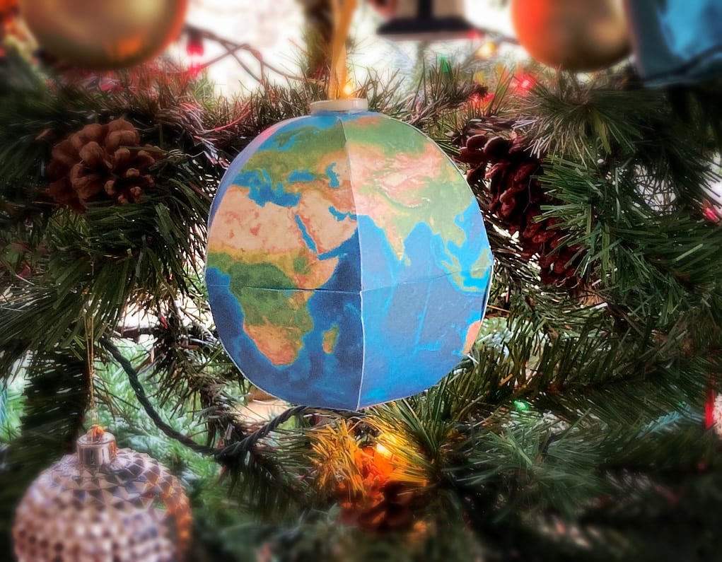
Willow hot-glued a button and ribbon to the top so we could hang it on the tree.
Could it do with a bit of craft-savvy trim work like yarn or piping along the seams to dress it up a bit? Oh yeah, for sure. Also, if you are pressed for time, try cutting out the template without the tabs, stack the two cutouts like a sandwich, and just tape the six edges. Then you might be able to form it into something globe-like when you pull the two poles apart.
Anyway, where were we? Oh, right, Geographic Information Systems…
GIS Nerd Fun
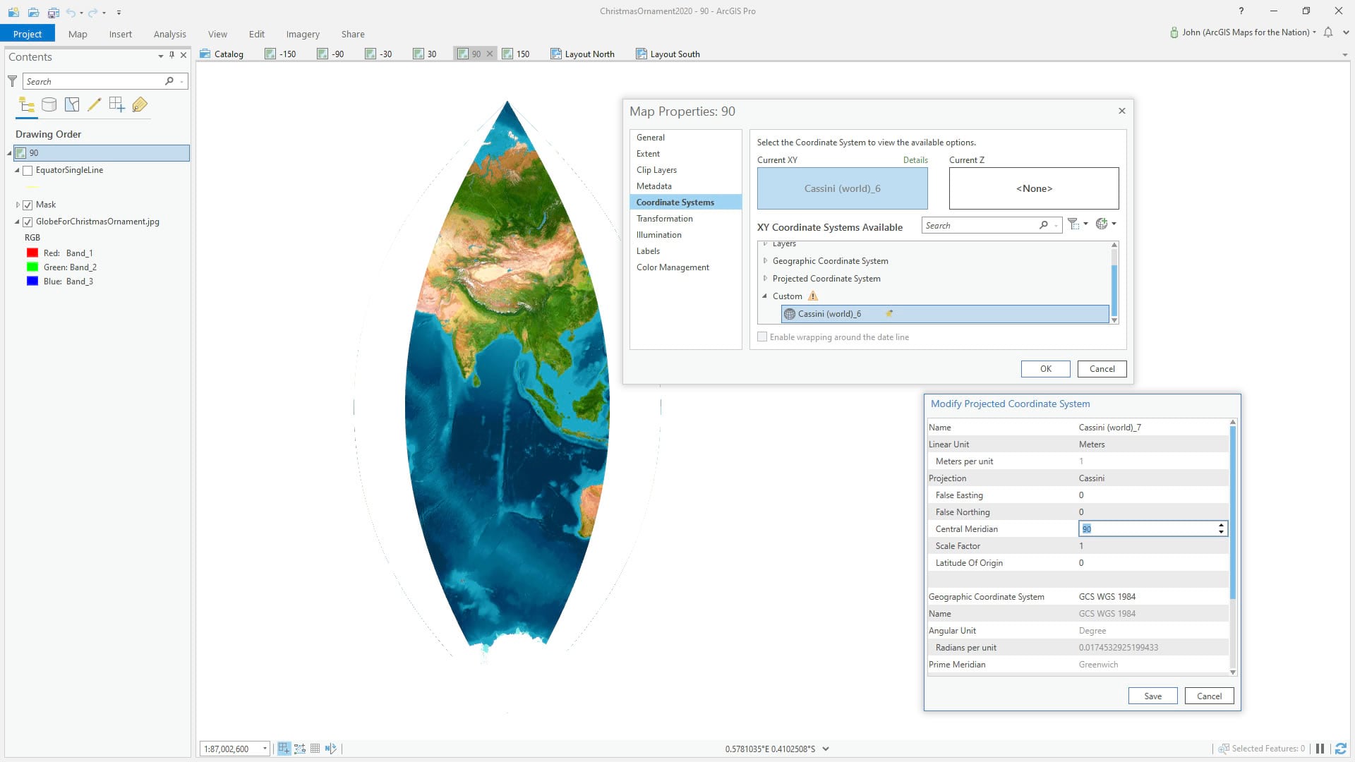
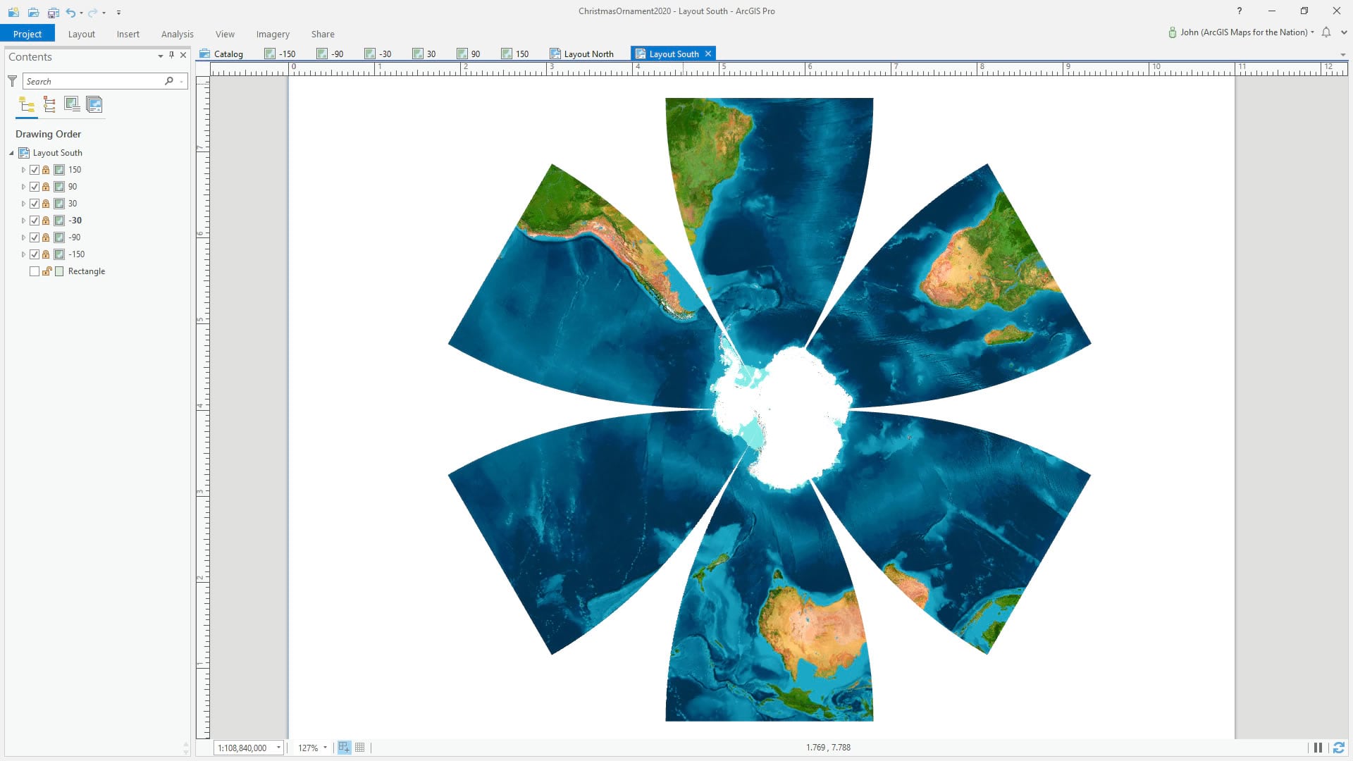
The ornament template was created in ArcGIS Pro. I’d been wanting to play around with creating globe gores in Pro for a while so this was a perfect excuse. I consulted with Esri’s resident geodesic genius Bojan Šavrič, and he suggested a couple projections to try for creating the gores. I went with Cassini. Oh, he also insisted I go with 12 gores instead of 6 because it would result in a rounder globe but he is a geodessist so of course he’d want more gores. I’m lazy so I went with 6.
The extent that Cassini gives you in Pro is a 90° swath. So if I were super lazy and not just sort-of lazy I would just go with four gores and my job would be done. But I want 6 gores so that means my visible extent needs to be only (hang on…360 divided by 6 equals…) 60°. Hmmm…
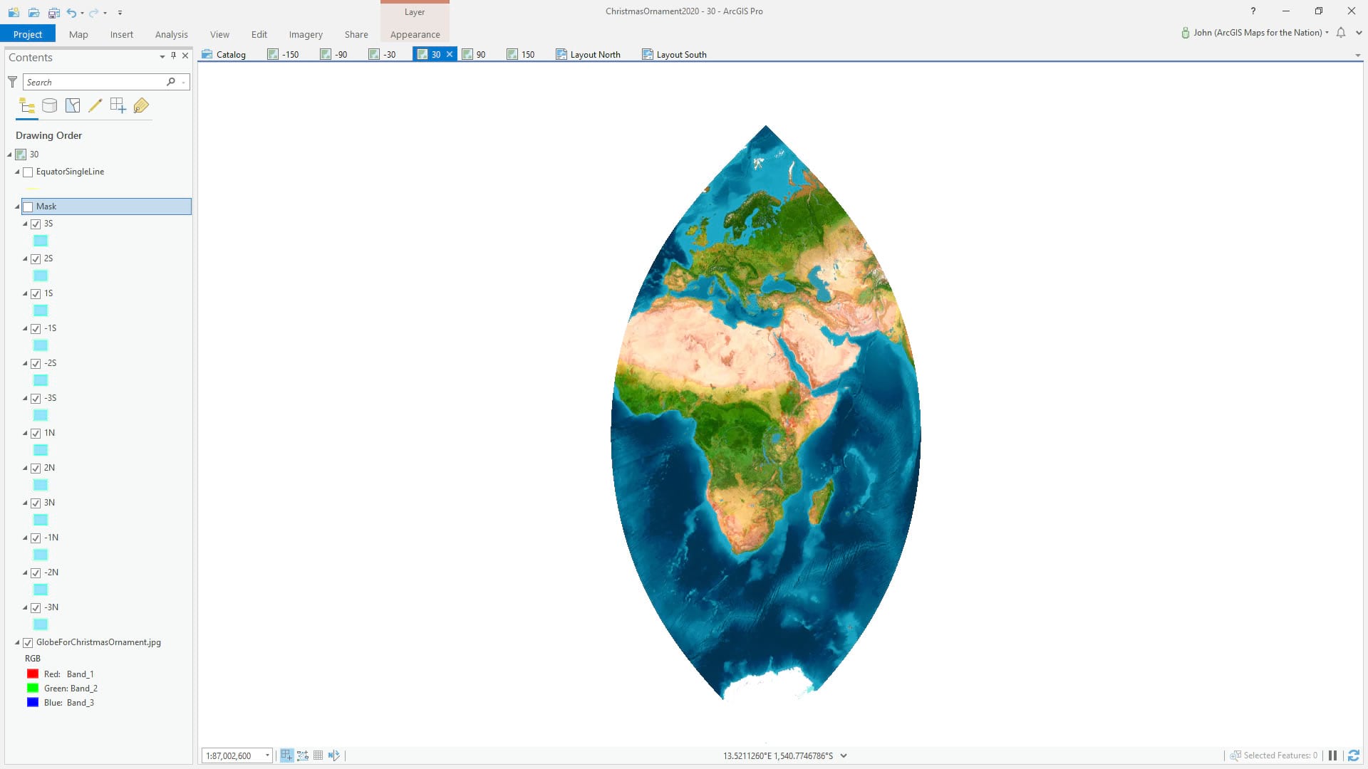
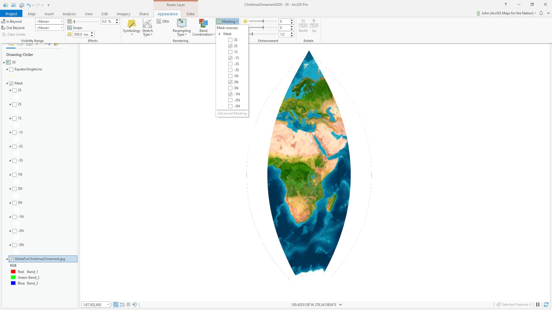
So I made up a set of grid cube polygons at 10° intervals and split them (manual selection, then make layer from selected features in layer’s right-click menu) out into layers of 30° latitude bands. I gave them a new naming (in hindsight I wish I’d named them by their longitude range as it would have saved me lots of headaches in the following steps).
Then I used these to mask my globe’s image layer so that I was only seeing a 60° wide swath (because I want to have 6 gores, each 60° wide, circling the earth).
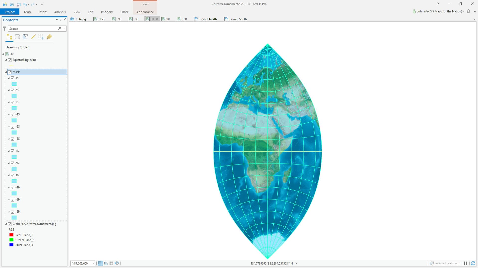
Then I duplicated the map, edited the projection to slide over another 60°, and updated my mask layers. See, another gore!
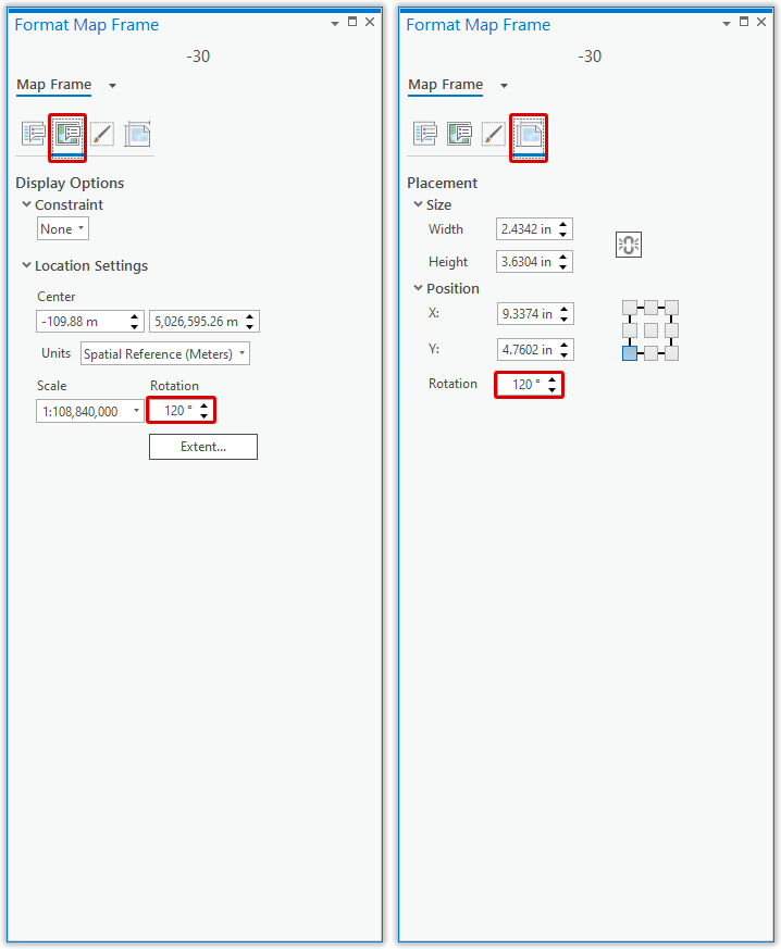
Then in a layout, I added in all the map views at the same map scale and same map view size, and arranged them in a radial fashion around the north pole. I sized the map frame so it was only big enough to show the north half of the gore, because I was doing the two hemispheres in separate layouts. Mostly it was a bunch of map frame copy/pasting, then swapping out the map that each map view pointed to. Lots of scale copy/pasting (lower-left corner) and manual positioning of the map navigation.
Pro tip (wink): If your layout is in active map-navigation mode and you want to navigate within the overall layout, just hold the “1” key down (no need to constantly switch between activating/closing map nav mode). Aubri Kinghorn told me about that and it’s a mega time-saver.
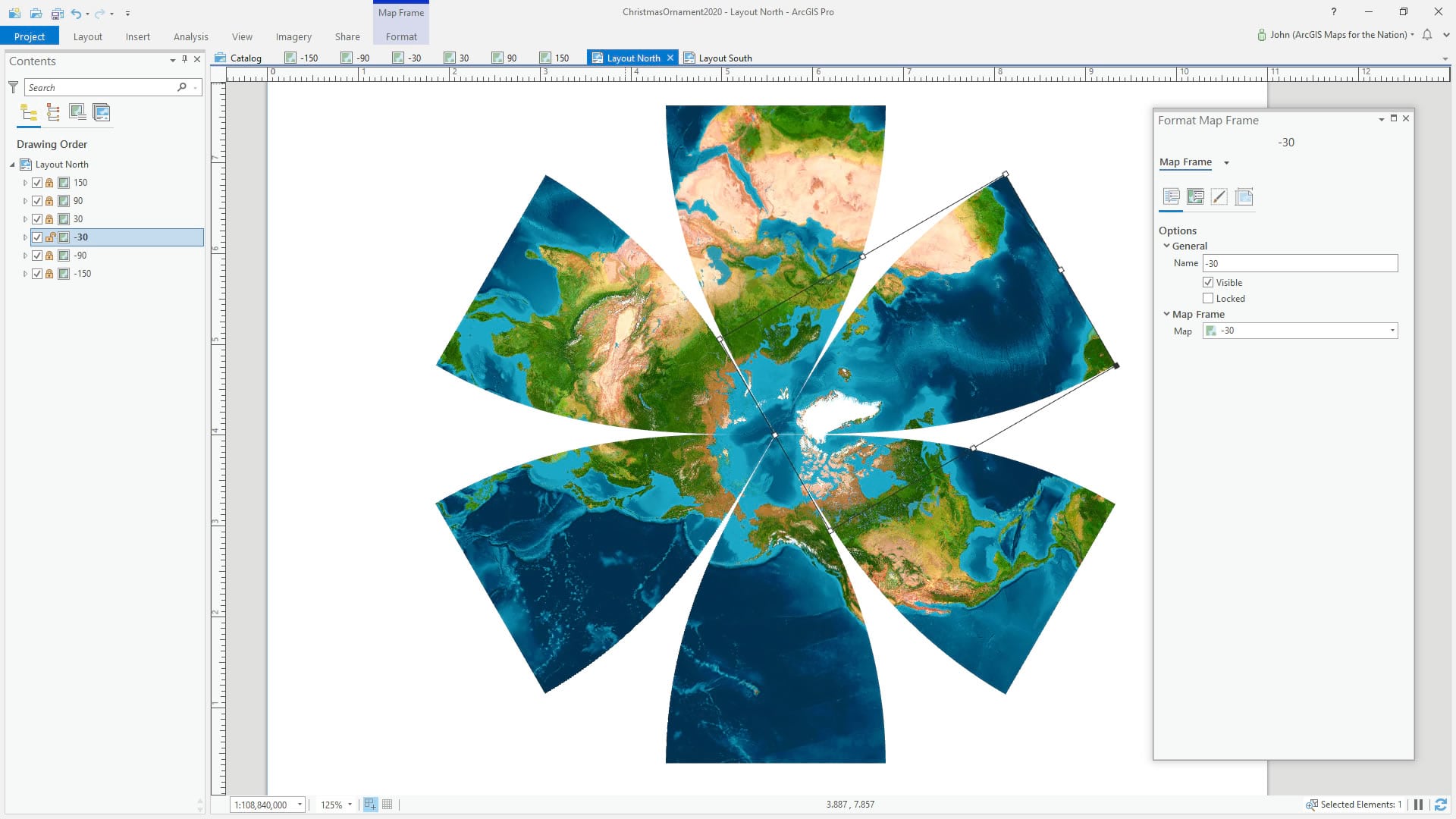
You can set the rotation of the map frame, but the map within it stays un-rotated. So you set the angle in two places to rotate the map frame and the map itself, to the same desired angle. You do this to each map view, with the desired angle (I had 6 gores so it was increments of 60°). Check it…
I duplicated my Northern Hemisphere layout and reconfigured it to show the Southern Hemisphere. You have no idea how much this hurt my brain.
Ok, my friends, that’s all there is to it! If you’d like to open up my source Pro project, I’ve packaged it up for you here. You can apply your own cartography. Speaking of cartography, this ornament is a mini-version of a giant 8-foot globe Esri just installed on campus (more about that insanely fun project later)!
So here is the paper globe ornament template, once more, if you want to give this fun craft a go! And if you do I would loooooove to see some photos of the process and result. You’ve been so generous in the past to share snapshots of the globe ornaments you, or your class, have made. It’s so fun. I hope you enjoy it and stay well my map friends!
Love, John

Very creative!