This map was made for the lovely folks at Conservation International, to help with an ongoing project regarding stewardship of undersea environments and ecosystems. It is the second in a series, the first being the Salas y Gómez and Nazca undersea ridges. Here’s a how-to video series for that first map, and technique in general.
The Emperor Seamounts are an undersea chain of volcanically formed mountains spanning 1,500 miles from the Northwest Pacific Ocean to the Hawaiian Island chain.
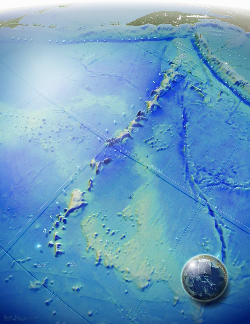
Most of the visual heft of this map comes from ArcGIS Pro, where I made a 3D scene, boosted its vertical exaggeration, and used GEBCO bathymetry as the surface elevation and for hillshading. I also used two copies of a lat-long grid, one draped to the seafloor and one sitting at a fixed sea level elevation, to create a fun and tactile sense of depth. I go into lots of detail in this video-laden blog post, if you are interested in creating this sort of 3D map in Pro.
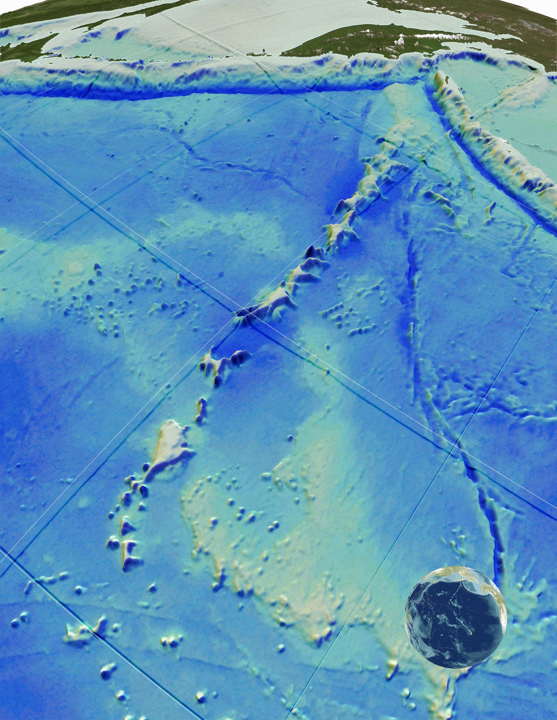
Here is a look at just the layers exported from ArcGIS Pro. If you are wondering about that floating graticule effect, it’s a fun little hack using two copies of the same lat-long layer:
- One is draped onto the surface (a GEBCO bathymetry image added to the “ground” elevation surfaces) and given a blurry blue stroke with an “overlay” or “color burn” blend mode. This looks like a shadow.
- The other is a thin white stroke set to an absolute height of 0 (sea level).
The result is a grid stretched taut over the oceans with a murky shadow diving over the depths and shallows of the sea floor. It’s a solid visual indicator of relative depth so that bathymetric color isn’t doing the only heavy lifting. It also looks sort of novel and fun. Plus the grid in general provides a directional reference better than any north arrow could (as long as I label them).
In this blog post I’ll focus on the opportunity to delve into making pseudo-3D looking labels (some earlier examples in these maps of Panama and Pacific Earthquakes) and nerding out on an over-the-top overview globe. I used the Maps for Adobe export format (.AIX) and exported individual layers (bathymetry, sea level grid, sea surface grid) as image assets to work with in Adobe. Maps for Adobe does a great job of maintaining layer names and hierarchy and can be an enormous time saver if your workflow involves Adobe. Because of the custom nature of this look, I placed, and distorted, the labels manually in Adobe. This includes…
- attaching text to a curved line,
- skew transforming text so that it appears to lay down on a domed surface,
- and distort-transforming the text so that “nearer” portions appear larger and more distant characters foreshorten into the horizon.
Lots of trial and error. But the fun sort.
In hindsight, I could have done a better job of bumping out the text so that letters didn’t collide with the reference grid. But there’s always some lingering distraction in any map that I eventually decide is good enough to kick out the door. That’s how it goes.
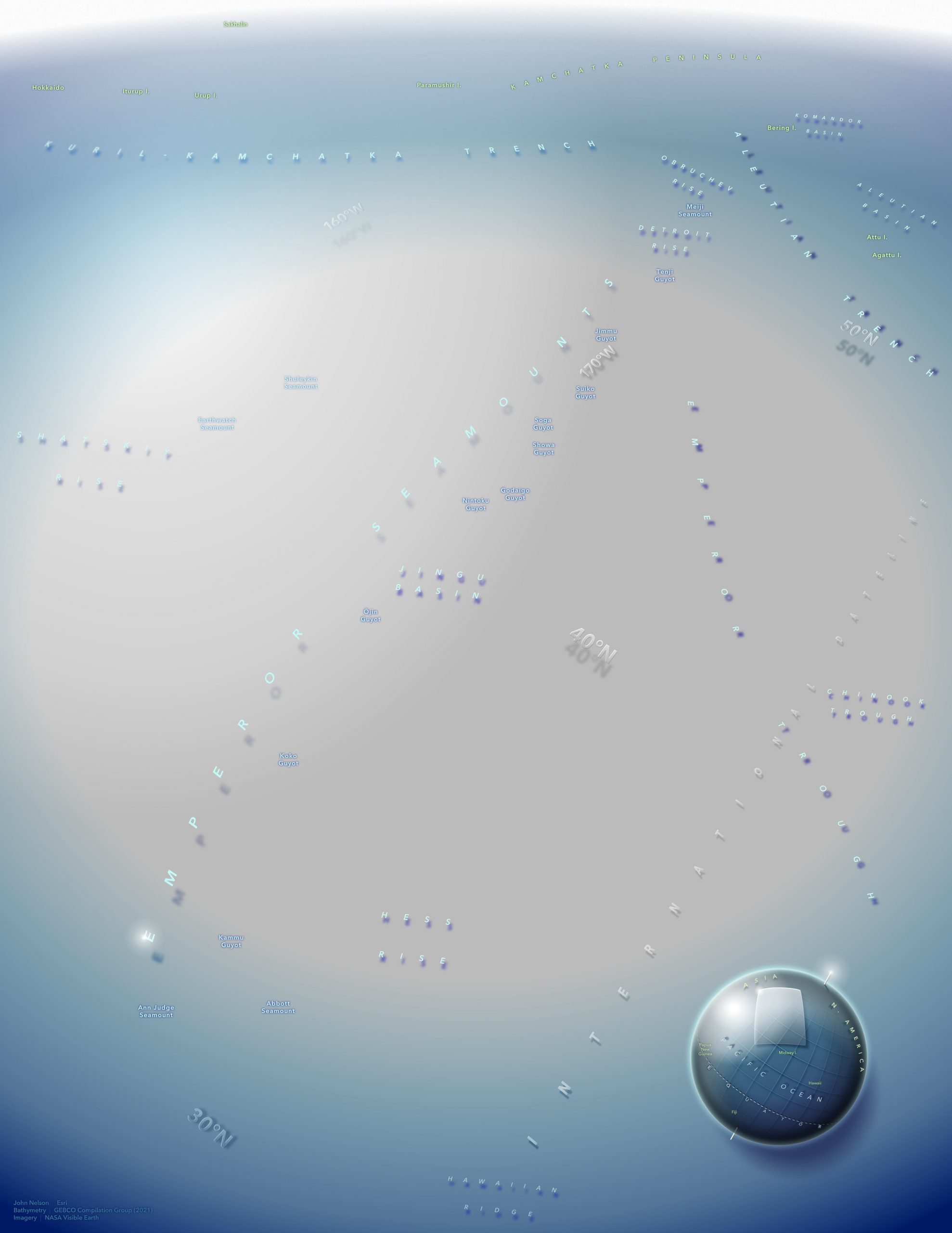
Speaking of labels, here is a look at just the labels.
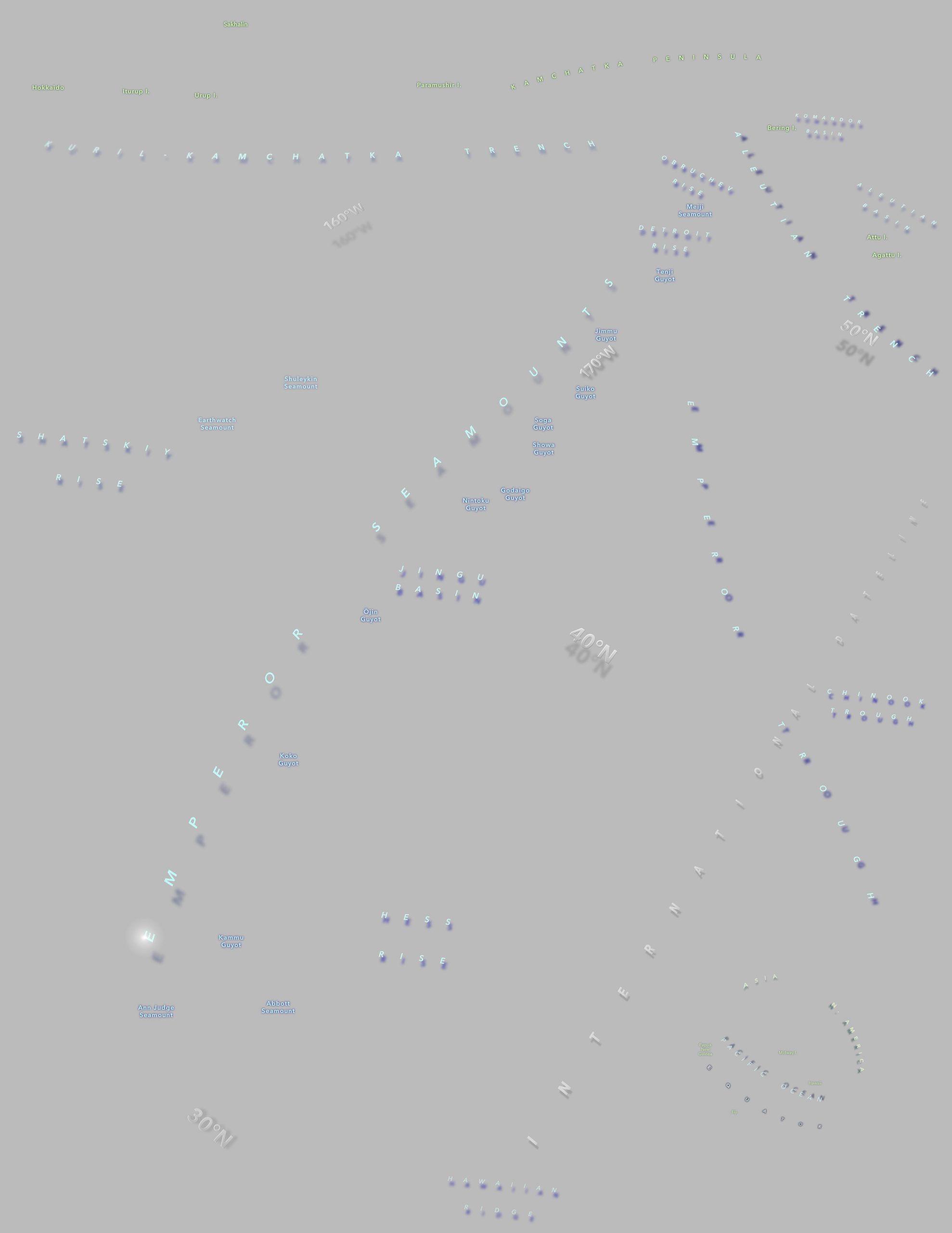
Not a ton of labels but certainly more than I normally have the patience for. I got lost in it. All of the seamount names I was able to find referenced in the Oceans vector basemap.
Does the “T” in Emperor Trough” stepping over “International Dateline” bother me? Yes. Why didn’t I add another space in there to keep it clear of the other text? I blew it, that’s why!
Here are a couple labeling details I especially enjoy. I added a glow shimmer ellipse (pretty much a Firefly point) to the corner of the “E” in the Emperors Seamounts label because that’s the de facto title of the map, and, since there isn’t an actual title, this helps lead the eye to it.
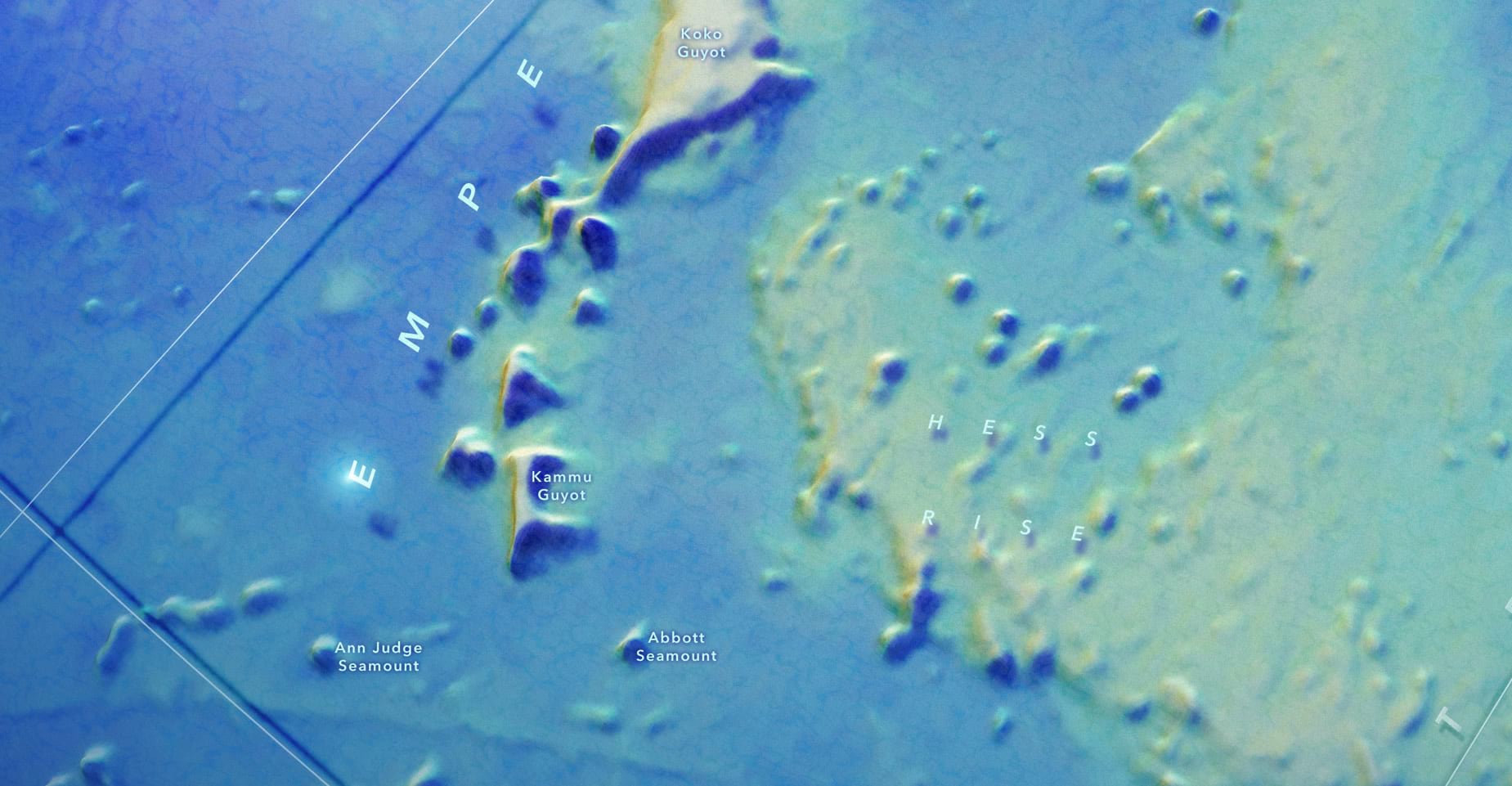
Labeling the graticules was a bit of a mystery right up to the end. I wanted them to visually recede so that you only really notice them if you are looking. That seemed about the right sort of visual prominence for them in the hierarchy of labels. This sort of glassy effect with a beveled edge worked (gray text with a white inner shadow at the top-left and black inner shadow at bottom-right, with an “overlay” blend mode).
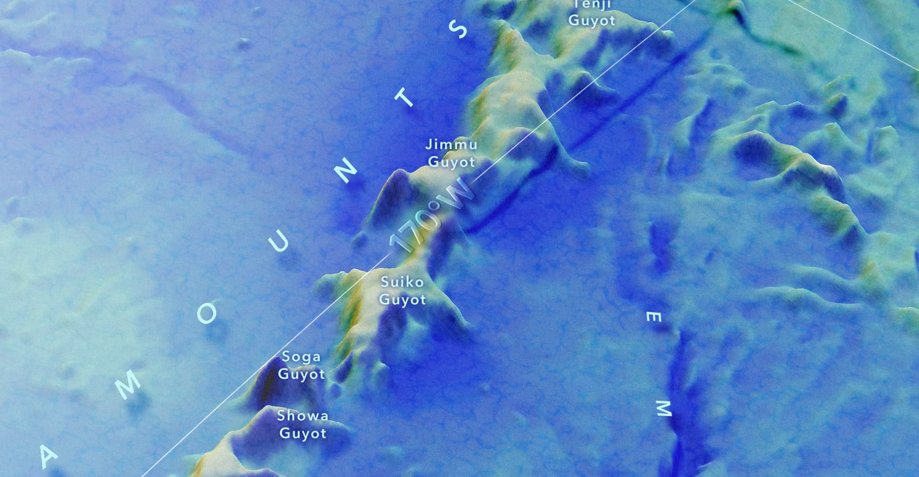
You know I got a great big smile when I added a text drop shadow to align with the grid’s shadow. I blurred the bit of grid/basemap where the labels appear to reduce their visual conflict.
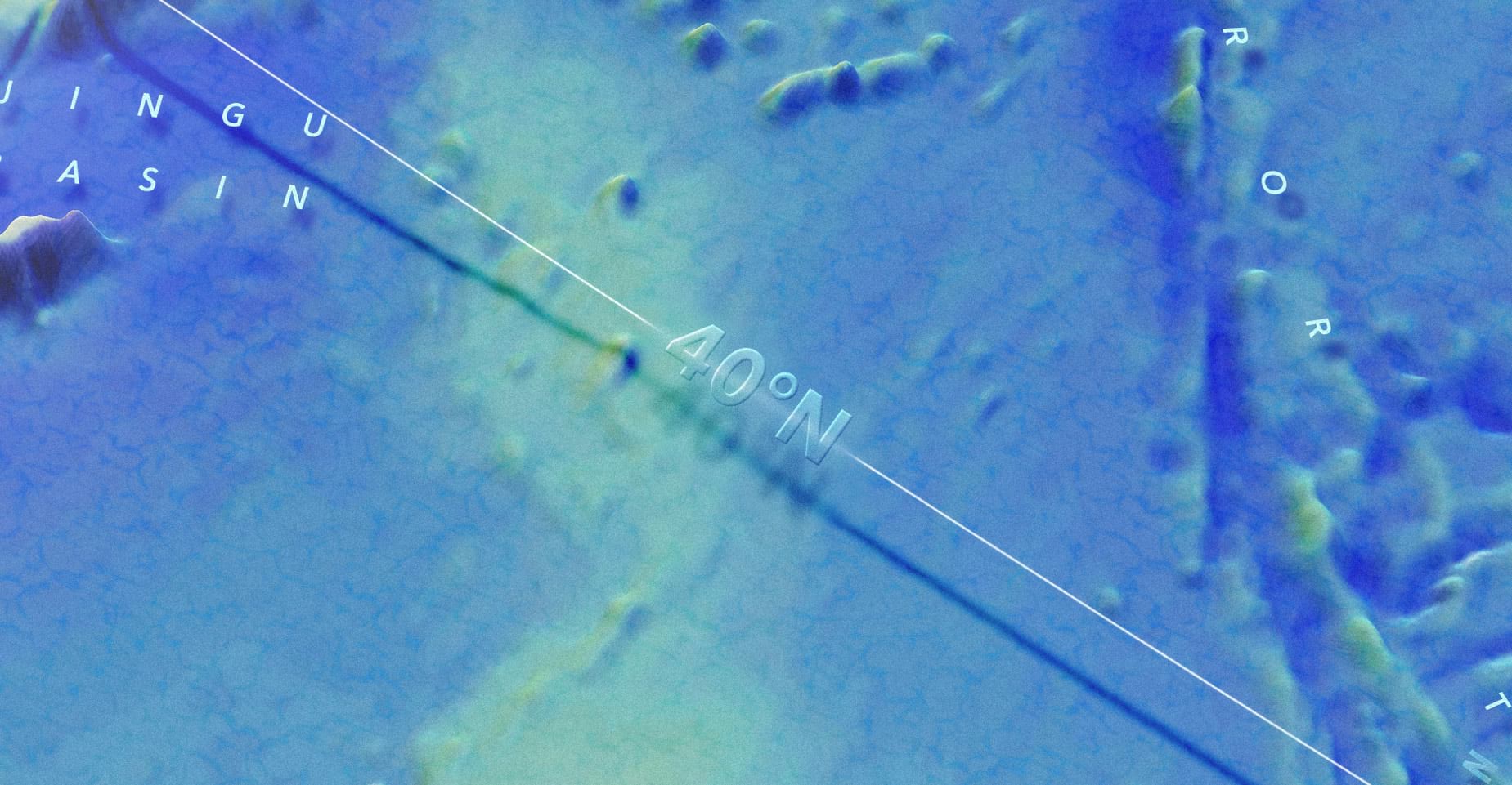
This is a ripe opportunity to advocate for exceptionally large letter spacing. Here’s a guideline for you to consider when you are labeling non-point geographic features: Whatever letter spacing you are considering, double it. Then multiply it by 100. Running out of room? Reduce the font size. It is almost impossible to have too much letter spacing when it comes to landforms (or seaforms). Many of these labels had a letter spacing value of 4,000. I kept increasing it, and it kept looking cooler.
To help visually frame the composition, and to trick our eyes into feeling like they have the otherworldly ability to cut through the dense medium of seawater, this map has what doctors call a little bit of a vignette problem. But if using vignettes with great relish is wrong, I don’t want to be right. Here’s a look at all the vignettes used in this one map. Keep in mind these are all non-geographic elements that…gasp…cover up geographic elements. But it works!
This brings us to the overview globe. My hope for this globe was that it might look like Earl C. Bateman III could have painted it with an airbrush in 1985. That was the inspiration anyway, so thank you once again, Earl!
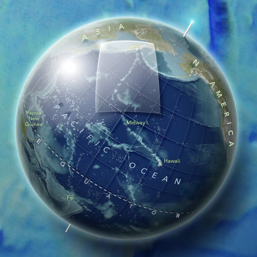
Here is a sequence that steps through all of the design accoutrements of this thing.
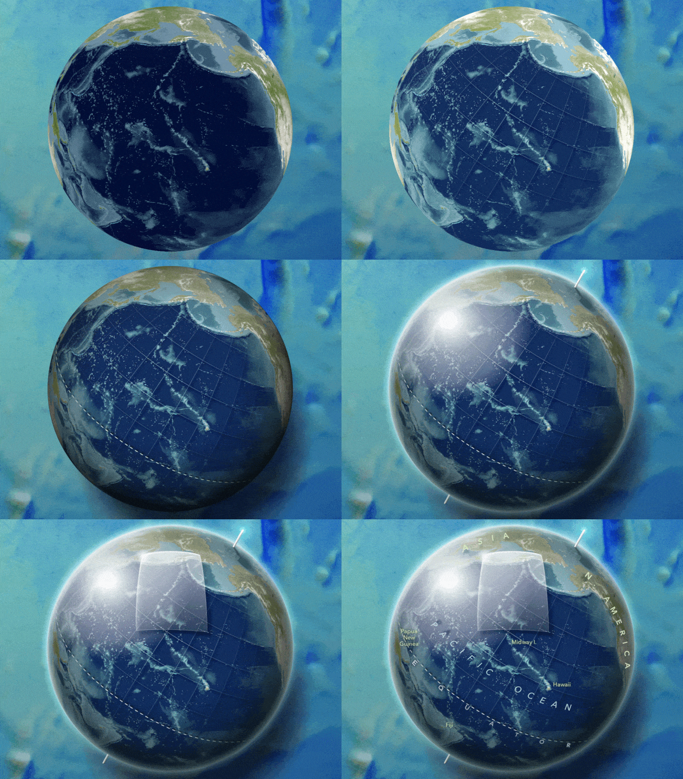
A rundown:
- The raw NASA Visible Earth image, as a 3D global scene in ArcGIS Pro, exported as an image and plopped into the Adobe layout.
- Filters to increase the brightness and contrast and reduce saturation.
- Adding the 10-degree lat long grid. This was exported from Pro separately and aligned to the globe in Adobe.
- The grid gets a radial gradient mask so it fades away at the edges. Then a dropshadow.
- Hand drawn equator dashed line (pen tool in Adobe) with dropshadow.
- Hand drawn ellipse covering globe with radial gradient from transparent black at center to semitransparent black at edge, nudged over a bit to the bottom right side looks shady.
- Another ellipse covering the globe but this time with no fill and a thick white stroke. Then a blur effect to make it look like a fuzzy little perimeter atmosphere.
- Hand drawn ellipse over the upper left section of the globe, given a radial fill with white at the center and fully transparent white at the edge. Like a reflection.
- A couple of hand drawn rectangles rotated and plopped about where the poles should be. They get an inner shadow and cute little light shimmer.
- Ah, finally, the area of interest indicator! This is a hand-drawn polygon meant to look sort of 3D. I don’t think I got the curves quite right to be totally believable, but I couldn’t improve it so there it lies. Linear gradient fill from semitransparent white to transparent white. Glassy and classy!
- Duplicated the area of interest, changed the whites to blacks, and gave it a strong blur. Shady.
- Added a glassy beveled edge to the area of interest (pathfinder tool fun) and another little glow shimmer to the corner.
- Labels!
Hopefully one or two things here spark some ideas that you can use in your own adventures. I had a blast working on this and I’m honored to have been a part of the team along with Kellee Koenig and Daniel Wagner of Conservation International.
Love, John

Article Discussion: