When working on a project, do you ever get a song embedded in your mind for the duration? Me too.
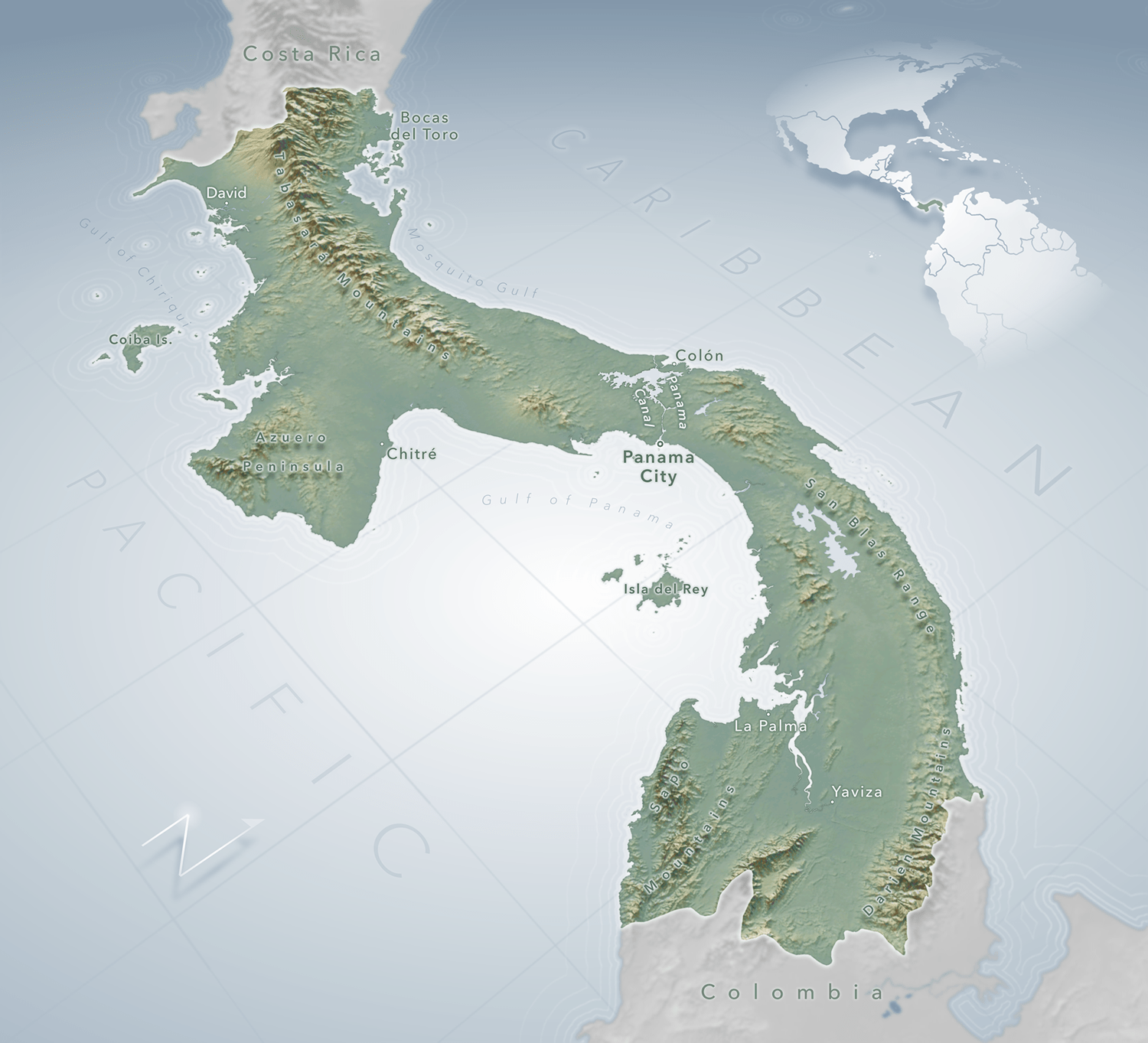
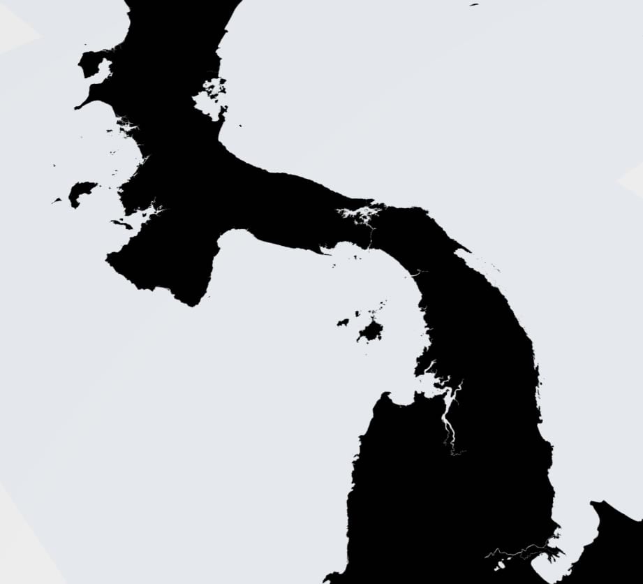
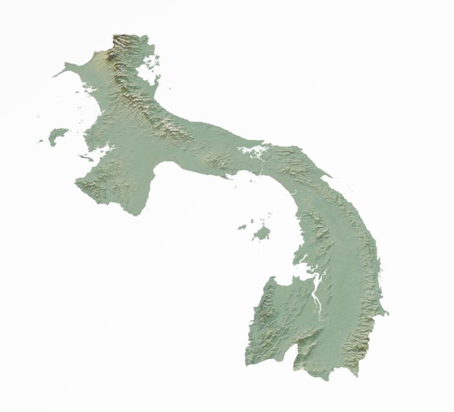
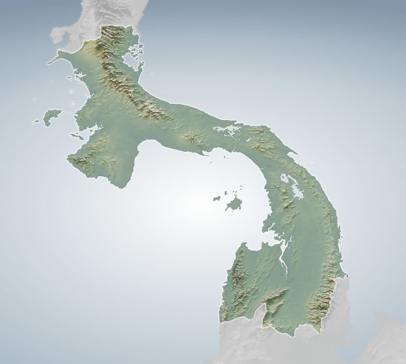
Here is a map of Panama…
Christian Harder, publisher maximus, asked if I would make a reference map of Panama for a project he’s working on. He also asked, “are you thinking 3D?” and I was all, “yes, actually” and he was like, “seems like a 3D kind of place” and I was all “let’s do this.”
Composition
The dimensions needed to be roughly square. Panama isn’t square.
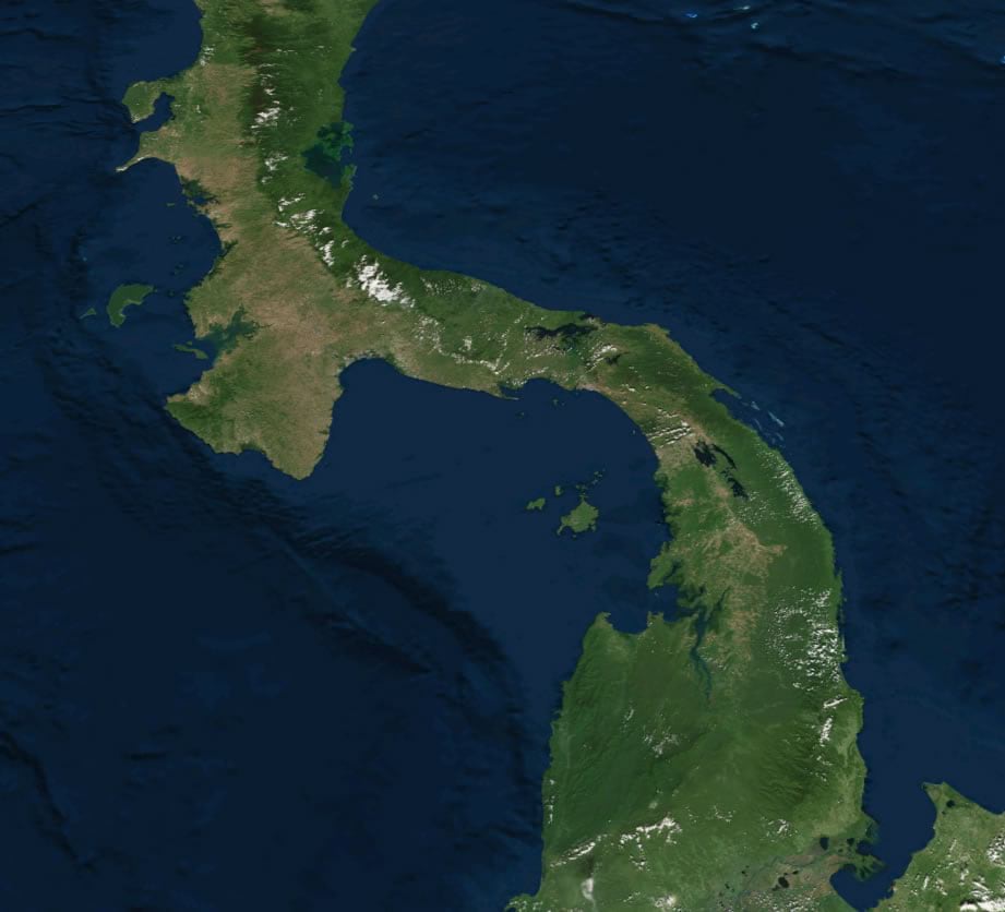
So this reaffirmed the notion of a sizzling 3D perspective composition. I fired up a global 3D map in Pro with an imagery base and tilted my perspective of Panama, choosing a viewing angle such that its sinuous shape would bisect the layout diagonally, the eastern end closest to us while the western end recedes slightly into the distance.
Breaking the seal on the cherished North-As-Up societal construct is risky, and not for every map, but can be rewarding if your parameters allow for it, and you provide enough contextual cues (like vertical exaggeration, graticule, north arrow, etc). More on that in a bit.
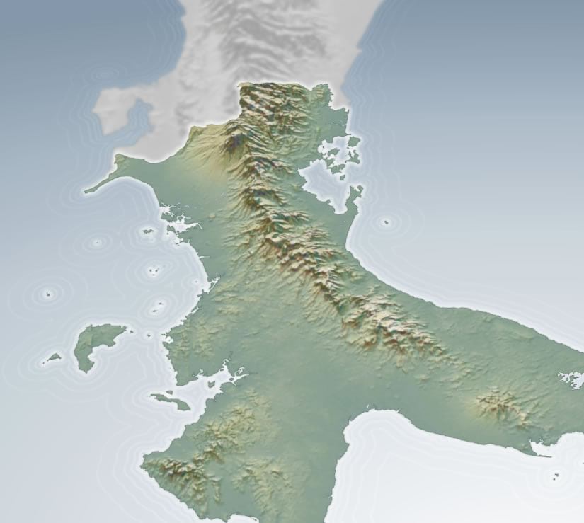
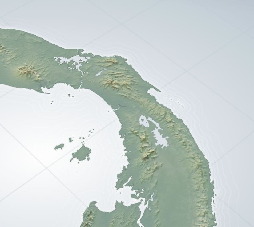
Topography
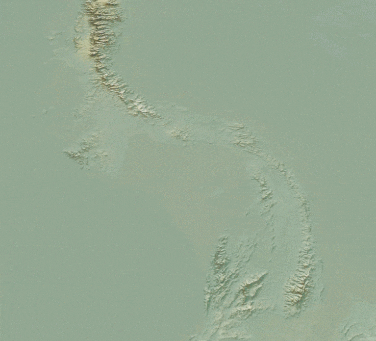
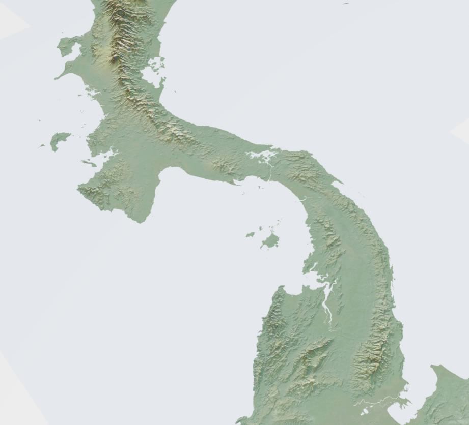
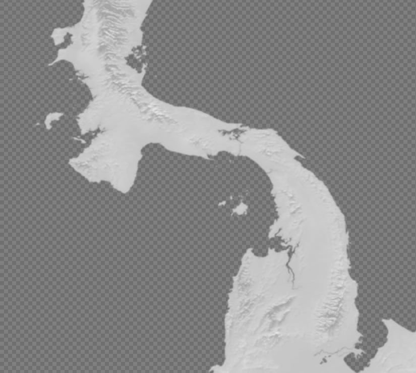
I decided to use a modified version of the Imhof style for this. Find all the scintillating cartographic details of that here. In short, it’s a stacking up of sneakily-colored hillshade, multidirectional hillshade, and elevation mist.
To give a true impression of the topography of Panama, we need to lie by cranking up the vertical representation of elevation. Such is the ironic mission of truthful cartography.
By selecting the “Ground” elevation surface in the 3D map’s table of contents, you can dial up the truth-giving lie of vertical exaggeration. I chose an 8x lie. In hindsight I wish I would have dialed it up to 11, but I must have been in too practical of a mindset at the time. Such is the delicate rope of sanity upon which we cartographers tread.
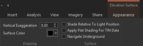
Exaggerating the topography is especially helpful in this map because of the off-north orientation and perspective viewing angle. More vertical dimensionality cozies up to the vanishing-point perspective dimensionality to create a more tangible surface. Bet you didn’t think you’d be reading about snuggling dimensionalities today. Such is the linguistically inventive mission of communicative cartography.
Geoprocessing Our Area of Interest
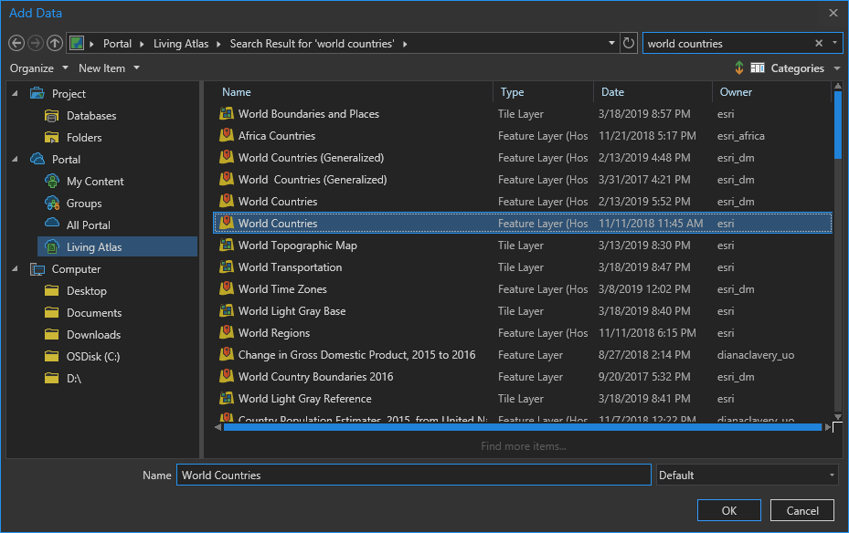
Now that we have a suitable terrain rolling (wink) it’s time to pull in some vector country boundary data from the ever-benevolent Living Atlas.
I added two layers, directly into Pro (did you know you could do that?). A detailed country boundaries layer and a super handy rectangle that covers the whole world called “global background” that I use all the time for geoprocessing hacks.
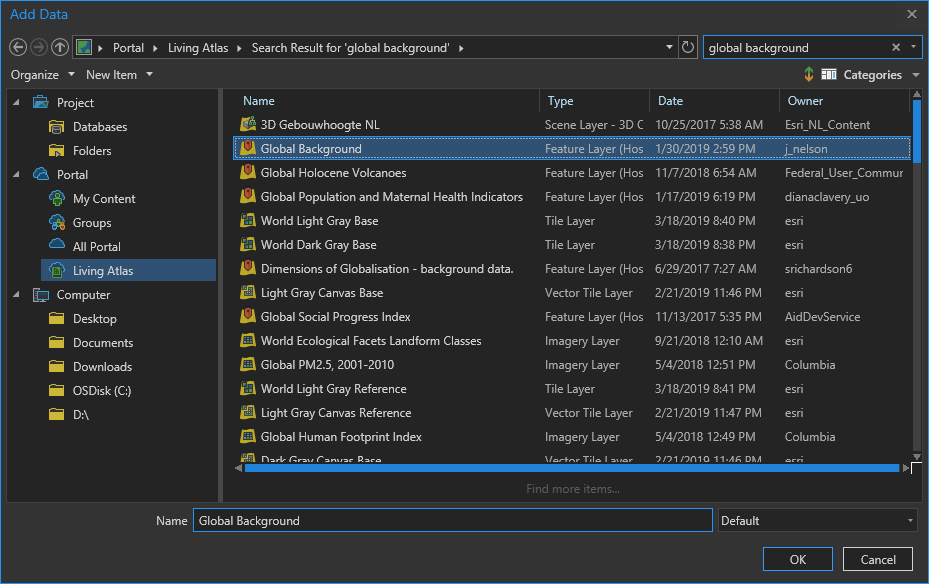
Here they are in Pro. The global background layer is white and the black countries layer sits on top of it.
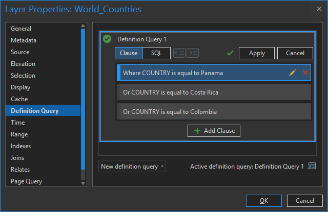
Next I want to isolate just the countries in my view (Costa Rica, Panama, and Colombia).
Then I’ll use the erase tool to chop out those land areas from my global rectangle. Like a cookie cutter.
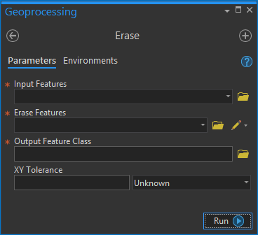
Pop. Pretty much making an oceans overlay. Now we can isolate our land areas, letting the topography show.
I did the exact same thing again, but this time just for Panama. This overlay will be handy for graying out the neighboring countries later.
Supplementary Layers
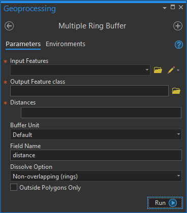
I love a good retro-vibe waterline effect in my maps. Rather than use Pro’s “offset” symbol capability for this, I decided to use actual buffered lines, to for more specific control. Such is the maniacal desire for infinitesimal cartographic control within which we cartographers revel.
I used the Multiple Ring Buffer tool.
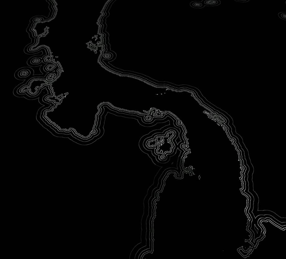
But good waterlines grow in spacing as they depart from the coast, like the ripple of a stone thrown into water. How to get those nicely offset distances without guessing or doing math? Not to worry, I’ve whipped up a little waterline calculator that lets you set your initial offset distance and rate of increase.
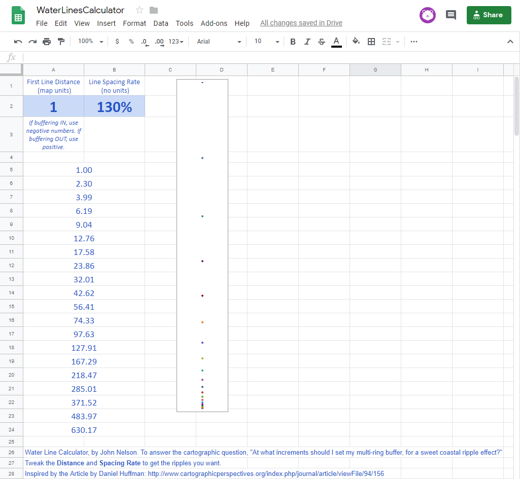
I exported the waterlines as a simple image because I am going to do some assembling weird designy stuff in Adobe next.
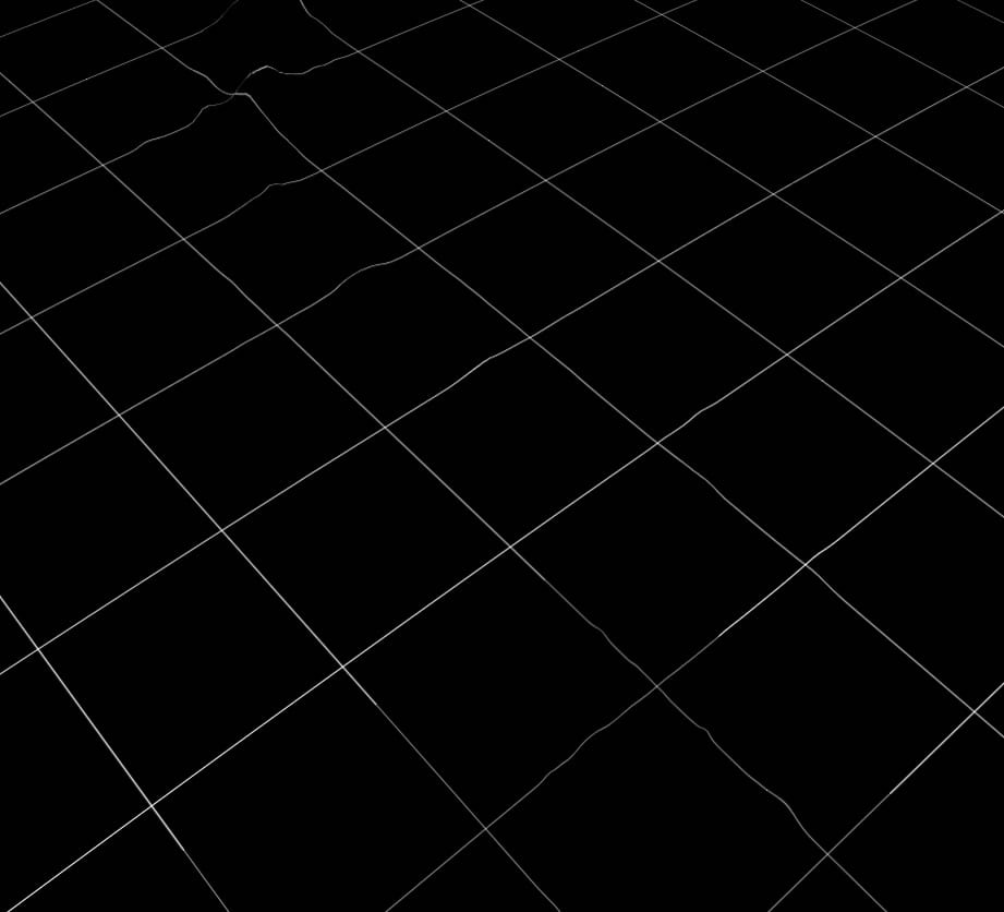
I also added a latitude longitude grid layer (also from the Living Atlas) and exported it as a basic black and white image. This grid is a key element that will help provide a sense of visual perspective, and orientation, in the map layout.
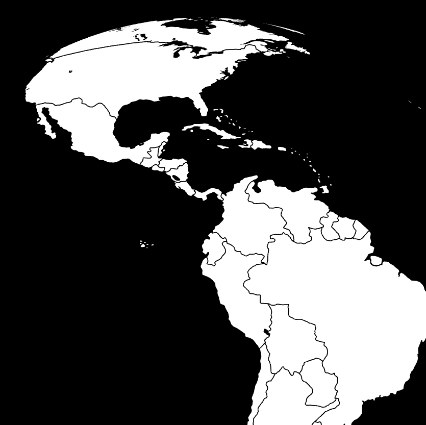
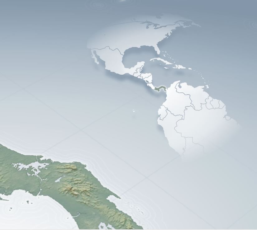
Lastly, in Pro, I created a new map view which will serve as a small locator (overview) map. This time I added a very simple countries layer drawn by Dylan Moriarty. Often small maps suffer from too much detail. I’ve found that this layer is excellent for small overview locator maps.
I chose the trusty World From Space projection and exported it as a simple black and white image asset.
Assembly
Because I wanted to do weird things with warping text to look sort of 3D, I knew I was going to do some work in Adobe. Any of the following steps could be done in Illustrator or Photoshop, depending on your preference. Also, most of it could be done directly in Pro, but since I knew I was breaking the Adobe seal for my labels I opted to do some layer assembly there where I can also do things with filters and blending modes (word on the street is that Pro will support blending modes in the future).
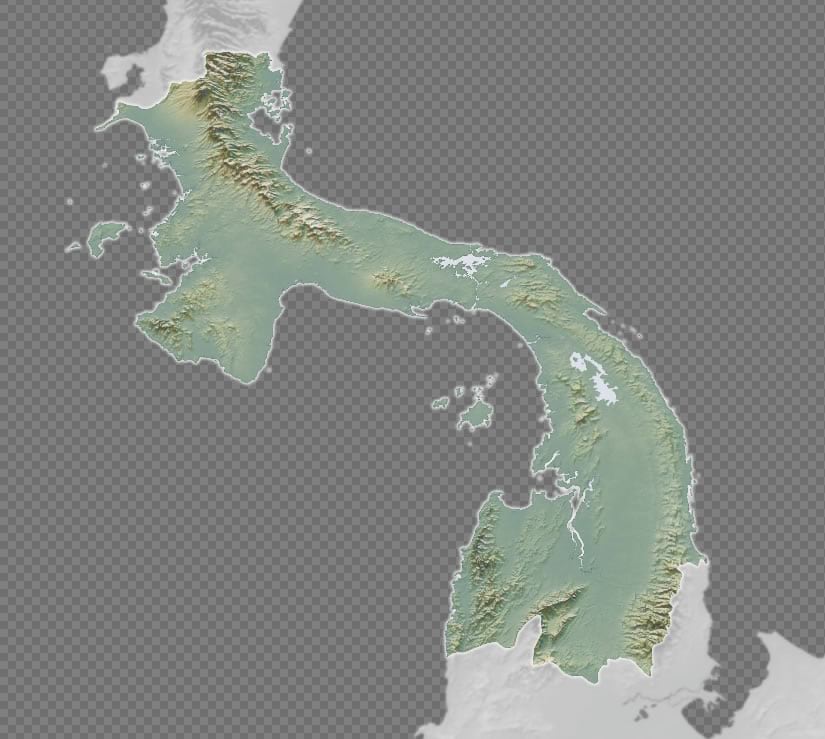
In Adobe, I added an image export from Pro of the terrain and magic-wanded out the ocean. I blurred and desaturated this layer, so it would serve for neighboring context without first-chair visual prominence.
Then I added in a Pro image export layer of just the Panama terrain. I removed the ocean and gave Panama a slight white glow, to visually underscore it as the subject.
Now for the ocean. Because I have a three-dimensional perspective, this is my big change to drive home the notion that we are looking at a round thing. I drew a background rectangle and gave it a gradient fill of nearly white to muted blue at the periphery.
What a difference! While I made this gradient background in Adobe (where I am assembling my map assets), you can totally rock gradients in Pro.
Next I brought in my waterlines image export and gave it an additive blending mode so it merges with the underlying water gradient colors and then I gave them a bit of a blur. It gives them that…I don’t know what. Such is my strange obsession with blurring.
It’s subtle, but because the waterline distances scale down at the more distant parts of this map, we benefit from a bit more enthingedness of the map. Enthingifying maps is something I love quite a lot.
Speaking of providing visual context for the 3D perspective, I brought in the grid layer and did pretty much the same blending and bluring. This time I made the grid a deeper version of the water’s color so they wouldn’t fight with the waterlines.
Often I advise against a north arrow in maps, usually as an unnecessary piece of furniture for maps whose implication of north either changes across the map, or when north is totally obvious, or when you already have a graticule (a super sneaky way of showing cardinal directions all over your map).
Even though I have a graticule, I couldn’t help myself from drawing a north arrow for this map. I started with an N, then added an arrowhead to the stem. Then I rotated and crushed it so it looked like an actual floating north arrow and sold the lot with an over-the-top dropshadow. Because dropshadows! Such is the nature of sometimes-indulgently heavy-handed cartography.

I placed it in the watery nook of the lower left portion of the layout. A glassy overview map will live in the opposite corner, and balance the layout.
I added the overview map image export from Pro and magic-wanded out the background. I drew an ellipse with a gradient fill of a semi-transparent white center that faded to full transparency. I used the overview map to mask this gradient. The result looks to me a bit like an ephemeral half-globe showing us Panama’s global location and scale in the context of the Central American and its neighbors. I really dig making overview globes.
Lastly, I indulged in manually placing and warping the label elements. My favorite bits are the perspective-distorted ocean labels and the shadows cast by mountain range labels. Both of these tricks reinforce the depth and orientation of the composition. Such is the importance of seemingly trivial pursuits to a wholly designed product.
Here is what they look like without the rest of the map content.
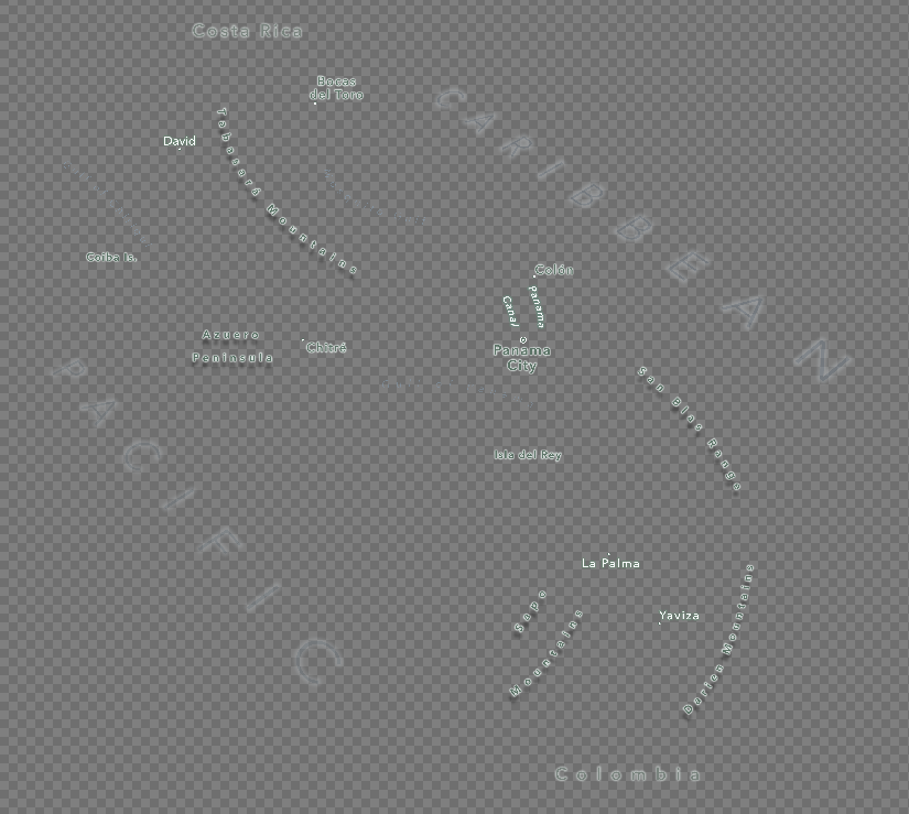
Here it is all together…
You’re still reading?? Bravo. This has to be the longest blog I’ve ever written. So that’s it. A step by step showing and telling of the creation of one map. Thanks for coming along for the ride and all the best in your own cartographic adventures!
Happy Mapping, John

Commenting is not enabled for this article.