A little while ago, this gem made the rounds on the socials…
Part 1: Abject Appreciation
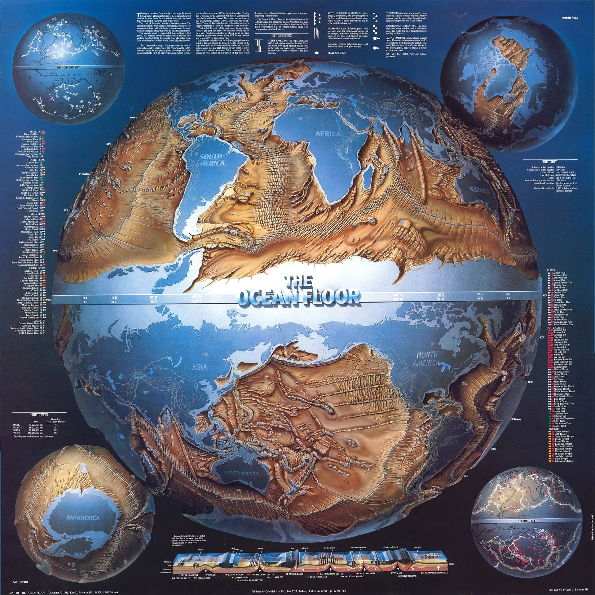
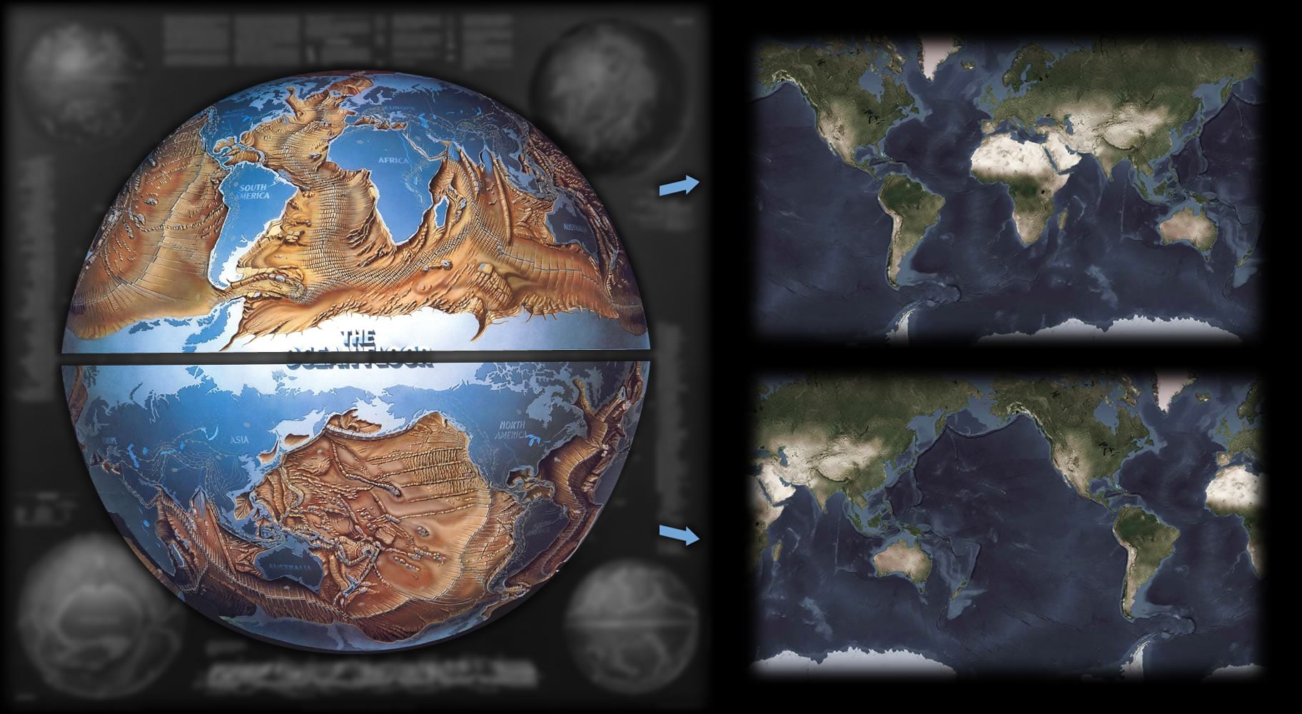
You can take a closer look at it in the David Rumsey Map Collection, here. I definitely took a closer look. Look at this lizard-skin bathymetric relief and alluvial fan…
Check the lighting on the underside of the sphere and the charming beveled relief edges of continents and labels…
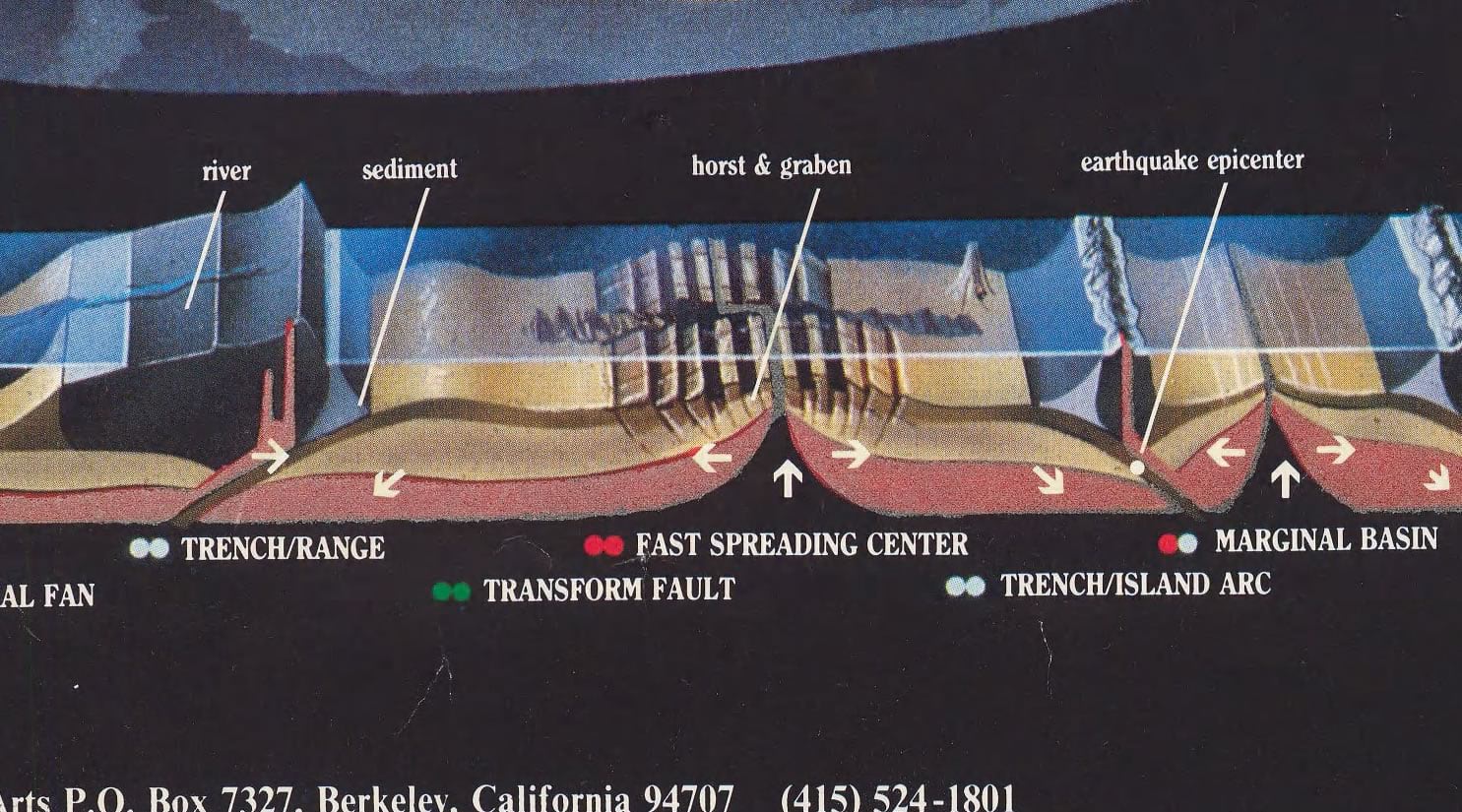
That eye-watering cutaway illustration…
And that title! Look at that extruded reflective metallic title! Waves of nostalgia wash over me, and I’m swept away to 1st grade wearing my Bigfoot 4×4 backpack tearing up in terror and humiliation because I forgot my locker number.
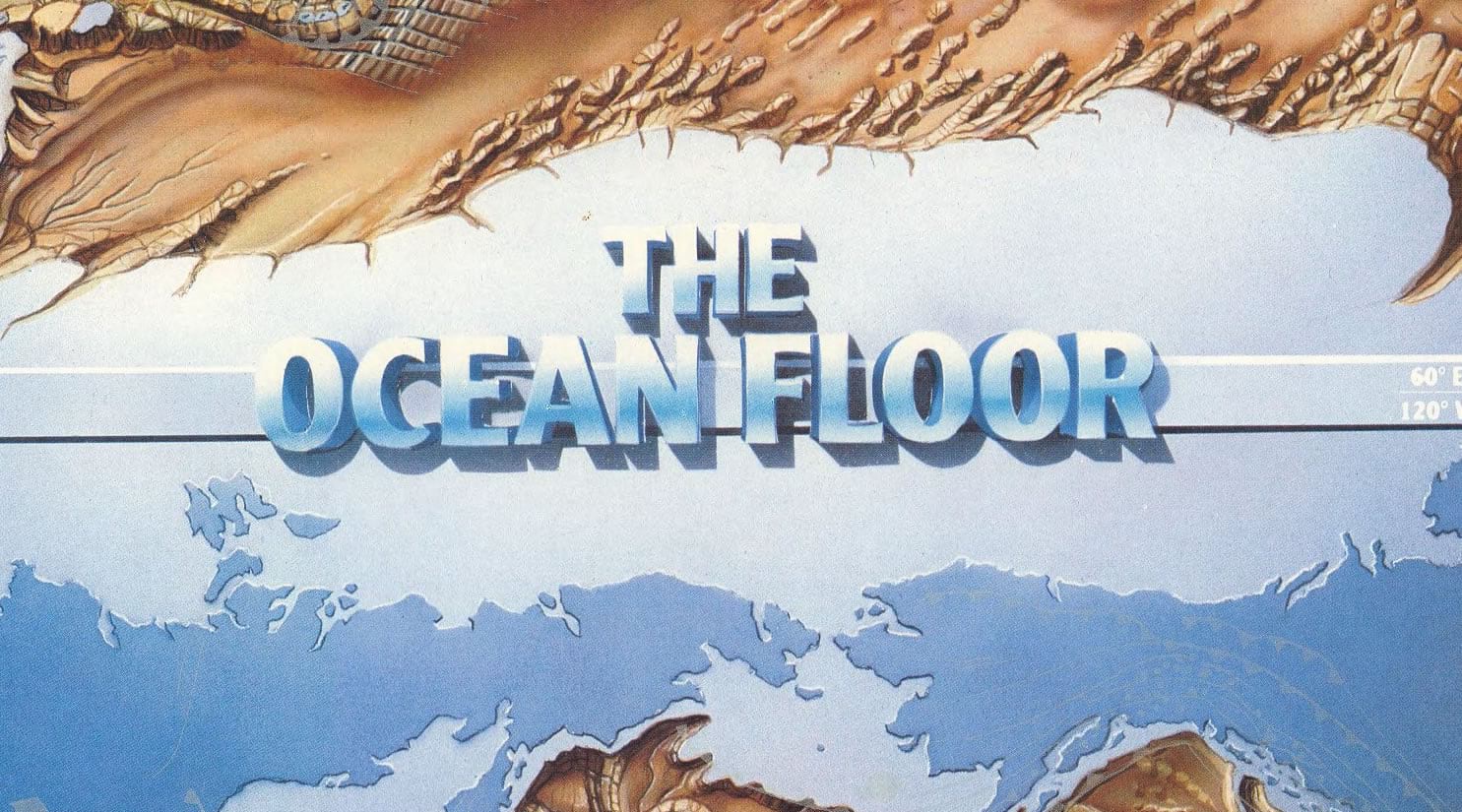
This illustration is the graphical spirit of its age. If I wasn’t told it came from 1985 I very well may have guessed it came from 1985. Glorious.
Part 2: Analog Techniques
I reached out to the map’s maker, Earl C. Bateman III, and, after gushing a bit, asked about his production techniques. He told me the paint work was a combination of masked and airbushed continents and bristle-brushed oceanic seamounts and bathymetry. “The original art was 48×48” on gessoed plywood, reduced to 36×36 and text & overlay added in print mark-up. 100% analog. I can’t imagine doing anything like it non-digitally these days.”
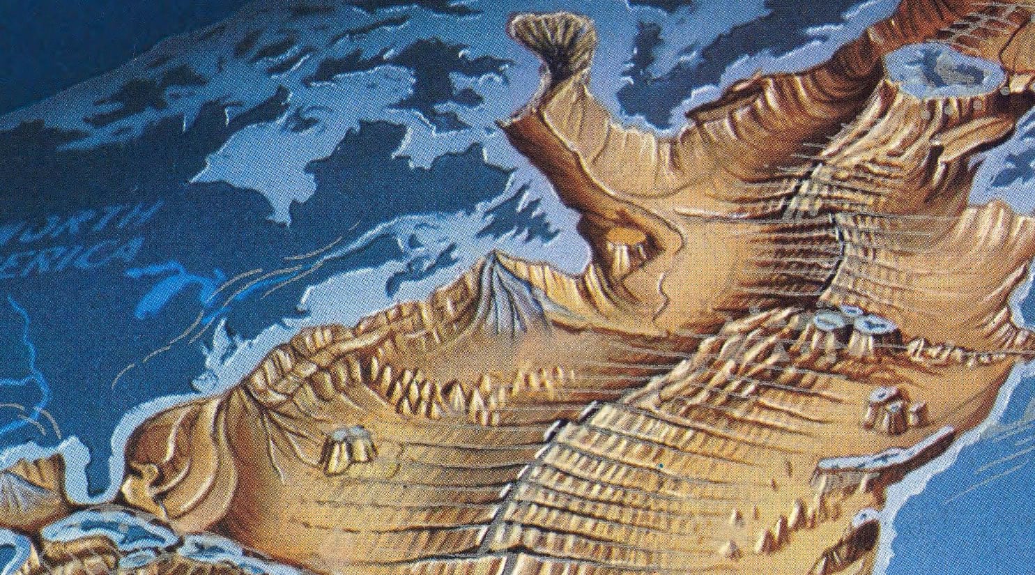
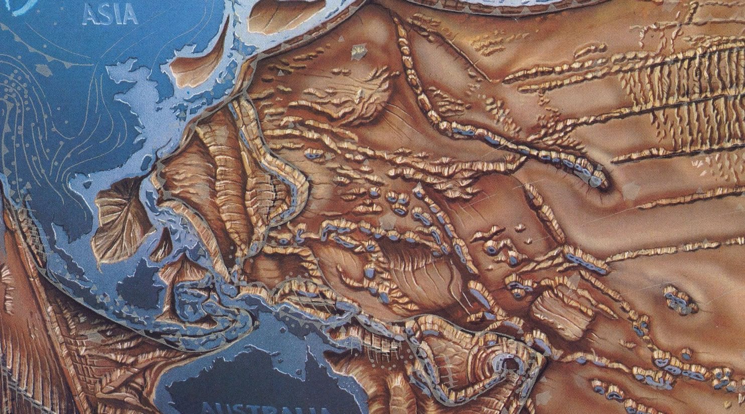
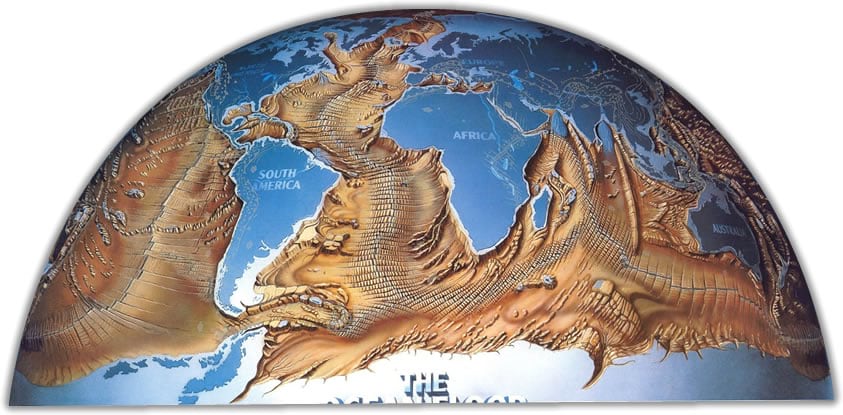
I asked Earl if his reference material was a physical globe (a technique used by Richard Edes Harrison for his handsome Earth-from-space perspectives). I would have assumed as much except that this map has such a curious projection that I doubted the existence of a practical globe out there that Earl could use as a visual model. Take a look. The top quadrant shows an Atlantic-centric perspective and the bottom quadrant shows a Pacific-centric perspective. The entire earth is represented twice on the half of a sphere facing us. A whole earth projected into a spherical quadrant, twice. How bizarre and lovely!
Here’s how Earl did it:
“I needed to show the whole of earth’s oceans on a flat square and these were the days before desktop 3D programs so I got a plastic hemisphere, divided eastern hemisphere from western, added lat & long lines and used the age-old grid transfer method to project the east and west earth on the upper & lower quadrants of the plastic dome, and also for continents and details. As far as I know, I invented the projection (several years later UPS briefly used the upper hemisphere as part of their truck side-logos). At least I hadn’t seen it anywhere else in the 1980s.”
The grid transfer method! An old favorite of mine that my mom (a geography AND art teacher) taught me, right around the era that Earl was painting this masterpiece. He drew a grid over reference material (in this case, I suppose a conventional map of bathymetry as we knew it in 1985) and a grid over a working surface (in this case, a big plastic dome) and you get to work transcribing each little square’s content from the reference picture, to the new surface. And at this point Earl had only done a manual re-projection of the earth onto the quadrant of a sphere for a visual reference —all before the work of actually painting the thing could start.
Part 3: The Workmanship of Certainty
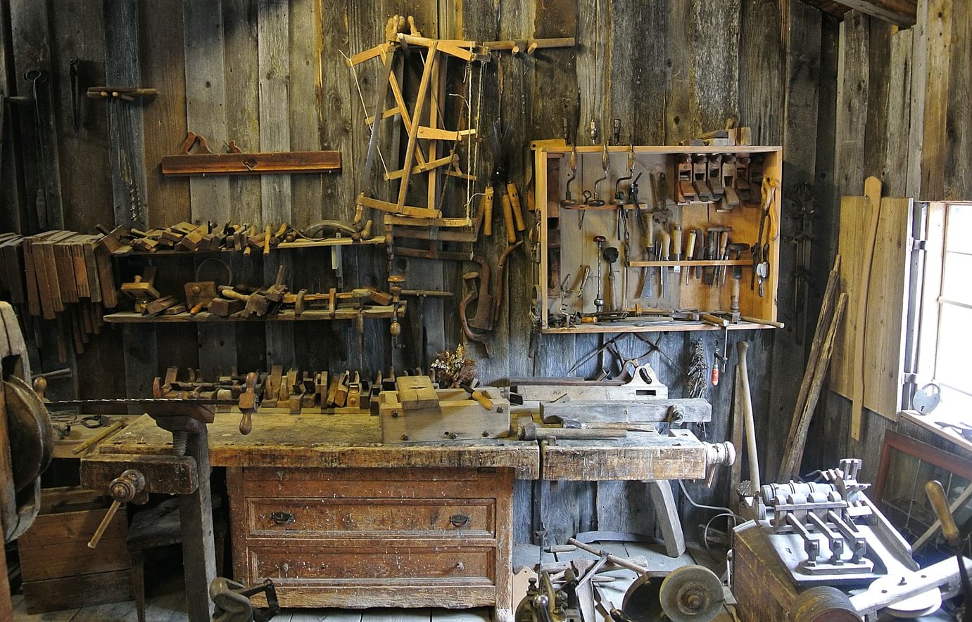
In David Pye‘s book, The Nature and Art of Workmanship, Pye goes into detail about what he calls the workmanship of risk and the workmanship of certainty. In the context of craft (David’s examples are primarily woodworking but they translate to all crafting, including crafting maps), the workmanship of risk might be something like hand cutting pieces of wood with saws and chisels and fashioning them into a chair. The maker has absolute control over the process, but the outcome is quite uncertain. Compare this to someone working in a chair factory whose job it is to feed dimensional wood stock through a series of precise and templated machines. This is the workmanship of certainty. The outcome is nearly guaranteed and consistent, but there is little freedom to deviate from the prescribed outcome.
These are the two polar extremes of approaching the production of a creative endeavor. As is the case for most extremes, the majority of us undertake our making somewhere in the middle. Where would you place yourself along that spectrum?
Part 4: The Workmanship of Risk
“I can’t imagine doing anything like it non-digitally these days.”
I was struck by this comment of Earl’s. It’s a natural enough thing to think, and easy to say, but I kept returning to that statement with some doubt. Sure, Earl’s process was time consuming and naturally tedious, and it required enormous creativity and skill. But Earl could paint whatever he wanted with some paint and imagination. How would he have done this digitally? Would he have been as willing to dream up, and make, such a unique perspective of the Earth? How would this poster look if Earl were conditioned to work within the workmanship of certainty?
I have mixed feelings about where my making falls between these extremes of risk and certainty. We work with powerful tools that are purpose-built for specific practical geographic applications. We feed these tools precise real-world data. This would put map-makers closer to the edge of certainty, no? On the other hand, these purpose-built tools and APIs have so many options for the insertion of creativity and invention along each step, from processing to visual representation, that the number of outcomes from any one starting point can seem nearly infinite. That seems in keeping with the flexibility and freedom of the workmanship of risk.
I think it’s both; both are happening at the same time.
Part 5: A Silly Hack With Real Data and an Honest to Goodness GIS
Hmmmmm. If I were making this map, and I didn’t want to manually transcribe a gridded world map onto a plastic dome, what might I do? Let’s try try to use the workmanship of certainty (real data, coordinate systems) and brew some workmanship of risk (manual editing, misapplied projections) into the process to hack together an approximation of the upper half of Earl’s unique projection. I first checked with resident projection genius, Bojan Šavrič, and he assured me this projection was not already available in the formidable list of options in the projection library. I certainly am no geodesist, so defining the specs to actually recreate this projection was out of the question (and I wasn’t successful in luring Bojan to have a go at it).
Time for shenanigans. I’ll try to force some actual geographic data into the Bateman projection (we’ll call it that, after Earl Bateman) using an actual GIS. We’ll do a quick transcribing—digitally—as Earl implied he wishes he could have done. We’ll just focus on the top half of the globe, the Atlantic view.
I thought about Earl’s physical process of transcribing a flat map onto the plastic dome. It’s a matter of reprojecting a regular grid onto a rounded surface. We have lots of tools and projections for that. My evil plan was to scale global data into a quadrant of the earth in a rectangular projection, then reproject it into an orthographic perspective. Let’s see…
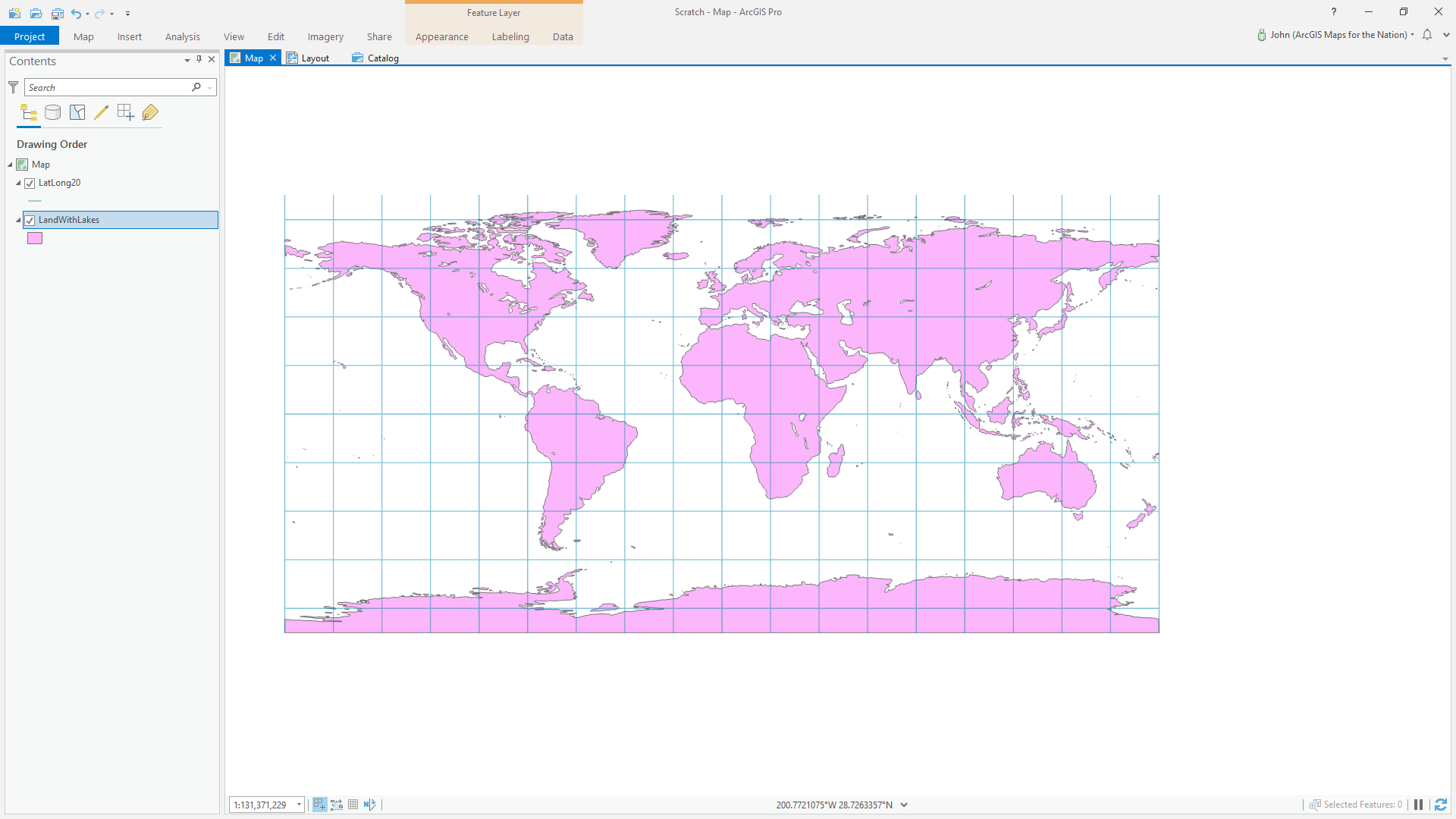
Here is the lovely Moriarty Hand global land polygon layer, in the ubiquitous regular old WGS 84 gridded coordinate system (which, depending on your mood, you can call equidistant cylindrical, plate carrée, equirectangular, or, ironically, unprojected, however that works) in ArcGIS Pro.
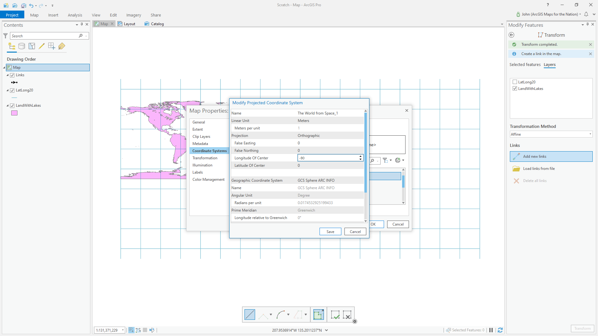
Because the Bateman projection depicts an entire earth within one quadrant of a sphere, I edited the reference data (a vector representation of earth’s continents, but it could be anything), by manually transforming it to fit within one quadrant of the grid. Easily done using the transform tool.
Did I get the manual resizing right in the first pass? No way! This is the workmanship of risk. You see how it looks and then iterate.
Then I changed my map’s projection to orthographic: the trusty old World from Space. I modified the center view to be 0° latitude (the Equator) and -90° (right in the center of the western hemisphere).
Which (high five, map friends!), looks a lot like the Bateman projection! And looks like is good enough for today, because we are just trying to come up with a way of creating a visual reference.
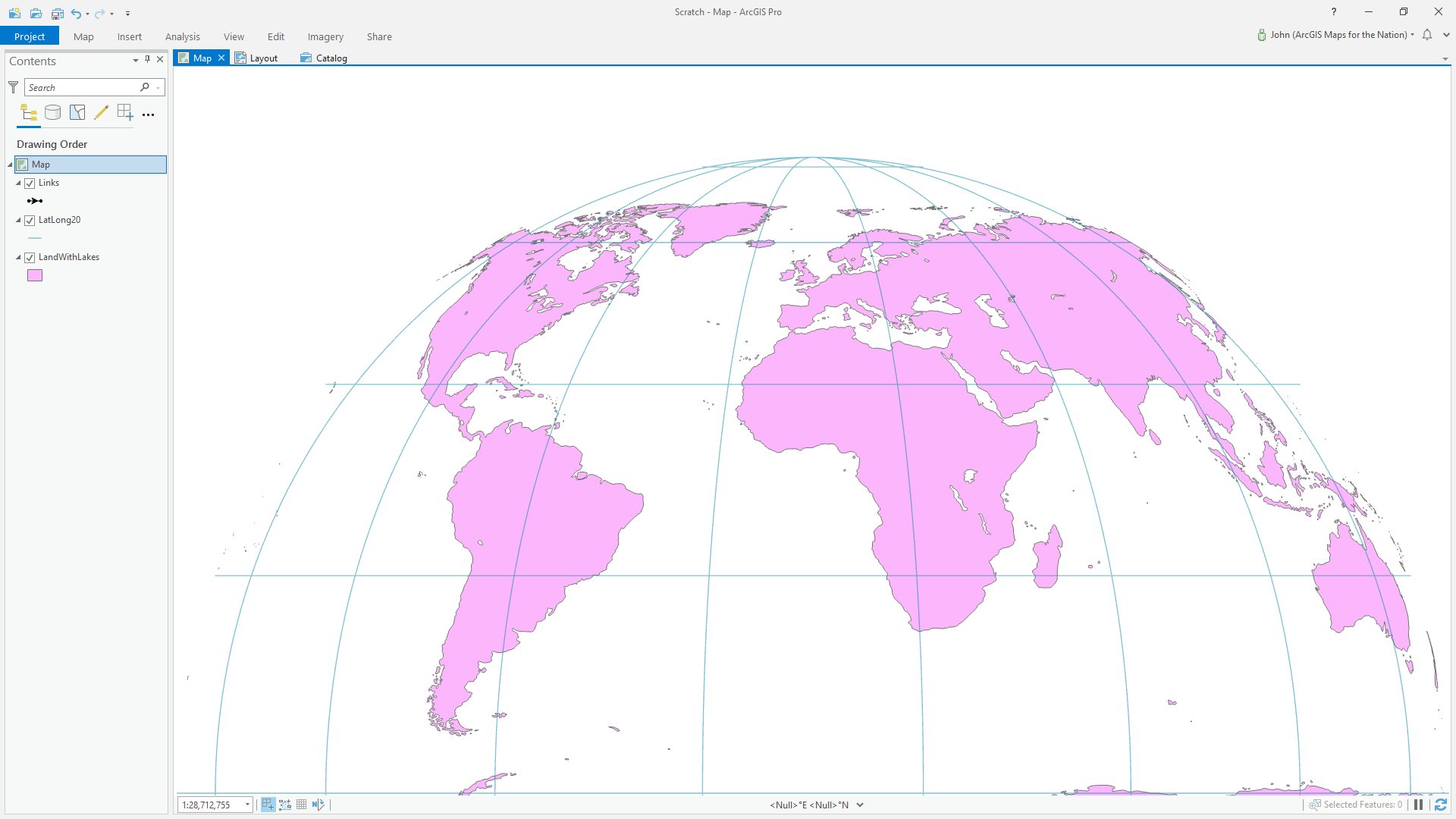
A Bateman projection looking thing!
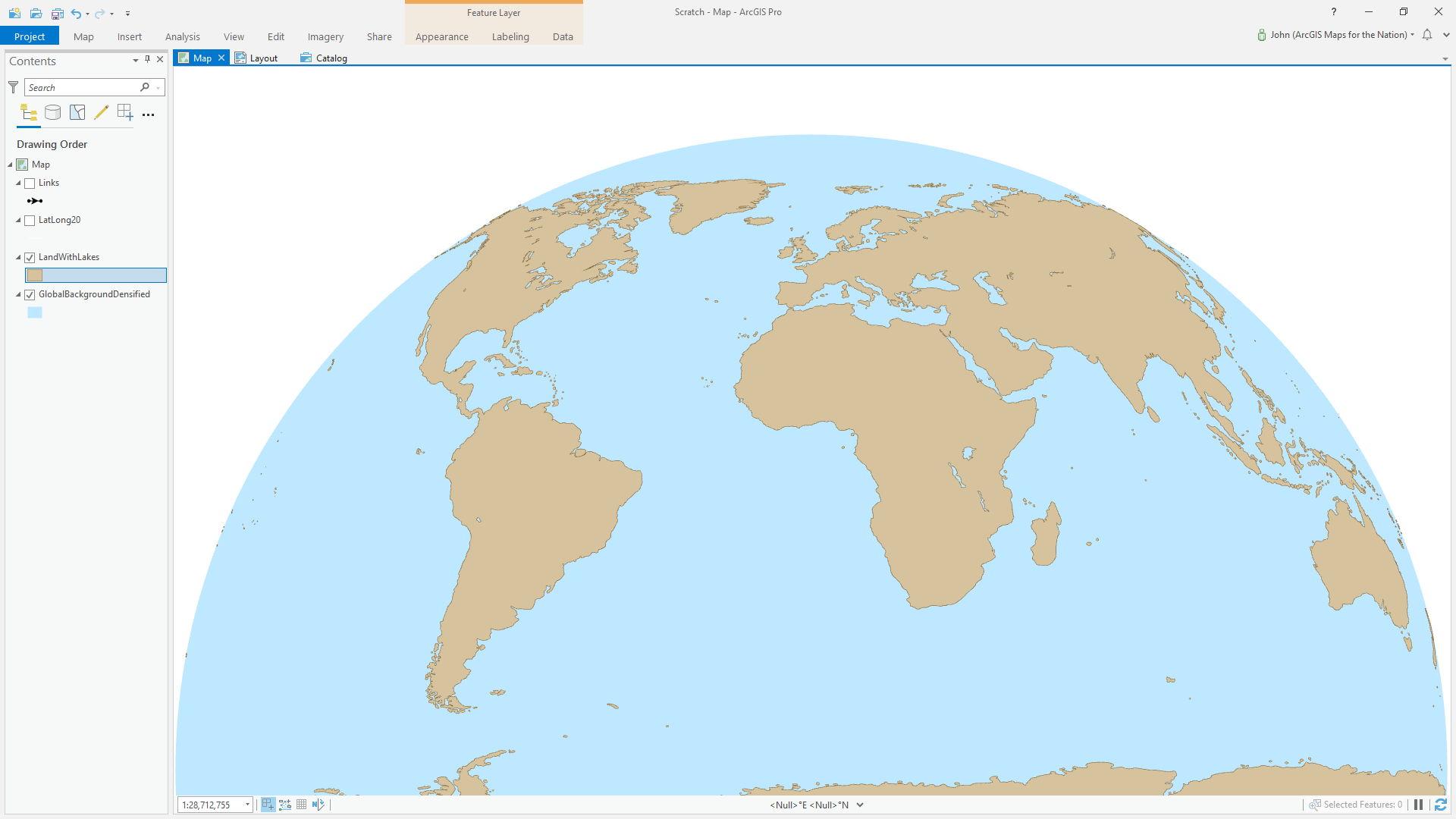
Ok, that’s enough for now. Certainly this isn’t the path to take if we really wanted to produce a fully digital version of Earl’s achingly beautiful The Ocean Floor. To do that we would really want to beg Bojan Šavrič to actually lay down the mathematical parameters and create an actual projection. But it serves as an exercise in taking a physical process like taping off a grid, transcribing it to a plastic dome, and using it as a one-off baseline reference from which to begin painting a masterpiece. “In the digital environment.”
I want to thank Earl Bateman for the inspiration inherent in his creation, still drawing in minds and prompting questions about the undersea world these 35 years later. And for his kind permission to share his map here and tinker at its structure in the digital environment. If you are interested in seeing, and being inspired by, more of the bounty of cartography’s rich past, then you could do worse then to lose yourself within the rapturous domain of the David Rumsey map collection. If you are interested in ways of representing the world’s oceans in a single nontraditional perspective, then you might also enjoy the Spilhaus map (which is a living digital projection into which you can pour your oceanic data and ideas). And if you are a serious nautical nut and want to explore the maps and materials available to construct your own cartographic expeditions, definitely check out Living Atlas.
Love, John

Article Discussion: