See what I did? Mashing up the title of a song by The Waterboys with the classic Police hit is a metaphor for the map mashup of the moon I recently created. Our moon is the fifth largest planetary satellite in our solar system and is the only astronomical body that orbits Earth. And I wanted to make a map of it to celebrate the 50th anniversary of the Apollo 11 moon landings, which took place on 20th July 1969. Given that I also turned 50 this year (and so did Esri) it seemed a fitting convergence of events. Any excuse to make a map right? But you’ve still got to make the right map, and make it right.
In this blog I’ll share some of the decisions that I made in creating my map of the moon, and also outline some of the technical considerations that drove certain decisions. All maps are compromises and I’ll share what I had to decide as I embarked upon my mission. You may want to have a go at making one yourself, or build a map of a different planetary object (or space station?). These tips should stand you in good-stead.
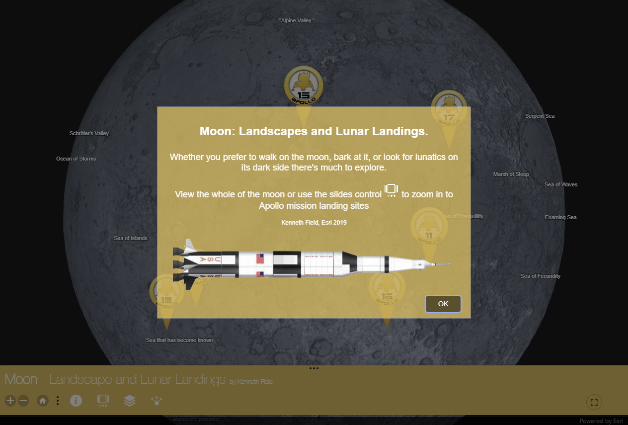
But first, let’s take a look at the finished app. You can go and explore, and when you return we’ll dissect it (launch here if you want to see it in a separate window)
The mission
Every mission needs a plan so the first thing to establish is what the map is going to do. What’s its purpose for existing? Paper or digital? Flat or round? Single or multiscale? Plenty of people have made maps of the whole of the moon, or parts of it throughout history, so what’s to be achieved by a new map?
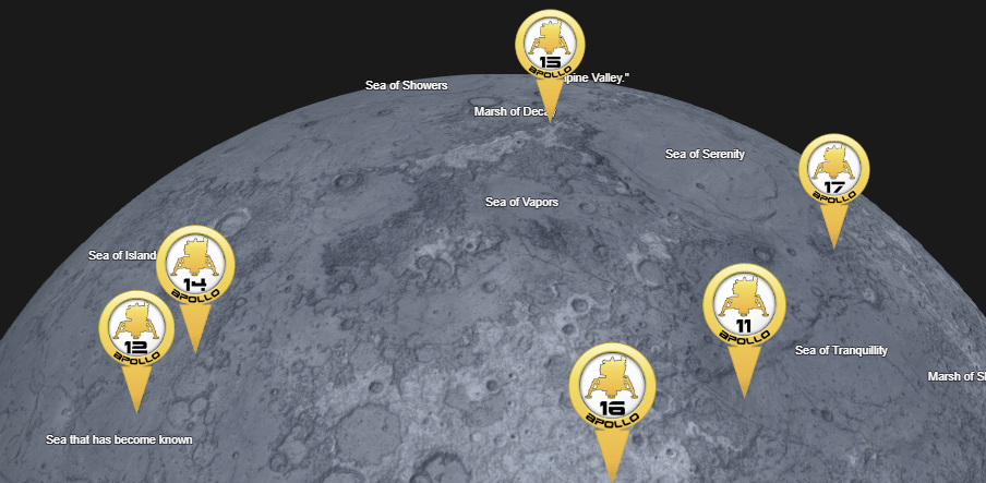
Well part of what I wanted to create was a single map that allowed people (anyone with a broad interest) to explore the moon and its landscape. But I also wanted it to provide a focus on the Apollo missions to tie it to the 50th anniversary of Apollo 11. A paper map with 6 large-scale insets? Or a digital multiscale version? The latter. I can publish the map to more people by creating a web-deliverable app. Should it be 2D? or 3D? Well, again, many people have made planimetric maps of the moon so let’s be different. Different is good. Let’s go 3D and make this map a virtual globe. People like spinny globes.
The data
Every map needs data. Fortunately the moon is well served by NASA who host or supply a wealth of different datasets that form the basis of the map. The basic data requirements are a Digital Elevation model. From this I can derive all sorts of other representations. The Planetary Data System is a great entry resource for moon data (and for other planets and satellites). The Lunar Reconnaissance Orbiter Camera (LROC) web site also provides detailed and high-resolution data for many parts of the moon, including the Apollo mission landing sites.
It’s easy to wrap a DEM around a globe but if the map is to provide interest then it also needs contextual information too, like names of features, details of the Apollo missions, and perhaps embedded objects and other media. The Apollo Lunar Surface Journal is a treasure trove of detail for the Apollo missions. And when I say detail, I mean detail. It’s a rabbit warren of all things related to each mission including maps, photographs, transcripts. Additional contextual data and information was obtained from the Lunar and Planetary Institute and the IAU Gazetteer of Planetary Nomenclature. So you end up with a basic data dump of many points of information, from multiple sources across a single DEM. Let’s get mapping!
Mapping the whole of the moon
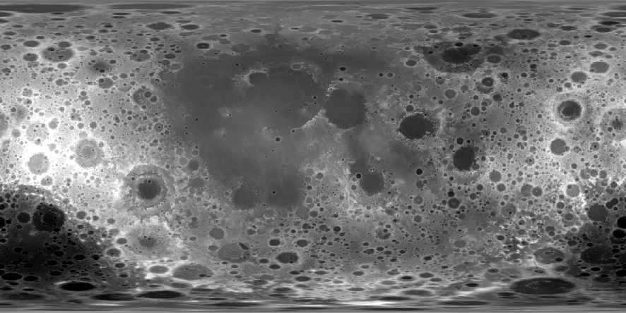
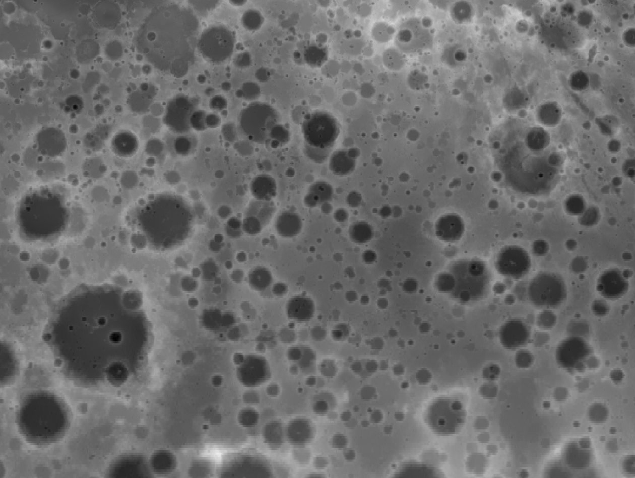
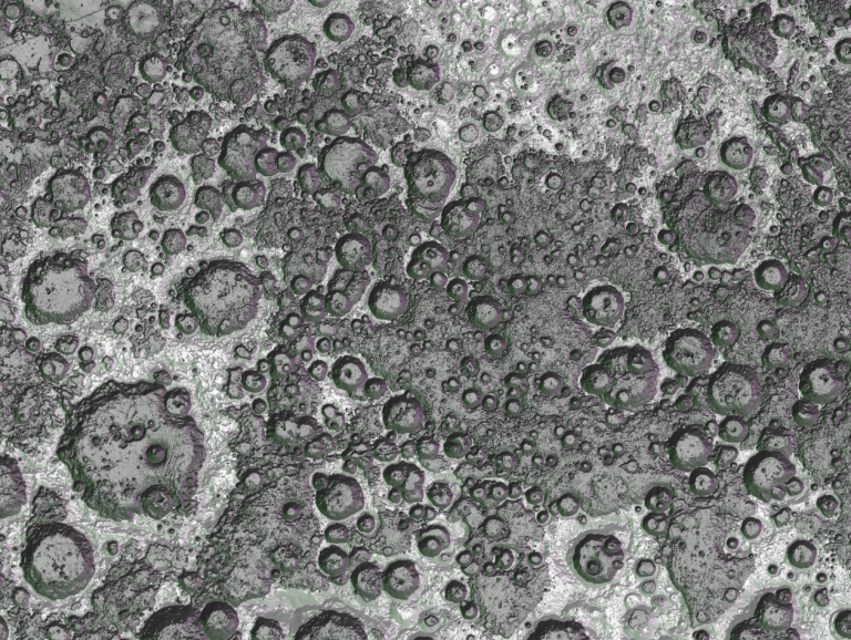
At a small scale (zoomed out) you don’t need a particularly high-resolution dataset, which is good news as the best complete DEM for the moon is 118m resolution. Each pixel covers nearly 14,000sq metres. But how do you represent a surface that most of us have never seen, and photographs seem to indicate is just a grey, dusty, rocky monotony? Many maps you see of the moon just fall back on showing the raw greyscale DEM. After all, it’s grey right? Lighter grey for higher elevations, darker for lower.
But we can do better. A lot better. And I don’t mean using a rainbow colour scheme either.
To make it a little more interesting I used the DEM as input to create a sky modelled hillshade which combines multiple individual hillshades, each with different azimuth and zenith settings using the sky model tool in the Terrain Tools we released a few years ago. (sidenote – Terrain Tools been downloaded more than 20,00 times at the time of writing – thanks!). In this way you can create far more interesting lighting effects across the terrain. It brings detail and nuance to the hillshade. I also didn’t want to use a single directional hllshade because on a globe that can be rotated this may cause people to see relief as inverted when viewed from certain angles. So you end up with something far more interesting.
But we can still do better. We can add a little colour (no, still no rainbows)
The surface is mostly grey but let’s introduce a little subtle colour. By calculating an aspect surface from the DEM, then recoding it and using subtle blues, greens and purples to represent different aspects you get an abstract landscape. By using a pan-sharpening raster function to combine the hillshade and the aspect layer you can introduce just a subtle hint of colour, making the moon a little bluer and with shifting colours dancing across the surface.
Even in planimetric form we’ve introduced some real depth to the view of the surface. But this is going on a globe. And on any globe the relatively small vertical distance among features ends up looking pretty flat.
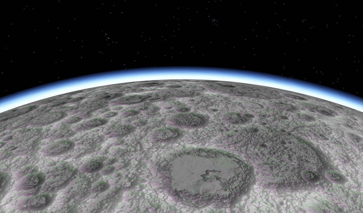
But the real trick to making the surface of the moon more interesting is in draping the colourized hillshade across an exaggerated elevation surface. That’s easy in ArcGIS Pro as you just set the vertical exaggeration on your elevation service and the globe comes to life in a scene.
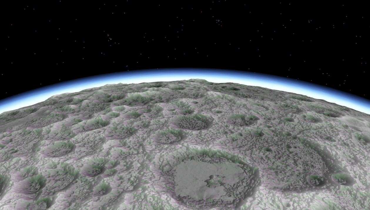
I went with a vertical exaggeration of x4 which seemed to work well. Too little and you’re not adding anything meaningful. Too much and you stretch the limits of credibility.
It’s all well and good having this great spinny moon globe on my hard drive in my office. I can invite people in to marvel at its spinniness. But remember, this is to be published as a web map and getting this to work in an ArcGIS web scene requires a little trickery.
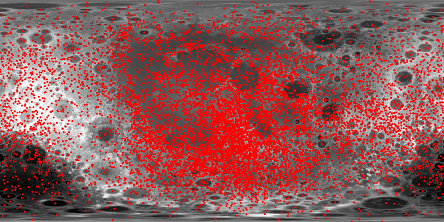
First, the moon’s diameter is approximately a quarter of that of Earth with a surface area of only 7% of that of Earth. None of this is a problem in ArcGIS Pro as the projection engine has a specific moon coordinate system. ArcGIS Online does not. To overcome this, all of the raster data I used in the project was re-projected to Web Mercator. This has the effect of stretching each pixel across a larger surface area when it’s stretched over an Earth sized globe in ArcGIS Online. Once re-projected, publishing the colourized hillshade as a tile service from a small planetary scale of 1:591 million to its largest scale of 1:1million gave me a 19Gb hosted tile service. Because of the resolution of the underlying DEM it’s just not possible to publish it at any larger scales.
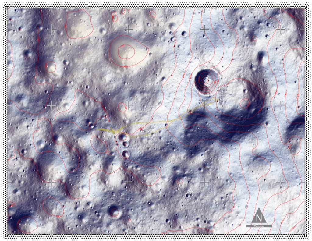
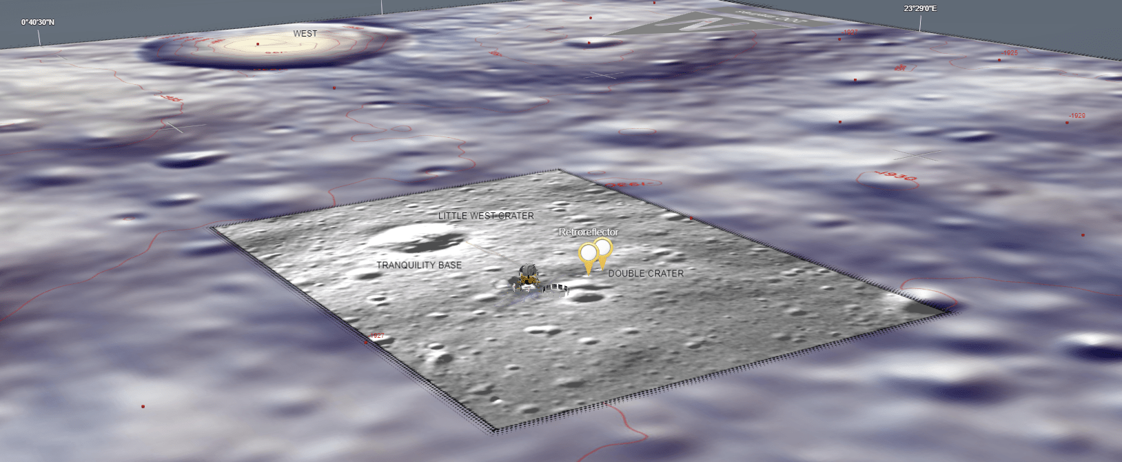
I used a dataset of craters, which included the latitude and longitude of the centre of the crater plus its diameter to create crater sized buffers. As this too had to be scaled to an Earth sized globe in ArcGIS Online, I had to scale up the buffer distance accordingly to get the craters to sit in their correct position. A semi-transparent disk hints at a clickable object. Crater names are billboarded and popups provide details of the crater and its naming.
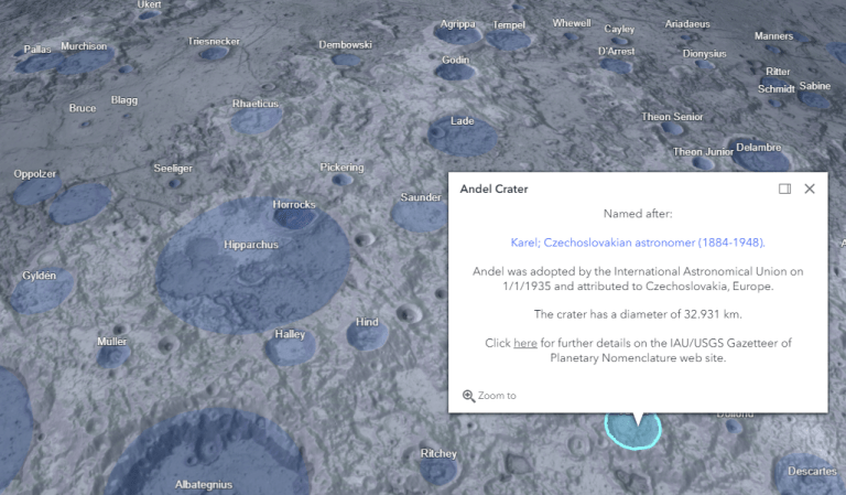
A point dataset of labels for landscapes was also used to create some labels for major landform features. Once published as scene layers, these layers can then be switched on and off as the map reader requires. Six point symbols, symbolized using billboarded PNG marker symbols locate the Apollo landing sites and are used as popups for core mission detail. These datasets give context at small scales.
Putting footsteps on the moon
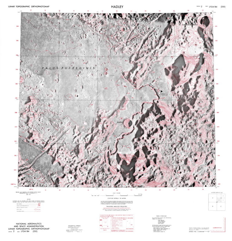
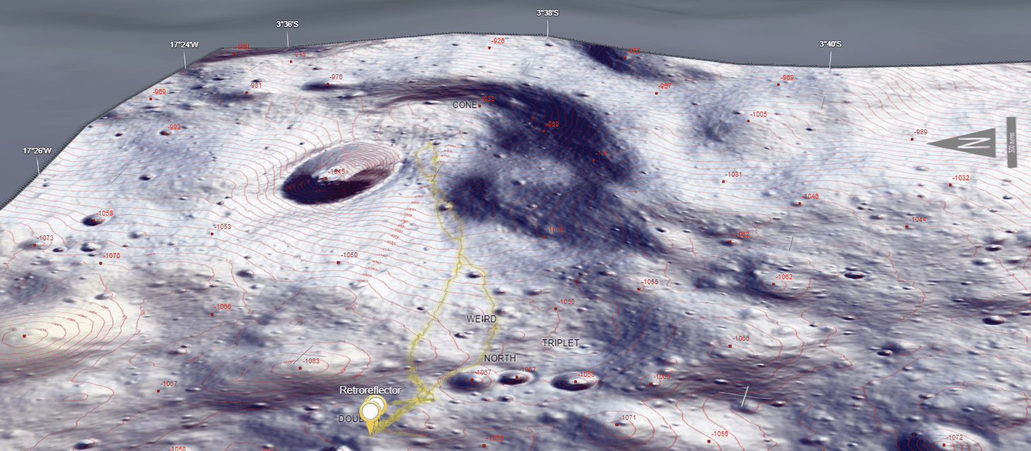
At larger scales things get interesting. I couldn’t use the whole moon DEM for landing sites because its resolution is too coarse. Apollo 11, in particular, has a landing area about the size of a football field. Landing sites got a little larger as the missions progressed (partly because they eventually used a lunar rover to get around) but I still needed hi-resolution data, or something to use as a suitable alternative. I tried to source original NASA maps with the idea that I could just drape them in place. But they were hugely inconsistent because they improved them with each mission as their knowledge and data improved (makes sense), and I wanted consistency. But the orthophotomaps of later Apollo missions are beautiful so I used their general design as my inspiration.
So, back to finding data. The LROC has 2m resolution data for the landing sites (sometimes 1m) which was perfect. It needed clipping to a manageable areal extent but that was no trouble.
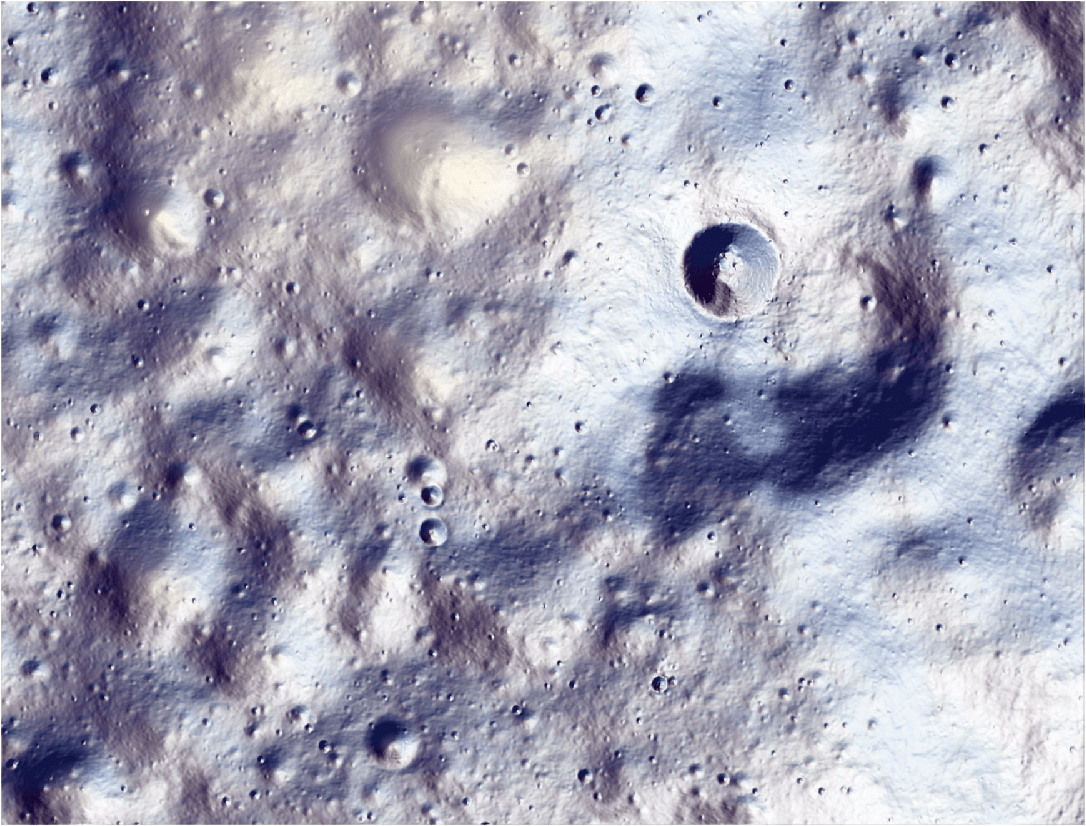
I ended up creating three hillshades for each landing site, using a zenith of 270°, 315°, and 360°. Each was symbolized with 80% transparency and with a colour ramp that extended from fully transparent to a hint of blue, red, or purple. I used a modified version of this excellent tutorial by my colleague John Nelson (but don’t tell him!). This gave the effect of a hint of colour on the most sunlit slopes. The hillshades were sandwiched between two copies of the DEM. The bottom one in the stack is shown in the default greyscale. The top one is symbolzed using a colour ramp from fully transparent at higher elevations to a light beige for lower elevations to add some variation in atmosphere across each landing sites base map. Here’s the Apollo 14 landing site.
But designing an evocative terrain for each landing site didn’t go far enough for me. I wanted a map. Almost a planimetric map that would drape on the globe. So I set about making a fully fledged map for each landing site. This wasn’t as simple as it sounds because the areal extent of each site was very different, which required different considerations for what to show and how to symbolize at different scales. Six different maps, but which all shared a consistent look and feel.
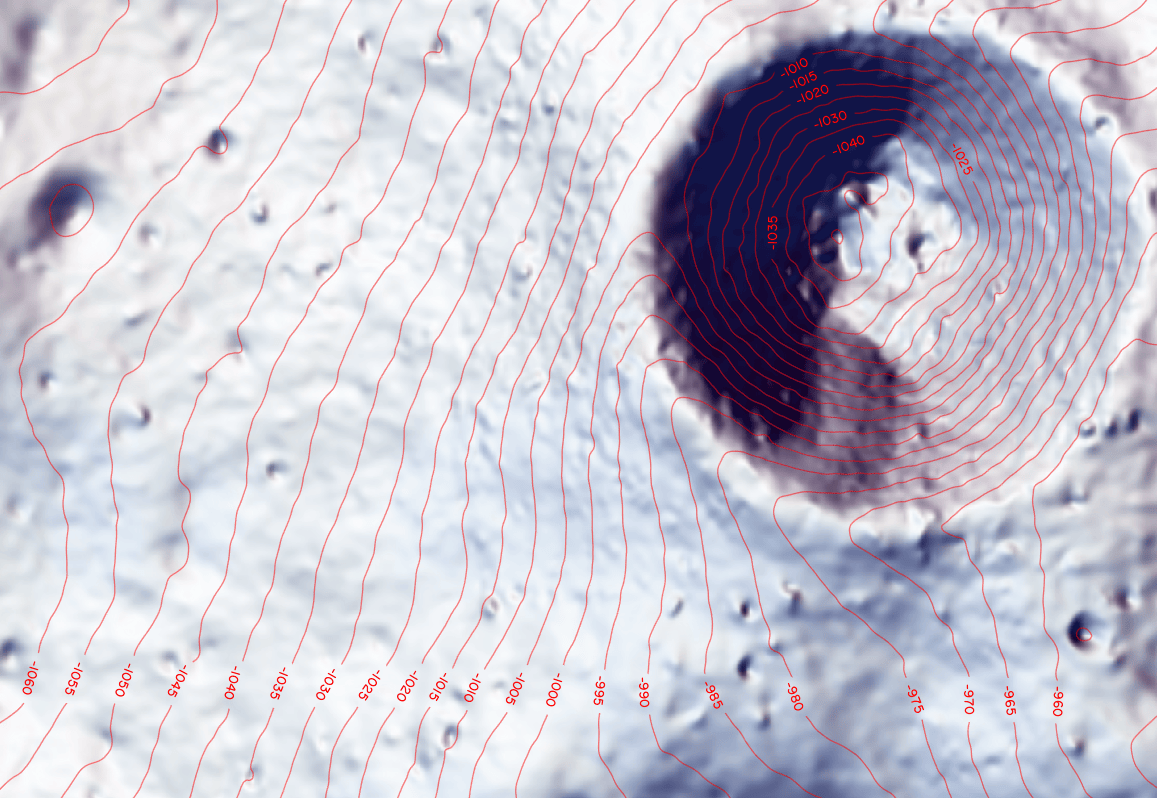
I created contours, using a smoothed version of the landing site DEM to get a good, smooth contour. For the larger landing sites I created contours at different intervals so as you zoom in, you see more detailed contours. Contour labels were dynamically placed, then converted to annotation. Feature Outline Masks were used to create a convex hull around each annotation component and these were used to mask the contour lines, enabling the contour labels to be seen and not conflict with the linework. I chose red for the contour lines and labels to riff off the NASA orthophotomap aesthetic. Labels are placed downhill, and not aligned to the ‘page’ because the globe is interactive and can be rotated at will. Downhill oriented labels made more sense.
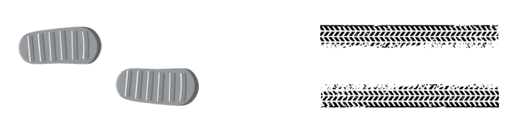
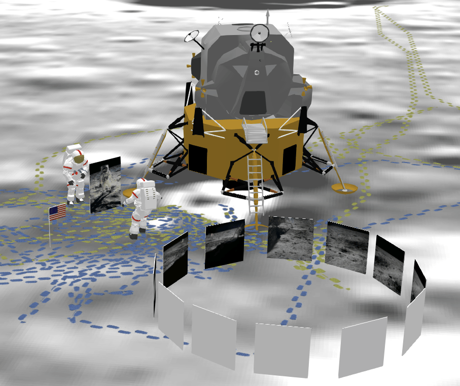
A key component of each landing site map is the activity of the astronauts, and rover. Again, the data exists but why use a boring line when you can design a moonboot footprint and use it as a marker symbol, or even a lunar rover tyre tread, again used as a marker symbol along the line – to scale! For each landing site map, two copies of the extravehicular activity data are used. One has several layers of semi-transparent yellow buffer effects applied. This allows the general pattern of movement to be seen when zoomed out. As you zoom in, the second layer with the footprints, or tyre treads, come into view.
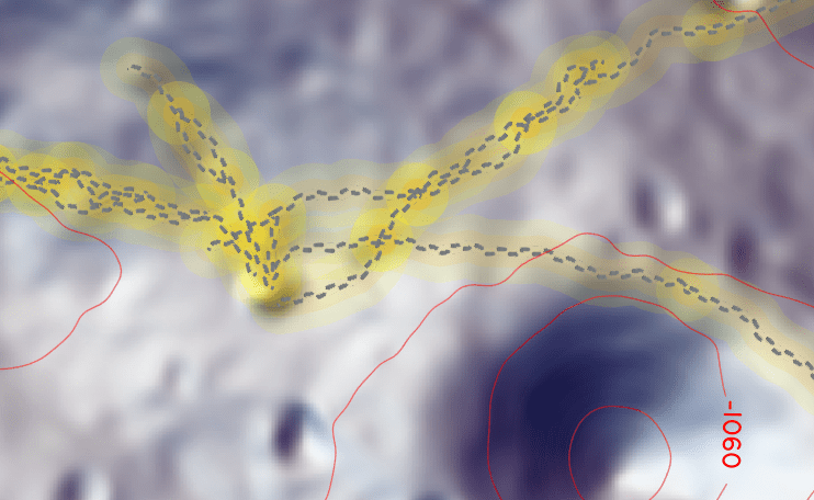
You can also see how the background is degrading as you zoom in. Even at 2m resolution things start getting a bit blurry. So there’s a balance to maintain. Yes, I designed a moonboot with a tread and a tyre with a tread but seriously, allowing people to zoom in to an individual footprint at the expense of the rest of the map goes beyond even my attempt at attention to detail. Here they are if you’re interested.
The maps are finished with some gridline ticks for latitude and longitude, a north arrow and scale bar. These all help orient the map reader when zoomed in to a very large scale. I added a border to each map as a halftone vignette, to allow it to have a slightly softer feathered effect in relation to the underlying globe DEMs. The landing site maps are published as a hosted tile service with all the components baked in.
Additionally, spot heights, labels and latitude/longitude labels were all published as point web scene layers. These labels have a visibility range setting applied so as you zoom out they disappear and declutter the landing site map. And when draped across the globe’s surface you get a hint of the undulations from the elevation surface.
Even more detail
At each of the landing site maps there’s some billboarded marker symbols for various items of equipment, revealed in a popup. The Apollo 11 landing site map goes one better by using an orthophoto for the largest scale because DTM resolution simply isn’t good enough.
3D models are placed in position for key elements: the Lunar Lander, Neil Armstrong and Buzz Aldrin, positioned where Armstrong took the famous photograph of Aldrin as he was reflected in the visor. The American flag is in position and I’ve also included a few billboarded original NASA photographs. Each of the models and photographs can be clicked to reveal detail in a popup. There’s even an orbiting lunar command module – in its correct orbit of course.
You know, the moon also has a dark side, it’s on the far side. See if you can find it!
The final m-app
Well, it’s a globe really, and one that shows the whole of the moon in one view and allows you to zoom in to almost footprint scale for the Apollo landing sites. The map was built as a web scene in ArcGIS Online. It’s a combination of hosted tile layers, an exaggerated elevation service and web scene layers. Many of the layers are hidden from view inside grouped layers. The map reader doesn’t need to know that information. Putting it all together means trying to organize and simplify the viewing experience to make it optimum so a lot of the messy work is hidden from view. In fact, there doesn’t even need to be a legend, so there isn’t one.
The web scene is published using the Web Appbuilder which is one of my go-to resources for preparing finished m-app experiences whether flat, global or local scene. A pithy title, welcoming splash screen, a few simple controls added to a simple title bar, a decluttered viewing experience, some bookmarked slides to lead the reader to key locations, a shortened url to share, some references to songs that reference the moon, and it’s good to go. Click on the image below to launch the m-app or go to https://esriurl.com/moon
Happy mapping!
Ken

Commenting is not enabled for this article.