Challenges of Rapid Urbanization in the United States
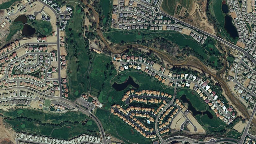
The United States is experiencing significant growth in urban areas. There are challenges of rapid urbanization that include traffic congestion, strained infrastructure, housing affordability, water availability, and loss of green space. Among the states experiencing this growth are Texas, Idaho, Florida, and Arizona. Queen Creek, a suburb in Maricopa County, Arizona, experienced a growth rate of 8.9% from 2020 to 2021. This made Queen Creek the third-fastest-growing city in the nation. Cities in Maricopa County, including Queen Creek, are contributing to some of the fastest growth rates in the country. We will use ArcGIS to analyze data from multiple sources and identify and address the challenges of urban growth in Queen Creek and surrounding areas.

Demographic Data and Imagery Working Together
ArcGIS is uniquely positioned to address the challenges of rapid urbanization in Queen Creek and other cities. Its access to thousands of demographic variables through ArcGIS Business Analyst, robust imagery platform, supported by timely data from our partners provide a comprehensive solution for organizations seeking to manage growth-related issues.
One particularly valuable source of imagery is Planet, an Esri partner that provides daily satellite imagery of the Earth’s surface. By integrating Planet’s data into ArcGIS, we gain a valuable tool for monitoring changes in urban growth. We can run change detection to find hotspots of change in the study area. We can also quantify the amount of vegetation or “greenness” in a neighborhood relative to the rest of the Phoenix area
Now that we’ve discussed the challenges of rapid urbanization and the potential of ArcGIS to help address them, let’s dive into our specific project analyzing Queen Creek. In this project, we used data from Planet Scope from 2017 and 2022 to analyze changes in urban growth in the Phoenix area. The data are 4 band, 3 meter resolution and were acquired from Planet’s web app Planet Explorer.
Quantifying Urban Change with Zonal Statistics
Bringing the imagery into ArcGIS Pro allows us to take advantage of robust imagery analysis tools that work alongside more traditional GIS workflows. We added the rasters from both years to two mosaic datasets to consistently apply my analysis across to all rasters for each year. For our purposes, we can use the change detection wizard to create a raster output that demonstrates areas with the most change in red. This is useful for understanding where change has taken place, however we can gain further understanding by aggregating change to the parcel level with the zonal statistics geoprocessing tool. This tool will take summary statistics (in this case the mean) and apply it to all pixels in a bin. Now change is very evidently seen from parcel to parcel and we can see very apparent changes when we display the reddest areas like this housing tract.


Change can also be aggregated into a hexgrid to show areas of change with consistent area but we will get back to that later.
Measuring Greenness
In addition to providing valuable data for monitoring changes in urban growth, Planet’s 4 band imagery also allows us to measure the amount of vegetation in an area. This is important because the presence of vegetation in a neighborhood has many proven health benefits. For example, it can lead to cleaner air, which can reduce the risk of respiratory problems. Additionally, studies have shown that access to green spaces can have psychological benefits, such as reducing the risk of anxiety and depression. Lack of green space can be one of the challenges of rapid urbanization. Concentration of vegetation is also particularly important in an arid region like this because it contributes to water consumption.
To further analyze the amount of vegetation in different areas, we used a raster function within ArcGIS Pro to perform NDVI analysis on the 2022 dataset. This allowed us to identify the greenest places within the study area.

If you want to learn more about raster functions, you can check out this overview of them. To get a more complete picture of urban growth patterns, we needed to use the NDVI raster alongside our change detection data. To do this, we aggregated the NDVI data to a hexgrid by adding the mean pixel value to each hexagon. However, we were careful to exclude hexagons that covered farms from the study, as this would skew the results in favor of agricultural areas. Once the results were added as values in each hexagon, we performed a field calculation to place the results on an index from 0-200. This allowed me to compare all hexagons in the study area equally. Consequently, it is easy to see where the greenest parts of the study area are on this map.

Combining Demographic Data and Imagery with Business Analyst
After analyzing the NDVI raster and change detection data, we enriched the hexgrid with demographic data. Business Analyst provides access to thousands of variables including demographics, consumer spending, and psychographics. For this analysis, we focused on population density, median household income, and child population. Additionally, Business Analyst can perform proximity analysis using point features such as parks and schools was performed using Business Analyst’s proximity functionality.
We could incorporate valuable point of interest data for suitability analysis by adding walking time in minutes to parks and schools from each hexagon. Point of interest data comes included as a part of Business Analyst. Grocery stores and gas stations might make good candidates for other proximity analysis. With all these data in place, we could then perform a suitability analysis to better understand the patterns and relationships between urban growth and demographics in the study area. We will showcase 3 scenarios using the suitability model with our complete dataset.
A Business Analyst suitability model allows us to identify locations that best meet our criteria by weighing numerical variables against. Now let’s take a closer look at three different scenarios that use the suitability model with our complete dataset. These scenarios are meant to help address some but not all of the challenges of rapid urbanization.
Scenario 1: Green Space
We want to make sure that greenness is spread across the study area and that areas with low access to vegetation and parks are addressed. Luckily, the suitability model lets us find areas that are both a far walking distance to parks and have a low greenness index. Therefore, we weighed both walking time to parks and greenness equally which shows areas that have a very low amount of vegetation in red.


Scenario 2: Candidate Locations for Development Projects
We want to find areas that are good candidates for future development projects that prioritize pedestrian accessibility. So, we can add population density, low household income, short walking time to parks and schools and a low amount of change to the suitability model. When weighed equally we get this result.

Scenario 3: Candidate Locations for New Schools
In one more scenario we can find candidate locations for schools. A changing urban landscape and more people in one place can means a need for new closer schools. Hence, we can add high walk time to schools, high child population and high percent change as our criteria to get a result like this.

Analyzing Urban Growth through Simple Web Apps
We have now seen how a GIS professional can bring these datasets together to perform this analysis but the beauty of ArcGIS is that it allows us to democratize web apps.
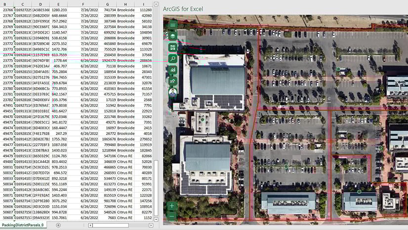
To tie everything together into a simple and beautiful web app, we used Experience Builder. Within the app, we incorporated several key functionalities. For example, an analyst could search the map for areas of high change and view key variables related to urban growth. Additionally, Experience Builder includes a Business Analyst widget that generates customizable infographics. We created a custom infographic that measures the effects of urban growth in Business Analyst web app. Next, we included the two imagery derived variables we created earlier as well as information on housing, income and commuting. We can click an area that has experienced a high percentage of change on the map to create a 15 minute walk time buffer and gain key insights about it from our infographic.

. This infographic can highlight variables that impact challenges of rapid urbanization. Click the image to view full size.")
This infographic provides a quick and easy overview of demographics within a customizable buffer around a point. By combining our imagery and demographic analyses, we gained valuable insights into patterns of urban growth and challenges of rapid urbanization.
ArcGIS allows users from beginner to advanced to combine datasets from multiple sources like imagery and demographics to gain key insights about the impacts of urban growth and change.
Steps in Summary:
- Import 4 band Planet imagery from two different years and create mosaic datasets.
- Perform change detection.
- Run NDVI and create a vegetation index on the most recent imagery.
- Run zonal statistics through a hexgrid and parcels to compare with demographic variables.
- Enrich hexgrid with imagery derived variables on change and greenness as well as Business Analyst demographic variables.
- Perform suitability analysis with Business Analyst for your given scenario.
- Create a custom Experience Builder app with a custom infographic to allow for others to view and analyze the impacts of urban growth.


Commenting is not enabled for this article.