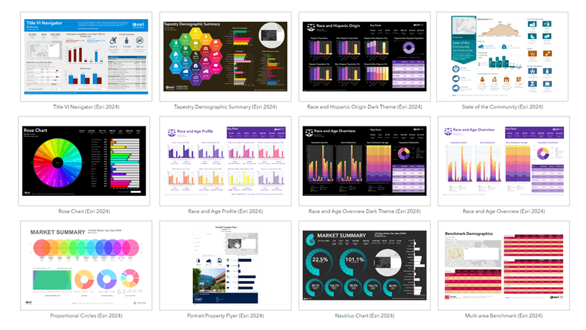
The Business Analyst team is always working to add new infographics. Some are added to the standard offering of infographics, but more can be found in the infographic gallery, accessible only by ArcGIS Business Analyst Web App Advanced licensed users. A new Environmental preferences infographic template is part of the infographic gallery, per the June 2023 release. This presentation-ready infographic includes psychographic data, which is based on a person’s lifestyle, values, and beliefs. Psychographic data can answer questions about a person’s preferences, habits, and decisions. For instance, would you buy eco-friendly products if they were cheaper? Do you consider the environmental record of a company to be important when you are buying products? These questions are important for businesses to understand their clientele, for nonprofits to better engage their supporters, or even for local governments to make informed decisions on green investments.

What’s in the infographic
The Environmental preferences infographic features expected environmental attitudes and behaviors from Esri’s Market Potential dataset, including MRI-Simmons, with supporting information from Esri Tapestry Segmentation, Esri Demographics, and the U.S. Census Bureau’s American Community Survey. All the data used can be found in the data browser, which is an in-app interface that displays variables for analysis.
The left column of the infographic includes a street view map, data visualizations of how people feel about climate change, and how many people use eco-friendly transportation to work.
Hovering over any pie slice of the Eco-friendly transportation to work chart will allow you to see all forms of transportation including a detailed breakdown of public transportation.

The center of the infographic includes prevalent environmentally conscious Tapestry Segmentation groups, key facts about the population, and eco-friendly trends. Clicking the different tapestry groups provides in-depth information about that population’s spending habits, market potential, and other locations in the country. Key facts are also clickable and expand to reveal more information on the breakdown of age, generations, and household spending.
The eco-friendly trends are represented by index value. With 100 representing the national average, an index of 200 would be twice the national average. In the example below, members of this community contribute to environmental organizations 37 percent more than the national average, while participation in environmental groups is much higher with an index of 178.

However, when there is a large swing in preference, that’s something very telling and useful to consider in making decisions. The following example shows the same eco-friendly trends with vastly different index values.

The right column of the infographic represents psychographic data pertaining to how environmental preferences influence a customer’s purchasing decisions. Most of these charts represent a moderate view, but just as the indices of eco-friendly trends can shift drastically, so can eco-friendly purchasing decisions. Reviewing the analysis for various locations will provide unique insights for those specific geographies, helping you make better decisions.

Why an understanding of community environmental preferences is important
It is necessary to understand a community’s environmental preferences because it provides insight into how a person’s opinions and preferences shape their decisions. If you are a grocery store franchisee and have data on how many households are using environmentally friendly or “green” products, that information is valuable and can influence how you stock your store shelves. Or a local government official, with data on how many people use eco-friendly transportation to commute to work, can use this information to inform policy decisions about building bike lanes or increasing the frequency of bus trips.
Beyond individual and organizational uses and solutions, there are many state and federal entities implementing initiatives toward a greener economy when it comes to jobs, manufacturing, and infrastructure. Possessing a relevant understanding of a community’s environmental preferences is increasingly becoming a necessity rather than a curiosity. Understanding this data and leveraging it in decision making for optimal solutions can save time and money while moving toward green policies and initiatives.
Who can use this infographic
This infographic is available to Business Analyst Web App Advanced license users. Despite the topic of the infographic, it is applicable to many industries, especially to view a community through a different lens.
Here are some examples of how the information in this infographic can help lead to innovative, green solutions. Let’s say the city of El Dorado Hills, California, has funding to use on green initiatives for the community. By running the Environmental preferences infographic and using the city boundary as the desired geography, decision makers now have data on environmental attitudes and behaviors of its community members. A quick review shows that most residents drive alone to work, and the most eco-friendly form of transportation used in the area is carpooling.

The infographic also provides data illustrating the growth rate for the community and a propensity to drive hybrid vehicles that’s 53 percent higher than the national average.

Based on the information provided through the Environmental preferences infographic, the city might then consider funding carpooling initiatives with the understanding that enough residents have fuel efficient, environmentally friendlier vehicles, especially as the population of the community will continue to grow.
Another example for using this infographic would be for economic development departments and agencies to leverage the information in this infographic to attract new businesses to a community with a high propensity to support eco-friendly and environmental products. Looking at Somerville, Massachusetts, for example, the infographic shows that the community is more environmentally conscious than many places. The environmentally conscious Tapestry Segments reveal market profiles of people that shop for environmentally safe products and activities that preserve the environment.
The panel of eco-friendly trends also provides further insight, corroborating what’s found within the Tapestry Segments. The city’s economic development agency could leverage this new data to target specific businesses with eco-friendly products and environmentally supportive causes knowing that there is a large consumer market within the community to support the business and bring in additional tax dollars to the city. This strategy brings in new business, helps with commercial vacancy rates that may exist, and supports the community and environment with new products and services.

How you can use this infographic
Many industries can benefit from using an environmental lens when understanding customers’ preferences and purchasing behavior. This infographic provides a general understanding of environmental preferences, but if you are a Business Analyst Web App Advanced licensed user, you can use the infographic as a template that can be edited and customized to better fit your goals.
Many more green and eco-related variables exist in the data browser, which can be found in the Behaviors and Psychographics data collections.

Regardless of the industry, the world is moving toward greener practices to ensure sustainable growth and development for the future. Also, many states and governments have already implemented goals to achieve greater environmental successes in green infrastructure and carbon neutrality over the next few decades. Applying an environmental lens to the work you do provides new insights and a shift in the paradigm for how you consider innovative solutions to the problems and obstacles you currently face while working toward established goals to create a cleaner, greener society.


Article Discussion: