ArcGIS Business Analyst helps you make smarter decisions for market planning, site selection, and customer segmentation. You can use ArcGIS Business Analyst Web App to help you identify under-performing markets, pinpoint the right growth sites, and find where your target audience is located through our web platform or mobile app. If you’d like to learn more or want to try ArcGIS Business Analyst Web App, sign up for a free 21-day trial.
The June 2023 release of ArcGIS Business Analyst Web App and ArcGIS Business Analyst Mobile App is here and we can’t wait to share what we have been working on. We continuously update ArcGIS Business Analyst to include new features and capabilities you all love. Here’s what’s been added recently:
- A new and improved interface
- New color-coded maps workflow
- New infographic templates
- Data browser search improvements
- Major data updates
- Additional language support
- ArcGIS Experience Builder: Business Analyst widget enhancements
A new and improved interface
We have some exciting news! The next time you sign in to ArcGIS Business Analyst Web App, you will be welcomed with a refreshed new look. You will notice that this updated interface showcases an intuitive, modern design that minimizes clutter and provides the overall best Esri user experience. With this update, you’ll notice an increase to the speed of the application, more responsive and faster results, improved usability, and greater accessibility improvements.
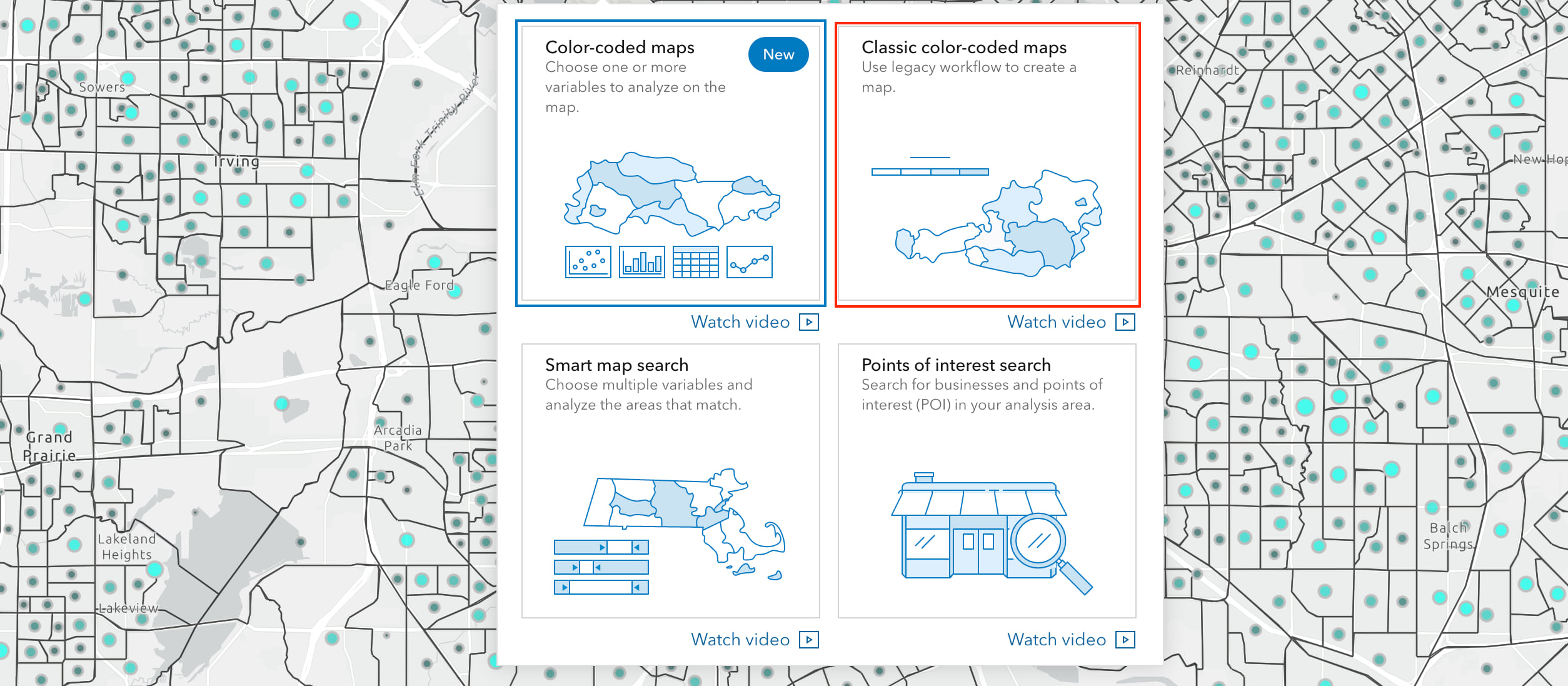
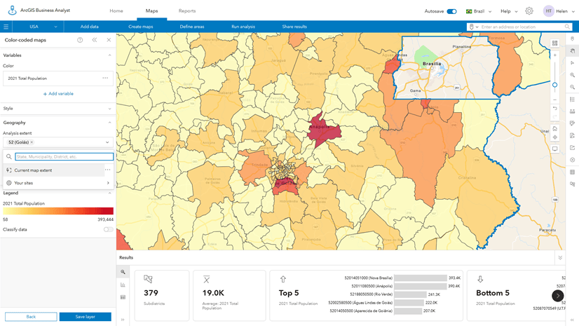
New color-coded maps workflow
With our updated interface, the color-coded maps workflow is the first redesigned ArcGIS Business Analyst feature. Color-coded maps provides information about an area of interest by identifying important patterns and trends. But wait, we aren’t stopping there—we are already planning for more major feature updates in the future, so stay tuned!
This newly redesigned workflow includes an easy way to define the geographic area of interest, a new summary results pane that provides deeper insights, and the ability to save analysis layers. We’ve highlighted the features of the new Color-Coded maps workflow below but for an in-depth breakdown, read our “Understanding level of detail in Business Analyst’s color-coded maps” blog article.
Enhancements to the mapping experience:
The workflow pane now lets you choose what to analyze and how it’s visualized on the map. Simply add a variable or pick the style you want with one click. Keep in mind, the default analysis extent is set to the United States, which allows the Legend value and Results pane to be fixed. This will provide a better analysis experience as the visualization remains interpretable as you pan and zoom across the map.
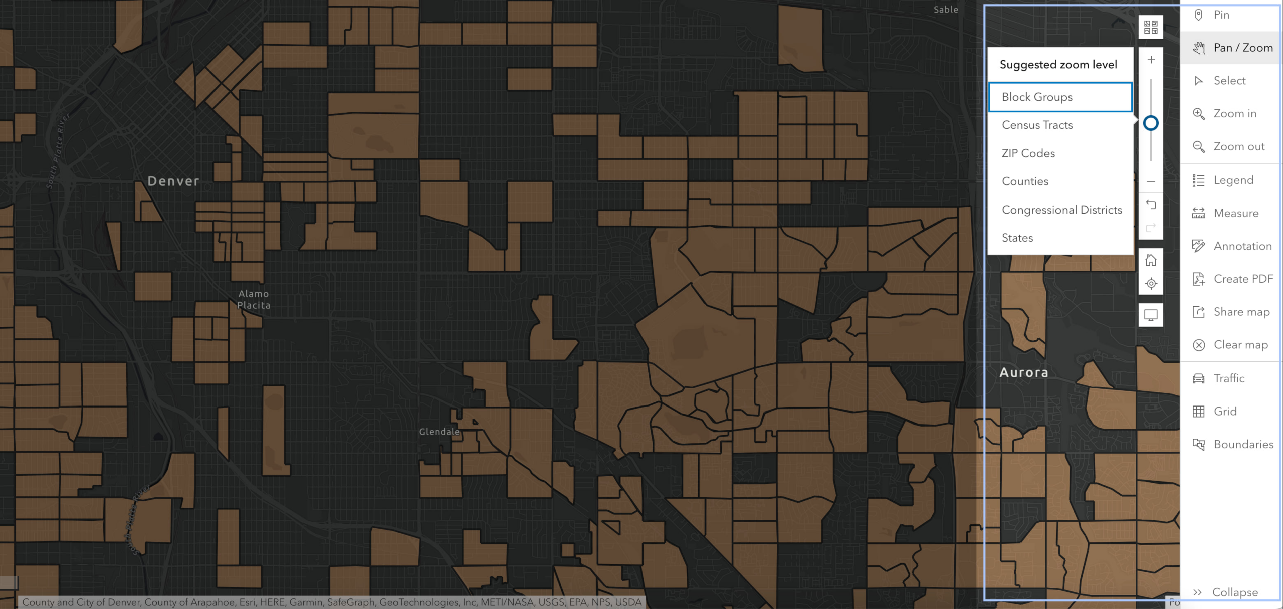
Map lower-level geographies:
Easily display smaller geographies, such as census tracts and block groups in a single map view at the block group level. This enhancement allows for a maximum of 10,000 features (geographies) that can be shown on a map at a given time, wow!
New ways to view and summarize data:
The Results pane includes three new ways to view and summarize the data on the map. Simply toggle between the tabs on the left to see the different views.
- Summary view: Gain a deeper insight into your area by viewing key information such as average value, top five, bottom five, and trends within the data. Simply add a second variable to display a scatter plot. You can hover over the visualizations to see more information and highlight areas on the map.
- Histogram view: Use this view to understand the minimum, median, and maximum values of the variables you are analyzing.
- Table view: Explore the data and export your results to Excel with this view.
Watch our video below that goes over all the exciting new features and improvements with the redesigned color-coded maps.
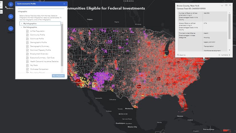
New infographic templates
Infographics allow you to visualize key information for your site in the form of eye-catching graphics, charts, tables, images, and text. We made updates to our standard infographics as well as the infographics available in the ArcGIS Business Analyst gallery (with an Advanced license).
Standard infographics –
- Update: Community Profile infographic is renamed to Community Summary infographic
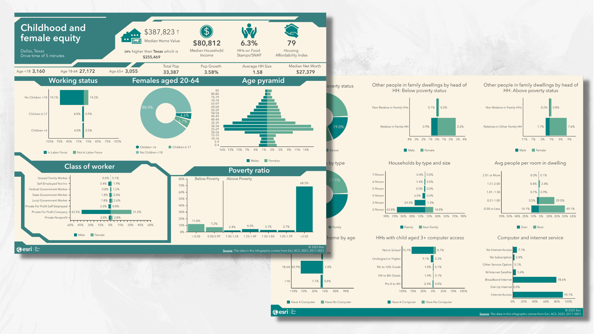
- New: Childhood and Female Equity infographic
This new infographic allows user to view insightful information on the social issues women and children are facing today. The infographic includes information on working status, housing affordability, poverty ratio, and poverty status.
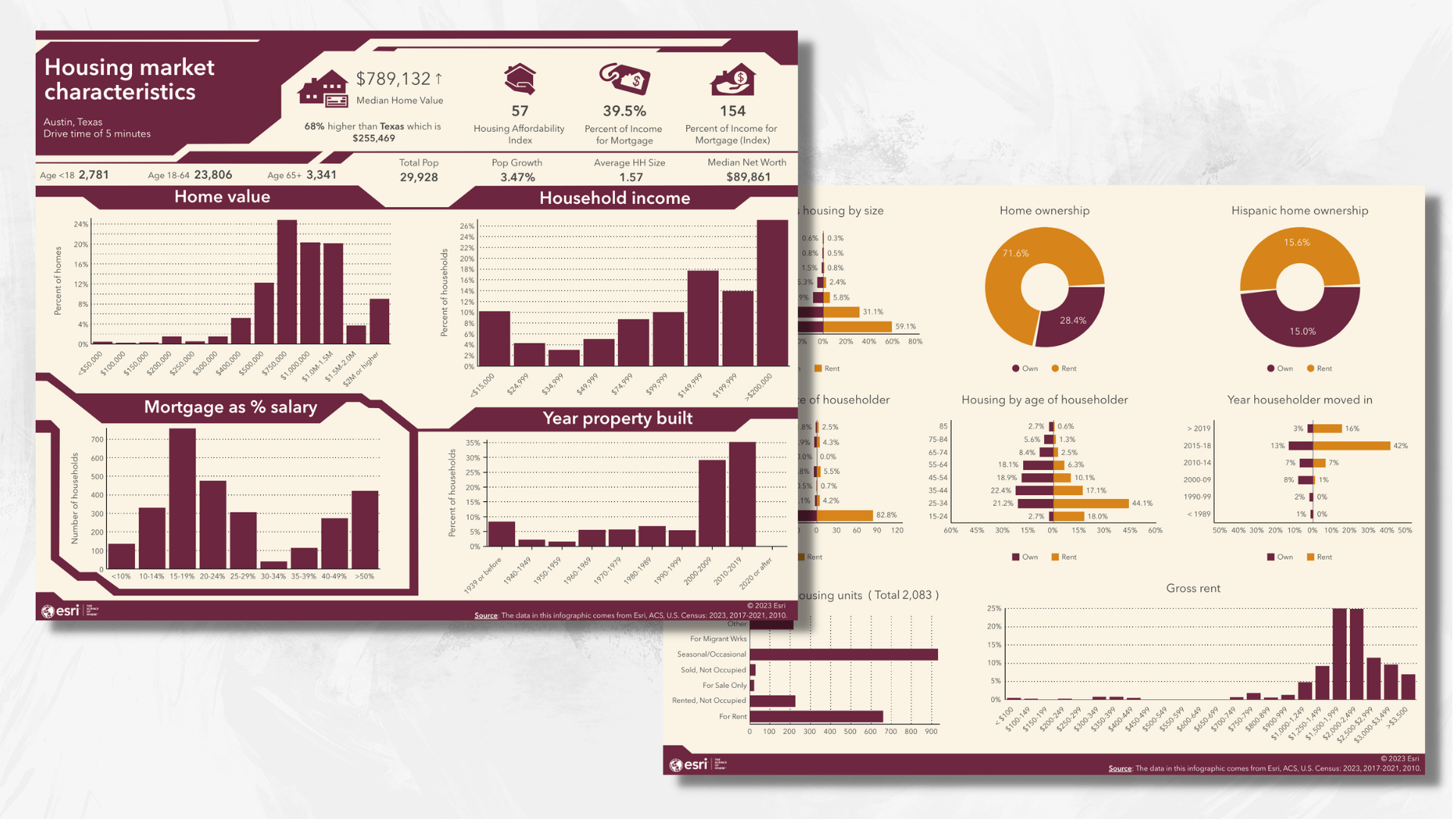
- New: Housing Market Characteristics infographic
With this new infographic, gain insight on a major economic indicator—the housing market. Your one-stop infographic for data on home ownership, vacant housing units, home value, property details, and rent / mortgage information.
Advanced infographics –
Note: this is only available for users with an Advanced license
- Update: Coronavirus Impact Planning infographic is now located in the ArcGIS Business Analyst gallery
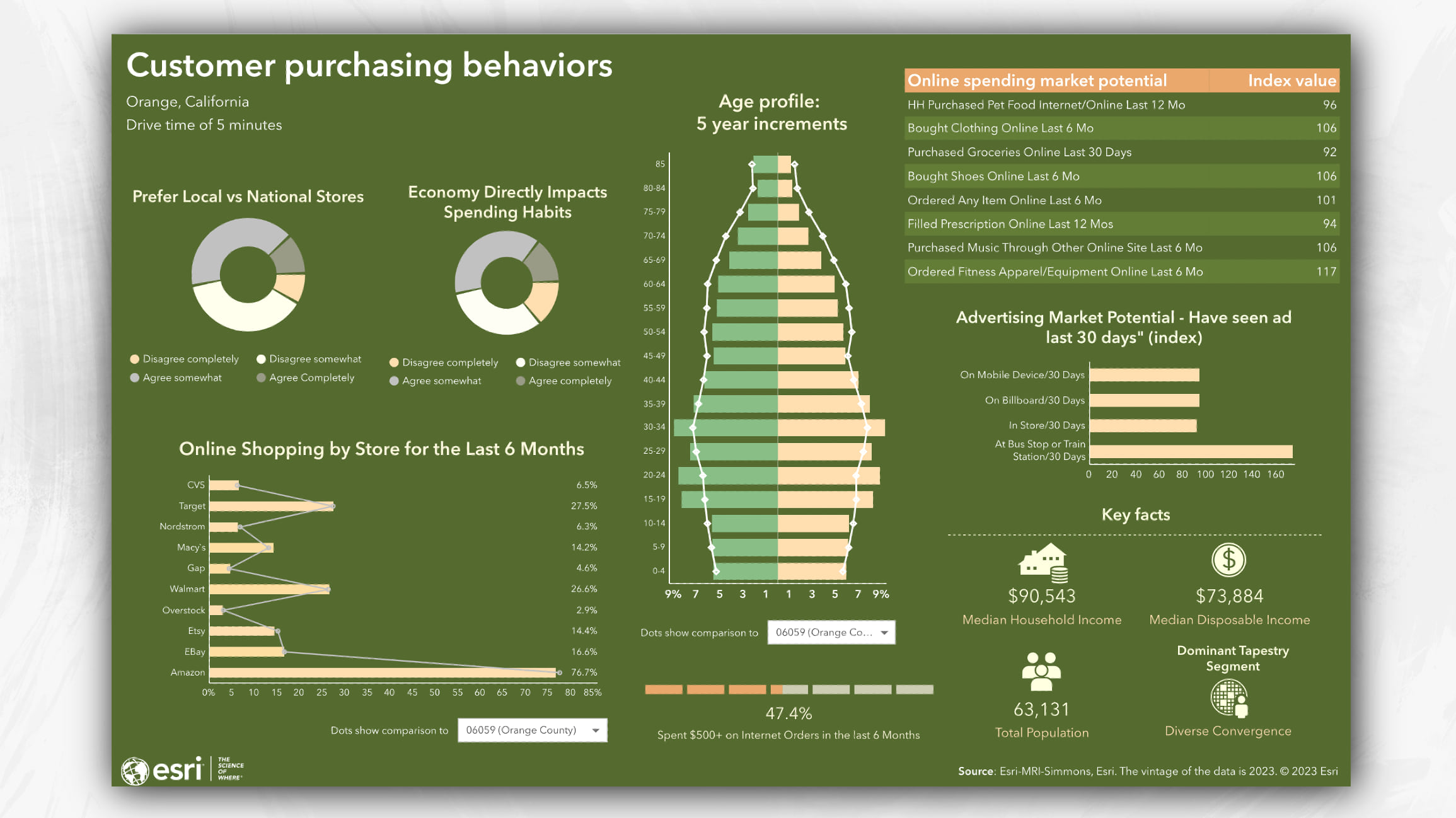
- New: Customer Purchasing Behaviors infographic
This infographic provides information on online shopping, spending habits, customer profile, and key facts of a given area.
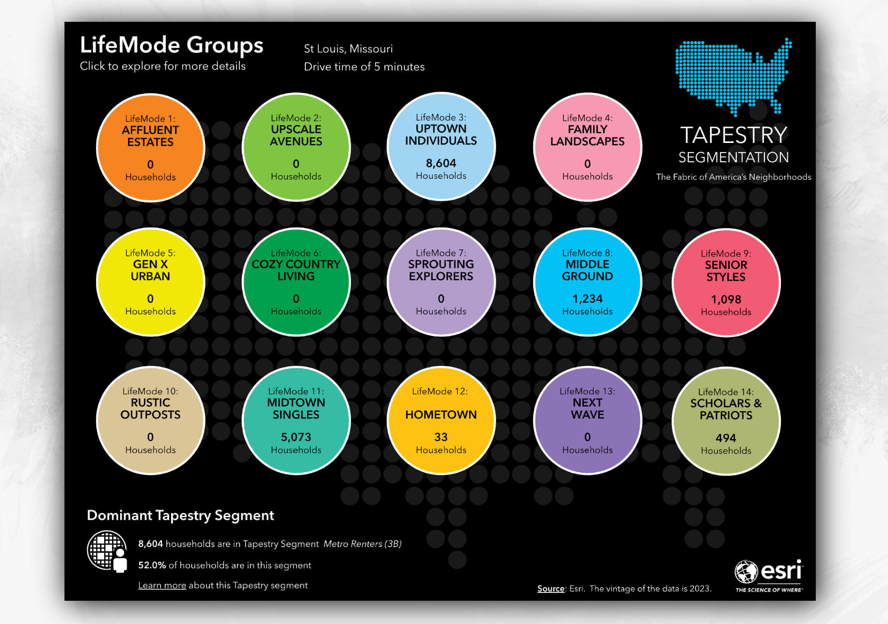
- New: Tapestry Poster infographic
Gain a deeper understanding of consumer lifestyle and behaviors by viewing Esri LifeMode Groups and Dominant Tapestry segment in this infographic.
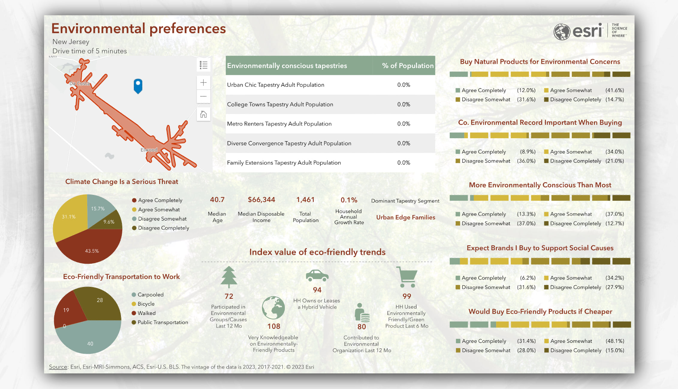
- New: Environmental Preferences infographic
An infographic that this world needs now more than ever before! View key environmental data about customer behaviors, Tapestry segments, and consumer viewpoints on environmental concerns.
To gain access to the Advanced templates, click Build reports > Build infographics > Add template > Browse gallery. Mouse over the template and click the Add button. The template will be saved and added on your My templates tab, where you can run the infographic or make the design edits you desire.
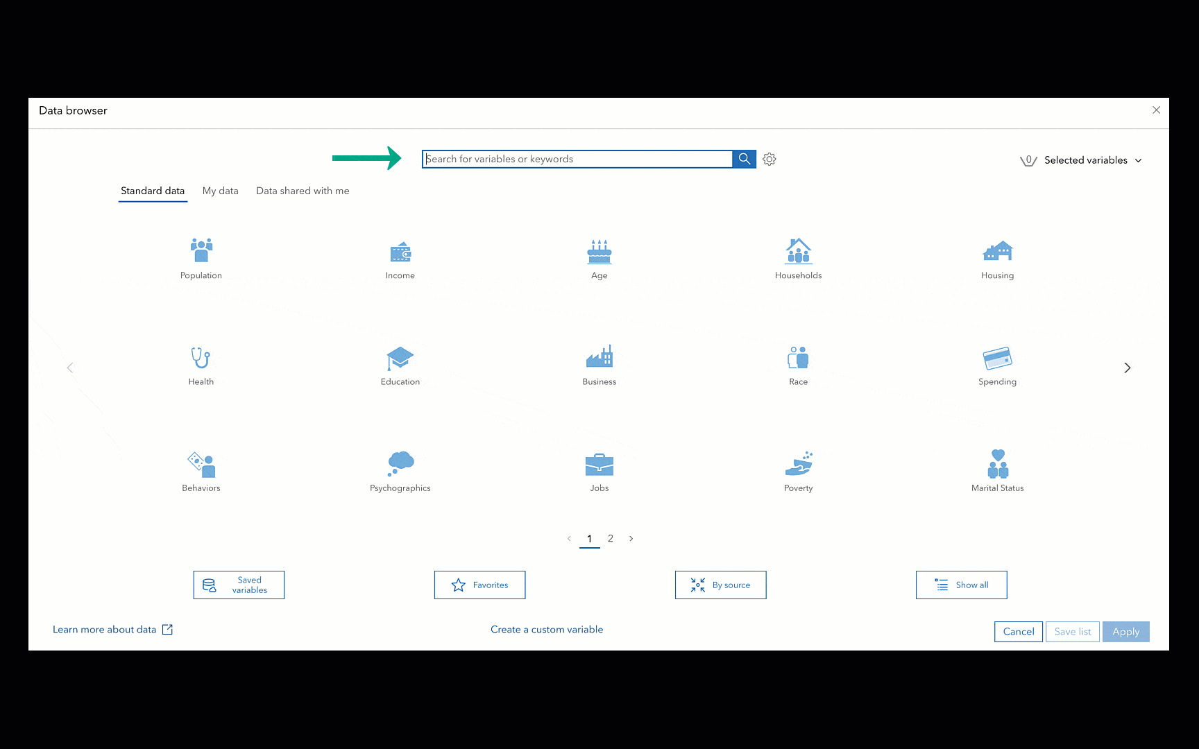
Data browser search improvements
You no longer need to know exact matches of variables in our data browser. Simply search keywords to identify related variables. This enhanced functionality now provides a wide range of variables that are sorted by relevance, alphabetically, or by category. You still have the option to search for exact matches by clicking the Settings gear icon and unchecking the Find similar variables check box.
Major data updates
The data updates you’ve all been waiting for are here! With this release, gain access to not only the new, current-year Esri 2023 demographic data, but also the previous Esri 2022 and Esri 2021 data sources. Stay tuned for our upcoming blog article that goes over each data source and how you can make the most use out of it for all your analysis needs.
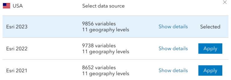
June 2023 Data Update:
- U.S. 2023/2028 Demographics, Tapestry Segmentation, Consumer Spending, Market Potential, Business Summary, and 2017-2021 ACS data in 2023 geography.
- Updated Crime Index to 2023 and available in 2023 geographic boundaries
- USA Traffic Counts (Kalibrate)
- New variables include: Socioeconomic variables, Historical Time Series variables, Labor Force variables, ACS poverty index, Market Potential variables, and Business Summary changes.
- Global data updates:
- Esri Japan, Netherlands (4orange), Michael Bauer Research for 26 countries and regions, global points of interest data from Foursquare, business data from Data Axle and SafeGraph
Additional blog articles regarding ArcGIS Business Analyst data update:
- Migrate U.S. standard geography sites to the Esri 2023 data source in Business Analyst
- What’s new with business data in ArcGIS Business Analyst
- What’s new in Esri U.S. Demographics (June 2023)
Additional language support
We added a new language to ArcGIS Business Analyst Web App: we now support Spanish. You can set the language in your browser settings. Most browsers have a language setting; check your browser’s help for the specific steps.
ArcGIS Experience Builder: Business Analyst widget enhancements
The Business Analyst widget in ArcGIS Experience Builder is a popular and well-loved tool that provides users with the ability to view additional information about any point or polygon feature on a map through the creation of reports and infographics. Check out some of our new enhancements:
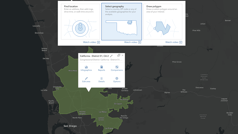
Draw polygon and pin drop options
Now when you connect to a map widget, you can define an area you want analyze by using the point site or draw polygon option. The draw polygon tool is best used when you have a unique geography or trade area you want to define.
Auto responsive view for infographics
We updated the default infographic option to Auto. This will adjust the infographic view according to your screen size and device. You can manually resize the widget on the canvas to get your desired viewpoint by using the ArcGIS Business Analyst widget in Preset mode.
Additional Resources
We hope you enjoyed reading through this blog article. Below we’ve added resources to help you with your ArcGIS Business Analyst journey:
- Business Analyst product overview page
- Review pricing and purchase Business Analyst
- Join our LinkedIn Business Analyst User Group
- Join our Business Analyst Esri Community
- Read more Business Analyst blog articles on ArcGIS Blog
- Watch Business Analyst Web App videos
- Watch Business Analyst Mobile App videos
- Visit the Business Analyst Resources page


Article Discussion: