Large datasets create some unique challenges for spatial analysis. It can be difficult to interpret spatial patterns and gain an understanding of your data when your dataset contains hundreds of thousands of unique features (or more!) In this blog series, we will go over some of the options available in ArcGIS Insights for visualizing and analyzing large datasets spatially.
The problem with points
Displaying your data as points (called a location map) is useful in a lot of situations, like for mapping the locations of hospitals in your city, or distribution centers in your region. However, as your dataset gets larger, your ability to distinguish patterns is reduced.
For example, the following map shows the occurrences of wildfires across the United States from 2010 to 2015. The dataset itself includes 450,234 features. However, the warning icon in the bottom left corner of the map indicates that Insights is not able to render all the points. In fact, clicking on the icon tells us that a sample of 112,000 points are being rendered (the full dataset will still be used in all analysis). The points that do get rendered are chosen randomly from the dataset, so the distribution of the sampled points should be representative of the full dataset. However, as your datasets get larger and the proportion of points being displayed decreases, your confidence in the distributions on a location map should also decrease.

On the map of wildfires, Alaska appears to have a lower density of fires than the contiguous United States. Fires seem to be ubiquitous across the contiguous states with the exception of a small area near the Great Lakes region that does not have any fires. However, with only 25% of the data being displayed, I don’t feel confident making any strong conclusions about wildfire distributions. A location map of this size also doesn’t display regional patterns, like changes in point density, which will affect how you interpret your data.
So if the location map is not ideal, which visualizations can you use? In Insights there are several options; the one you choose will depend on which questions you want to answer about your data. For this blog we will focus on using spatial aggregation, a technique available in Insights and across ArcGIS, to display your data using graduated symbols.
Spatial aggregation
Spatial aggregation calculates the count of features (or a statistic calculated with a number field) within specified boundaries and displays the count using graduated symbols. Spatial aggregation is most useful when the boundaries you choose have some significance to your analysis and warrant a comparison.
On the map below, I’ve aggregated the wildfires by state. I can use the graduated symbols map to compare the number of fires between states. For example, the largest symbols on the map are for California and Texas, indicating that those two states had the most wildfires during the period from 2010 to 2015. Hovering over the states displays a pop-up that gives the minimum, maximum, and mean values for the dataset. Based on the pop-up below, Texas had 63,004 wildfires, which was also the maximum count for all states.
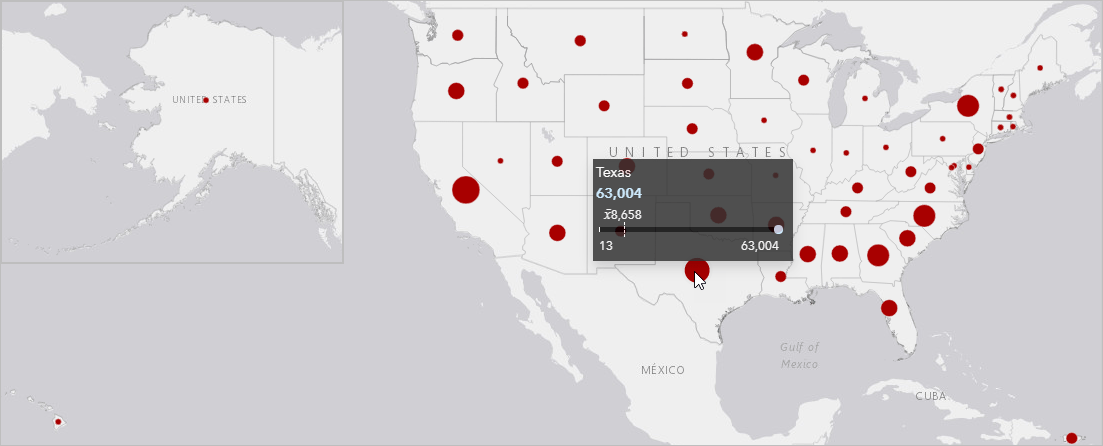
The graduated symbols map also allows us to analyze patterns in the spatial data. For example, there is a general trend of higher counts of wildfires in states further south in the continental United States. However, there are some outliers; New York has a relatively high count of wildfires compared to its neighboring states.
Classification
Another aspect of a graduated symbols map that affects how you interpret the spatial patterns is the classification. The default classification on a graduated symbols map is natural breaks with five classes. Natural breaks classifications provide breaks based on natural groupings in your data. The other classification options are equal interval, quantile, standard deviation, unclassed, and manual.
Natural breaks – Data is grouped based on naturally occurring patterns in the data.
- Use it when your data has inherent groupings with relatively large differences between them.
- Do not use it when you are comparing distributions on multiple maps.

Equal interval – Data is grouped into set ranges.
- Use it when your data has a known range, such as when mapping percentages

Quantile – Data is divided into groups with the same number of features.
- Use it when you want to display your data by rankings.
- Do not use it when you want to see any type of proportional change in your data. This classification type can easily skew interpretations of data, since the breaks are determined based on the number of features and not any type of differences between the values.

Standard deviation – Data is grouped based on difference from the mean.
- Use it if the mean value is important or if you want to determine statistical significance (conventionally, data that is more than two standard deviations from the mean is statistically significant).

Unclassed – Data is displayed using a continuous increase in symbol size, rather than classes.
- Use it if you want to see high and low values in your data.
- Do not use it if you want to see discrete classes or groupings.

Manual – Data is classified by the class breaks you define. Manual classifications are often created by applying a standard classification and adjusting the class breaks to fit your data.
- Use it if there are important values in your data that should be used as class breaks, or to customize a standard classification type.
- Use it when making comparisons between maps
Normally there is more than one classification type that can be used for a dataset. The one you pick will depend on what information you want to derive from the data or the results you want to communicate. For the wildfire dataset, most of the classifications can be used, but some are more appropriate than the others. For example, the quantile classification will skew the appearance of the data so that some states appear to have more fires than they actually do. However, you can reduce the effect of the skewed symbols by changing the maximum symbol size to lessen the impact of the symbol classes.
The default classification (natural breaks with five classes) is also not ideal in this situation. However, in this case it’s because of the number of classes rather than the symbols. Since the wildfire data is skewed so far toward lower numbers of fires, five classes are too many to accurately portray the natural groupings in the data. Changing the number of classes to three represents the natural groupings better than five classes.

Takeaways
When should you use spatial aggregation?
- When the boundaries themselves have significance to your data.
- When you want to have counts or other statistical calculations.
Which classification type should you use?
- A classification type is chosen based on what information you want from your data and what you want to communicate from your map.
- There is often more than one classification type that can be used for your analysis.
- The number of classes also affects how the data is displayed and interpreted.
Up next
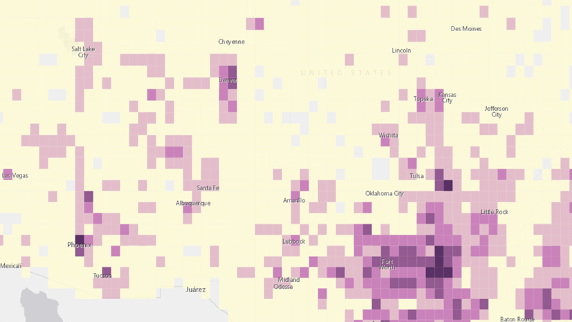
Learn about using binned maps and heat maps in Out of bounds: Mapping large datasets in ArcGIS Insights, part 2.


Article Discussion: