Recently, while browsing data in the Living Atlas of the World, I stumbled upon this layer of U.S. census tracts, which contains population data for the United States. The variables nighttime population and daytime population caught my attention. Naturally, I thought “why not try out this data with the DotDensityRenderer using the ArcGIS 4.11 API for JavaScript?”
While exploring various ways to visualize this data, I settled on a few that seemed to work for these attributes:
1. Toggle the visibility of two layers
2. Calculate population growth/decline
3. Compare the populations of residents versus workers
Toggle the visibility of two layers
When taking an initial look at this data, I created two layers and assigned each a DotDensityRenderer using the same dot value (300 people per dot), but with different fields. One referenced the nighttime population field…

The other referenced the daytime population field…

Adding both fields to the same renderer doesn’t make sense because it would render twice as many dots as needed to represent the actual population. So to compare how population changes from night to day, you can toggle the layers on and off.

Toggling layer visibility can be effective, but it’s also difficult to discern subtle nuances of the data.
Calculate population growth/decline
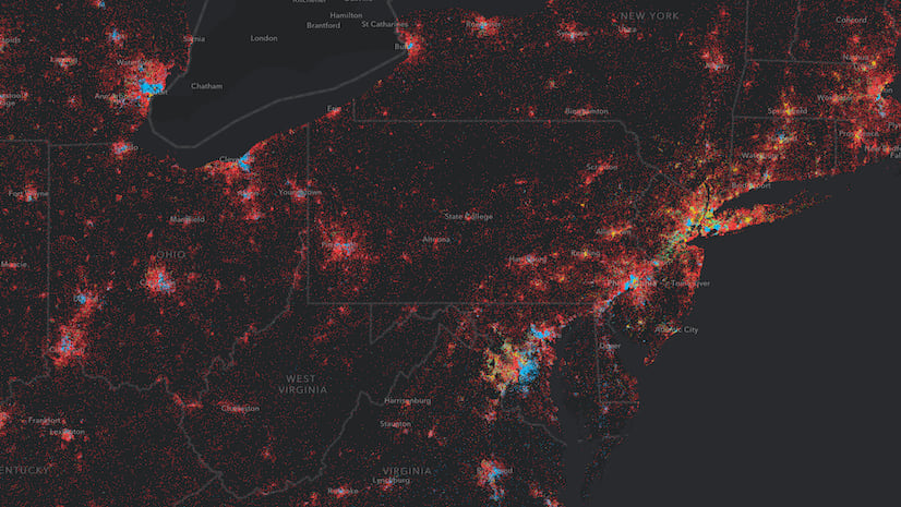
Since DotDensityRenderer supports Arcade expressions, I decided to visualize how the population grows (or shrinks) as the time of day transitions from nighttime hours to daytime in a single renderer.
The resulting visualization looks like the following.

I achieved this by setting the following renderer on the layer.
const baseRenderer = new DotDensityRenderer({
  referenceDotValue: 300,
  outline: null,
  legendOptions: {
    unit: "people"
  },
  attributes: [{
    valueExpression: "$feature.DPOP_CY - $feature.TOTPOP_CY",
    color: [255,255,0,1],
    label: "Daytime population growth"
  }, {
    valueExpression: "$feature.TOTPOP_CY - $feature.DPOP_CY",
    color: [ 0,255,255,1],
    label: "Nighttime population growth"
  }]
});
Notice that I actually write two expressions in the renderer’s attributes.
One for population growth in the day time:
// daytime population - nighttime population
$feature.DPOP_CY - $feature.TOTPOP_CY
And one for nighttime population growth; or, in other words, areas that experience population decline during the daytime hours of the day.
// nighttime population - daytime population
$feature.TOTPOP_CY - $feature.DPOP_CY
The DotDensityRenderer doesn’t render dots for negative values. So by changing the order of the fields in the expression, I can visualize growth in the daytime and in the nighttime. All negative values returned from each expression will be excluded from their respective attribute.
Therefore, this configuration will always render only one color of dots per feature. Features with blue dots show areas of population decline in the daytime (or growth in the nighttime). Features with yellow dots show areas of population growth in the daytime. It is also possible that some features don’t render dots at all. This indicates areas where the population doesn’t change at all from nighttime to daytime.
The resulting visualization clearly shows the geographic trend of people commuting from suburbs to places of business, such as downtown areas and areas along major highways.

Conversely you could look at it going the opposite direction: areas with blue dots show regions that experience population growth at night.

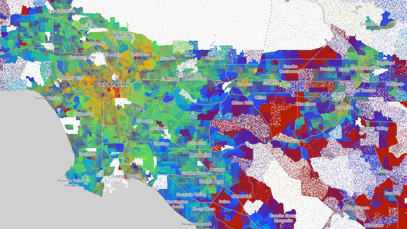
Compare the population of residents versus workers
This led me to create another renderer breaking down the daytime population by residents versus workers.
workersRenderer.attributes = [{
  field: "DPOPWRK_CY",
  color: "#35ff89",
  label: "Worker population"
}, {
  field: "DPOPRES_CY",
  color: "#ff0ad2",
  label: "Resident population"
}];
This creates the following map.

As expected, you’ll notice the patterns of worker population to resident population roughly follow the same patterns of population change from night to day.

Here are some other interesting areas I found while exploring this data.


Try it yourself! Use the search widget in the top left corner of the app to search for other cities and regions to view how population changes from day to night in your area of interest.
Also, check out some of these other posts to learn more about dot density and the ArcGIS JS API.
- Dot density for the web
- Interactive dot density maps for the web
- Visualizing growth with dot density
To learn about the methodology behind the daytime population data, see the following white paper: Methodology Statement: 2018 Esri Daytime Population.


Commenting is not enabled for this article.