Data from Michigan, Wisconsin, and Louisiana reveals that COVID-19 amplifies pre-existing racial inequities. As such, it is critical to manage your COVID-19 response to increase racial equity. Additionally, data about COVID-19 is rapidly changing. As more data becomes available and the crisis evolves, we need a dynamic response approach. For these reasons, use ArcGIS Dashboards to see racial inequities at a glance and adapt as the situation develops.
An Evolving Situation Requires a Dynamic Approach
COVID-19 is shedding light on pre and existing racial disparities, and inequitable community conditions surrounding the novel coronavirus are evolving rapidly. For example, racial and economic inequalities are emerging in testing and treatment. Moreover, existing inequities in access to healthy food and healthcare are increasing the risk for communities of color. As such, there is an urgency to ensure racial equity in COVID-19 responses and response efforts are adapting accordingly.
A racially equitable response addresses racial equity head-on — leading with race — to minimize the impact of COVID-19 on existing disparities. Moreover, a racially equitable response is dynamic in that it is both nimble and resilient. In other words, the actions your community needs next week might be different from what it needs now. Changing conditions dictate where resources are needed most at any given time. Therefore, consider implementing dynamic systems that monitor changing community conditions and needs to focus where the needs are greatest.
Dynamic systems help ensure that resource allocation remains equitable. To be precise, you need an equitable approach that identifies unserved and underserved communities as well as persons disproportionately impacted. Your actions must adapt as the evolving pandemic shifts community needs. Adaption of your efforts should decrease barriers and burdens in these communities. To that end, use ArcGIS Dashboards to see racial inequities at a glance and adapt your response accordingly.
GIS Dashboards Can Help Monitor Racial Inequity
GIS dashboards can help monitor evolving community conditions and help increase sustainable racial equity priorities in your COVID-19 response. In other words, dashboards can help decision-makers see the big picture and quickly gain insight to inform equitable action. As such, dashboards are a great way to highlight areas of the most significant community need. Above all, building equity indicators into dashboards unmasks disparities, increases transparency, and makes it easier to respond to inequities as they arise.
For instance, Milwaukee County’s COVID-19 dashboard keeps equity risk factors front and center. More precisely, Milwaukee built equity indicators into the dashboards used to monitor and make decisions. The dashboard displays authoritative case data alongside breakdowns of cases and patient outcomes. More specifically, the dashboard totals confirmed cases and reported deaths by race, gender, and age.
Ultimate, you can use ArcGIS Dashboards to see racial inequities at a glance and adapt responses for more equitable outcomes.

The Right Dashboard for the Right People
Dashboards provide action-based insight for people working at all levels of your COVID-19 response efforts. Therefore, consider which type of dashboard is needed by your teams and stakeholders.
- Strategic dashboards help executives track key performance indicators (KPIs) and make strategic decisions, including investing where the needs are greatest, by evaluating performance based on their organization’s goals. So, use strategic dashboards to inform top leaders overseeing your organization’s COVID-19 response.
- Tactical dashboards help analysts and line-of-business managers analyze historical data and visualize rapidly evolving trends to gain a deeper understanding. In this case, use tactical dashboards to provide insight to leaders managing specific COVID-19 response initiatives or services.
- Operational dashboards help operations staff understand events, projects, assets or potential reallocation needs, by monitoring their status in real-time. Therefore, use operational dashboards to guide your teams actively delivering your COVID-19 response services.
- Informational dashboards help organizations inform and engage their audiences through community outreach. Finally, use informational dashboards to keep unserved and underserved community leadership, the general public, and private external stakeholders informed of your efforts.
Ongoing Commitment to Racial Equity
Embed the principles of racial equity in your organization’s policies and practices year-round. By championing that principle, your teams will likely have the right knowledge, tools, and data at hand during a crisis. For example, Milwaukee County recently declared racism as a public health crisis. To address this, they publicly committed to the vision that “by achieving racial equity, Milwaukee County will be the healthiest county in Wisconsin.” Additionally, Milwaukee County is a core member of the Government Alliance on Race and Equity (GARE). As such, they approach everything they do with a racial equity lens, and this pandemic is no exception.

More Ways to Use GIS Dashboards to Monitor Racial Inequity
Case data disaggregated by race provides essential information to stakeholders. Include racial breakdowns of testing, cases, and deaths in your performance management dashboards. This approach will improve critical decision-making. Add case data disaggregated by race to your map to amplify charts and tables. Charts and tables help you understand inequities in the number and proportions of cases. However, maps help you visualize where racial inequality exists. For example, you might discover that cases among the African American or Latinx populations predominate in certain areas. In summary, bring the “where” behind the data into the forefront to better guide your resource allocation.
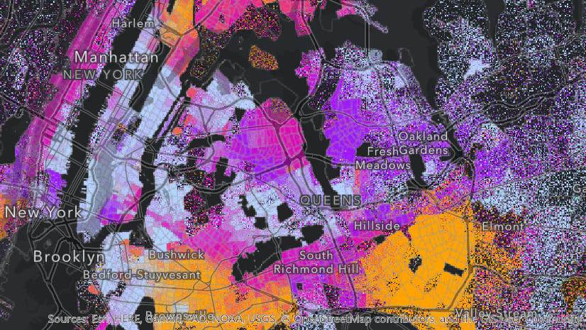
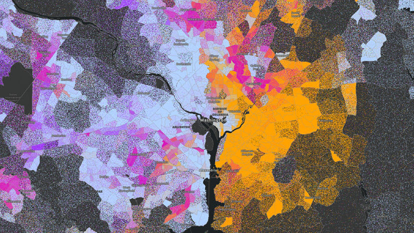
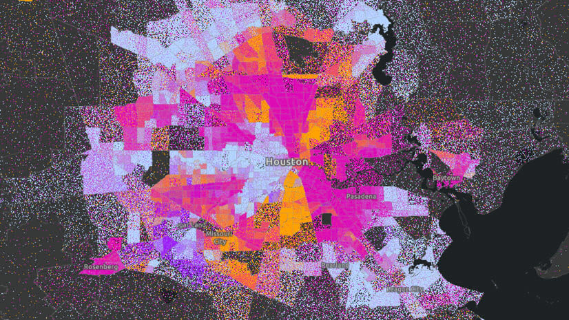
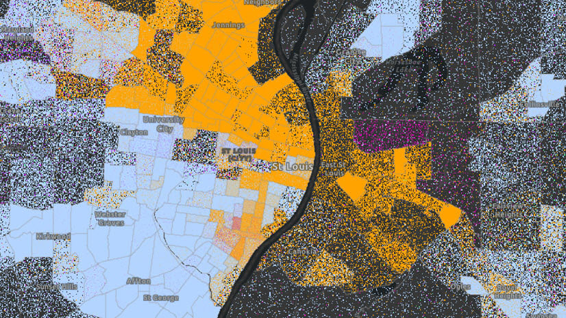
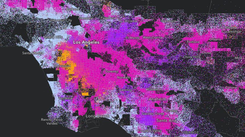
Visualize Inequity At-a-Glance: Layer Case Data with Demographic Data
You might also consider adding demographic layers from the Living Atlas to your dashboard. Layering case data on top of demographic data increases understanding of where racial inequities exist and which communities are most impacted. Layering data in this way provides invaluable insight to stakeholders and decision-makers. Additionally, display population data by race in the same views presenting racial breakdowns of case data. In this way, you will be able to see racial inequities at-a-glance.
The example below shows how you can use ArcGIS Dashboards to see racial inequities at-a-glance. Above all, this approach helps everyone involved plan appropriate resource interventions that better serve these areas.

Get Started with ArcGIS Dashboards
ArcGIS Dashboards comes included with the Essential Apps bundle in ArcGIS Online, so anyone with a Creator or GIS Professional user type can create a dashboard to inform the COVID response in their community. Below are some resources to get started:
- ArcGIS Dashboards Training Videos for COVID-19
- Learn ArcGIS Lesson: Create your own dashboard of COVID-19 cases, deaths, and recoveries for each country.
- Getting to Know the Coronavirus Solution Dashboards
We Want to Hear From You
How is your organization responding equitably? Please share your success, tips and challenges by commenting here. You can also share your experience and questions using the GIS for Equity and Social Justice GeoNet Forum.


Article Discussion: