Welcome to Part II of Earthquake Mapping using Esri’s Live Feed data.
In Part I we used an Arcade expression to take multiple fields in our data and combined them into one set of symbols. This resulted in 60 possible symbol combinations!
Here in Part II we are going to stylize the results of that Arcade expression in a meaningful way and create an earthquake map that immediately conveys the critical information that needs to be seen. We will do this by taking our combined fields and applying them to a symbol with varying color, size, and stroke to tell the complete story of the earthquake data. Get ready!

Earthquake Data in the Living Atlas
The Living Atlas of the World hosts recent global earthquakes from the U.S. Geological Survey (USGS) and their Prompt Assessment of Global Earthquakes for Response (PAGER) program.
This Live Feed is updated every five minutes and has fields detailing individual earthquake information including an event’s ID, Hours Old, Magnitude, Location, and Alert Level.

What Should We See on Our Earthquake Map?
Earthquakes are powerful and scary with many factors of concern that need to be represented on our map. Having been through many myself I know that earthquakes happen unexpectedly and vary in their size, intensity, and severity for people and the environment.
Earthquakes are usually not isolated incidents. They have aftershock events in the same vicinity that unfold within a few hours, days, or even years of the initial incident. According to plate tectonics earthquakes occur within the same general areas and visualizing them this way can show patterns and trends.
The information that should stand out on our map:
- When was the earthquake?
- How big was the earthquake?
- What are the impacts on people and the environment?
The earthquake data has three fields to make this happen: Hours Old, Magnitude, and Alert Level (See Part I of this earthquake blog to find out how these were combined in Arcade).
Map Purpose and Design
The purpose of this map is to visualize the earthquake data as intuitively and elegantly as possible with our end goal being to update the Live Feed earthquake data that is available in the Living Atlas.
This is a web map with hundreds of dynamic points of data. I was asked to work within these design requirements:
- Design an easy to use ArcGIS Online web map with one earthquake layer in the Contents pane.
- Display the earthquake data so our viewer can quickly determine and differentiate an earthquake’s Time, Magnitude, and Alert Level.
- Use out of the box ArcGIS Online map symbology that is quickly retrieved, available to all users across the platform, and can be easily replicated.
- Create a map palette that has a visual hierarchy and is also acceptable for color blindness.
- The cartography must work on both a Light or Dark Basemap with no change to the story focus (a challenging feat indeed!).
A Simple Circle Symbol (But Really Not Simple)
The symbol needs to be intuitive and differentiate hundreds of global earthquakes, with three variables, as simply as possible, on a map that is always changing.
In 1967 French cartographer Jaques Bertin developed the concept of visual variables in his book Semiologie Graphique (Esri republished in 2010). This book is considered to be a foundational work in information design, visualization, and the first analytic theory of graphic representation.
Bertin’s graphic system has six main categories of visual variables which include: size, value, texture, color, orientation, and shape; along with two other variables that dissect an items space: position and position in a series. We can apply his visual variables framework to our earthquake data.
He writes about the visual variables:
They form the world of images. With them the designer suggests perspective, the painter reality, the graphic draftsman ordered relationships, and the cartographer space (Bertin. 1983, p. 42).

Since all earthquakes have an epicenter using the shape of a point or circle symbol to represent each earthquake is a good place to start. This symbol is also friendly to overlapping or stacking, and using transparency for visualization.

Data Field #1: Hours Old
Time is a critical component for our map’s message. Using color to bring out time will allow the visual hierarchy to show:
- Where are the earthquakes that are happening right now?
- What happened recently because there may be aftershocks?
- What happened lately to see some patterns or trends?
The Live Feed data goes back three months and has a field called “Hours Old” which can be divided into three time periods:


Data Field #2: Magnitude
The USGS determines the size of an earthquake by Richter magnitude which measures the energy released at the source of the earthquake and is recorded as the maximum motion observed by a seismograph. The earthquake’s severity is ranked by The Modified Mercalli Intensity Scale.

Filtering the Data
According to the Modified Mercalli scale earthquakes that are within the range of 4-4.9 magnitude are detectable by people outdoors and are strong enough to wake some people up at night. This is a good threshold for representation on our map.
Additionally we want to only only display those earthquakes that are > 4 magnitude because the USGS collects information on smaller magnitude earthquakes; however, only in the United States (< 3.9 magnitude). If we were to include all the data that comes with this map service there maybe an impression that more seismic activity is happening in the United States when that is not the case. There are just different levels of detail in some places than there are in others.
We want the data balanced and even across the globe and this is easily done by applying an ArcGIS Online filter (explained in detail in Earthquake Mapping Part I ).
Complete Earthquake Dataset

Filtered by > 4 Magnitude

Now that our data is filtered we can place the earthquakes in four classifications using a graduated symbol. The circle will increase or decrease in size as a reflection of it’s magnitude.

Data Field #3: Alert Level

The USGS’s PAGER program is an automated system for rapidly estimating the shaking distribution, the number of people and settlements exposed to severe shaking, the range of possible fatalities, and economic losses. The estimated losses trigger the appropriate color-coded alert which determines the suggested levels of response (Red, Orange, Yellow, Green, or None Issued).
In this respect (for our map) not all earthquakes need to be represented equally. A 6.5 magnitude earthquake that happens in an area that does not effect people or the environment versus a 6.5 magnitude earthquake that is devastating for a certain area or region – our map will need to display these both differently. With that said, every earthquake record is important for visualizing patterns and trends, but the PAGER Alert Levels will be the most important part of the map story since this measures the earthquake’s impact on people and the environment.


We already have three colors for time, using another four for red, orange, yellow, and green PAGER alerts would just be too many on the map. And why restrict yourself to that anyways?
At first glance the color green implies “safe”, as well, the rainbow rank of the PAGER colors as a measure of potential damage do not immediately produce an intuitive visual hierarchy.
This is the cartographer’s craft – to envision the data in an authentic and meaningful way even if it goes against the data’s embedded and default colors. Stepping outside the box is sometimes necessary in order to try to intuitively convey the story of the data.
So instead of the PAGER alert colors, we can use the value of the colors we have already selected for time; and then, take those and ramp them from light to dark with three sequential colors thus demonstrating their severity.
This will be applied to the stroke or outline of the circle symbol. By applying a progressively thicker and darker stroke to our symbol this will convey something more significant or severe than for those symbols that only have a thin and light stroke.
Here are the symbol specifications:
Magnitude 4-4.9 = Size 12 points / Stroke 4 points
Magnitude 5-5.9 = Size 18 points / Stroke 5 points
Magnitude 6-6.9 = Size 24 points / Stroke 6 points
Magnitude > 7 = Size 30 points / Stroke 7 points
Here’s how these PAGER Alert Levels are arranged and what they mean:

Bertin writes that value variation is ordered and represents a continuous progression, so much so, that you cannot disregard it visually (Bertin. 1983, p. 73).
ArcGIS Online Symbology
This web map was designed to use out of the box ArcGIS Online symbology so that it can be replicated by anyone within their own workflows. Please watch the video below to see the location of the circle symbol and how to apply the stroke.
A Tale of Two Basemaps
One of our earthquake map goals was that the color palette had to work on both the Light and Dark Basemaps so that multiple users can be supported. Concurrent cartography for both the Light and Dark Basemaps is a challenge in the world of online mapping!
Please take look at the image below to see what happens to value order for the brown, purple, and blue colors. The emphasis on the symbol value is switched and tricks your eye.
There is a counterintuitive shift of values with using Light and Dark Basemaps and definitely a challenge when trying to use both as display options. On the Dark Basemap the lightest values stand out, while on the Light Basemap it’s the darker ones.
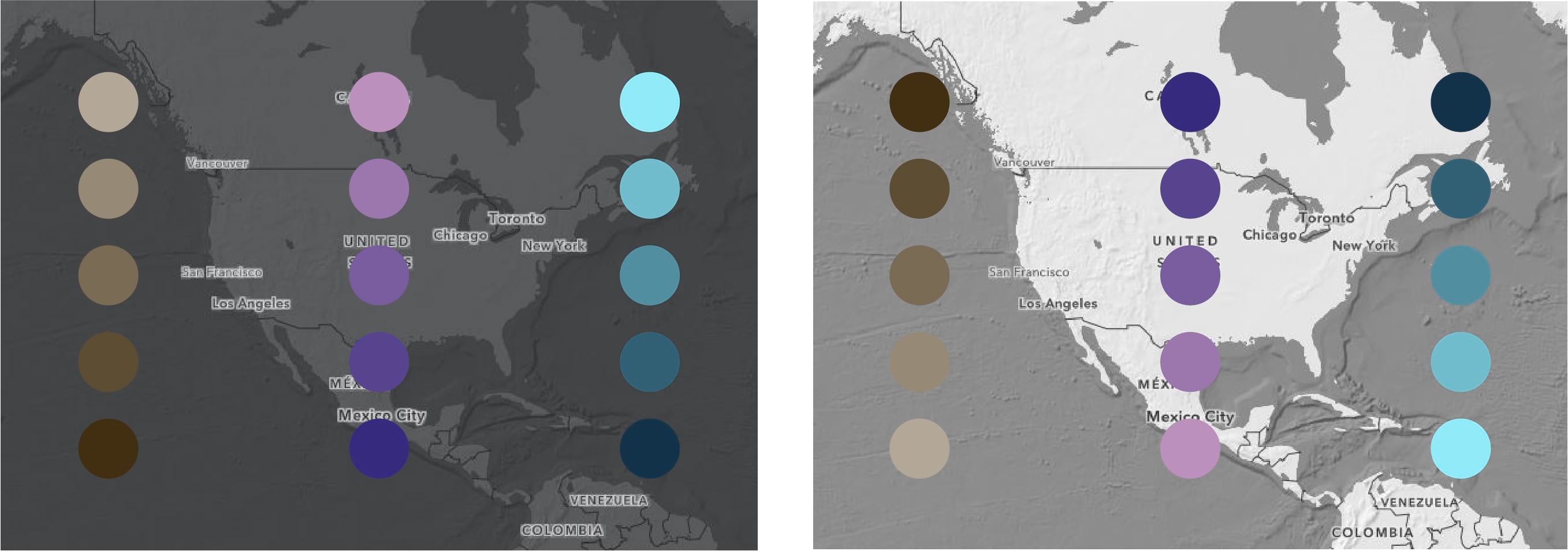
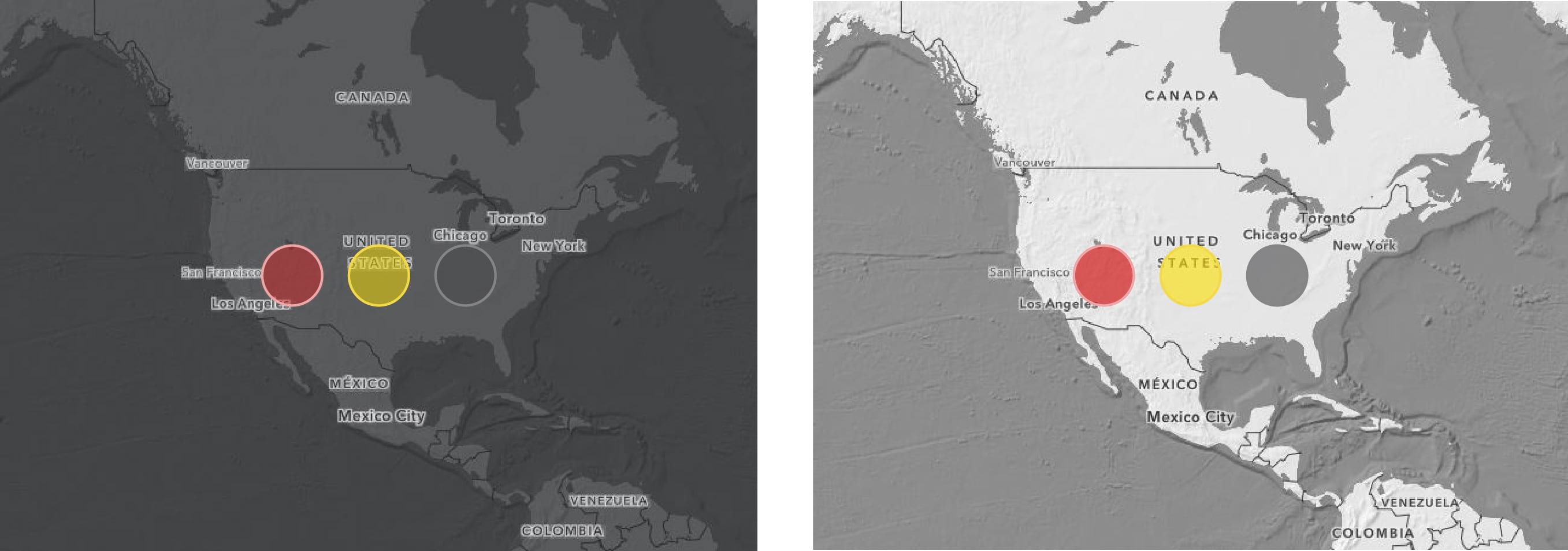
To avoid this issue the map has a natural visual hierarchy of red the intuitive color for danger; yellow which implies caution; and gray still part of the narrative but almost seems to fade away by it’s lack of color.
Layering the Basemaps for More Storytelling
Please take a look at how these Basemaps are arranged. The Light Basemap consists of a bathymetry hillshade, Human Geography Base, and Human Geography Detail. Notice how the Human Geography Label (Map Annotation) is placed outside of the basemap to allow the earthquake labels to be at the top.
Outside of the Light Basemap is a Human Geography Dark Base basemap and World Imagery Clarity which the user can toggle on and off depending on what they need. Since the bathymetry is nested inside the Basemap section they both have their transparencies set to about 25% to allow the bathymetry to tell the story of plate tectonics.


Color Blindness

Esri tries to be respectful of all people who might be viewing our maps and creating something that is sensitive to color blindness factors into the design. This is what the map would look like for a person with Deuteranopia:

The palette still works for color blindness, but to make sure that the red symbols (past 24 hours) really stand out they get a label with their magnitude, along with a white halo (set at 7 points for a box shape) to make them even more prominent.
This way someone with Deuteranopia or any other type of color blindness would be able to visually recognize – if the point has a label, then they happened within the last 24 hours. There is no change for Deuteranopia between the yellow and gray symbols.
All Together Now!
Time, Magnitude, and Alert Levels are united as one and our map symbols are intuitive and simple. Here is the legend that has everything together:

Wait a minute, hold on…this legend is intimidating and slightly overwhelming with all 60 symbols. Let’s try this one. It’s simplified but still has the same information:

Circling Back…
We have certainly come a long way. We turned three data fields into one symbol using an Arcade expression in Part I. Using Jaques Bertin’s cartographic theory for visual variables, we used a graduated symbol available to all ArcGIS Online users to display our data in an intuitive and meaningful way. We also selected an color palette that would be visible for all of our potential map viewers, while making sure that it works on both Light and Dark Basemaps.
Setting map goals and expectations that are governed by your viewer’s needs and guided by your own artistic sensibilities will allow you to create amazing webmaps.
More Information
Esri hosts many training resources in cartography and how to create maps in ArcGIS Online. There are other Esri blogs available on cartography as well as some blogs that are linked at the end of this page. Please check them out.
Introducing our Map…
The final map is here and the app is located here. Here are a couple of sneak peeks below:
Light Basemap

Dark Basemap

Map Muse
While recently touring the Museum of Modern Art in San Francisco, Roy Lichtenstein’s surrealist Figures with Sunset from 1978 totally inspired me on this map. Lichtenstein’s dots and primary colors evoked the circles and color palette of this earthquake map…effectively making this cartographic imitation 😉 !
Be sure to check out this amazing 1960’s Story Map that has a Lichtenstein inspired Basemap courtesy of Andrew Skinner.

Reference
Bertin, Jaques. 1983. Semiology of Graphics. Redlands, CA: Esri Press, 438 pages, ISBN 978-1-58948-261-6. Originally published in French as Sémiologie graphique in 1967. Find information about how to order this book here or here.

One last note…I grew up in San Jose, California and I experienced the devastating 1989 6.9 magnitude Loma Prieta earthquake. I brought that experience to this project and it was a frame of reference for me. Art and life are together now…


Commenting is not enabled for this article.