
About the author: Deepak Puri is a Silicon Valley executive and co-founder of The Democracy Labs, a San Francisco based nonprofit. DemLabs works pro bono with progressive groups to understand their needs; find the tools best suited to get the job done; and provide training through blogs, online help, and free workshops. DemLabs neither develops nor sells software, but instead promotes low-cost, easy-to-use, proven technology (like Story Maps!).
Stories are remarkably good at persuading people, but creating good content is only half the battle. To have any impact, they first must reach their intended audience. With over 250,000 views, a story map I recently worked on reveals three things that make all the difference in maximizing reach for stories relating to activism and social change:
- Positioning: How well does your story relate to issues that people currently care about?
- Timing: Is your story being timed to align with the press cycle?
- Distribution: Are there partners who are interested in amplifying your story?
Let’s look briefly at what each of these mean and how they make a difference.
Positioning
The same story map can be positioned in different ways to reach more people. Positioning involves minor tweaks to a story’s title and opening lines, but doesn’t require changes to the core of the story. These initial adjustments increase the chances of your story getting picked up by the press because they tie your narrative back to the news. Journalists have limited resources and are under tight deadlines, so they’re more likely to pay attention to a story that adds perspective to whatever they are working on currently. Savvy groups use positioning to get free publicity (also called earned media) rather than having to pay to advertise their story.
While there is no guarantee that your story will be picked up, thinking through positioning is worth the effort. The key is to find an angle that connects your existing narrative to whatever is in the news cycle at the moment. Here’s an example of how a story map about the condition of public schools can be repositioned in three different ways:
- Tax cuts announced: Tax cuts will slash funding for public schools and hurt the quality of public education.
- Wildfire destroys town: Use fire restoration funds to improve the sad condition of public schools.
- New factory being built: New workers are expected when the factory starts operations. Will schools be ready to educate their children?
This approach does not require you to recreate a story map for each headline. Instead, you can connect your story to the headlines just by customizing the title, header graphic, and opening lines.
Timing
When trying to secure coverage of your story map, it’s essential to move fast and work with the news cycle. Launch the new, positioned version of your story while that issue is in the headlines. And don’t be afraid to adjust your positioning as the story du jour changes. If your story doesn’t get picked up today, tomorrow may bring another chance with a different flavor headline. Just make sure you’re ready to adapt—quickly.
Promotional partners
You can expand the reach of your story by partnering with like-minded organizations. Who are the other groups that agree with your message and would be interested in getting it more visibility? In exchange for helping publicize it, you can help collaborators can get more visibility for their own efforts via a mention or credit in the story map.
These tips in action
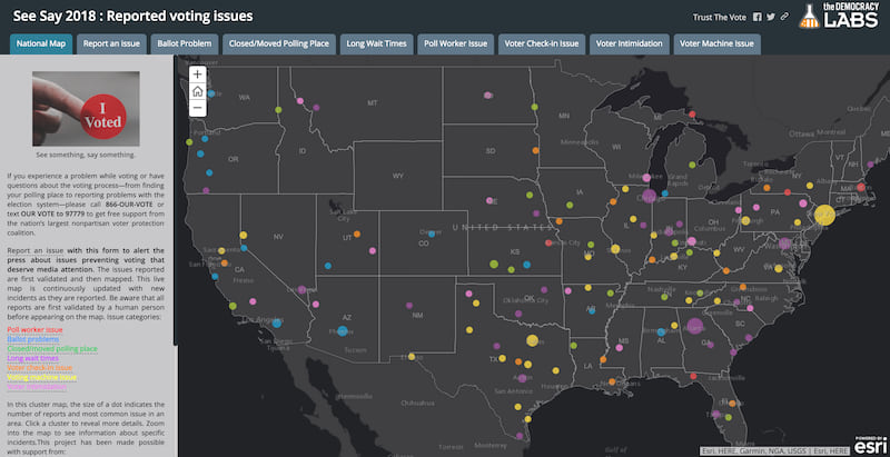
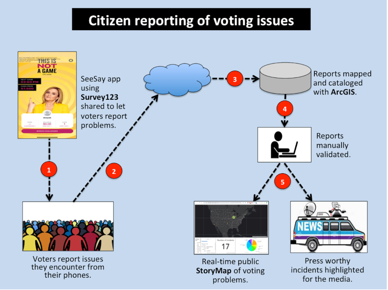
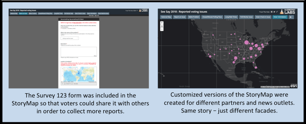
My nonprofit, The Democracy Labs, created a story map to highlight, in real-time, the voting issues that people encountered during the 2018 midterm elections. The project combined a variety of Esri technology: We used Survey 123 to collect reports of incidents, ArcGIS Online to curate them, and Story Maps to visualize and display the valid instances of voting issues that were reported.
Positioning
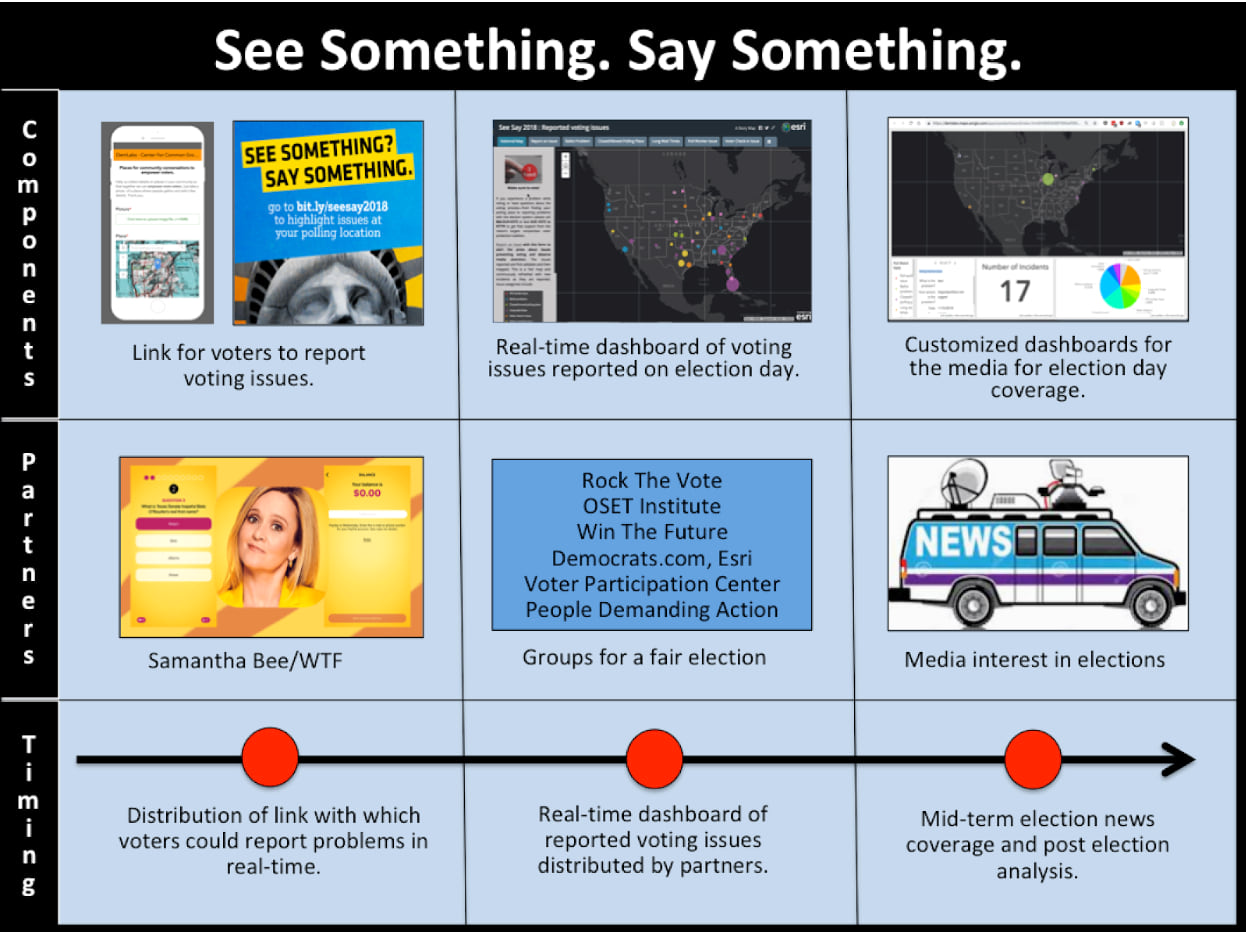
The See Something, Say Something (SeeSay) story was positioned as a means to understand the state of democracy in America. This made it relevant to news organizations covering the elections, organizing groups encouraging people to register to vote, as well as those interested in a free and fair election.
Timing
Work on SeeSay started in September 2018, giving us ample time before the election. It was important to create and distribute the form by which voters could report issues that they encountered well before they went to the polls. Reports of voting issues began coming in on election day and the story map gave up-to-date results in real time.
Distribution
We partnered with a multitude of groups to share the form for submitting reports of voting issues, and recruited other partners to distribute the story map and dashboard based off this data.
Incredibly, See Something, Say Something got over 250,000 views without any paid advertising. In developing the system, we did have to solve a few technical riddles—this is how the final process worked:
Some practical tips to keep in mind:
1. Remember to feature partners who collaborate on distributing your story as a gesture of gratitude (and to strengthen the relationship for future collaboration).
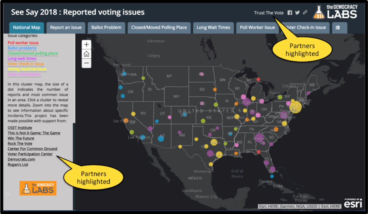
2. Be sure to incorporate built-in ways for readers to share the story further, and offer customized versions of your story to different media partners that can carry their own branding.
To sum up
Sailors know sailing with the wind and tide gets them further with less effort. In the same vein, stories reach more people when they’re aligned with the news cycle and amplified by partners. If you want your story maps to get in front of more viewers, try identifying several distribution partners, position your story to align with their goals, and release it when related issues are gaining traction with the press. I’m confident you’ll see a tremendous difference.


Article Discussion: