Are you a seasoned StoryMaps user, looking for ways to give your stories an extra push? The content of your story may be polished, but what else can be done to elevate your story? Let’s take a look at how you can take advantage of ArcGIS StoryMaps tools, like themes and collections, to help your story stand out.
Themes
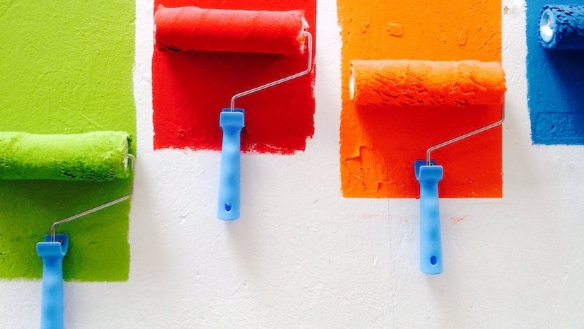
Create a Color palette
One of the easiest places to start with building a theme is picking background and text colors. Picking a color that highlights the message of your story, without overpowering it, is essential. You also want to pick several colors that work well together to create a cohesive palette. It can be helpful to start with one color you know you would like to include in your theme, and creating a color palette from there. You can do this manually, or use a color palette generator. Now, your readers are immersed in your story before even reading a word!

Use Contrast checker
We value our product’s accessibility for our authors and readers. Something we’ve added that helps make sure your story is legible for your audience is our contrast checker. This feature ensures that the colors selected for your theme have a high enough contrast between one another to allow for legible text. Check out this story for a bit more context on the accessibility guidelines with which we base our contrast checker, and for more tips on accessible storytelling.

Import from Google Fonts
Don’t feel like any of the provided fonts are matching your story perfectly? You can import from your favorite Google Fonts into your theme to help your text stand out above the rest. Make sure to note which imported fonts aren’t allowing for bold and italic styles, which will be indicated with a red Warning icon.
Logo image and link
Once you’ve picked a logo image that encapsulates your story, don’t forget to add a link to your logo. This allows your reader to be redirected to the site of your choice when they click on the story’s logo. This can be helpful for sending your reader to your organization’s home page for further context.
Try out a Featured theme!
Does all this choice and customization sound a bit too overwhelming? That’s fair, and we hear you. That’s why we’ve created a set of Featured themes that leaves all of those little design choices up to the professionals. Whether you want to highlight your code snippets with a darker theme like Digital, or take your reader back in time with the Historical theme, we’ve got you covered. Check out your options by clicking on the Design panel, then the Featured themes gallery button.

Picking a Layout
When choosing a collection layout, it’s helpful to take some time to understand your design layouts and think critically on which layout may work best for your story and content’s purpose. Some layouts are more effective with a higher number of content. Other layouts are preferable when wanting to focus mostly on one story, while still including previews of accompanying content. For example, the Grid collection layout may be a good choice for displaying a high number of stories, while the Journal layout may be best when you are looking to list just a few stories you want the user to explore.
Collection Navigation
A strength of collections is the available options for navigating through your stories and items. Our long term authors especially like how some of these navigation layouts can mimic our classic storytelling templates. For example, the Tabbed navigation layout has a similar look and feel to the Story Map Series layout. If you’re missing that classic feel, give the Tabbed navigation a try. Wanting a simpler organization of your content that gives a feeling of flicking through an ebook? Try the Compact navigation layout.

Mix Up Your Themes
We hope by this point in the blog, you’ve already begun work on an exciting and expansive theme. Let’s make sure that theme gets maximum use by applying it to both your stories and collection. This will draw your reader in, keeping them focused on your content, instead of providing them with any formatting distractions. Even better, why not play around with using multiple themes? Switching back and forth between multiple themes for different stories in a collection can help add some color and additional context for each story’s purpose.
Embed from Elsewhere
Another way to pull your reader into your collection is to embed an immersive slide. This could be an option for those looking to add content to a collection without sharing it publicly. Your readers can get a peek at accompanying data or maps that provide additional context to your stories.
New to Collections:
- You can now set your collections to autoplay with a few different speed options. Let your stories play in the background while you give a presentation, or give your audience a quick peek at the content on a faster autoplay.
- The length of the collection description has increased. Not only that, you can now also add links within your description.
- The language of your Collection can be set to allow appropriate translation of the reader’s navigation headings and notifications.
Looking for More?
Check out this story for more tips and tricks on vamping up your Collections: Enhance your collections with design options and more


Article Discussion: