This post was originally published in June, 2021, and was further updated in May, 2023 and August, 2024.
_______________________________
When ArcGIS StoryMaps was originally rolled out in 2019, collections were amongst the first features to be implemented. Ever since, the ability to gather stories together and present them as a set has been one of ArcGIS StoryMaps’ most popular and most asked-about features.
In the months and years since, the StoryMaps team has worked tirelessly to continuously improve the collections experience, for both storytellers and readers. This effort has manifested in a number of updates to collections that this article will walk you through below.
If you’re unfamiliar with collections, please check out this blog post that goes in depth on their purpose and functionality, as well as this step-by-step tutorial that covers how to actually put a collection together in ArcGIS StoryMaps.
Expanding your collection
A couple of upgrades have made collections bigger than ever—literally. For starters, the types of items you can add to your collection has grown steadily over the past year. In addition to stories, you can also add ArcGIS apps like Insights pages, Survey123 forms, Living Atlas content, and other ArcGIS Online items. But that’s not all: you can even add content from elsewhere on the web via URL, or upload image, video, and PDF files directly.
Furthermore, the number of items that it’s possible to place in a collection doubled from its original 30 up to 60. This makes collections a great way to house and promote content on a weekly basis over the course of a year, like a newsletter or a recurring status update or data tracking. As an example, the StoryMaps team uses a collection for our Weekly Waypoint.

We’ve also made it easier to provide a preface for your collection by adding a description field, which allows for much more text than the original summary field (which is still around, and can be used to give your collection a de facto subtitle). The description field also supports more robust text formatting: bold, italic, strikethrough, superscript, subscript, hyperlinks, and text color can all be implemented in the collection description.
Enhancing your collection
Layout options
From their inception, collections always displayed as a grid of cards representing the items within it, with three items in each row (or two on narrower screens). In June 2021, however, two additional layout options were added, selectable within the Design panel in the collection editor.
The magazine option magnifies the card for the first item in the collection, with the subsequent items lining up two-by-two below it. This is a useful format for collections that have new content added on a regular cadence, with the most recent items moved to the top, such as a blog or newsletter. It’s also a good choice when the first item in a collection serves as an introductory piece or index to the following content.
The journal layout widens each individual item card so that it occupies its own line of the collection, and also displays story subtitles if applicable. Shorter collections where each item is roughly of equal importance make a sensible use case for this layout.
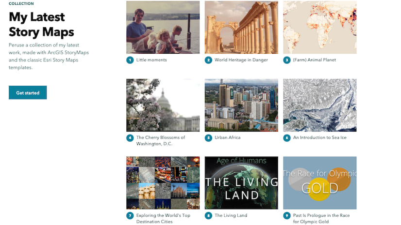
The default grid layout is still available, too, of course. It remains optimal for larger collections, especially ones that contain items that might not have thumbnails suitable for the enlarged item cards of the other two layouts.
Map view
Below the layout options, you’ll see a button option to Show map, which was added in August 2024. Toggling this on adds a map to the collection overview that occupies half of the available space (with the title/description/item cards, etc. still occupying the other half). You can then add a location to each item, as desired, through an Add location button that appears on the item toolbar when hovering over an item card in the builder. You can select a location either by clicking anywhere on the map, or via a search widget. Any item with a location specified will be represented by a point on the map, with a hover-over pop-up that readers can use to access those items (they can still use the item cards to open items, too — note that all three layout options appear and function the same when the map is toggled on).
You also have the ability to change the basemap and the point colors, or even set the map to be a 3D globe (though be aware that this feature is not ideal for collections that have items placed in different parts of the world, as only half the globe can be seen at any given time).
Navigation options
Within the design panel, you’ll also see three options to determine how the readers of your collection can navigate through it via the navigation bar that appears at the top of the page when any collection is open to one of the items within it.
Here are brief descriptions of each of the three navigation options, with recommendations for when they’re best suited:
- Compact: This option presents as an X/Y format, where X is the order of the item within the collection and Y is the total number of items in the collection. Arrows on either side of the display take the reader one item forward or backward at a time.
Best used for: longer collections, particularly where there isn’t a need for the reader to be able to jump around quickly. For instance, a presentational format where each item is effectively a “slide.”
- Tabbed: Displays the names of every item in the collection across the navigation bar, with the current item highlighted. If there are more items than can fit in the bar, arrows allow horizontal scrolling through the list. Clicking on any other item name takes the reader to that item.
Best used for: shorter collections that have fairly brief item names, say, a limited series with multiple parts that have generic names, like “Part 1, Part 2,” et cetera, or a monthly publication where the item names correspond to the names of the months.
- Bulleted: Every item in the collection is represented as a number, arranged horizontally across the navigation bar, with the current item highlighted. Hovering over any of the numbers will reveal the name of that item, and clicking on any number will take the reader there.
Best used for: similar cases to tabbed, but where the item names are long enough to appear unwieldy in the limited space of the navigation bar.

Edit individual item details
It’s the little things that make a difference, and that holds true for ArcGIS StoryMaps collections. Now, the editor of a collection has the capability to change the name of any item as it appears in the collection overview and navigation bar, as well as to manually select a thumbnail image for the item’s card in the collection overview. An item’s custom name will also be reflected in the tabbed navigation layout, making this capability an effective way to cut down on potential word salad in the navigation bar.
These actions can be taken via the Custom item details panel, accessed by clicking the gear icon that appears when hovering over an item in the overview. For collections that are in the Journal layout, you’ll also have the option to change an item’s summary line (the default is a story’s subtitle, if there is one). Note that modifying any of these elements only applies to how they appear in the collection overview; it does not affect the actual underlying item.
Hide a story’s cover
Also amongst the custom item details for a story item is a checkbox for the option of hiding that story’s cover. This feature can come in handy for presentational formats, where there may be live narration or guidance that makes the cover superfluous.
Hide the secondary collection elements
All collections automatically contain a big “Get started” button on the collection overview page, as well as a “Collection” label above the title. Thanks to a May, 2023 update, those ancillary elements can be hidden from view. Simply go into the More actions menu (three dots) in the header and enter the Collection settings modal. You’ll see a checkbox to “Hide overview page elements.”
Branding your collection
Theme a collection
With ArcGIS StoryMaps’ theme builder, storytellers can concoct their own scheme of background, accent, and text colors, pick from an expansive selection of fonts, and more. Themes can be saved for future use and can also be shared across an organization, allowing for a virtually infinite number of combinations that can be used to match a topic, convey a mood, or complement a brand.
This capability has also been extended to collections—in the design panel, you can choose from six standard themes, or you can click browse themes to access your own themes library. If you’ve never experimented with themes before, check out this tutorial to get you going. It’s also worth taking a look at these two blog posts that will help you create effective themes: one offers general advice on the theme builder’s many options, and another specifically deals with font choices.
Add a logo
Put your brand out there along with your collection by adding your organization’s logo, using the uploader at the bottom of the design panel. The logo will appear above the collection title on the collection overview page. Once your logo has been uploaded, a field will appear in the design panel to add a URL, which makes the logo a clickable link. (Note that you can also incorporate a logo as part of a custom theme.)
Sharing your collection
Customize the collection’s share details
Whenever your collection is shared on social media or comes up in the results of a search engine query, by default it will display using the collection’s actual title, the description that you’ve entered on the collection overview page (if there is one), and a thumbnail that is an automatically generated collage of the thumbnails from the first few items in the collection.
However, you have the ability to change any of those details, if desired; for instance, to shorten the description, or to provide a different thumbnail. Those details can be tweaked in the Publish options page, which you’re taken to whenever you hit Publish in the collection builder. (Note that there’s a checkbox that determines whether those new sharing details will also be used to overwrite the corresponding item details in ArcGIS Online. It’s set to do that by default, so be sure to uncheck it if you’d rather not push those changes to the root item.)
Get iframe embed code
When it’s time for your collection to be out in the world, you may appreciate the ability to embed it on another website, whether that’s because of an employer’s protocol, or because you have your own proprietary site or blog with lots of traffic already, or for any other reason.
Embedding a collection as it appears in full on another website is super easy to do, thanks to an addition to the header menu of a published collection that enables you to pull an automatically generated, embed-ready iframe code. See this blog post for a detailed guide on how to embed ArcGIS StoryMaps output elsewhere on the web.

As mentioned above, collections remain a huge hit with the storytelling community, and we love seeing the inventive ways in which they’re used. Our goal is to continue enhancing all aspects of the collections experience—more updates are in the pipeline, so stay tuned! Your feedback helps drive our product planning, so please leave any questions or suggestions in the comments of this blog post, or find us on Twitter or on the Esri Community.
Stamp collection photo: Allie (@wordsmithmedia), via Unsplash


Article Discussion: