Adding images to your story is both easy and popular. Whether it’s a beautiful photograph for your cover, a static map exported from ArcGIS Pro, or a series of data-driven charts, there are many ways images can enhance your story.
Striving for flexibility, the ArcGIS StoryMaps builder supports a number of popular image types: GIF, JPEG, PNG, and SVG. Each of these types of files has its own strengths and weaknesses, so knowing how to pick the right one for your needs is key. On top of that, it’s helpful to understand the relationship between image resolution, image size, and file size; these will all impact how sharp an image looks and how quickly it loads for readers.
If you’ve been wondering how to get crisp, clear images throughout your story without having to sacrifice speedy load times, keep reading. The tips and best practices that follow, along with some behind-the-scenes support from the builder, will make you an image-wielding wizard in no time.
Striving for flexibility, the ArcGIS StoryMaps builder supports a number of popular image types: .jpg, .png, .gif, .svg, .bmp, .webp, .heic, .heif, .tif, and .tiff
First things first: file types
When it comes to choosing a file type for your images, you’ve got options. (Selecting an image’s file type is easily done in most image-handling software through the Save as or Export tools.) But each type comes with its own set of pros and cons; you’ll want to choose the one that best aligns with what you need your image to do. Here’s a quick breakdown of some of the more common file types supported in the story builder:
JPG (or JPEG) files are perhaps the most common type out there; the file extension stands for Joint Photographic Experts Group, if you’re curious. What makes JPGs so great is the amount of detail they can preserve in a relatively small-sized file. However, JPGs can experience “lossy” compression when they’re repeatedly exported, meaning that they’ll gradually look less and less sharp the more times you edit and then re-save the file, or re-size it.
GIF files (short for Graphic Interchange Format) are growing in popularity these days, largely for their ability to display animation or movement. GIFs can be composed of a series of frames, which is how they achieve this effect. They also support transparent backgrounds, so you won’t have to modify the file just because you decide to change your story’s background color. But while you gain animation and transparency with GIFs, you lose color flexibility. GIFs only contain 256 colors, making them less than ideal for complex or highly detailed images with rich color palettes or gradients. Additionally, the more colors a GIF has, and the more those colors change, the larger the file size of that image will be.
PNG files (Portable Network Graphics) aren’t as widely known, but they’re incredibly useful for publishing content on the web. Like GIFs, PNGs support transparent backgrounds, but unlike GIFs, they aren’t limited in the number of colors they can contain—a gradient that looks chunky in a GIF will look silky smooth in a PNG. And, unlike JPGs, PNGs are inherently lossless; they’ll never degrade in quality no matter how many times they are re-sized. The tradeoff here, though, is file size. If you save the same image as both a JPG and a PNG, the PNG will always be a larger file.
SVG files (Scalable Vector Graphics) are certainly the most niche format on this list—you’ll need more sophisticated design software (like Adobe Illustrator or Sketch) to export to this file type. Or you can find them in many of the icon libraries available on the web. As the name states, these files are vector based, so unlike any of the file types above they can be scaled up beyond their original size without experiencing any loss in image quality or bloating the file size. They’re also another file type that supports transparency. But SVGs aren’t built to handle the level of detail you see in photographs, hillshade layers, or complex artwork.
You’ll want to choose the file type that best aligns with what you need your image to do.
Ok, so that’s what each file type is, but when do you use them? Again, it depends on your goal for that image. It’s probably more helpful to break this down by common use cases:
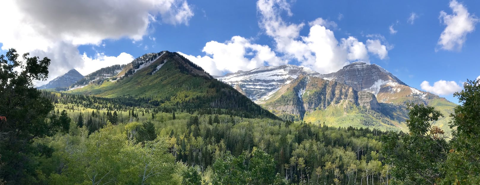
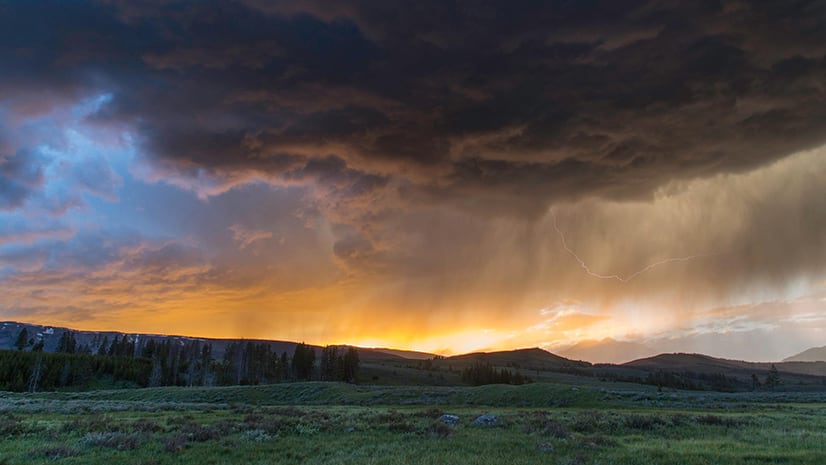
You want to show off a breathtaking photograph or awe-inspiring piece of art. These will have lots of colors and fine details, and you don’t want to diminish any of that great work! A JPG will give you the crispest image for the smallest file size—more on this in a bit—so that should be your go-to image type. See how beautifully they display the landscape and wildlife images in this story?
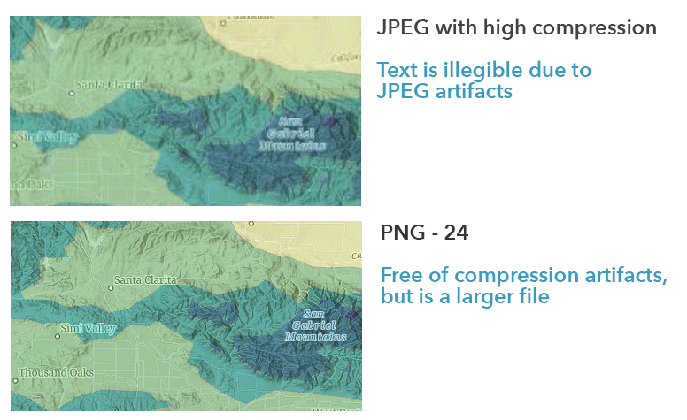
You have a static map with labels or annotations that contain key information. Now we’re getting into PNG territory. Why? Because they’re lossless. The story builder works hard to ensure readers don’t have to wait long for an image to load, so it does some magic behind the scenes to optimize image delivery, which usually involves a bit of image compression. Because PNGs are lossless, this compression won’t adversely affect extremely fine elements like text, lines, or arrows; those could start to get a bit blurry if the image was a JPG. For this story, the annotated maps were exported as PNGs for that very reason.
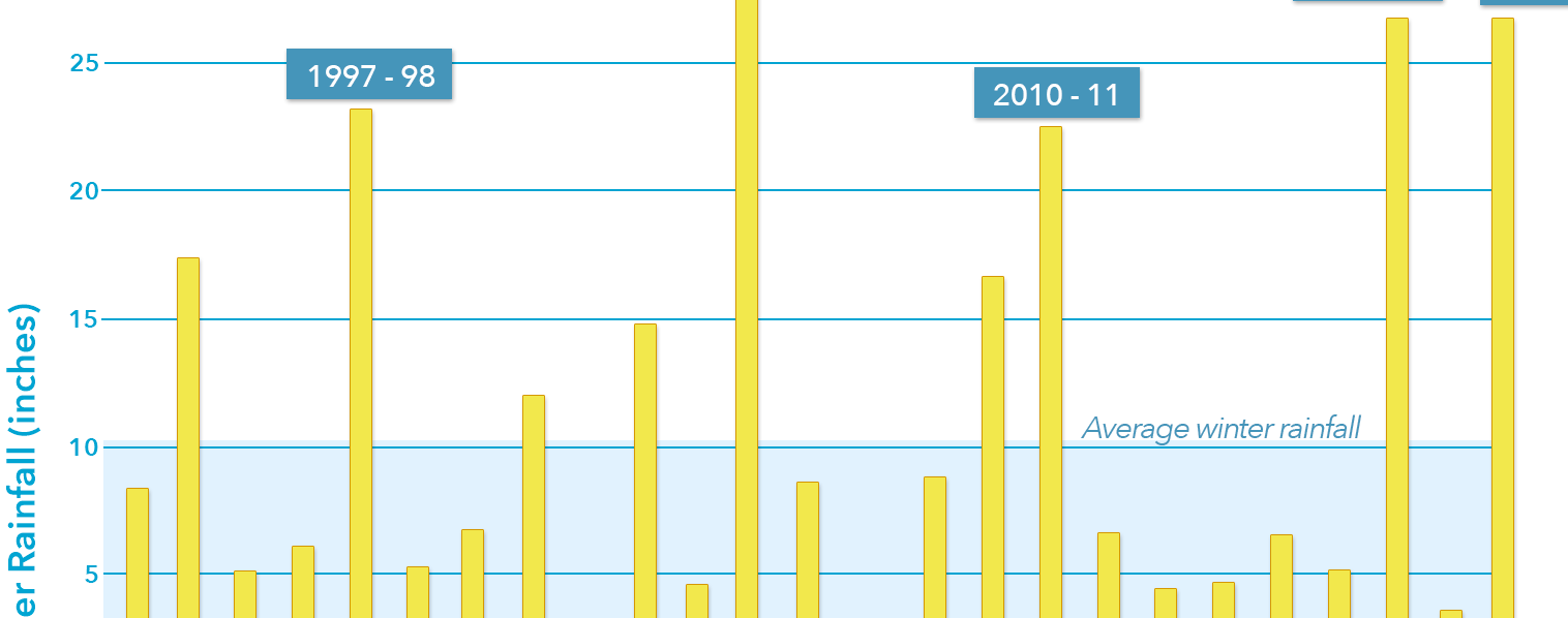
You have an infographic or chart that adds depth to your narrative. Depending on the complexity of the graphic, you have options here. PNGs will serve you well for the lossless qualities described above, and their support for transparent backgrounds will make it easier to seamlessly integrate them into a story’s visual language. SVGs will do the same, but with an even smaller file size. If the graphic only contains a handful of colors, a GIF could also suffice. The charts in this story are all PNGs, as are the map legends.
You have a series of static maps or charts that, when animated sequentially, show important trends or changes over time. As you likely guessed from the keyword “animated,” GIFs are the way to go in this instance. You’ll need software that can help you turn the static images into frames of a GIF (Adobe Photoshop can do this, but there are myriad free online tools you can try, too). This animated map technique is used to great effect in the livestock density visualization shown here.
You have small icons or other visual embellishments that will give your story that extra level of polish. Whether a logo, custom separator, an image marker in an express map, or other unique elements to set off each section of your story, these graphic flourishes are ideal candidates for SVGs. They’re usually simple, and not worth a slow load time, so the smaller the file size the better. Of course, a PNG will be a fine substitute, since it also supports transparency. The pawprints that bookend this story provide one example of this technique.
File size, resolution, and load times
Knowing which type of file to use for your images will go a long way in ensuring your stories look their best, but file type isn’t everything. As you’ve likely gathered from the discussion above, file size (measured by kilobytes, megabytes, etc.) plays an important role, with larger files taking longer to load.
The more pixels an image has, the more detail it contains, and the higher its resolution is.
Keep in mind that file size isn’t the same as image size (which refers to how wide and tall an image is), but the two are linked by way of image resolution. Before we dive into this, let’s define some key terms to ensure we’re on the same page.
PPI stands for pixels per inch. It’s sometimes used interchangeably with DPI (dots per inch), but they’re actually different terms. Dots are round, and they matter a lot in print mediums. Pixels, however, are square; these are the units that matter for digital mediums and screens. That’s because pixels directly correlate to resolution, or the amount of information contained in an image or display. The more pixels an image has, the more detail it contains, and the higher its resolution is. A 1920 x 1080 image (1,920 pixels wide, 1,080 pixels tall), is half the resolution of a 3840 x 2160 image. If both of these images were scaled to be 2,000 pixels wide, the second image would be much clearer than the first, because it has a higher ppi.
So, the higher the resolution, the better the image, right? Not necessarily! All that resolution detail also affects file size; more detail means more bytes of storage, so higher resolution images will mean larger files and slower load times.
While print mediums require immense dot density, digital content is more forgiving. Web graphics will look sharp on the majority of devices at just 72ppi; anything above that, and you’ll be getting minimal improvement in image clarity while risking a significant increase in the time it takes for that image to load.
So, if you’ve designed a map or chart for print and then want to reuse it in a story, you’d be wise to scale down its resolution before uploading it in the builder. The same is true of photographs captured with high-end cameras—your story just doesn’t need all the pixels jammed into the original image.
Web graphics will look sharp on the majority of devices at just 72ppi.
The right image size for your chosen block
If you’ve used the story builder much, you know that there are many content blocks than can incorporate images, but the sizes of these can differ substantially from block to block, layout to layout, and even device to device. So, if you’re being a real stickler for load times and want to use only as large an image as is absolutely needed for that block, how do you figure all that out?
For starters, remember that the story builder is on your side. It’s going to do that behind-the-scenes magic mentioned earlier to optimize whatever you upload for the fastest delivery possible. If you upload an image that’s 3,000 pixels wide and then set it to float in your narrative, the builder will create a new version of that image that’s only as wide as needed for the float size (510 pixels). If you later set it to the medium size, it will serve up a newly sized version (1,200 pixels wide) to accommodate the larger setting. The builder also creates smaller sizes that are served to mobile readers who have smaller screens and possibly slower download speeds.
Where you need to focus your efforts, then, is ensuring the image isn’t too small, or too low res, for the place you intend to use it. Scaling down an image is easy, there are plenty of extra pixels to work with. But scaling up is a different story (SVGs being the exception) because the original pixels don’t provide enough detail for the new, larger size. This is when your image will get blurry or pixelated.
The story builder again tries to help you in these situations. When using the image block, for example, you may notice certain sizes will be disabled if you have an especially low-res image. The medium size requires images that are at least 1,200 pixels wide, and the large option requires a 1,920-pixel width at minimum.
Generally speaking, then, you’ll want an image that has a 1920px resolution for large images, or to fill the large media panels of sidecar, slideshow, swipe, and map tour (if you’re using the media-focused layout). For smaller options, you can comfortably scale down to 1200px without worry—or ever smaller for those embellishing icons mentioned above.
Another thing that’s good to know is that you can set an image to always fit within the window or screen in which it’s being viewed. This is an especially handy option for images with vertical aspect ratios that might otherwise not be visible all at once and require scrolling to see in their entirety. This “fit to screen” option can be toggled in the image options, accessed by clicking the little gear icon that appears when hovering over an image in the builder.
Bonus: Modify images right in the builder
You can make all the right decisions when it comes to file type and size, but sometimes you still just need to be able to make minor adjustments to an image on the fly. Maybe it would work better in a vertical aspect ratio instead of a horizontal one, for instance, or maybe it’s coming straight from your phone and it’s tilted the wrong way.
Fortunately, ArcGIS StoryMaps has a built in image editor that allows for basic image manipulation; this feature can be accessed by clicking on the little pencil icon at the left end in the toolbar that appears when hovering over an image in the builder. In the Crop tab, you’ll find a number of pre-defined aspect ratios, or you can crop the image to custom dimensions if preferred. You can also give an image rounded corners or even make it circular, for a more stylistic feel. Finally, you can rotate the image in 90-degree increments or flip it horizontally (like a mirror image) if needed.

In the Markup tab you’ll find drawing tools—lines, points, shapes, arrow, etc.—that can be used to draw attention to specific elements of your image.
Armed with all this image-specific information, you should now feel pretty confident in your ability to create a story that looks sharp and loads fast. But if you still have questions, shoot us a note over on Esri Community; we’re always happy to help!


Article Discussion: