This piece of content references and/or links to a retired product; it is no longer being maintained.
About the author: Liz Juers is the GIS Specialist for American Prairie Reserve in Bozeman, Montana. She entered the world of GIS via a background in biology, environmental studies, and wildlife field work. Liz has been striving to make better and better maps for American Prairie Reserve since 2013.
American Prairie Reserve is tricky to explain. It’s both like a National Park and completely different from a National Park; it’s ready and waiting for you to visit, but it’s still being created. As staff members for the nonprofit organization tasked with protecting this rich ecosystem, we are continuously trying to improve the ways we tell our story and explain this unique project.
The challenge of story scope
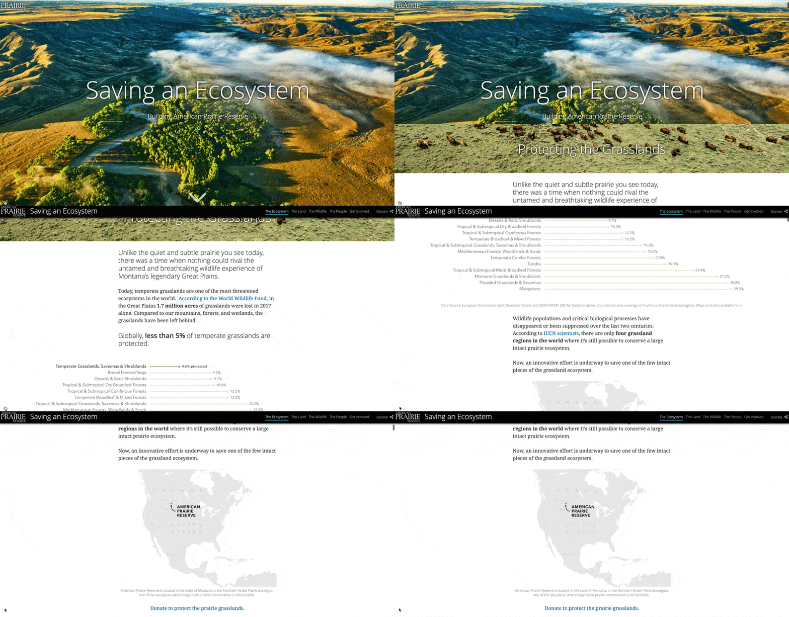
Our team was looking to add another tool to our what-exactly-is-American-Prairie-Reserve storytelling toolkit. We wanted a digital product that was “fun-size”—more bite-sized and shareable than our full website, but still robust enough to satisfyingly explain some complexities of the project. I had a hunch that incorporating maps would help achieve this, by letting us walk a reader through information one layer at a time. When Esri’s StoryMaps team offered to collaborate with us, that was the icing on the cake and we decided to create Saving an Ecosystem with the Story Map Cascade template.
That goal of a fun-size product—that happy medium between too much information and too little— was the overarching challenge of this project. Explaining the core of any mission can be complicated. There’s the struggle of choosing one of many different approaches for telling the story, while also considering many different stakeholder opinions. There’s usually a long list of motivations, accomplishments, volunteer projects, studies, and more—and there are emotions attached to that list.
I knew from the beginning we were going to have to leave some things out. It was going to be tough (shout-out to all the fantastic research projects, collaborations, and initiatives that got cut from this story map!), but I knew it had to be done to keep the end product manageable for the reader.
Planning for success
We started with a project proposal (by “we” I mean my colleagues Katy Teson, Becky Lonardo, and myself). An official project proposal might be overkill for some story maps, but I still recommend taking a minute to write down your goal(s), your target audience, and your measures of success. If the subject is a nonprofit or a mission-based project, is the target audience your existing network, new faces, or both? Does success equal increased awareness (demonstrated by views), sign-ups to your newsletter, or reduced calls to your office about a certain confusing topic? These answers give you the criteria to later weigh which content is more or less critical for success—i.e. what makes the cut and what doesn’t. Putting it in writing helps keep you honest.
Our goal was an evergreen product that would be relatively easy to update for ongoing use and could help transform curiosity into advocacy and support. Our primary target audience was people who are new to our project. The work at American Prairie Reserve is only possible thanks to charitable donations, so we knew that click-throughs to support the cause would be one of our measures of success.
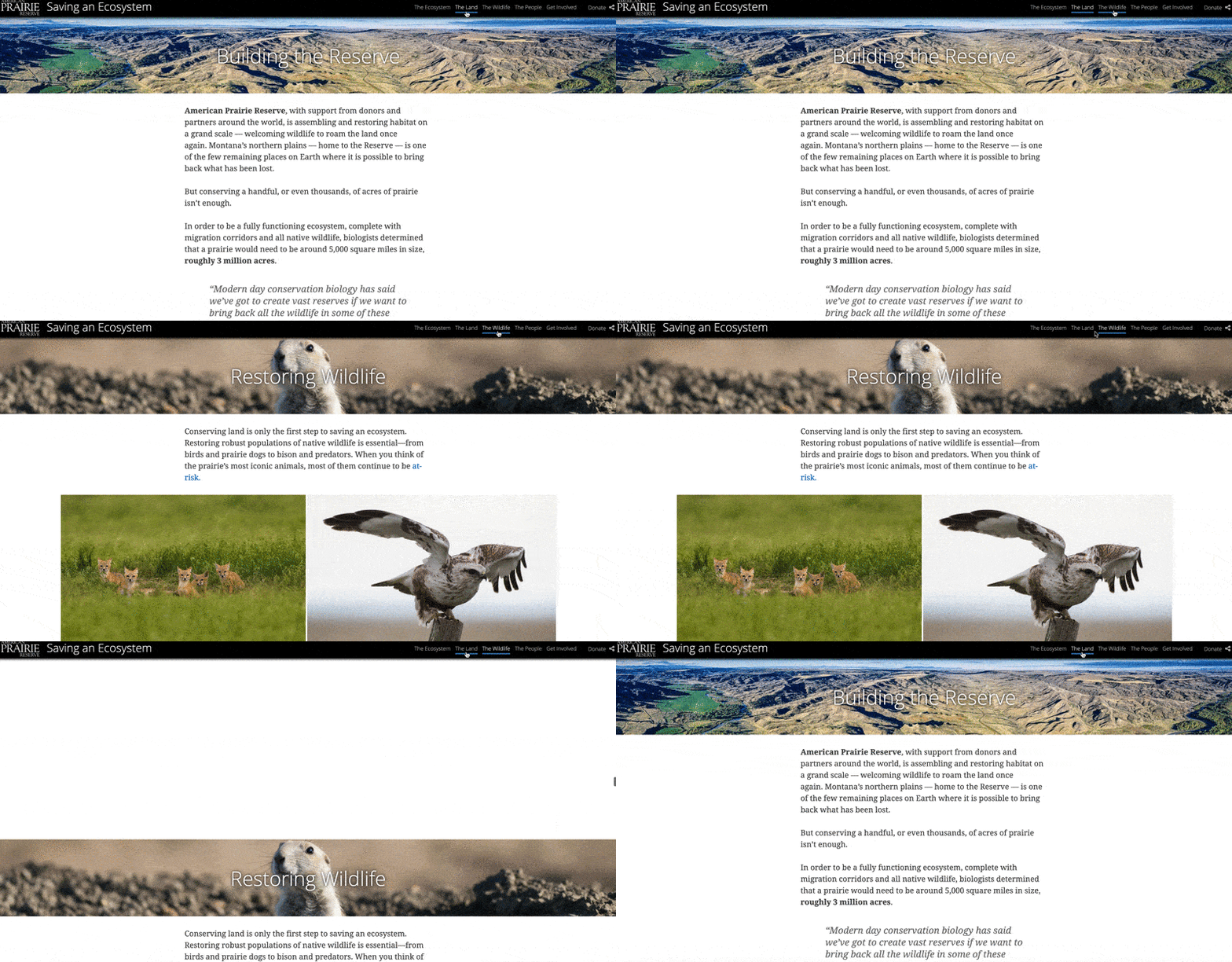
The next step was a content outline. The original outline was arranged into six sections, but we ended up editing two of the smaller sections into one. The resulting five sections are reflected both by headers and bookmarks along the top of the story map. (I think three to five sections is a good range if you’re aiming for that mid-size target.) We stayed pretty close to our original outline, which kept us focused and organized. Most of the changes we made along the way involved slightly trimming the content and rearranging content for a better flow.
Keeping only the essential content
You don’t see much about managing emotions and personal psychology on the ArcGIS Blog, but I couldn’t help but notice how important these were to the decision-making for this story map. When certain ideas or details landed on the chopping block, I found myself using a trick to manage to my emotional attachment. Instead of having to feel like those ideas were gone forever, I told myself I was saving that idea for a follow-up story map, or several. (For the record, you don’t have to immediately make that follow-up piece for this trick to work.) Remember, it all comes back to the goals and definition of success you set to guide these inevitable chopping-block decisions.
Another trick is to make good use of hyperlinks. A brief mention with an in-line link to more information can be just the ticket. This lets curious readers learn more without overwhelming the rest of the audience. As the story map author, it also works to soothe any unease at leaving out your favorite details. Similarly, you can sneak a short sentence with an extra tidbit of information or a link into a photo caption. Captions are easy for a rushed reader to skim over, and this can help keep the story map from feeling overwhelming.
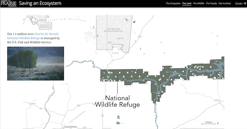
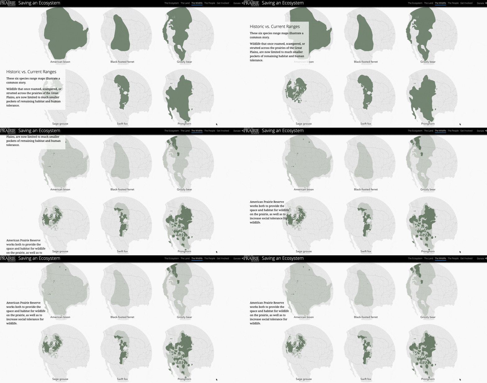
Then there’s the wisdom that a bar chart is worth a thousand words. For this project, I gave myself time to brainstorm and mock-up different options for maps and graphics that could communicate important points in the story in addition to breaking up blocks of text. For me this meant taking advantage of Cascade’s immersive sections and fade transitions to create faux animation between static maps. I used that technique to introduce types of landownership one at a time, and to show prairie species’ ranges shrinking as a reader scrolls.
Looking forward
Now that our fun-size story map has been published, we are keeping an eye on our measures of success. We used unique trackable links for each call to action to help us evaluate which messages are most compelling to our audience. We can also use this information to prioritize follow-up pieces that expand on different aspects of the story. Promotion of the story map is ongoing, in particular we are featuring it an email series for new supporters, and will continue to share it via social media. The evergreen nature of the piece means there is an ongoing editing cycle, like keeping up to date with new land purchases. This also gives us a clear opportunity to reflect and assess what is working and incorporate what we have learned in future revisions.
This fun-size candy bar metaphor has me thinking about prairie dogs, who, if you didn’t know, are the candy bars of the prairie because so many animals love to eat them. I remember the first time I heard their squeaky “barks” popping up around me as I mapped the perimeter of a prairie dog town, and how captivating it was. While the team and I succeeded in achieving the level of explanation we wanted from this story map, there is never a substitute for experiencing something in person. I invite you to come visit American Prairie Reserve and see it for yourself.



Article Discussion: