I habitually spend a small portion of my workday exploring stories recently created with ArcGIS StoryMaps, usually by searching on ArcGIS or Twitter. I try to spot trends and identify common pitfalls, and I’m always on the lookout for exemplary stories that I might bookmark or use as examples of outstanding storytelling.
Happily, I’m encountering more and more stories of exceptionally high quality. Their topics cover almost everything under the sun, and their authors range from students doing first-time projects to professionals communicating on behalf of large organizations. I have saved a subset of these stories into a collection, Outstanding stories from theArcGIS StoryMaps community.
Among the extraordinary qualities of these stories is their effective and imaginative use of immersive blocks. Nearly all of my favorite stories use one or more of ArcGIS StoryMaps’ immersives—sidecar, slideshow, and guided tour—often in interesting combinations.
I’d like to show you a few of my favorite examples, in hopes that they might inspire you to use immersive blocks creatively in your own storytelling efforts.
[Note: Because I frequently modify my Outstanding ArcGIS StoryMaps collection, the links below go directly to the individual stories.]
Sidecar
An immersive with stationary media panel and scrolling narrative panel
By far the most widely used immersive is sidecar, which offers two layouts: floating panel and docked panel. Sidecar can be used in lots of ways, and is great for showcasing both maps and images. (I go into greater detail about using sidecar’s docked and floating layouts in this blog post.)
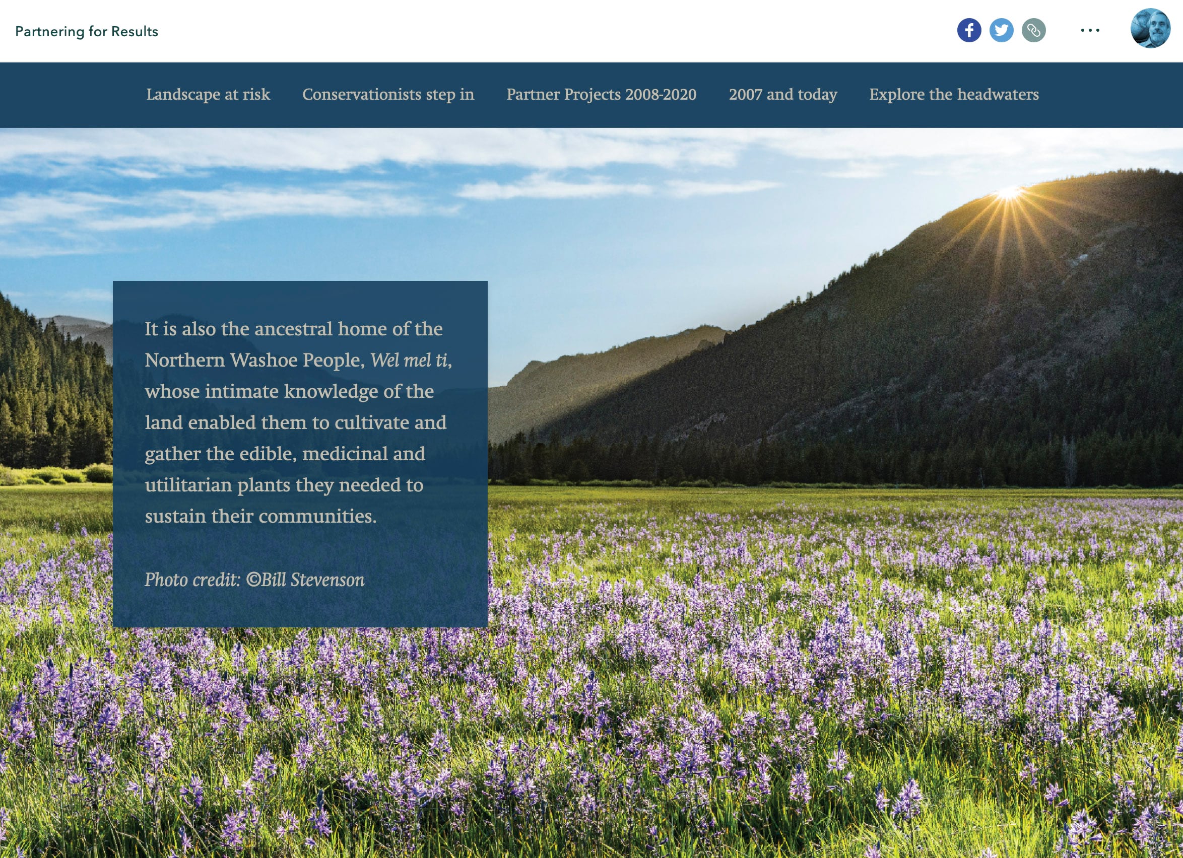
Partnering for Results by the Northern Sierra Partnership makes particularly effective use of the floating panel option. The story showcases striking photographs, videos, and static maps. Floating panels are placed to minimize interference with the images as readers scroll. Text within the sidecar sections is short (for longer text it’s usually advisable to use the docked panel layout). Use of the Tidal theme, with its dark blue background, visually unifies the floating panels with the rest of the story.
Sidecar is the ideal stage on which to perform map choreography—adjusting layer visibility, zoom levels, and map extents to turn a multi-layered web map into a narrative. My perennial poster child for map choreography is Salmon River’s South Fork by Gene Trantham of Penn State. His introductory sidecar immersive puts the Salmon River in a regional context, then gradually zooms in, exposing a variety of themes, each of which is interpreted in the docked side panel. His cartographic dance ultimately takes us to the site of an abandoned gold mine, the proposed reopening of which poses environmental threats.
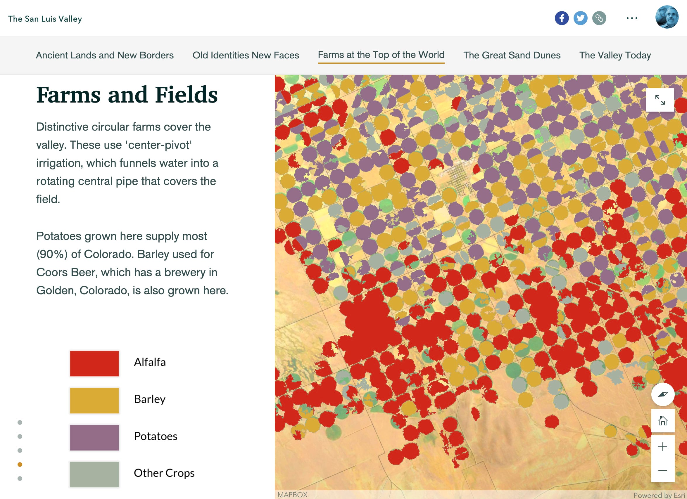
The San Luis Valley, a “personal project” by Carl Churchill, includes a docked-panel immersive within its Farms at the Top of the World section. It takes us on a virtual tour of the upper Rio Grande, even rotating the map for optimal viewing of key locations and themes. The author has also included map legends as static images within the side panel. The sidecar section is brief, but Churchill resumes the virtual tour in the next chapter of his story.
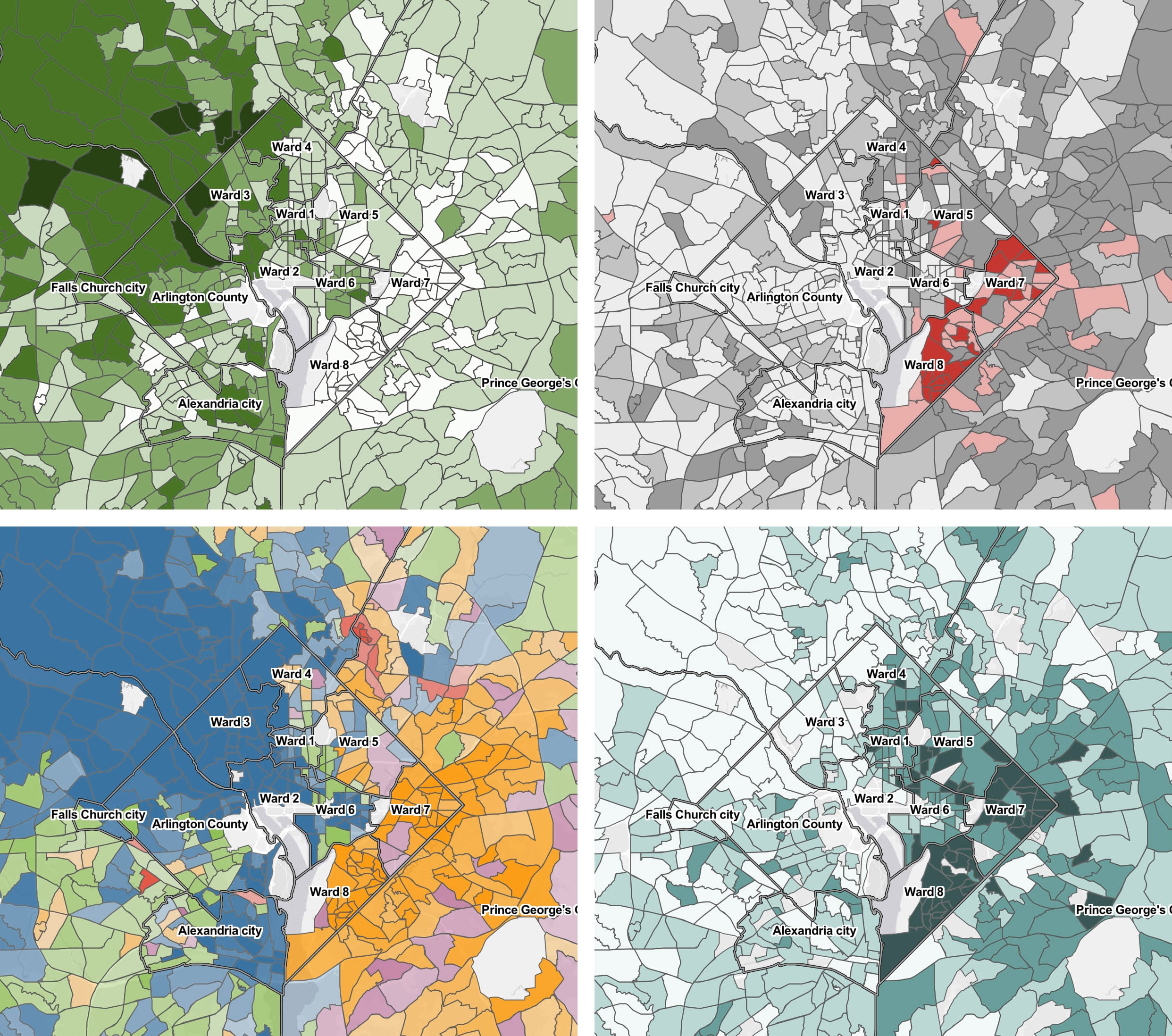
Hunger Report 2020 by the Capital Area Food Bank contains a powerful floating-panel sidecar within which four thematic maps starkly portray the DC area’s east-west socioeconomic divide. The maps’ consistent scale facilitates easy comparison across the themes; map legends and sources are included in the panels. No additional bells and whistles needed: the four maps speak for themselves.
I’m a sucker for super-simple maps. In Celebration, Reflection, Elevation by The Nature Conservancy, a series of maps within a floating-panel sidecar vividly depict a years-long effort to protect wetlands and barrier beaches. No labels, no scalebar, no pop-ups—just a single, simple map legend.
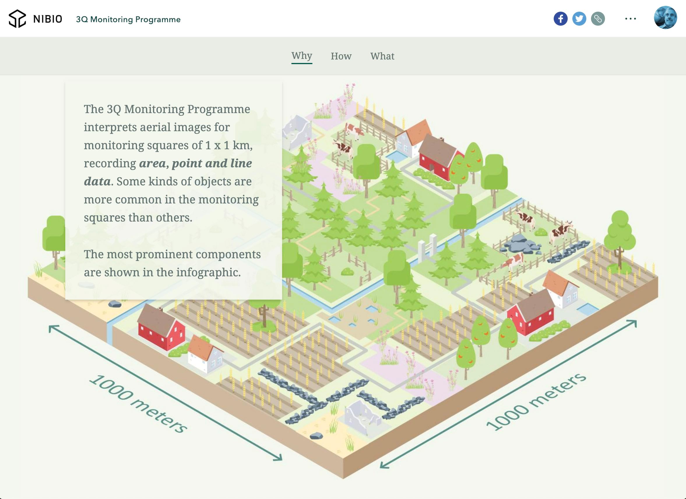
Near the top of the 3Q Monitoring Programme story by NIBIO, a Norwegian research institute, is a floating panel sidecar that uses schematic artwork to turn what could have been a dry discussion of land cover categories into a charming sequence. Check out the rest of the story for its imaginative use of infographics, maps, and annotated photographs. It’s a tour-de-force.
My team and I usually recommend that immersives be used rather sparingly; that it’s best to intersperse them judiciously within a larger, scrolling narrative. That said, there are effective exceptions to the rule, among them Tracking a wilderness icon from WCS Canada. It’s an all-sidecar story. But you’ll notice that it’s not a single sidecar, it’s a series of them, with docked panels sometimes on the left, sometimes on the right to give rhythm and variety to the story. They’ve slipped a couple of floating-panel sidecars into the narrative as well. Note how they sometimes chose to “fit” images and videos rather than “fill” the media panel, in cases where key elements of the visuals might otherwise be cropped out.
Don’t forget, by the way, that you can use audio to make your immersives even more immersive! This story on Climate & Ugandan Coffee by the Alliance for Resilient Coffee is a good example of how environmental sound can add a new dimension to your storytelling.
Guided tour
Walk your audience through a list of locations one place at a time
I’m a big fan of guided tour, the two layouts of which—map focused and media focused—give storytellers a rich playground for creating point-to-point narratives.
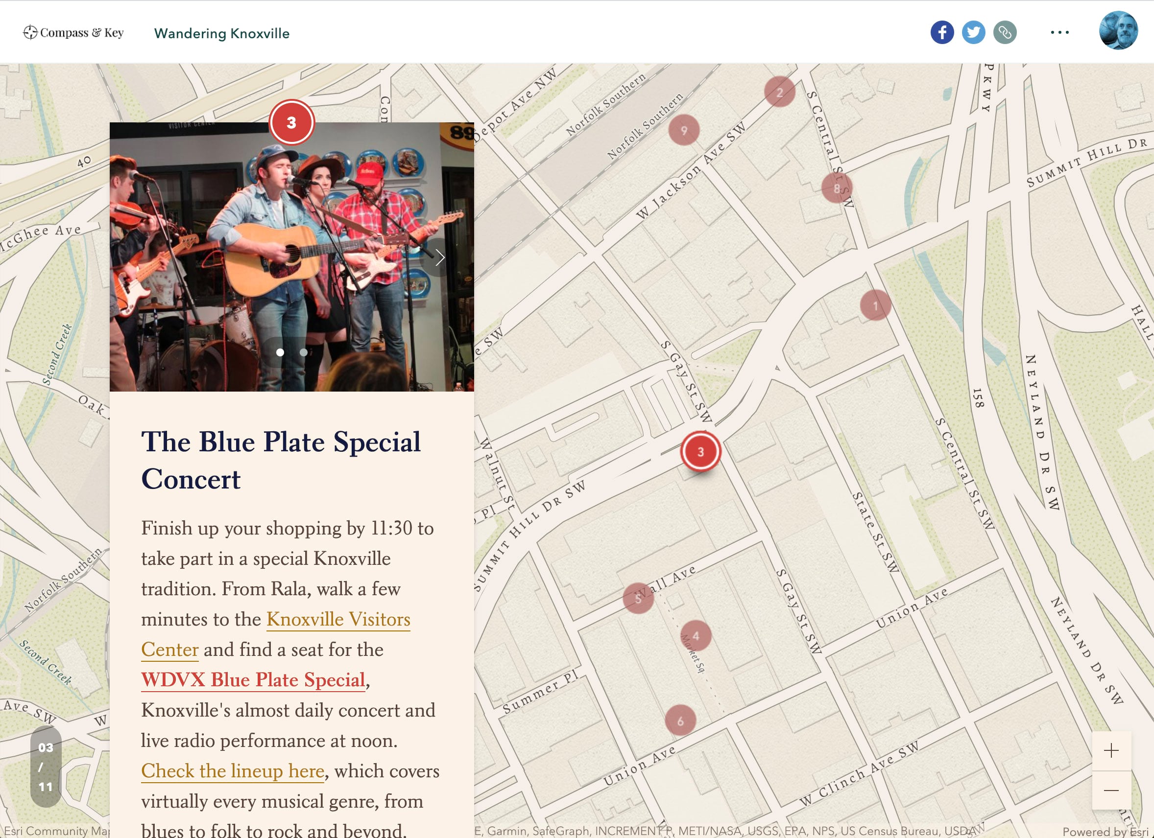
A tour worthy of emulation is Compass & Key’s Wandering Knoxville. The guided tour sets off after a brief and engaging introduction. Note how the initial map view encompasses all of the tour points. This orients the reader, while map extents for the remaining points zoom in closer. Remember that it’s easy to set custom extents for any or all of the points in your tour. Some guided tours I’ve seen remain zoomed too far out; others start so close-in that you never gain a geographic context.
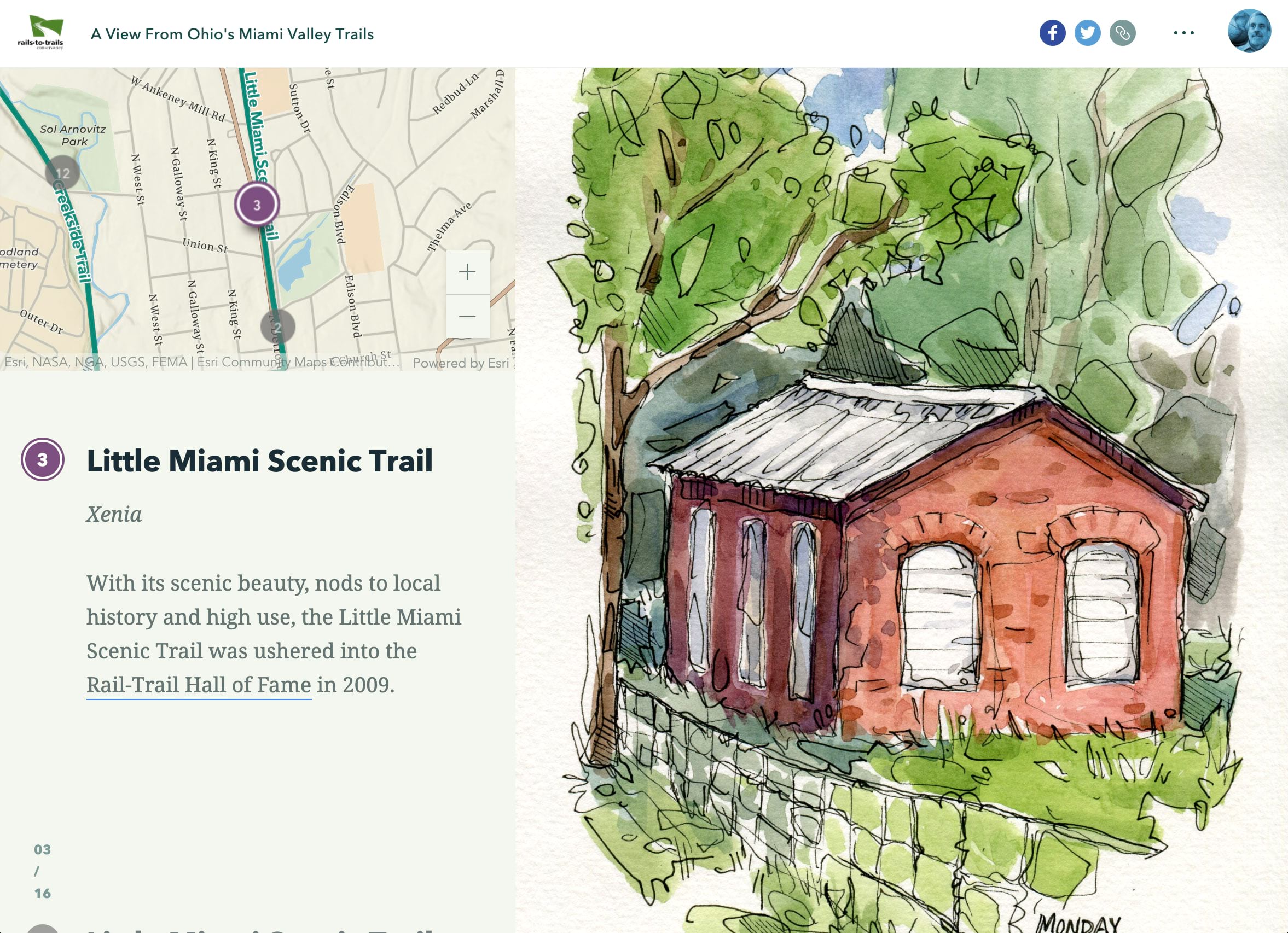
I usually prefer the media-focused guided tour layout, which gives the visuals ample real estate and relegates the map to a supporting role. Here’s a media-focused guided tour, made distinctive by the fact that, rather than using conventional photos and videos, A View From Ohio’s Miami Valley Trails by the Rails to Trails Conservancy features watercolors by artist and cyclist Maggie Reckers. Not all of us have drawing skills or easy access to someone who possesses them, but using illustrations within ArcGIS StoryMaps is a surefire way to make them distinctive and engaging.
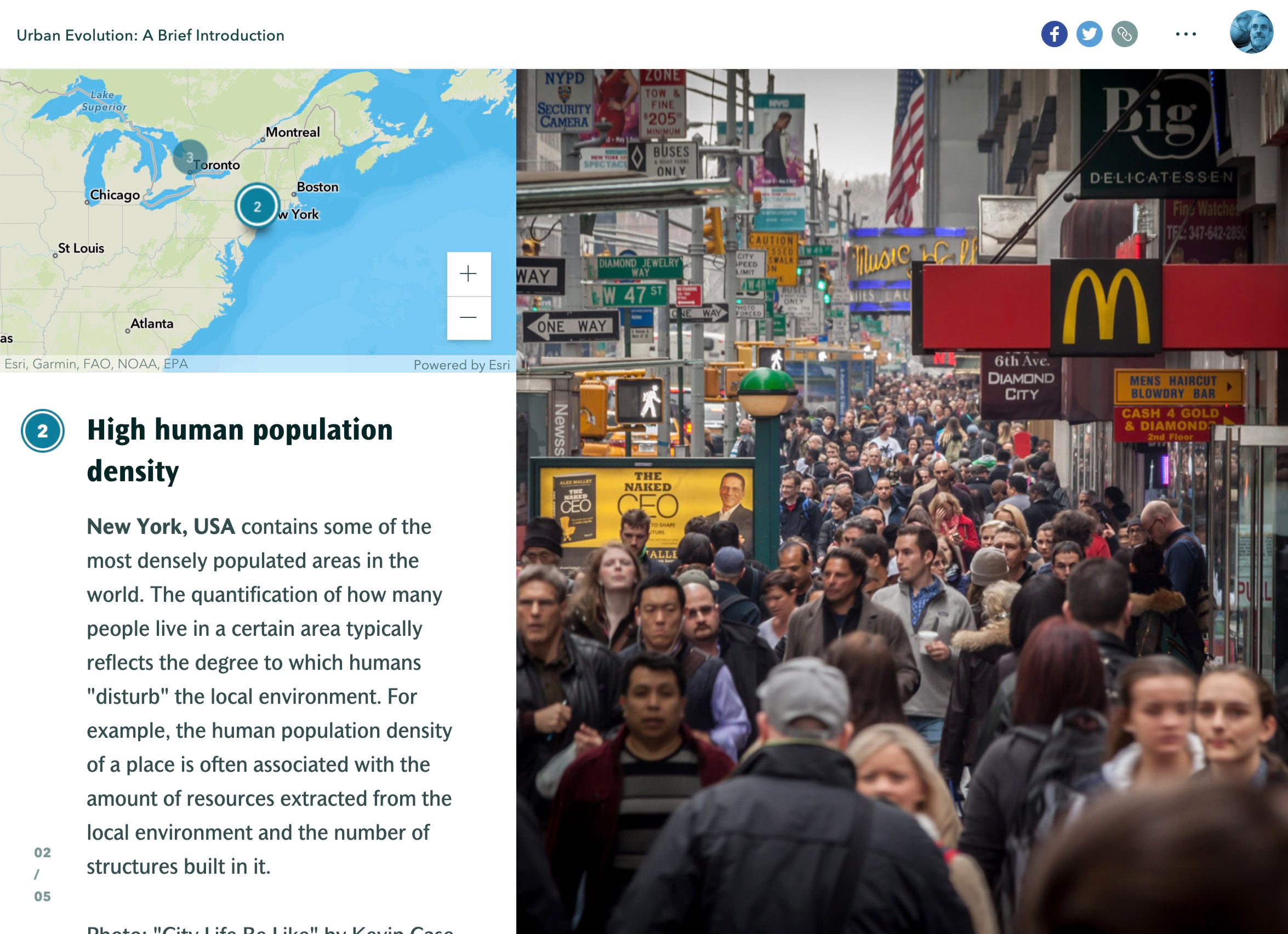
Guided tours most often take us virtually along a route, whether it’s a walk through a historic district or along a bike path. But tours can also illustrate themes, as does the pair of guided tours in Sophie Breitbart’s fascinating look at natural evolution in cities. They can also trace the path of a career of activism, as in The Life of Dolores Huerta. The latter uses a mix of slideshow, guided tour, sidecars, and scrolling narrative in a rich multimedia biography.
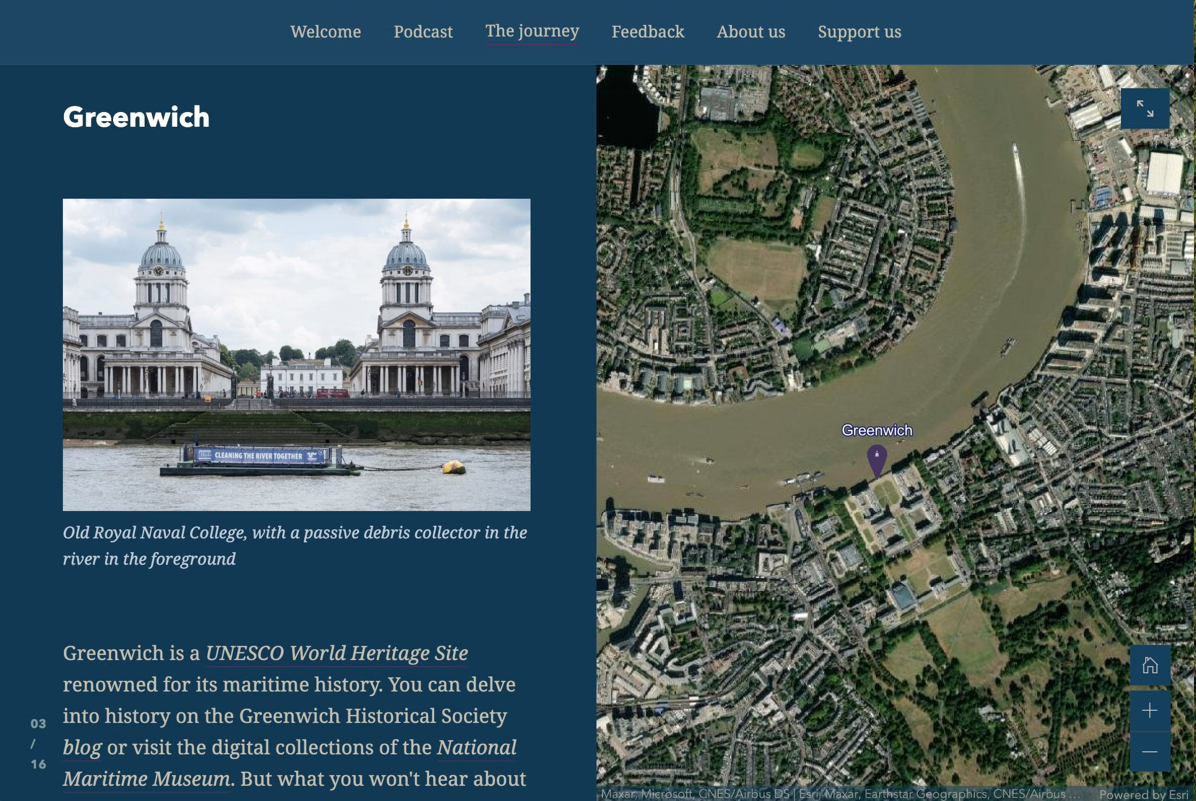
It’s good to remember that the guided tour immersive block isn’t the only way to take people on a tour. I like to use the sidecar immersive, especially the docked panel option with the panel width maximized so it fills half the screen. The Thames Estuary Partnership’s story, The Tidal Thames, uses this technique. Their use of an imagery basemap provides a vivid sense of place, and the wide side panel effectively showcases photographs of each tour point.
Looking for more pointers about guided tour? Check out this blog post.
Slideshow
A full-screen, media-focused layout with minimal accompanying text
As is evident from its name, slideshow is ideal for displaying a sequence of images for which lengthy captions aren’t required. Because its horizontal, previous/next interaction interrupts the standard vertical scroll experience, it’s often best used for material that’s supportive of, but not essential to, the main narrative. You can perform map choreography within slideshows, but my feeling is that sidecar is a more effective way to showcase your maps.
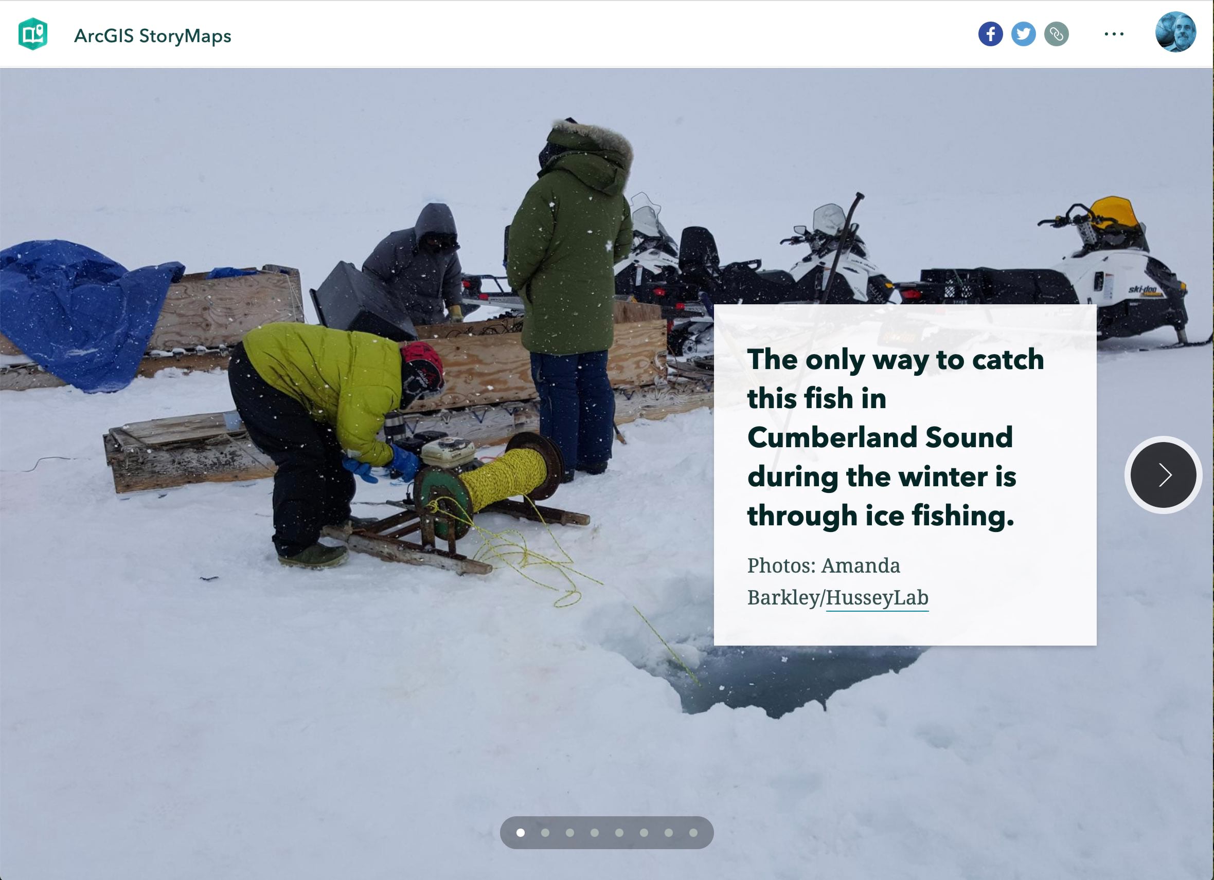
Nomads of the Deep by HusseyLab and partners has an ice fishing slideshow midway through its narrative. Not being an ice fishing enthusiast, it’s easy for me to scroll past the slideshow to focus on more alluring aspects of the “Arctic abyss.”
The same story uses the slideshow block in an additional, clever way: It incorporates single-image slideshows. The result is a full-screen image with a stationary text panel, and no arrows pointing to additional slides. The story starts with two of them. I’m not sure that’s the best way to go, but these image/text panels can provide effective punctuation to a narrative and can introduce new sections.
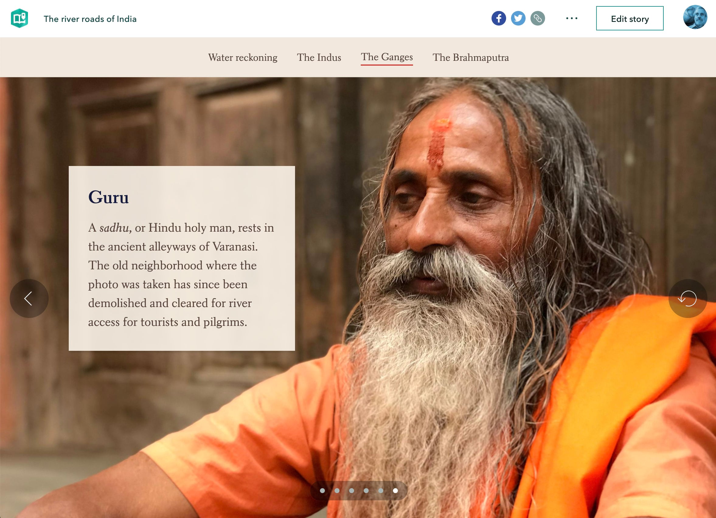
The river roads of India, on which our team collaborated with Paul Salopek’s Out of Eden Walk, uses slideshows to introduce sections featuring three of India’s major river systems. The slideshows provide a strong sense of place. They punctuate the story and add rhythm to it, and they put a human face on the story. I envision the slideshows as horizontal slices across cultures and landscapes, placed within a vertical narrative that focuses on larger issues, namely the looming water crisis facing India’s one-billion-plus people.
Swipe
Compare two web maps or images with an interactive slider
While it’s not an immersive, the swipe block also opens interesting doors for visual storytellers. Swipes play a prominent role in La Normandie face aux bombardements, The story documents the aerial bombardment of Normandy’s cities during World War II as Allied forces made their way inland from the D-Day beaches. Swipe blocks show swaths of destruction, with neighborhoods reduced to rubble and pocked with craters. The story features war-era aerials within sidecar sections, followed by swipe blocks displaying the same imagery juxtaposed with today’s satellite view.
The author could have chosen to add the contemporary views as additional items within the sidecar sections, enabling readers to do a similar then-and-now comparison—map choreography style—by scrolling rather than swiping.
Which is preferable? It’s a matter of taste and judgment. I usually prefer the sidecar option, but am inclined in this case to agree with the author’s choice. The swipe actively engages readers in exploring the contrasts, and perhaps prompts them to contemplate the devastation and marvel at the remarkable post-war recovery.
I hope you’ll enjoy experimenting with our immersive blocks, and will put them to good use in your stories. One word of caution: Immersives should support your narratives, not distract from them. Please embrace sidecar, guided tour, and slideshow—and the swipe block—whole-heartedly, but use them with discretion. You’ve got important stories to tell. Immersives should amplify your storytelling, not interfere with it.


Article Discussion: