You may have noticed that, as of June, 2022, ArcGIS StoryMaps’ sidecar immersive block now features an additional layout choice. The original docked and floating panel layouts have been joined by a new slideshow layout option.
Those of you who have been using ArcGIS StoryMaps for some time will likely remember slideshow as its own stand-alone block. Now that it has been folded into sidecar, storytellers can combine all of the capabilities of sidecar with slideshow’s horizontal click-to-scroll functionality. (Note that all preexisting slideshow blocks have automatically been converted to the slideshow layout of the sidecar block, and that you can still add a fresh slideshow-layout sidecar to a story directly from the block palette.)
This post will walk through all three layouts and take a look at some instances of when it makes sense to use each one.
The evolution of sidecar
At its start, sidecar was intended to be somewhat analogous to our classic Story Map Journal template. But one of the more popular features of our classic Story Map Cascade was an immersive section where you could fill the screen with media such as maps, photos, videos, or embedded content, while accompanying text and supporting media appeared in floating panels that moved vertically across the media window as readers scroll.
We were excited to integrate this floating panel experience into our next-generation storytelling tool in April of 2020. It gave storytellers the ability to add drama and visual variety to their stories—and was a big step in encouraging those who were still building stories using our classic templates to migrate over to ArcGIS StoryMaps.
And now, offering a horizontally based option as part of sidecar’s robust immersive experience provides an even greater level of storytelling versatility.
Here’s how the options are previewed within the builder. Remember that you can switch back and forth between the layouts at any time; your initial choice isn’t irrevocable.
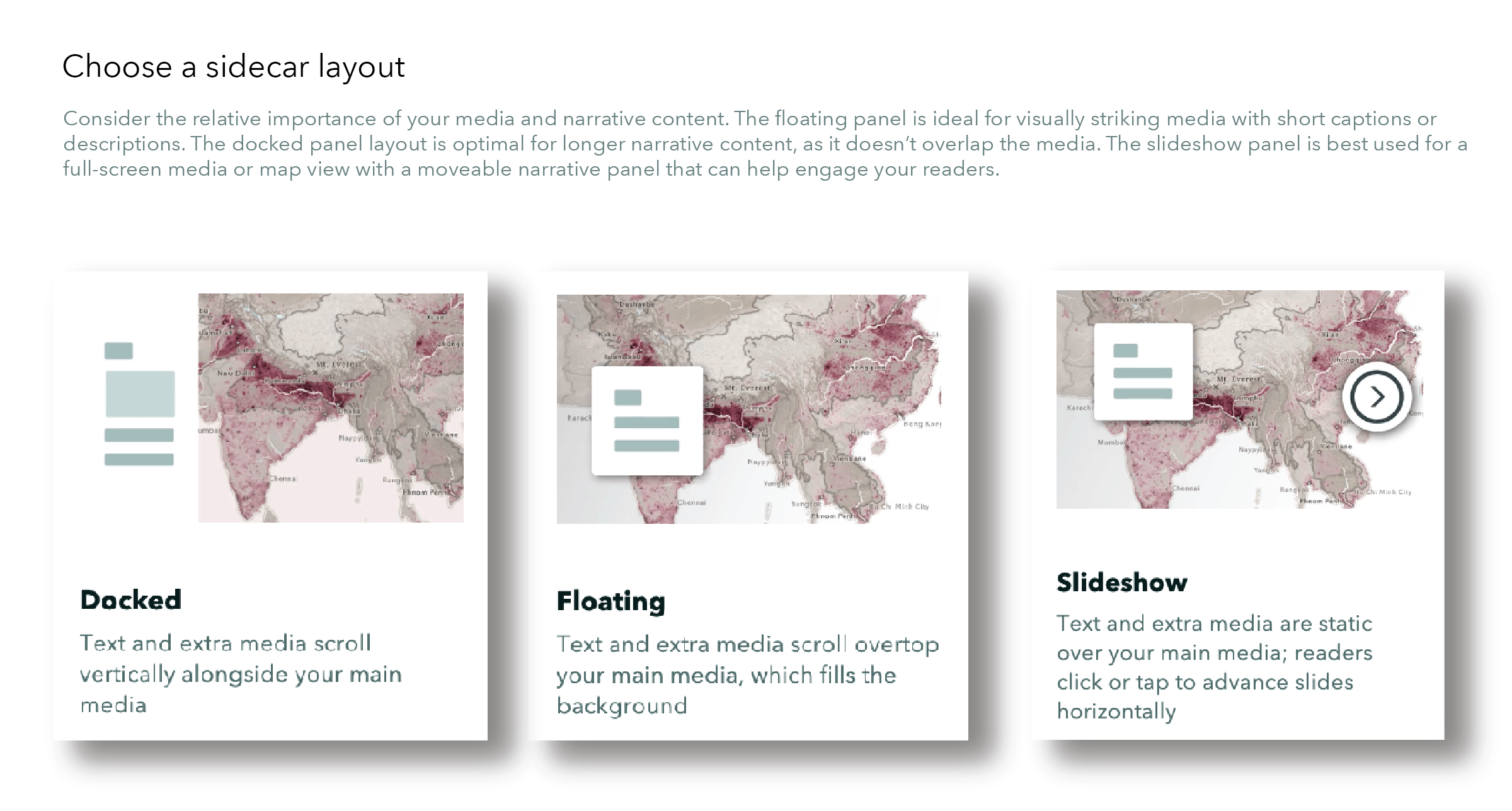
Docked and floating: compare and contrast
I thought it would be interesting to compare the two vertically-scrolling layouts by incorporating them into two otherwise identical stories, as a way to explore the formats’ strengths and shortcomings.
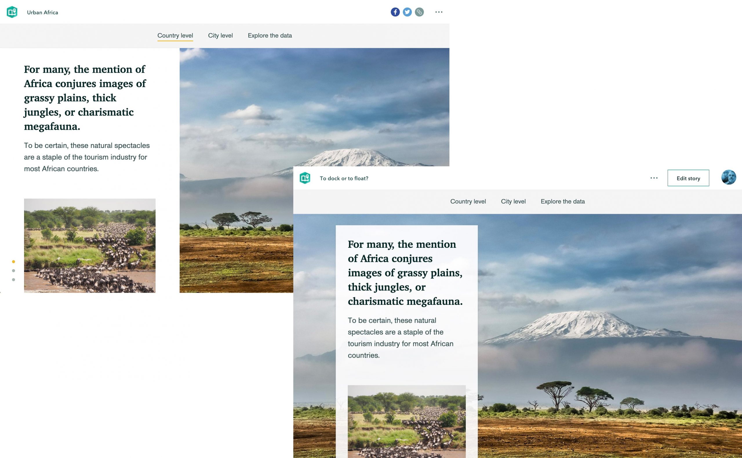
Let’s use the two stories to consider the virtues of floating panel vs. docked panel. Feel free to open the two stories—Urban Africa and To dock or to float?—in separate browser tabs in order to easily compare them yourself. (And remember that duplicating stories is a great way to experiment with different layouts even as you’re building a story).
The introduction to the Urban Africa story features attractive landscape photographs. In this initial section I strongly prefer the floating panel layout. The photos feel confined by the side panel, whereas they have plenty of breathing room beneath the floating caption boxes. The more immersive, full-screen images act like a dramatic fanfare, placing you vividly in the African continent.
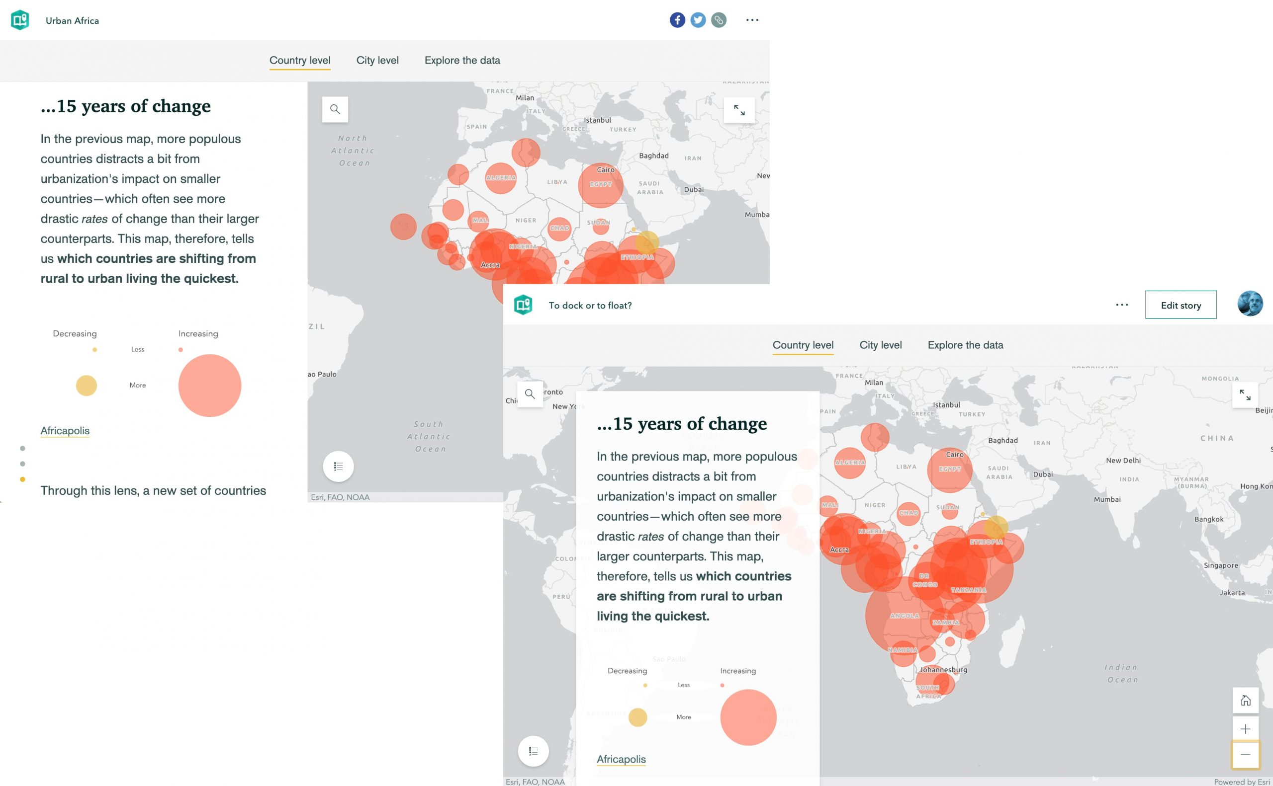
The set of circle graphs at the end of the opening section sit much less comfortably in the floating panel layout. The panel interferes with the graphs—even though I moved the caption to the right. If my team and I had made the original story when both layouts were available, I would either have put the graphs in their own docked panel section, or simply made the graph and accompanying text part of the standard scrolling experience.
Next comes the African urbanization section. Here I think it’s pretty evident that the docked panel layout is preferable. The shape of Africa fits nicely next to the side panel, and the text and graphics accompany the maps without overlapping them—as they do on the floating panel layout. It might seem tempting to use the map settings controls to nudge the Africa maps to the right, out from under the floating panel. But that won’t work on mobile devices, where smaller screen real estate requires that the floating panel sit directly atop the map.
For the brief, final section inviting users to explore the data, I could go with either layout. I lean toward the floating panel option in this case, because it gives the story a little rhythm and variety, and it might be nice to have the final section echo the format of the introduction.
In general, here are a few good reasons to choose the docked panel layout:
- If your narrative text is rather long: Multiple paragraphs are more legible on the opaque background of the docked panel, and in the mobile layout too.
- If you want to include a few map actions in your slides: The buttons call to readers more clearly in the docked panel.
- If your media panel contains a narrated video: Floating text panels atop the video would be a distraction.
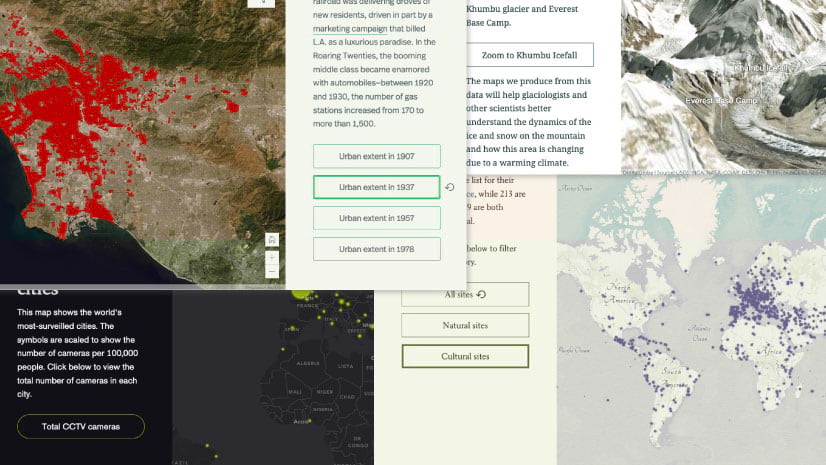
- If you don’t want to obscure any of the media, especially the data on a web map.
Here are some circumstances where floating panel is likely to be the best choice:
- If you want the media to be the star of your show: Sometimes it’s fine to have your text play second fiddle.
- If each slide only needs a little bit of text: Brief text can result in excess negative space in the docked side panel.
- If you want to vary the location or width of the narrative panel by slide: For example, on the first slide your text might appear on the left side of your map, but then appears to the right side on the next slide.
In general I’m a big fan of the floating panel layout. But that’s not to say I’d use it everywhere. The big visuals in the floating caption layout stand to lose much of their impact if they appear throughout a narrative. Much better to save the drama for key moments. A symphony performed solely at fortissimo volume quickly becomes wearisome; much better to vary the dynamics for maximum dramatic effect.
Slideshow: Thinking sideways
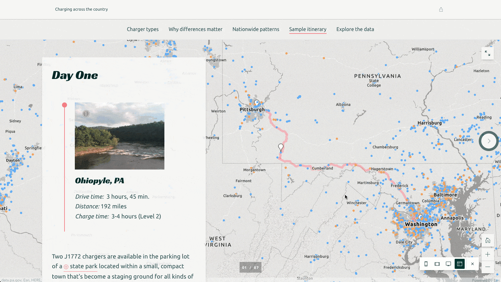
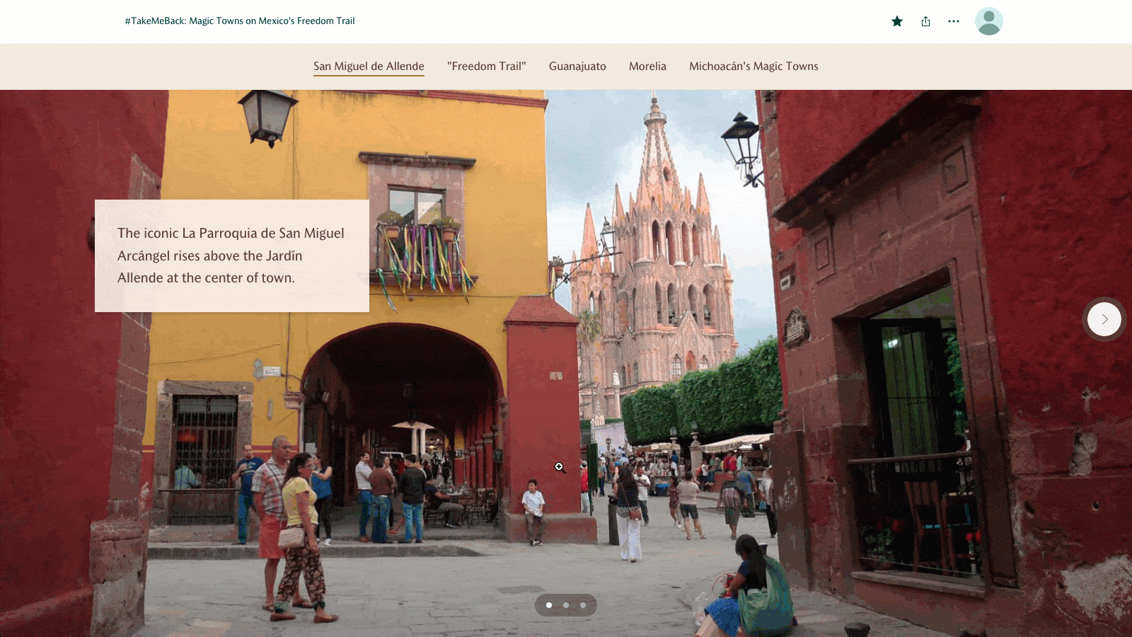
On top of all that, there’s now a third sidecar layout option: Slideshow. Unlike the docked and floating layouts, slideshow involves a sequence of horizontal slides, which readers navigate by actively clicking an arrow at the far right of each slide, while a floating narrative panel can provide additional context.
But that’s basically where the differences end. Just like in the docked and floating layouts, slideshow offers a full-window, media-based experience for photos, videos, or embedding applications or websites. You can even add background audio to complement your narrative. And, like the other two layouts, in the narrative panel you can incorporate additional media, map actions, swipe blocks, button links, separators, and timelines.
In general, since it also utilizes a floating narrative panel, many use cases for the floating panel layout also apply to the slideshow layout. But because the slideshow layout has a relatively small content footprint—readers only need to scroll vertically past one slide to move beyond the whole block in the story—it can be especially useful to create visual “asides” within a story.
Sometimes it’s good to give your audience to the chance to pause and enjoy the scenery or explore some cool maps and data. At other times, you might want to add some additional context or background on a particular sub-topic without interrupting the flow of your story. The slideshow layout gives the audience the choice of how much of that content to dive into. This “elective” nature can help avoid the mental fatigue that comes from too much scrolling.
Here are a few examples where the slideshow layout would be an ideal choice:
- Presentations: Accompanying a narrator who’s walking viewers or listeners through the slides.
- Extra information: Providing deeper context or detail on a particular element of a story that isn’t crucial to understanding the whole story.
- Carousel of photos: Sharing personal or professional photos to display beautiful photography. (Note that in both the floating and slideshow layouts, you can set the narrative panel to be transparent; if you don’t add anything to a transparent narrative panel, those slides will display as media-only in the story).
- Mimic the classic Story Map series template: Create narrative-style uses of your text and media for your stories.
Even more flexibility!
As you experiment with sidecar’s three immersive layouts, remember that within each there is an additional degree of customization possible in the ways you’re able to manipulate the narrative panel.
To start with, in all three layouts there are three different panel width options. A wider narrative panel helps the text and other elements within it to breathe. The trade-off, obviously, is that it will compress (in the case of the docked panel layout) or cover more of the media space.
André versus Capability is a great example of how the widest docked panel width can be used effectively. This story chronicles the works of two 17th– and 18th-century landscape designers who had wildly different philosophies. The docked narrative panel occupies 50% of the sidecar, leaving plenty of room for the text and photos that accompany satellite imagery of landscapes that the two men designed.
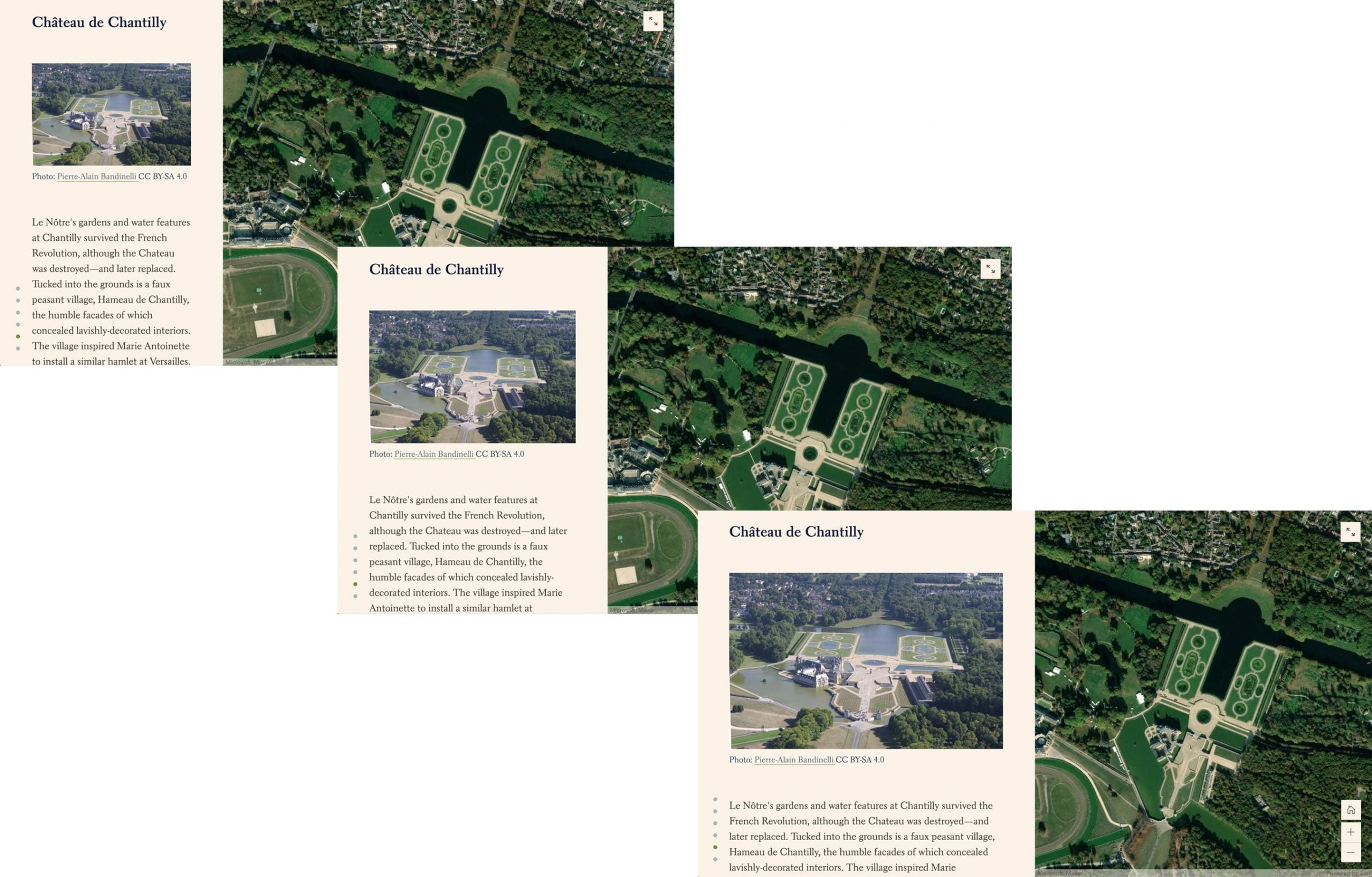
You also have some control over the position of the narrative panel. In the docked layout, you can opt to place the panel to the left or to the right of the media. In André versus Capability, the narrative panel is placed on the opposite side for each of the two men, playing up their contrasting styles.
In the floating layout, you have the choice of positioning the narrative panel to the left, center, or right, and in the slideshow layout you have three vertical placement options on top of that. And, as mentioned above, in those latter two layouts, you can also make the entire panel transparent, with either light or dark text.
(Be aware that what looks good on a computer screen won’t always work on smaller screens, so please take advantage of ArcGIS StoryMaps’ preview mode to make sure your stories will look and function the way you imagined across all devices!)
_______________________
This was a lot of information, but that’s only because sidecar can do a lot! For all the nuts and bolts detail about how to actually build all three kinds of sidecar layouts, head over to this step-by-step tutorial. And for additional storytelling advice and anything else you might want to know about ArcGIS StoryMaps, our resources page is a great place to start.
Once you’ve gotten to building and have discovered your own interesting uses for sidecar, don’t hesitate to drop us a line on Twitter @ArcGISStoryMaps. We love seeing what you create!


this helped me