Public Policy Maps Show Opportunities for Nonprofit Action
Esri Maps for Public Policy provide free, map-based data on community issues such as health, housing, and jobs to support nonprofit planning and action.
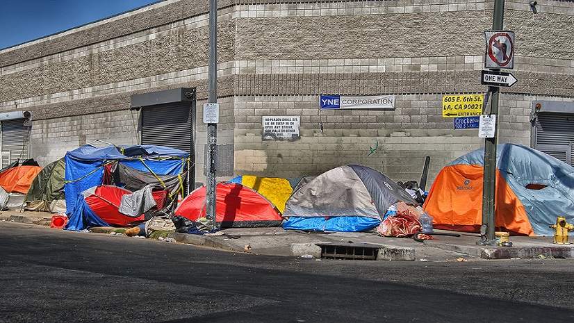
Communities are complex, with social, economic, and environmental factors interconnecting in unique ways. Seeing and understanding communities through the lens of where they are located can reveal patterns and relationships. For example, what does the environment look like for low-income populations suffering from asthma, diabetes, or other health issues? Do they have adequate access to public parks and health services, or are they located near toxic facilities and in a food desert? Location-based information connects the dots on the many factors that impact communities. And maps provide a simple, common reference that is intuitive and easy to understand.
Policy Maps Support Advocacy and Action for Nonprofits
Esri Maps for Public Policy provide free, map-based information on social equity and health, economic opportunity, public safety, transportation and infrastructure, and other issues. For example, nonprofit organizations use Esri Public Policy Maps to research location-specific community information such as racial disparities in income and housing, and access to services and public goods that serve the health and well-being of local populations. This in turn informs program planning, decision-making, and resource allocation. It also supports communication and advocacy efforts by showing stakeholders what the situation on the ground is and where efforts need to take place.
A policy map clearly shows where there is an opportunity to intervene.
Stephen GoldsmithHarvard Kennedy School of Government, Deputy Mayor of NY
Esri Maps for Public Policy are easy to use – no GIS or mapping skills are required, and you can get started right away. They are curated by Esri public policy experts, demographers, and statisticians, and are part of the ArcGIS Living Atlas of the World. The Esri Maps for Public Policy site contains data layers, maps, and StoryMaps. The content itself is based on curated, open, and authoritative data, for example from government agencies.
You can really learn about a topic pertinent to a community just from interacting with the maps. This site allows you to view and share multiple maps on a topic, all zoomed in to your community.
Diana LaverySenior Product Engineer working on Esri Maps for Public Policy
Jen Van Deusen has worked with nonprofits, NGOs, and other organizations that are focused on creating positive social and environmental impact, and a more sustainable future. She is passionate about GIS for good, and the power of storytelling with digital maps and location intelligence to engage stakeholders and inspire action. Her background combines business, nonprofit leadership, and cross-sector collaboration in applying technology to achieve sustainable outcomes in the infrastructure/AEC space, with efforts ranging from renewable energy/energy optimization for AEC, to sustainable infrastructure in small island developing states (SIDS), and clean water access in developing communities. Jen has lived/worked internationally, and holds an MBA focused on environmental and social governance in global markets from Brown University, and is also a Sustainability-certified professional.