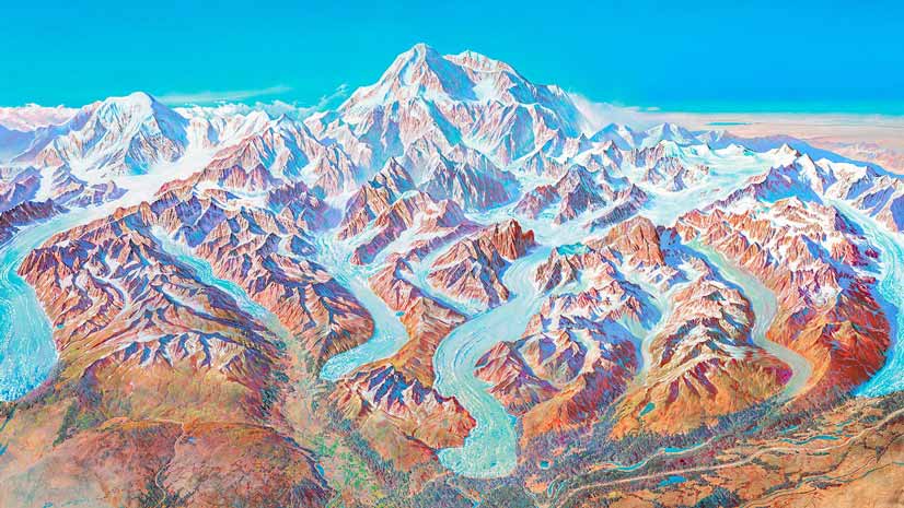
An Ocean Floor Map to Remember
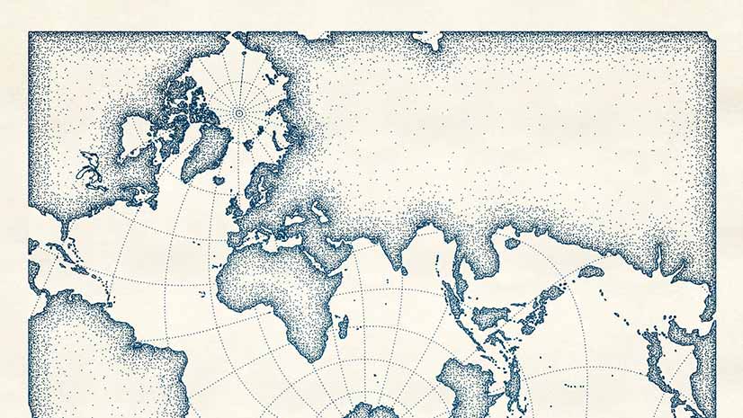
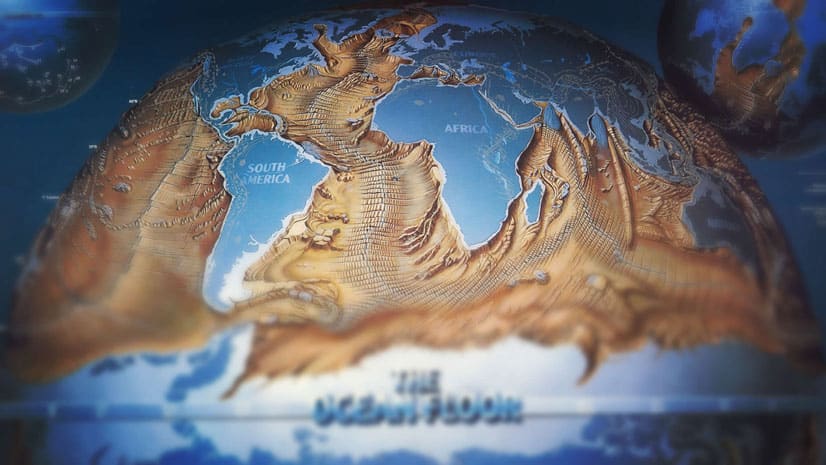
John Nelson of Esri dives deep into the David Rumsey Map Collection and finds a 1985 map called The Ocean floor that deserves to be revisited.
John Nelson of Esri dives deep into the David Rumsey Map Collection and finds a 1985 map called The Ocean floor that deserves to be revisited.
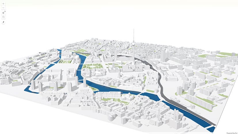
When working in 3D, you need to define a point or ‘camera’ in the 3D space from where you want people to view the scene. Learn how to do this.
You can now use geotagged photos to locate tour places in ArcGIS StoryMaps guided tours. That's just one of the new enhancements available.
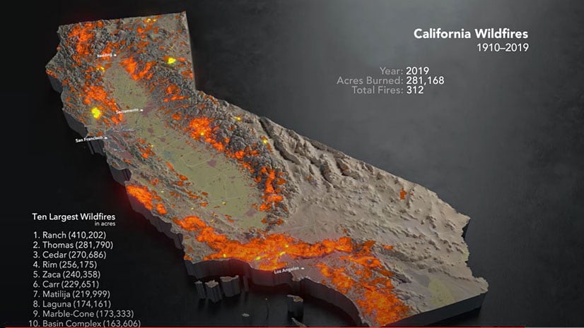
A map created using ArcGIS Pro, Cinema 4D, and other technologies shows an animation of the ten largest wildfires recorded over the last century.
Do you have to convert maps made in Map Viewer classic to Map Viewer beta? Learn the answer and get your other Map Viewer queries answered.
Allen Carroll, program manager for storytelling at Esri, shares a collection of his favorite stories created by the ArcGIS StoryMaps community.
Betsy Mason, co-author of All Over the Map: A Cartographic Odyssey, talks about how data visualization changed the course of history.
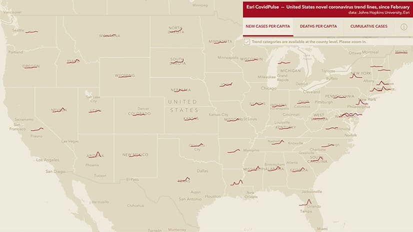
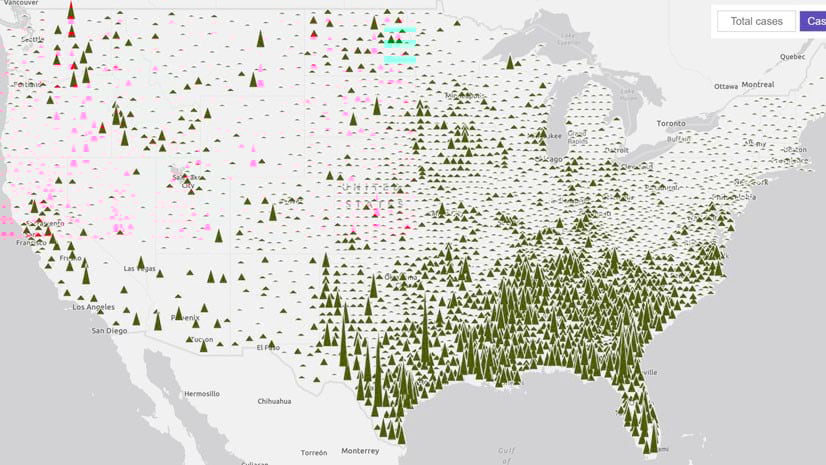
Check the new CovidPulse map from Esri to see the trend lines for reported cases of and deaths from COVID-19 in the United States.
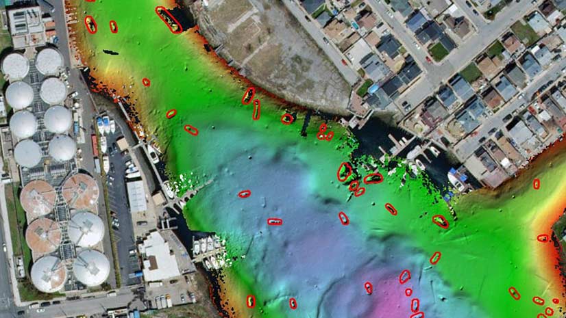
Deep learning tools in ArcGIS Pro were used to automate the task of detecting shipwrecks from bathymetric data of Jamaica Bay, New York.
ArcGIS API for JavaScript recently began to support high-quality, scalable vector symbols in 2D MapView instances. See what you can do with them.
Discover how spatial analysis differs from other kinds of data analysis during Going Places with Spatial Analysis, a six-week online course.
Create a digital map that looks like it was drawn with pen and ink using the new pen and ink style created for ArcGIS Pro.