September 24, 2020 |
Este Geraghty, MD, MS, MPH, GISP | Public Safety
The United States is experiencing the fourth wave of COVID-19 infections, due to the far more infectious Delta variant of the virus. The mutation with a coinciding spike in cases was expected, but the rampant nature of the spread across the country poses many questions. First and foremost is, Where do I need to be especially careful?
The interactive map “Which Way Are Things Going?” by Esri colleagues Charlie Frye and Jim Herries gives a county-by-county view of active cases for a week-by-week perspective on COVID-19 trends.
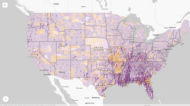
Southeastern states are seeing surges, led by Louisiana, Mississippi, Arkansas, Georgia and Florida. While rates are currently lower in Iowa and South Dakota, these two neighboring states will be places to watch in the coming weeks, given that the Sturgis Motorcycle Rally caused concern as a potential superspreader event. The map is dynamic, allowing viewers to track the impact of significant events as they unfold.
The map aims to provide accurate and actionable information for everyone, with data from state level to county level that makes it easy for anyone to zoom in and see the trends that will help them make decisions about when and where to better safeguard their health and that of their family. The latest Centers for Disease Control and Prevention (CDC) guidelines have renewed the call for indoor masks where cases are highest, and many people are dialing back on personal and business plans even as reopening continues.
During the many waves and phases of the COVID-19 pandemic, a map-based view has proven compelling and informative—letting people know whether things are getting better or worse in their area. Johns Hopkins University (JHU) set an early example for COVID-19-related map-based insights. Data from that effort also underlies this weekly map update.
The original Johns Hopkins COVID-19 Dashboard has become an iconic source of information during these many months. It has surpassed all prior metrics for an online issue-oriented map with trillions of views to date. And the open data approach the team took has facilitated the work of other countries, local governments, and businesses from around the world as they present a localized view of the data to their constituents and stakeholders.
A serendipitous alignment of technical knowledge, a desire to inform, and the work ethic to harvest data from around the world (while even pushing aside sleep) helped the JHU team become a trusted and authoritative source of information that has been so sorely needed in this crisis. The background on how this map came to be has continued to fascinate people (rightly so, given the sociocultural barriers they’ve overcome in this work) even as eyes turned from case counts to how and where to receive a vaccine.
At a high level, we may feel like we’re all in this together. And we are. There is a level of interconnectedness across the globe that inspires solidarity as we all continue pandemic response efforts. At the same time, we know that the COVID-19 pandemic’s impact is not the same for everyone.
Communities experience the virus and its consequences unevenly and often unfairly. People of color, essential workers, and those with poor access to health care and services are at higher risk of contracting the virus. These and other determinants related to COVID-19 can be mapped and analyzed in a way that supports resource allocation with equity at the center.
We also know that the per capita rate of new cases follows a pattern—the highest case rates occur where the fewest people are vaccinated, compounded by geographic variations in adherence to other public health measures such as masking and social distancing. Mapping can support ongoing messages of vaccine efficacy and protection from the worst symptoms and most devastating outcomes of the virus.
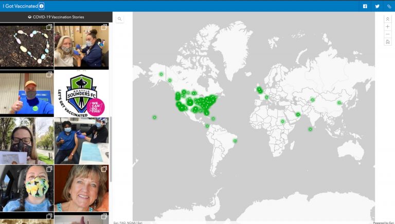
We can encourage broader vaccine uptake by sharing individual stories, such as the crowd-sourced I Got Vaccinated map. Anyone can contribute their vaccination experience. Mapping techniques are also used to better understand unvaccinated populations in ways that help health officials more precisely support their varying needs from place to place.
Scientific and spatial analysis will continue to surface the patterns and anomalies arising from the ongoing global spread of this outbreak, and mapping will aid epidemiologic understanding of those patterns and targeted actions.
As we all anxiously wait for this crisis to pass, maps will continue to point the way to better public health preparedness and response.
Learn more about how understanding the impacts of place leads to better health.