June 30, 2021 |
Multiple Authors | GIS for Good
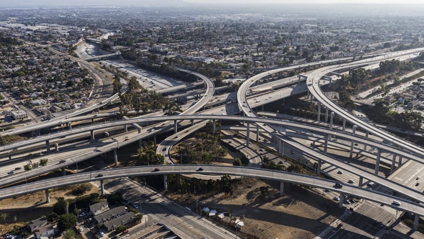
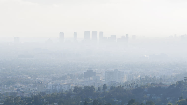
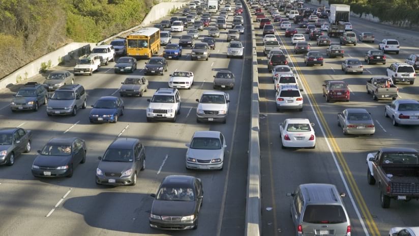
Glimpsed through the windshield as you head south out of San Francisco, the Bayshore Freeway is just a 50-mile stretch of US Route 101 that connects the city with San Jose. What you don’t see is a mile-wide corridor of higher-than-average pollution to the west.
By the time you reach Redwood City and enter Silicon Valley, the pollution corridor has widened and switched sides. There, the heavy pollution zone lies almost exclusively east of the freeway, which appears as a dividing line between two worlds, as solid and impermeable as a political border.
CalEnviroScreen, an online map built by the Office of Environmental Health Hazard Assessment (OEHHA), part of the California Environmental Protection Agency (CalEPA), provides this view. Combining data related to pollution and people, the map shows California from an environmental justice perspective.
Using modern geographic information system (GIS) technology, CalEnviroScreen ranks and color codes California’s more than 8,000 census tracts to reflect vulnerability to pollution. The formula behind CalEnviroScreen considers the presence of various types of pollution, the prevalence of health problems that can be worsened by pollution, and population data.
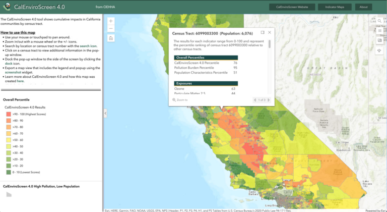
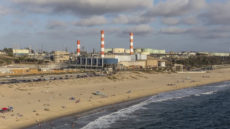
In addition to showing this overall score, CalEnviroScreen is designed with tools for building maps that isolate any of 21 datasets. One could discover, for instance, that the city of East Palo Alto has significantly more waste treatment sites, groundwater contamination, and lead exposure—and higher rates of asthma, heart disease, and low birth weight—than Palo Alto and Menlo Park, its neighbors across the freeway. Reconfiguring the map further reveals that East Palo Alto residents also experience more poverty, unemployment, and prohibitively high housing burden.
One of the environmental justice movement’s key tenets is that pollution—and its effects—are unevenly distributed. The presence of pollution, furthermore, does more than contribute to a community’s ill health; it also perpetuates it, exacerbating social conditions that are not directly caused by pollution.
Translating this holistic perspective into the language of maps was a major focus during CalEnviroScreen planning sessions in the mid-2000s. “A lot of similar projects had looked at individual factors, but a driving force behind CalEnviroScreen was figuring out how to combine them,” said Walker Wieland, an OEHHA research scientist and GIS expert.
In communities with a heavy pollution burden, Wieland explained, an already embattled population experiences it in a way that makes it even heavier, creating an oppressive feedback loop.
“Residents often live in areas with socioeconomic characteristics, such as high poverty and low educational attainment, that can make them more vulnerable to the effects of that pollution,” he said. “It’s the air they’re breathing, the water they’re drinking.”
The map itself is only the most visible manifestation of CalEnviroScreen, which CalEPA calls a “screening methodology . . . to help identify California communities that are disproportionately burdened by multiple sources of pollution.” In other words, it is both a map and a way to think about the power of maps, in this case facilitating a geographic approach to realize the goals of environmental justice.
CalEPA encourages community groups to use the tool to understand how their neighborhoods are impacted by pollution. The map’s format emphasizes specific categories of inequities—by color-coding based on percentile—rather than a raw pollution score.
A user can quickly discover, for instance, that a census tract’s pollution burden is higher than the pollution burden in 90 percent of all other tracts. “The power of CalEnviroScreen is that you can use it as a relative tool, to show that this community is more burdened than that one, and here’s the data to prove it,” Wieland said.
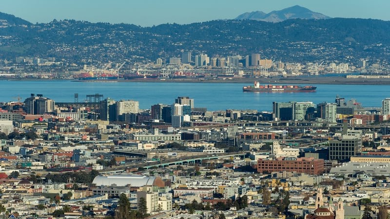
The map gives deep context that tells a story—the more one investigates, the more complex narratives emerge. Zoom out a bit so that your imagined drive on the Bayshore Freeway begins at the base of the San Francisco-Oakland Bay Bridge. CalEnviroScreen reveals that nearby Market Street marks a pollution-burden divide as stark as what you’ll find when you reach Silicon Valley. Zoom out further and you’ll notice a high-burden pollution ring extends around much of the bay.
CalEPA considers CalEnviroScreen a perpetual work in progress. For instance, previous versions did not allow users to generate maps of individual indicators, a capability often requested by community groups.
“Now you can identify areas that may score high in one or two indicators—like air pollution or proximity to [chemical] cleanup sites—but don’t register high on the cumulative map,” Wieland said.
This change makes the stories told by CalEnviroScreen even more complex. East Palo Alto’s overall burden is relatively large, but the city is mostly unaffected by pesticides. However, Menlo Park, Palo Alto, and the surrounding environs—including Stanford University—have some of the Bay Area’s highest pesticide percentiles.
Wieland said OEHHA also produces a report evaluating CalEnviroScreen alongside racial and ethnic data, and continues to evaluate new indicators and methodologies. The agency also hopes to improve characterization of indicators in tribal and rural communities.
“There’s obviously way more than 21 datasets that could go into CalEnviroScreen,” Wieland said. “But our process is rigorous and scientific. We want to make a tool that’s robust, defensible, and powerful for the wide range of people that use it.”
Learn how GIS can be used to detect pollution patterns. The Air Quality Aware app provides a map of air quality across the US from information shared by US Environmental Protection Agency.