February 18, 2020 |
Este Geraghty, MD, MS, MPH, GISP | GIS for Good
Mapping Populations at Risk of COVID-19 Speeds Support to People Who Need It Most
Public officials responding to the coronavirus disease 2019 (COVID-19) are urgently trying to find and protect the most vulnerable among us. Vulnerability is determined by factors such as age, living situation, income, and preexisting health issues.
That’s why smart maps that display US Census Bureau demographic data about age and income, layered with information about senior living facilities, homeless encampments, hospitals, and clinics have become vital to health care professionals, government officials, and community leaders. A map view gives immediate insight into where the number of serious cases may spike and where supplies or health care infrastructure should be bolstered.
In the US, mortality rates appear to nearly double with each decade of age after 30, posing a disproportionate risk to the 40 million Americans who are over the age of 65. In 80 percent of cases, symptoms of COVID-19 are mild, but in 20 percent of cases the virus develops into a severe pneumonia, resulting in a 1–2 percent fatality rate. The fatality rate jumps to 10-27 percent for adults 85 years of age and older, and has a greater impact on people with underlying health problems like asthma, heart conditions, and diabetes, according the Centers for Disease Control and Prevention (CDC).
Finding those at-risk populations starts with census data describing the demographic makeup of a community. This data is analyzed in a geographic information system (GIS) along with psychographic, traffic, and historical information and other relevant data. Officials can use GIS maps to visualize all this information in the context of locations of senior communities and popular retirement destinations, for instance.

By first identifying concentrated areas of vulnerable populations, health organizations can strategically ramp up COVID-19 response.
For example, areas of the coastal Pacific Northwest; the Midwest; suburban Washington, DC; northern Michigan; and popular retirement destinations in coastal Florida are swollen with older populations. Regions of the eastern US and the Deep South are also home to populations with elevated vulnerability.
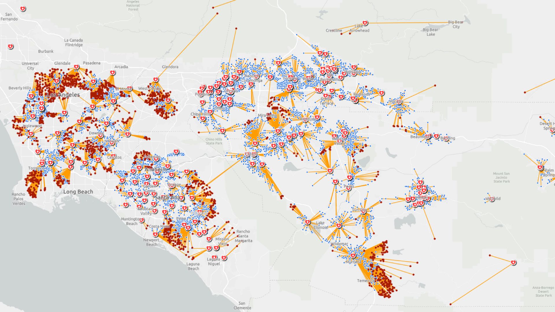
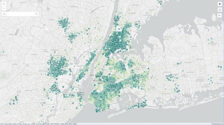
Areas lit up in orange on this map show the top 40 US counties with a high daytime population and high numbers of travelers and seniors. Locations like Orange County, California; Denver, Colorado; and Richmond, Virginia, have one or more of these factors. A high concentration of seniors, high expenditures on travel, and areas that are especially crowded during a typical weekday all factor into the disease’s spread and impact.
When exploring age and other social vulnerability factors across US locations that correlate with higher susceptibility to COVID-19, health and city officials and local emergency responders can see where there will likely be an influx of health needs in the weeks and months ahead.
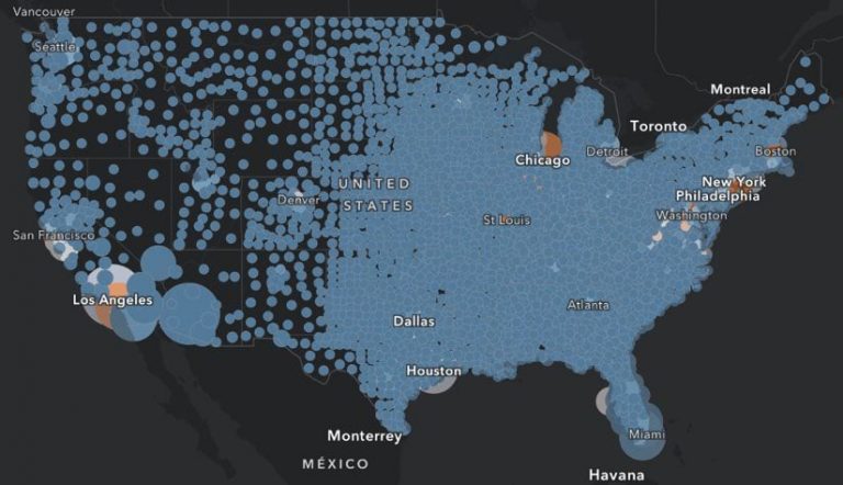
Another high-risk, vulnerable group is the transient and homeless population. These people are at higher risk because of poorer health and living conditions. An app detailing where the homeless live includes a pie chart breakdown of homeless people by type of shelter in all US counties. This information helps homeless and public health outreach teams, state and local health departments, hospitals, health care facilities, and emergency responders identify where these communities exist and create preventative measures against the spread of infectious diseases.
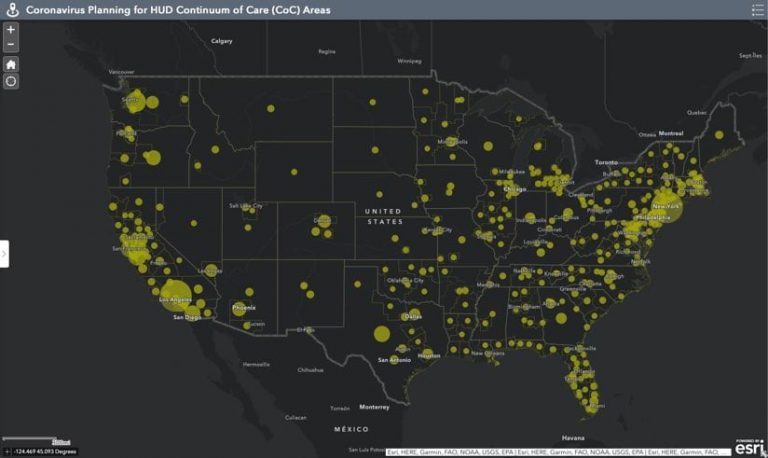
The CDC’s Social Vulnerability Index uses a composite of 15 social factors including poverty, lack of vehicle access, and crowded housing conditions. The index can flag communities that might experience a punctuated demand for health care that outpaces the local medical infrastructure.
For example, according to the US Federal Reserve System, 44 percent of Americans would not be able to afford an emergency $400 expense—like a medical bill or a home or car repair—putting them in a high-risk category.
This map of disposable income, poverty, and savings reveals which households in the US are the most vulnerable to loss of income. Investigators are using GIS to map boundaries around infected areas to trace where it is spreading and learn how to slow it down to protect the most vulnerable populations.
Zoom in to view your neighborhood’s Social Vulnerability Index score by clicking on the map below.
Shortages of hospital beds and other supplies are an issue during a pandemic. The real danger happens when everyone gets sick at once. The health care system becomes overwhelmed and does not have the capacity to treat the inflow of patients.
Italy is the most recent example, with the number of ill patients outnumbering hospital resources and, as a result, intensive care units are taking almost no patients older than 70.
In the US, responders are using maps to underscore the importance of intervention and prevent these overwhelming situations. Maps are proving to be one of the most efficient ways to see whether certain actions like social distancing—avoiding public places and contact with others—have impacted the virus’s spread among specific populations or locations.
In September 1918, cities around the world were celebrating the end of World War I and hosting parades to encourage people to buy bonds to fund final military missions. At the same time, a flu pandemic had been sweeping through the US, and a second wave was about to hit.
In Philadelphia, sailors in the naval yard were already dying, though no civilians had been infected yet. Health officials in Philadelphia allowed a huge parade to go ahead. However, St. Louis cancelled its parade and closed schools, theaters, and bars to prepare for the worst. Philadelphia hospitals were overwhelmed in weeks, and many people died. St. Louis was able to avoid excessive deaths, thanks to enforced social distancing. In just over a year, the 1918 virus infected 500 million around the globe—killing between 50 and 100 million people.
This story sounds all too familiar today, with restaurants closed, events postponed or cancelled, and handshakes having become a thing of the past. The cautionary history lesson shows the costs and results of government decisions during a pandemic.
In this rapidly evolving crisis, filled with planning and contingency assessment, it is especially important to consider the most vulnerable among us—the ones who have the most at stake. Low-income families, the elderly, the homeless, and those with underlying health conditions are sadly the most vulnerable when illness or tragedy strikes. Being able to map their location allows authorities to allocate resources—such as food banks, hospital supplies, and shelter—to areas in need.
See the COVID-19 GIS Hub for location intelligence resources. The Coronavirus Response solutions page provides a collection of maps and apps that can be used by public health agencies to understand the virus’s impact and share information about the pandemic with your community. Local authorities and organizations that need help in crafting their responses can reach out to the Esri Disaster Response Program for assistance.