February 18, 2020 |
Este Geraghty, MD, MS, MPH, GISP | GIS for Good
March 17, 2020
As hundreds of millions of eyes stay glued to the rising toll and reach of the novel coronavirus disease 2019 (COVID-19), map-based dashboards have become a compelling, near real-time way to monitor the outbreak. They’ve also substantiated the message that everyone must take precautions and alter daily interactions.
When the World Health Organization (WHO) declared COVID-19 a pandemic, director-general Tedros Adhanom Ghebreyesus warned that the situation would worsen. Yet, he noted, this is the first world pandemic that can be controlled, in part due to global connectivity and awareness.
The controllability of COVID-19 can also be attributed to tools that quantify data inputs—and aggregate information about who and when in the context of where. Geographic information system (GIS) technology underpins mapping dashboards and provides the means to investigate and understand the spread, guide control measures, and assess strategies for COVID-19 response.
See the COVID-19 GIS Hub for location intelligence resources.
Health analysts are using GIS to track the situation across space and time. At Seoul National University, a spatiotemporal epidemiologist named Hwang Seung-sik was able to determine that someone know as “Patient 31″ became a superspreader in South Korea. This patient infected fellow members of a church, and this gave rise to 60 percent of the country’s current cases.
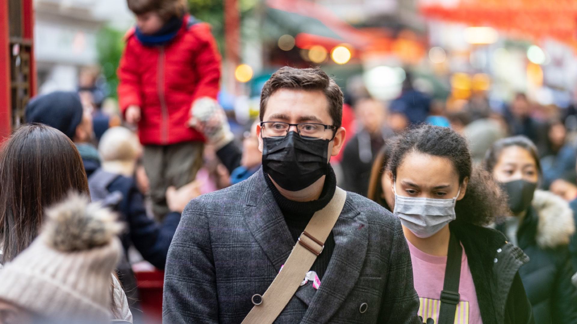
This incident and others have amplified the need for social distancing to help ensure that even healthy people don’t become vectors and spread the disease to more vulnerable people.
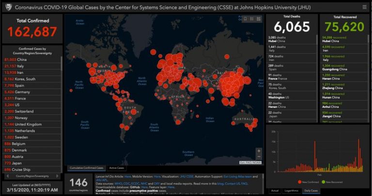
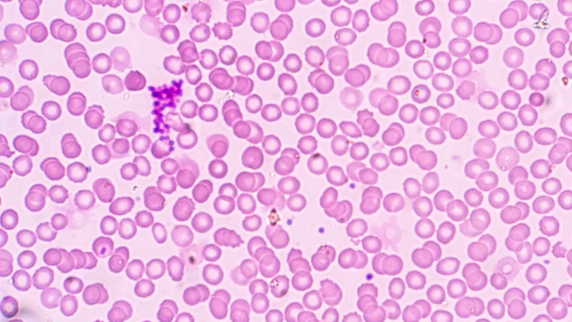
Epidemiologists use GIS and datasets to link the interactions of infected people—mapping such things as credit card transactions and mobile phone location traces to see where an infected person has been and who they may have come in contact with. GIS also aids investigations into social networks to see and assess the spread within groups. This analytical approach helps scientists and policy makers develop the epidemiologic curve for the virus, and enhance the traditional model with maps that show the disease’s spread across space and time to deepen understanding and inform actions globally.
Looking at the spread of disease risk from a more granular perspective, investigators use GIS to map boundaries around areas of known infection to trace who may have been exposed to infection and how transportation routes, for example, could compound the spread. The same location intelligence tools help authorities find and get in touch with people who entered an infected person’s orbit so that they can quarantine themselves to limit further infections.
Implementing travel bans, canceling group events, conducting classes online, and indefinitely postponing professional sports matches are all effective tactics to flatten the curve—slowing the spread so that hospitals don’t become overwhelmed by the surge and critical care facilities can focus on those most in need.
The elderly and people with underlying health conditions are the most susceptible to serious COVID-19 infection. We can understand at-risk populations geographically. For example, census data informs us of the demographic makeup of a community and GIS provides the means to home in on the locations of populations at increased risk, such as senior communities and popular retirement destinations. By seeing concentrations of vulnerable populations, health organizations can pinpoint COVID-19 response—taking control measures such as ramping up hygiene and social distancing efforts and screening people on-site prior to entry.
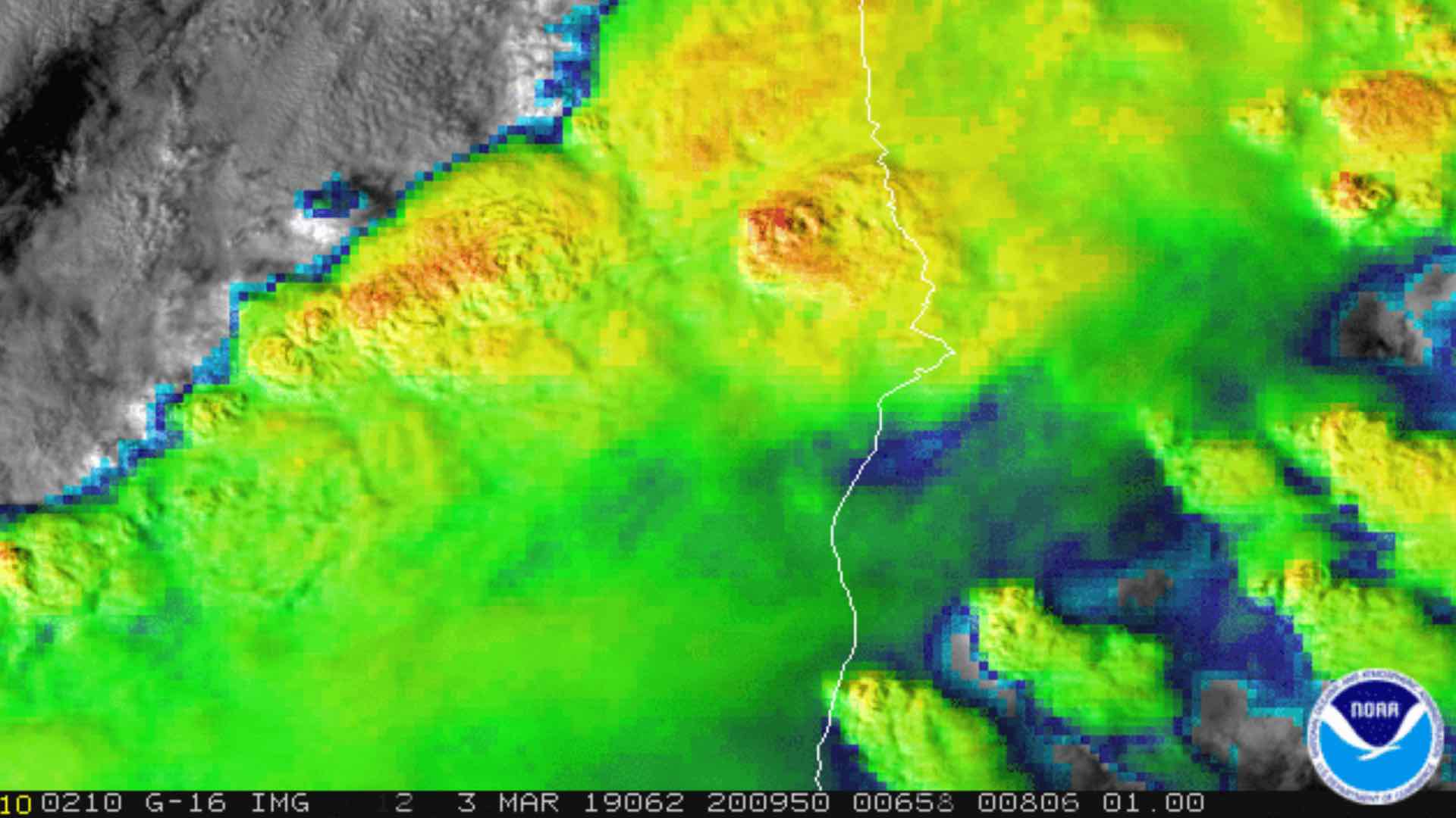
Epidemiologists use GIS modeling to forecast and visualize the changing rates of disease and its spread across space and time. These models can guide decisions on when and where to implement control, preventative, and surveillance measures. For example, a map that models outbreak hotspots allows authorities to allocate preventative resources.
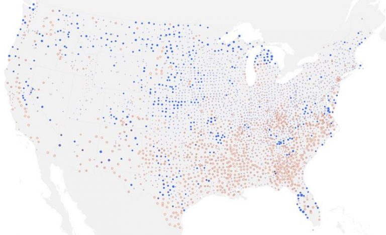
Shortages of hospital beds are a potential issue, even if people with mild symptoms quarantine themselves at home. Most hospitals regularly communicate their capacities to policy makers, and GIS tools help them monitor diminishing capacity and compare it against increasing infection rates, allowing real-time shuffling of resources to boost capacity where COVID-19 response is needed most. Esri partnered with Definitive Healthcare to make US healthcare facility and bed utilization information available as a service so that any GIS user can add this critical information on a map.
Proactive efforts are under way to identify suitable underutilized facilities that can serve as makeshift hospitals to increase capacity if needed. With GIS, potential locations can be matched with concentrations of vulnerable populations and transit accessibility to make the best decisions about which facilities to activate. GIS also has a role to play in assessing the supply chain to provision these facilities with required supplies. By determining efficient routes from warehouses to healthcare sites, supply chain managers can make certain they are prepared in the quickest way possible.
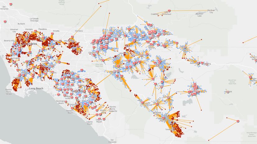
Location information can also help responders understand the impact of interventions. Officials can use GIS maps to see whether certain actions have changed the virus’s spread among specific populations or locations. Disease distribution maps display a point for each case and show changes to counts and rates across time. By visualizing the intensity of infections, health care professionals and policy makers can confront difficult decisions about ramping up or dialing back control measures.
Monitoring and even simulating interventions based on other approaches may help quell the infection rate. This action proved useful in tracking the spread of the Ebola virus in Sierra Leone to reveal the importance of quarantine efforts.

For policy makers and emergency responders, maps are one of the most efficient ways to communicate, assess, and understand the scope and scale of unfolding events. A carefully crafted map can make the difference in allocating resources while keeping the public informed. The science and evidence-based underpinnings of GIS maps also serve to suppress misinformation.
As authorities move from monitoring and assessing the global movements of the virus to COVID-19 response, GIS provides many capabilities to make the most of limited resources in order to safeguard community health.
See the COVID-19 GIS Hub for location intelligence resources. The Coronavirus Public Health Response solutions page provides a collection of maps and apps that can be used by public health agencies to understand the impact and share information about the pandemic with your community. Local authorities and organizations that need help in crafting their responses can reach out to Esri’s Disaster Response Program for assistance.
[The image at the top is a network adequacy model that helps hospitals and policymakers see patients who have less than optimal access to healthcare facilities.]