Last month, the 4.14 version of the ArcGIS API for JavaScript (ArcGIS JS API) introduced point clustering in beta. Clustering is a method of merging nearby and overlapping features into a single symbol.
Clustering is configured on the featureReduction property of a FeatureLayer, CSVLayer, or GeoJSONLayer.
layer.featureReduction = {
  type: "cluster"
}
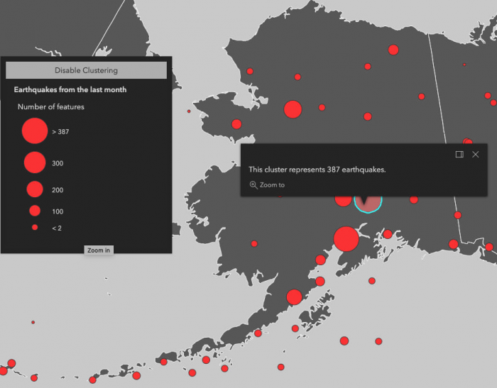
Take a look at this GeoJSONLayer displaying earthquakes from last month.
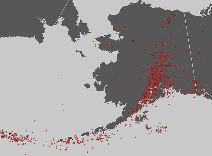
You can already see some spatial patterns by just displaying all the data in the view. However, in some areas where symbols overlap, the actual density or concentration of earthquakes is not obvious. Once clustering is enabled, you immediately see a clearer view of the data. For this time period, the area in and around Anchorage appears to be the epicenter of seismic activity.
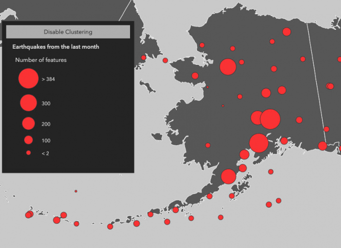
View the code that makes this sample work
const layer = new GeoJSONLayer({
  title: "Earthquakes from the last month",
  url: "https://earthquake.usgs.gov/earthquakes/feed/v1.0/summary/all_month.geojson",
  copyright: "USGS Earthquakes",
  // enables clustering on the layer
  featureReduction: {
    type: "cluster"
  },
  renderer: {
    type: "simple",
    field: "mag",
    symbol: {
      type: "simple-marker",
      size: 4,
      color: "#fc3232",
      outline: {
        color: [50, 50, 50]
      }
    }
  }
});
Without clustering enabled, it’s difficult to see the high number of earthquakes in the northwest and south-central regions because they are stacked on top of one another.
Notice this map was created with a GeoJSONLayer in a non-Web Mercator spatial reference (i.e. Alaska Polar Stereographic). This is not possible using the ArcGIS JS API 3.x implementation of clustering, which limits you to the Web Mercator and WGS 84 spatial references. In the 4.x implementation of clustering, support for projected non-Web Mercator spatial references is experimental.
Cluster radius
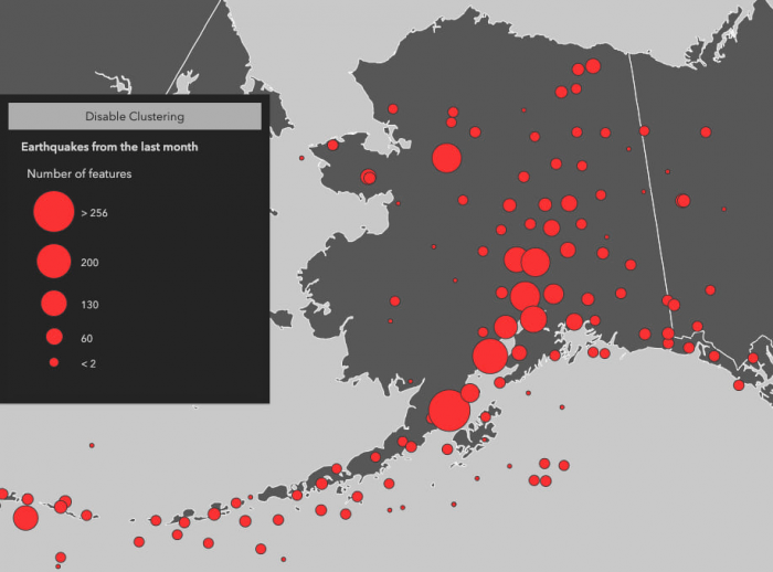
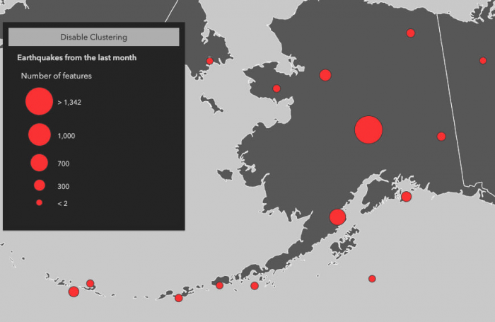
The FeatureReductionCluster class defines the properties you can configure in point clusters. One of these properties is clusterRadius. This property controls each cluster’s area of influence. By default, the clusterRadius is 80 pixels.
Decreasing the cluster radius creates more clusters typically comprised of a fewer number of earthquakes.
Increasing the cluster radius reduces the number of clusters, but increases the number of features in each of them.
Popup templates
You can also configure a popupTemplate in FeatureReductionCluster. This allows the user to view summary information about the features represented by the cluster. This is independent of the layer.popupTemplate, which will display information for individual non-clustered features. The featureReduction.popupTemplate provides you with access to aggregate fields used to summarize the features within the cluster.
The table below describes the aggregate fields you can reference in the cluster popup.
Aggregate fields
| Field Name | Description |
cluster_count |
The number of features in the cluster. This field is always available on clustered layers. |
cluster_avg_{fieldName} |
Only available in clustered layers with renderers visualizing at least one number field either with size, opacity, rotation, continuous color, or class breaks. This field describes the average of each rendered number field among all features in the cluster. |
cluster_type_{fieldName} |
Only available in clustered layers with a UniqueValueRenderer. This field describes the predominant value of the rendered field among all features within the cluster. |
layer.featureReduction = {
  type: "cluster",
  popupTemplate: {
    content: "This cluster represents {cluster_count} earthquakes."
  }
};
Styles and configurations
The renderer controls a layer’s style, even when it is clustered. The following content describes the various ways the renderer affects a clustered layer’s style and popup.
Count only
In the most basic scenario, where all points are styled with a SimpleRenderer and no visual variables, the number of features within the cluster will determine the cluster’s size. This uses the same popup configuration as described in the previous section.
View the code that makes this sample work
// Configures clustering on the layer. A cluster radius
// of 100px indicates an area comprising screen space 100px
// in length from the center of the cluster
const clusterConfig = {
  type: "cluster",
  clusterRadius: "100px",
  // {cluster_count} is an aggregate field containing
  // the number of features comprised by the cluster
  popupTemplate: {
    content: "This cluster represents {cluster_count} earthquakes."
  }
};

const layer = new GeoJSONLayer({
  title: "Earthquakes from the last month",
  url: "https://earthquake.usgs.gov/earthquakes/feed/v1.0/summary/all_month.geojson",
  copyright: "USGS Earthquakes",
  featureReduction: clusterConfig,
  // popupTemplates can still be viewed on
  // individual features
  popupTemplate: {
    title: "Earthquake Info",
    content: "Magnitude {mag} {type} hit {place} on {time}"
  },
  renderer: {
    type: "simple",
    field: "mag",
    symbol: {
      type: "simple-marker",
      size: 4,
      color: "#fc3232",
      outline: {
        color: [50, 50, 50]
      }
    }
  }
});
Visual variables and class breaks
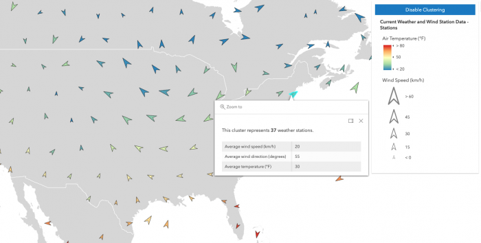
When any numeric field is used by the renderer, either with one or more visual variables or a ClassBreaksRenderer, the average value of that field will be used in the cluster symbology and made available to the developer in the popupTemplate.
In the example below, the layer representing weather stations is rendered with three visual variables: color, size, and rotation. When clustering is enabled, the average of each field referenced in the visual variables is computed for the features within each cluster. The color, rotation, and size of the cluster is then applied to the cluster graphic according to the average value of each respective field for the visual variables of features in that cluster.
View the code that makes this sample work
// Displays each weather station with three variables:
// Rotation - indicates wind direction
// Color - indicates air temperature
// Size - indicates wind speed

const renderer = {
  type: "simple",
  symbol: {
    type: "simple-marker",
    // Arrow marker
    path: "M14.5,29 23.5,0 14.5,9 5.5,0z",
    color: [50, 50, 50],
    outline: {
      color: [0, 0, 0, 0.7],
      width: 0.5
    },
    angle: 180,
    size: 15
  },
  visualVariables: [
    {
      type: "rotation",
      // Use {cluster_avg_WIND_DIRECT} in the
      // featureReduction.popupTemplate to
      // display the average temperature of all
      // features within the cluster
      field: "WIND_DIRECT",
      rotationType: "geographic"
    },
    {
      type: "size",
      // Use {cluster_avg_WIND_SPEED} in the
      // featureReduction.popupTemplate to
      // display the average temperature of all
      // features within the cluster
      field: "WIND_SPEED",
      minDataValue: 0,
      maxDataValue: 60,
      minSize: 8,
      maxSize: 40
    },
    {
      type: "color",
      // Use {cluster_avg_TEMP} in the
      // featureReduction.popupTemplate to
      // display the average temperature of all
      // features within the cluster
      field: "TEMP",
      stops: [
        { value: 20, color: "#2b83ba" },
        { value: 35, color: "#abdda4" },
        { value: 50, color: "#ffffbf" },
        { value: 65, color: "#fdae61" },
        { value: 80, color: "#d7191c" }
      ]
    }
  ]
};

// Configures clustering on the layer including
// a popupTemplate referring to aggregate fields
// that summarize the values of the fields used
// to render the cluster graphics.

const clusterConfig = {
  type: "cluster",
  popupTemplate: {
    content: [
      {
        type: "text",
        text: "This cluster represents <b>{cluster_count}</b> weather stations."
      },
      {
        type: "fields",
        fieldInfos: [
          {
            fieldName: "cluster_avg_WIND_SPEED",
            label: "Average wind speed (km/h)",
            format: {
              places: 0
            }
          },
          {
            fieldName: "cluster_avg_WIND_DIRECT",
            label: "Average wind direction (degrees)",
            format: {
              places: 0
            }
          },
          {
            fieldName: "cluster_avg_TEMP",
            label: "Average temperature (°F)",
            format: {
              places: 0
            }
          }
        ]
      }
    ]
  }
};

const layer = new FeatureLayer({
  portalItem: {
    id: "cb1886ff0a9d4156ba4d2fadd7e8a139"
  },
  renderer: renderer,
  featureReduction: clusterConfig
});
Unique values
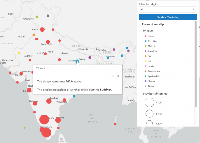
When a layer contains a UniqueValueRenderer, the clustered graphics are rendered with the symbol of the most common unique value of the features represented by the cluster.
View the code that makes this sample work
// Enable clustering on the layer

const clusterConfig = {
  type: "cluster",
  popupTemplate: {
    content: [
      {
        type: "text",
        text: "This cluster represents <b>{cluster_count}</b> features."
      },
      {
        type: "text",
        // layer.renderer.field = "religion"
        text: "The predominant place of worship in this cluster is <b>{cluster_type_religion}</b>."
      }
    ]
  }
};

const renderer = {
  type: "unique-value",
  // Aggregate field for the popup becomes
  // {cluster_type_religion}
  field: "religion",
  uniqueValueInfos: [
    // defines a unique symbol for each
    // type of religion in the layer
  ]
}

const serviceUrl = "https://services.arcgis.com/V6ZHFr6zdgNZuVG0/arcgis/rest/services/Places_of_Worship_India/FeatureServer/0";
const layer = new FeatureLayer({
  url: serviceUrl,
  title: "Places of worship",
  outFields: ["name", "religion", "denomination"],
  featureReduction: clusterConfig,
  renderer: renderer,
  popupTemplate: {
    title: "{name}",
    content: [
      {
        type: "fields",
        fieldInfos: [
          {
            fieldName: "religion"
          },
          {
            fieldName: "denomination"
          }
        ]
      }
    ]
  }
});
Improvements from 3.x clustering
You may have already picked up on a few improvements from the 3.x implementation of clustering. Some highlights include:
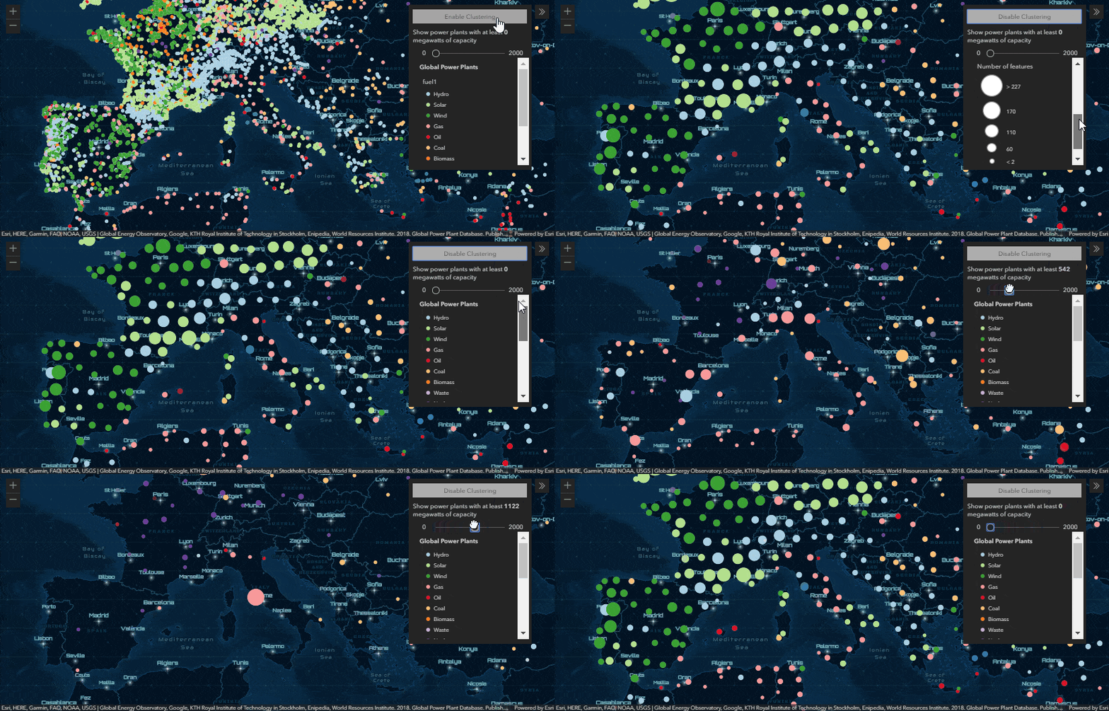
- Cluster more data: While 3.x had a limitation of clustering a maximum of 50,000 features, 4.x doesn’t have such a limit. You can cluster all data that can be loaded into your app.
- Faster filtering: You can use the same fast client-side filters on clustered layers as you can on unclustered layers in 4.x. Clusters are automatically recomputed client-side without needing to refetch the data. In 3.x you’re limited to filtering data with the
definitionExpression. This refetches data from the service, which doesn’t have the same level of interactivity as client-side filters. - GeoJSON layers: Since the GeoJSON layer is a first-class citizen in 4.x, you can now enable clustering in the same way that you would with a feature layer.
- Multiple projections: 4.x has experimental support for more projections than just Web Mercator and WGS 84. Those were the only supported spatial references in the 3.x implementation of clustering.
Coming soon
Remember, clustering is in beta! We’re seeking feedback on improvements in this latest implementation. Some things we currently don’t support, but are working hard to add soon include:
- Arcade expressions – We’ll add support for layers with renderers containing at least one valueExpression (i.e. Arcade expression) in the renderer or visual variable. This includes predominance, relationship, and age renderers created from the smart mapping creator methods.
- Labels – Currently clusters cannot be labeled with the total count of features comprising the cluster nor any other aggregate information known by the cluster.
- Auto-generated popup templates – The popupTemplate is not generated by default (this is the default in 3.x). We’re working on adding helper functions for creating good default popup templates for clustered layers.
- Full spatial reference support – Clustering layers with spatial references other than Web Mercator and WGS 84 is experimental and may not work for every projection. We’re hoping to stabilize support for all our spatial references.
Thanks for reading! Be sure to explore the samples in more depth and try out clustering on your own layers.

Commenting is not enabled for this article.