You can now investigate annual air quality patterns in the United States with a new layer added to ArcGIS Living Atlas of the World. The feature layer contains 19 years of aggregated particulate matter (PM 2.5) concentrations, which helps us visualize how air quality has changed over time. The Living Atlas layer is derived from NASA’s Socioeconomic Data and Applications Center (SEDAC) gridded annual PM 2.5 data. The data was aggregated and analyzed at multiple geography levels:
- States
- Counties
- 116th Congressional Districts
- 50km hex bins
What can we learn from this layer?
According to the World Health Organization (WHO):
“Ambient (outdoor) air pollution in both cities and rural areas was estimated to cause 4.2 million premature deaths worldwide per year in 2016; this mortality is due to exposure to small particulate matter of 2.5 microns or less in diameter (PM2.5), which cause cardiovascular and respiratory disease, and cancers.”
According to the US Environmental Protection Agency (EPA), PM 2.5 can be ingested into your lungs, and is small enough to enter your bloodstream, posing a great risk to health. It also reduces visibility (haze), impacting even our nationals parks and wilderness areas.

The Living Atlas layer contains multiple geography levels, allowing us to see PM 2.5 in ways that make sense to us. It helps us see spatial patterns to answer questions like, “does my county have a high amount of air pollution?” or policymakers ask questions like, “is my congressional district meeting WHO guidelines for air quality health?”
Exploring air quality through PM 2.5 values helps us investigate areas of higher risk in the US, particularly how this impacts the population. From the new layer, many new web maps were created that tell us different things about the patterns of air quality in the country over the past two decades. For example:
What is the average annual PM 2.5 in the US?
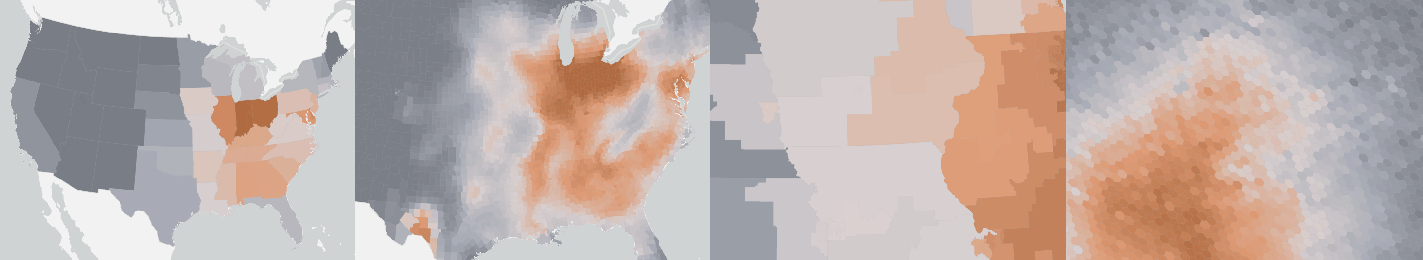
Since PM 2.5 is such a major environmental risk to health, in 2016, WHO set PM 2.5 guideline limits aimed to achieve the lowest concentrations of PM 2.5 possible. The target was set to be no more than a 10 μg/m3 annual mean in order to reduce air pollution deaths, particularly in cities. The map below shows which areas meet the target of 10 micrograms per cubic meter over 19 years, and which areas do not meet the target.
Initially, you can see which states are meeting the target, but if you zoom in, you will gain increased detail. You’ll see the same pattern at the county level, and then as you continue to zoom in you will also see which congressional districts and 50km hex bins meet the target.
Click on the map to learn more about an area. Zoom and pan to see more detailed patterns.
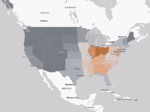
What is the overall air quality trend over from 1998 to 2016?
Have parts of the US been seeing improved air quality? Areas in blue saw an improvement over the years, while areas in orange saw a decline in air quality over time. As seen in the map below, the good news is that most areas of the country saw an overall improvement in air quality over time.
Click on an area to see how the PM 2.5 values changed over time. Zoom and pan to see more detailed patterns.
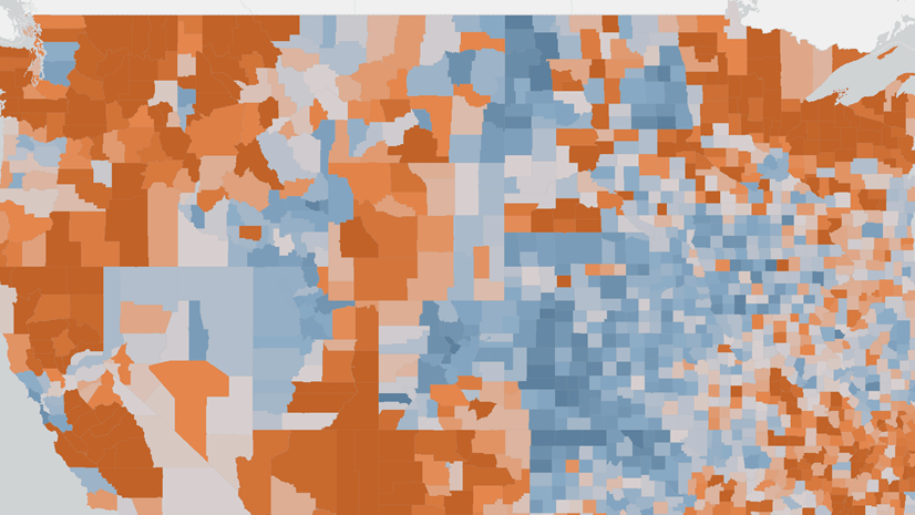
How are humans impacted by air quality in the US?
Not only does this new layer tell us more about how the air quality has changed over time in the United States, but it also includes demographic attributes to visualize the human impact of improving or declining air quality. Explore a population-weighted analysis of the PM 2.5 values to see where population is most impacted or least impacted by poor air quality.
Click on the map to learn more about the human impact of PM 2.5 in the US. Zoom and pan to see more detailed patterns.
These are just a few of the many maps that can be created from the air quality layer. Many other questions can be answered with this data, as you’ll see in a moment.
Want to better understand what the data patterns are showing us? This StoryMap provides a guided experience where some of the key patterns are explained by the creators of the maps. Learn more about what you’re seeing, and how those patterns are important for public policymakers.
How can I use this layer in my own maps?
The layer, USA Particulate Matter (PM) 2.5 between 1998-2016, can be found in ArcGIS Living Atlas throughout the ArcGIS platform and added into your own maps.
The maps we saw before are just a few examples of what can be made from the layer. There is also a collection of ready-to-use maps that utilize this layer which tell many different stories about air quality in the US:
These maps can be found in ArcGIS Living Atlas, this group, or this gallery.
Go to the map topic of interest, zoom to your area, and save the map as your own! You can customize the symbology, popup, or the geography levels being shown.
How was the layer created?
NASA SEDAC’s global annual gridded PM 2.5 data is derived from MODIS, MISR and SeaWiFS Aerosol Optical Depth (AOD) with GWR, and consist of annual concentrations (micrograms per cubic meter) of ground-level fine particulate matter (PM2.5), with dust and sea-salt removed between 1998 and 2016.
NASA’s WGS GeoTIFF files were first brought into a multidimensional mosaic dataset in ArcGIS Pro 2.5.0. This allowed the 19 years of data to be analyzed together within a Space Time Cube, which allows us to visualize and analyze spatiotemporal data. From the Space Time Cube, we are able to analyze the data through a Mann-Kendall trend and the Emerging Hot Spot Tool for each geography level. These analyses provide us with the average annual PM 2.5 value for each year, the average value of PM 2.5 over the 19 years, the hot and cold spots, and the trend over time.
In order to investigate the human impact, each geography level was enriched with demographic data such as the total population, the minority population, poverty, and more. The hex bin population figures were used to create a population-weighted figure for each area.
50km hex bins were used as the lowest level of analysis due to research done by Birch, Oom, and Beecham in 2007.
Kevin Butler, a Product Engineer on Esri’s Analysis and Geoprocessing Team designed this workflow, along with Lynne Buie from the Spatial Statistics team at Esri. Try out a similar workflow yourself using the same NASA data by following along with a Learn ArcGIS lesson by Kevin and Lynne:
Investigate Pollution Patterns with Space-Time Analysis
More info about air quality in the US
To learn more about the full set of content available about air quality in the US, check out the following resources:


Article Discussion: