We’ve all felt it at the grocery store this past year: rising prices. It’s almost always happening, but if you think it’s happening a lot faster than usual lately, you are right. From 2020 to 2021, prices rose faster than at any other point in the past 15 years. Economists at the Bureau of Labor Statistics measure the rate of price increases, also known as inflation, and they publish these rates in the Consumer Price Index (CPI).
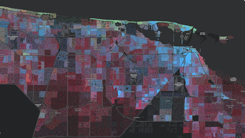
Some of the most popular attributes in Living Atlas, such as median home value and median household income, are affected by inflation. As GIS analysts, we can use the CPI to adjust for inflation when comparing these measures over time.
CPI and inflation over the years
The Consumer Price Index – Retroactive Series for all items started off in December 1977 with a value of 100. December 2021 closed out with a CPI of 410.5. This means that the same hypothetical basket of goods and services that cost $100 in December 1977 cost $410.50 in December 2021. The Bureau of Labor Statistics takes great care to adjust for improvements in product quality and to replace obsolete goods with more relevant goods over the years. (Anyone purchasing a video cassette recorder these days?) They also account for one of my favorite econ vocab words: shrinkflation. The price remains the same but the net weight is lower, or they cut corners with inferior ingredients/materials, or hotel stays no longer come with hot breakfast. You generally get less for the same price.
Just in the past 15 years or so, the CPI has changed quite a bit. Let’s look at how the annual average CPI has changed since 2005, the year the American Community Survey started. Dividing one year’s CPI by the previous year’s gives us inflation:
| Year | CPI | Inflation |
|---|---|---|
| 2005 | 286.9 | 1.034 |
| 2006 | 296.2 | 1.032 |
| 2007 | 304.6 | 1.028 |
| 2008 | 316.3 | 1.038 |
| 2009 | 315.2 | 0.997 |
| 2010 | 320.4 | 1.016 |
| 2011 | 330.5 | 1.032 |
| 2012 | 337.5 | 1.021 |
| 2013 | 342.5 | 1.015 |
| 2014 | 348.3 | 1.017 |
| 2015 | 348.9 | 1.002 |
| 2016 | 353.4 | 1.013 |
| 2017 | 361.0 | 1.022 |
| 2018 | 369.8 | 1.024 |
| 2019 | 376.5 | 1.018 |
| 2020 | 381.2 | 1.012 |
| 2021 | 399.0 | 1.047 |
Inflation – the rate of price increases – was 4.7 percent in 2021, compared to only 1.2 percent in 2020 and 1.8 percent the year before that. The recent spike in prices at your favorite stores or sites is not just your imagination!
Higher dollar-denominated values in the 2017-2021 American Community Survey
The rolling five-year nature of the American Community Survey (ACS) means that respondents could have answered questions about their income, home value, rent, and other topics during any of the five years within the period. The Census Bureau always reports inflation-adjusted dollars to the last year of 5-year range. That means that the most recent vintage: 2016-2020 has all dollar-denominated values expressed in 2020 dollars. When we get the 2017-2021 values this winter, they will be reported in 2021 dollars.
They’re usually slightly higher with every new release, but this time around, expect a bigger jump than in the past. If no real change occurred (“all-else-equal” as economists say), these values should be 4.7 percent higher, which is much bigger than previous increases. Bottom line is, these values will be noticeably higher than before.
The layer itself will have adjusted symbology with breakpoints calculated from the new data distribution. Many of the layers center their map symbols and colors around the national figure of the attribute being mapped, to emphasize areas with higher or lower figures than that national figure. For example, the U.S. median household income is currently shown as $65,000 in that layer’s legend.

Once the annual update occurs, a new figure will appear there based on the latest data, and new top and bottom values will be calculated. This means that the layers’ symbology will change based on the new data.
What this means for your maps
If you’ve created an original web map using these layers, plan to take a look at the new data distributions and adjust the breakpoints of your symbology. If you’ve centered your map around your state’s or county’s median value, keep in mind that those values will most likely change as well.
What this means for your programs and policies
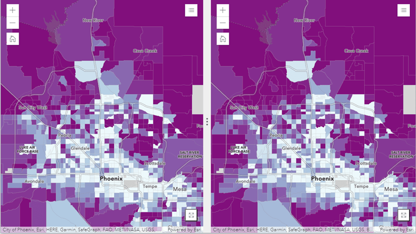
Recently, I had the pleasure of talking to a decision support analyst for a program in Los Angeles County with the goal of making Broadband internet more accessible. Part of the program’s eligibility was a means test, so household income had to be below a certain threshold: $50,000. Naturally, the analyst created a map of tracts within the county for which median household income was below $50,000.
When we get new data this fall, it’s likely that fewer tracts will have incomes below this amount. Being able to explain why will build your credibility as a decision support analyst.
Does an eligibility income threshold need to be adjusted?
Probably, depending on what data was used when it was established. For example, say this threshold was established based on 2018 data. Let’s see what the amount of goods and services that someone could buy with $50,000 in 2018 would cost in 2021. Using the annual CPI (from BLS, or from the table above), we simply multiply:
$50,000 * (CPI in 2021 / CPI in 2018)
$50,000 * (399.0 / 369.8)
Therefore, the amount of goods and services that one could buy for $50,000 in 2018 cost $56,618.72 in 2021. You can roughly check your work using this app from the Bureau of Labor Statistics to calculate this (using December for both months), which yields similar results ($55,486.74).
Which ACS layers have monetary values?
- Earnings by Occupation (boundaries & centroids)
- Earnings by Occupation by Sex (boundaries & centroids)
- Household Income Distribution (boundaries & centroids)
- Median Household Income (boundaries & centroids)
- Housing Units Occupancy (boundaries & centroids)
- Population and Housing Basics (boundaries & centroids)
“Income in the past 12 months” is also used to determine poverty status and housing costs as a percent of income, even though it is not a field on those layers. Keep in mind that income and earnings questions in the ACS do not go by calendar years, but rather “earnings/income in the past 12 months.” If you respond to a survey in 2022, then some of your earnings took place/income was received in 2021.
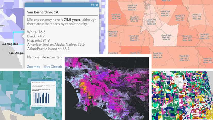
We also have a number of web maps available on income and many other topics that are refreshed every year.

Parsing real change from inflation
Real change is about purchasing power, not the dollar value. Real change excludes the effect of inflation. Let’s take a look at median household income at the national level.
| Time Period | Median Household Income | Inflation-Adjusted to 2021 dollars |
|---|---|---|
| 2005-2010 | $51,914.00 | $64,649.46 |
| 2006-2011 | $52,762.00 | $63,697.54 |
| 2007-2012 | $53,046.00 | $62,712.16 |
| 2008-2013 | $53,046.00 | $61,796.65 |
| 2009-2014 | $53,482.00 | $61,267.06 |
| 2011-2015 | $53,889.00 | $61,627.15 |
| 2012-2016 | $55,322.00 | $62,460.32 |
| 2013-2017 | $57,652.00 | $63,720.63 |
| 2014-2018 | $60,293.00 | $65,053.83 |
| 2015-2019 | $62,843.00 | $66,598.56 |
| 2016-2020 | $64,994.00 | $68,028.87 |
According to these inflation-adjusted numbers, households had it relatively good in 2005-2010, and then their buying power dipped. It didn’t recover until the period from 2014-2018. When you hear business analysts on T.V. or podcasts talking about how “real wages” stagnated, this is what they’re talking about.
You could do these same calculations for income, home value, and contract rent. It works for any dollar-denominated values, not just ones in the American Community Survey. This is how researchers are able to make assertions about how the real price of things like electronics and clothing has generally gotten cheaper over the decades, whereas the real price of necessities like housing, health care, and child care have gotten more expensive (Washington Post article, 2016; Howmuch.net, 2019).
The ACS breakdowns by age, sex, and race/ethnicity can help us see if there’s been real change for some groups more than others (such as households on a fixed-income). The beauty of GIS and mapping is that we can see where there’s been real change in some places but not others.
Conclusion/Call to Action
As consumers, we respond to inflation by pinching our pennies: preparing more food at home, taking the bus instead of driving so much, and generally making fewer purchases. As GIS analysts mapping economic data, we can respond to inflation by:
- Expecting higher values in ACS 2017-2020 data, and redefining the breakpoints in our maps’ symbology as appropriate
- Communicating why fewer areas fall below an eligibility threshold, and potentially adjusting the threshold
- Adjusting values using the CPI when comparing over time to parse real change from inflation
All of these actions provide a valuable service to your decisionmakers and your maps’ intended audience. If you want to, you can also throw in the word “shrinkflation.”
Photo by Kenny Eliason on Unsplash

Article Discussion: