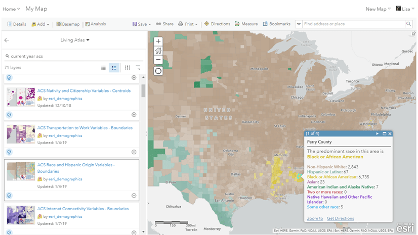
Comparing two numbers is often the first step of analysis. Informative maps are foundational to decision-support briefings and discussions, particularly ones that compare and contrast two values. ArcGIS Living Atlas of the World contains more than 100 layers of American Community Survey data from the U.S. Census Bureau that can highlight many social, demographic, economic, and housing topics, and smart mapping capabilities within ArcGIS Online make it easy to make maps that compare different values. One way to make these types of maps more informative is to show what differences are statistically significant and which ones are not.
What is statistical significance anyways?
When comparing two groups or two time periods, most analysts want to know: What is the difference between the two data points? In addition, skilled data analysts and statisticians will ask: What is the probability that this difference is real, and not simply due to getting a lucky (or unlucky) sample? In any data point that comes from a sample, there is always the possibility that the difference occurred through sampling error. If the probability of the difference being due to sampling error is small, then we say that our observation of the difference is statistically significant.
A statistically significant difference is not necessarily a big difference. In fact, with larger samples, the chance of a difference being statistically significant is higher, even if the difference itself is not very large. Conversely, large differences might not be statistically significant, particularly if there was a small sample.
Think of "statistical significance" as likely to be true in the whole population, and likely to be observed again if another sample is drawn.
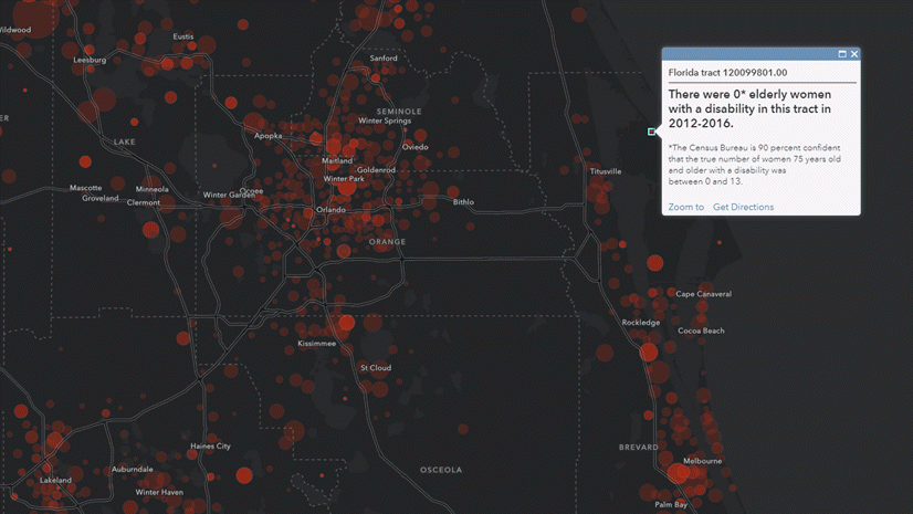
The Census Bureau uses a 90 percent confidence level as their standard, which means the cutoff for the probability of the difference being due to sampling error is 10 percent (or p<.1). If the difference between two estimates is at least 90 percent likely to be observed in the full population, or 90 percent likely to be observed again if another sample is drawn, then we say the difference is statistically significant. The Census Bureau provides a Statistical Testing Tool which uses the estimates and the margins of error to test for statistical significance. For more information, see ArcGIS Pro documentation titled What is a z-score? What is a p-value?
We used this tool as the inspiration for ways to use Arcade to show statistical significance between two different estimates within different types of maps.
Compare estimates for two different groups within the same geography
Here I have a map comparing homeownership rates between two groups: non-Hispanic White vs. Hispanic and Latino. This map uses the Compare A to B mapping style, great for comparing two attributes, as it shows one value as a ratio of the other. This is one of many ways to show differences among groups in your maps.

Show significance in the pop-up

The pop-up contains language coming from Arcade expressions to state whether or not the difference in homeownership rates between these two groups is statistically significant. The first expression is the significance test:
![var white_est = $feature["B25003H_calc_pctOwnNHWhiteE"] var HispLat_est = $feature["B25003I_calc_pctOwnHispLatE"] var_white_MOE = $feature["B25003H_calc_pctOwnNHWhiteM"] var HispLat_MOE = $feature["B25003I_calc_pctOwnHispLatM"] //compute standard errors var white_SE = white_MOE / 1.645 var HispLat_SE = HispLat_MOE / 1.645 //use standard errors to compute z-score var z_score = abs(white_est - HispLat_est)/sqrt(pow(white_SE,2)+pow(HispLat_SE,2)) //compare z-score to alpha (1.645 if using 90%) return iif(z_score > 1.645, "statistically significant", "not statistically significant")](https://www.esri.com/arcgis-blog/app/uploads/2021/03/Significance_Test_Arcade_Expression.png "var white_est = $feature[\"B25003H_calc_pctOwnNHWhiteE\"] var HispLat_est = $feature[\"B25003I_calc_pctOwnHispLatE\"] var_white_MOE = $feature[\"B25003H_calc_pctOwnNHWhiteM\"] var HispLat_MOE = $feature[\"B25003I_calc_pctOwnHispLatM\"] //compute standard errors var white_SE = white_MOE / 1.645 var HispLat_SE = HispLat_MOE / 1.645 //use standard errors to compute z-score var z_score = abs(white_est - HispLat_est)/sqrt(pow(white_SE,2)+pow(HispLat_SE,2)) //compare z-score to alpha (1.645 if using 90%) return iif(z_score > 1.645, \"statistically significant\", \"not statistically significant\")")
View the map and sign in to take a look at the expressions in the pop-up configuration. You’ll see that other expressions created were text to display the words “higher” or “lower”, the right conjunction (“and” or “but”). The conditional color of the text was done in Map Viewer Classic.
Show how significant a difference is in the pop-up
For the statistician purists who are reading this, you are probably wondering about displaying how significant a given difference is. Set an Arcade expression to say * (p<.1), ** (p<.05), or *** (p<.01) depending on the z-score and associated confidence levels.

This was achieved using the following expression which used the Existing tab -> Significance Test expression as a starting place.
 //evaluate z-score return when(z_score 1.645 && z_score 1.960 && z_score 1.576, \"***(p")
Show significance through symbology with an outline
If you are comparing two estimates within the same layer, Arcade Expressions are also useful for symbology. Create a copy of the layer you’re already working with and symbolize by a New Expression. Use the statistical test expression above and symbolize with a hollow polygon with a thick outline:

Compare estimates from two different time periods for the same geography
For many of the ACS Living Atlas layers that contain the most current ACS data, there is now a corresponding 2010-2014 ACS boundaries layer, symbolized using the same color ramp and breakpoints for a clear comparison. There are many ways to reveal trends using these layers.
For example, here is a map showing the median age from the two ACS periods. The transparent symbols are symbolized to depict the same values, and are stacked on top of each other, making it easy to see which counties have a blue vs. red outline. A blue outline depicts an area where the median age has decreased (population is getting younger), and a red outline depicts an area where the median age has increased (population is getting older).
 have large blue outlines around the purple circles.")
Show significance in the pop-up

We can show whether or not a change is statistically significant in the pop-up using Arcade FeatureSets. FeatureSets allow you to construct Arcade Expressions that combine multiple layers. This example uses the Filter() function to connect the layers by a matching attribute shared between the two layers.
![var Est_CY = $feature["B01002_001E"] //second estimate var hist_layer = FeatureSetById($map, "ACS_10_14_Median_Age_Boundaries_7466") var geoid = $feature.GEOID var fl = First(Filter(hist_layer, "GEOID = &geoid")) var Est_Hist = fl.B01002_001E var MOE_CY = $feature["B01002_001M"] var MOE_Hist = fl.B01002_001M var SE_CY = MOE_CY / 1.645 var SE_Hist = MOE_Hist / 1.645 var z_score = abs(Est_CY - Est_Hist)/sqrt(pow(SE_CY,2) + pow(SE_Hist,2)) //return z_score return iif(z_score>1.645, "statistically significant", "not statistically significant")](https://www.esri.com/arcgis-blog/app/uploads/2021/03/Significance_Test_FeatureSets.png "var Est_CY = $feature[\"B01002_001E\"] //second estimate var hist_layer = FeatureSetById($map, \"ACS_10_14_Median_Age_Boundaries_7466\") var geoid = $feature.GEOID var fl = First(Filter(hist_layer, \"GEOID = &geoid\")) var Est_Hist = fl.B01002_001E var MOE_CY = $feature[\"B01002_001M\"] var MOE_Hist = fl.B01002_001M var SE_CY = MOE_CY / 1.645 var SE_Hist = MOE_Hist / 1.645 var z_score = abs(Est_CY - Est_Hist)/sqrt(pow(SE_CY,2) + pow(SE_Hist,2)) //return z_score return iif(z_score>1.645, \"statistically significant\", \"not statistically significant\")")
View the map and sign in to take a look at the other expressions in the pop-up configuration, such as the other conditional text and conditional color.
Show difference over time through the symbology
If you want to visualize this change through your layer’s symbology, you’ll first need to join the 2010-2014 and 2017-202 ACS layers of your choice either in ArcGIS Online or in ArcGIS Pro. You’ll then want to create new fields for your change over time calculation.
This map uses the Color and Size mapping style with the above and below size theme, which is available in the new Map Viewer. The map utilizes triangles pointing up to show increases over time and downward triangles to show decreases. The size of the symbol is proportional to the percent change over time so that larger symbols experienced a larger change. This technique allows us to clearly see if the percent of population without health insurance increased or decreased over time, and by how much.
Where has the percent of population without health insurance increase or decreased?
Clicking on any of the triangles on the map will pop-up an information window on the left panel of the web map with information such as whether the percent change of those who are uninsured are statistically significantly or not.
, 2015-2019 Percent of Uninsured: 10.4% (+/- 1.1%). Percent change for Percent who are uninsured: -34.1%, a statistically significant change.\"")
Compare estimates for a geography within a larger geography
You can also compare across geography levels, for example, county values to their state’s value, or tract values to their overall county’s value. Here I have a map of where people age 5 and older speak Spanish at home, and the pop-up compares the county value to that of the overall state’s value:

This was achieved using Arcade FeatureSets by the following expression:
![//county values var county_est = $feature["B16007_calc_pctSpanE"] var county_moe = $feature["B16007_calc_pctSpanM"] //get state values var st_layer = FeatureSetById($map, "ACS_Language_by_Age_Boundaries_5046") //match by name field in state layer var st = $feature.State var fl=First(Filter(st_layer, "NAME LIKE @st")) var_st_est = fl.B16007_calc_pctSpanE var st_moe = fl.B16007_calc_pctSpanM //from there compute standard errors, z_score, and interpret z_score](https://www.esri.com/arcgis-blog/app/uploads/2021/03/state_significance_Arcade_Expression.png "//county values var county_est = $feature[\"B16007_calc_pctSpanE\"] var county_moe = $feature[\"B16007_calc_pctSpanM\"] //get state values var st_layer = FeatureSetById($map, \"ACS_Language_by_Age_Boundaries_5046\") //match by name field in state layer var st = $feature.State var fl=First(Filter(st_layer, \"NAME LIKE @st\")) var_st_est = fl.B16007_calc_pctSpanE var st_moe = fl.B16007_calc_pctSpanM //from there compute standard errors, z_score, and interpret z_score")
Statistician purists, we hear you! County values are not independent of states, and tract values are not independent of county values, since the smaller geography is part of the larger one. This could potentially be a problem if the smaller geography is a large part of the larger group (e.g. Los Angeles County has roughly a fourth of the state of CA’s population), however, this is a reasonable comparison to make when planning programs and policies.
The same caveat holds when comparing one group to the overall population. When possible, compare two independent groups (males vs. females rather than males to total population). This leads to a few more notes and considerations:
Considerations
- If comparing currency values across time periods, adjust for inflation first.
- If the margin of error of an estimate is zero, it is most likely because the estimate is controlled and a statistical test is not appropriate.
- If the margin of error of an estimate is null, it is likely because the estimate falls in the lowest or highest interval of an open-ended distribution (e.g., $250,000+) and is not an actual value. Statistical testing is not applicable.
Get Started
Get started by browsing the Current ACS layers which always contain the most recent estimates, as well as the 2010-2014 ACS layers, all available at your fingertips through ArcGIS Living Atlas. See our FAQ site for more information. Post any questions or share your work by posting on Esri Community’s Living Atlas space.
Additional Resources
- Your Arcade Questions Answered, and Arcade Function Reference
- Census Bureau’s Statistical Testing Tool, and ACS Data User’s Handbooks.
The online ACS Data Users Community is a great place to ask questions specific to the American Community Survey.


Article Discussion: