ArcGIS Living Atlas of the World contains lots of the most popular American Community Survey estimates in the form of hosted feature layers whose values are updated annually. This past December, they were updated with the most recent 2015-2019 values. This is the first time that there have been two five-year periods since the 2010 Decennial Census. That means we can now make comparisons for specific states, counties, and tracts between the most recent 5-year period, 2015-2019, to 2010-2014, to reveal trends over time. It’s not a comparison between 2014 to 2019, but rather a comparison between the 60-month period of 2010-2014 to the 60-month period of 2015-2019.
For many of the ACS Living Atlas layers, there is now a corresponding 2010-2014 boundaries layer, symbolized using the same color ramp and breakpoints for a clear comparison.

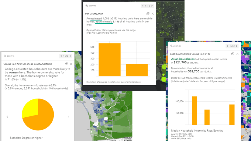
The possibilities!
From displaying maps side-by-side, to creating informative pop-ups, to performing analysis, the possibilities are endless.
Display changes via configurable apps
The Compare as well as Swipe and Spyglass configurable apps are ideal for creating an interactive comparison that can easily be embedded in your story maps, dashboards, and hub sites. Here are two examples using the ACS Housing Units Occupancy layers that are symbolized to show the homeownership rate. We used the most recent boundaries layer, currently displaying 2015-2019 values, along with the corresponding 2010-2014 boundaries layer.
Interact with the two apps below to see changes in homeownership in Phoenix. The first one uses Compare app and the second uses Swipe.
Example using Compare App:
Example using Swipe App:
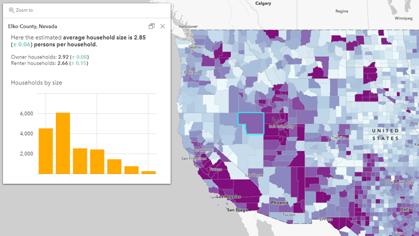
Show historical context in pop-ups
Using an Arcade capability called featureSetByPortalItem(), it’s possible to bring in attributes from another layer into your pop-ups without having to add that layer to your map. Our colleague Lisa Berry used this approach to create a pop-up that shows total population count for the two time periods in this map.
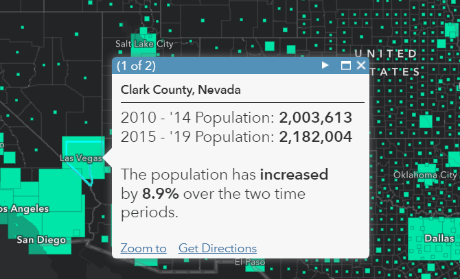
She even added additional expressions to calculate the percent change, and the conditional text of “increased” or “decreased.” Open the map and choose “Modify Map” at the top right to explore the Arcade expressions within the pop-up configuration. For more details about this technique, check out this blog.
Bring the two layers together for further analysis
Join the layers from the two time periods together to calculate change. This can be done with analysis credits in ArcGIS Online, however it’s much faster to do in ArcGIS Pro. Once you have computed the change, there are lots of next steps you can take. Symbolize your map by the change itself with a diverging color ramp, known as an above and below mapping style in ArcGIS Online, to show growth vs. decline. Create graphs and charts with this new attribute in Pro or in Insights. Select only the counties and tracts that have had a change above a critical value. Combine these layers with other data to add context to your work. We will be putting out more in-depth tutorials on these workflows in the coming year.
What should I keep in mind when making these comparisons?
Smoothing will hide fluctuations
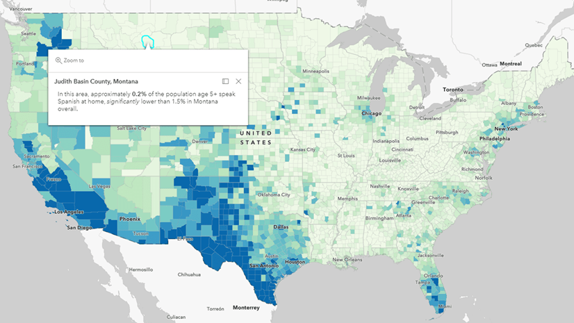
The nature of pooling together 5 years’ worth of data is great for making data available for very fine geography levels for specific groups of people (e.g. children under 6 years old in the care of grandparents). One downside to the five-year estimates is the inherent smoothing effect it has on trends over time. Large fluctuations from year to year will not be apparent when comparing the two 5-year periods of 2010-2014 and 2015-2019. There are only two data points available over a combined 10-year period.
These values are estimates
All ACS data values are estimates based on responses from a sample of the population rather than a complete count. The Census Bureau encourages anyone making comparisons to pay attention to sampling error associated with the estimates. To help with interpreting the reliability of the estimates, the Census Bureau publishes a margin of error (MOE) for each and every ACS estimate. For the commonly-derived calculated fields that we have added, we have followed the guidance from Census for estimating MOEs for those estimates as well. There are several ways to incorporate the MOEs into your maps, should you need to do so.
How do I know if a change is a significant change?
Great question! Fortunately Census provides a Statistical Testing Tool to help you compare two or more estimates to see if the difference between them is statistically significant.
How do I adjust for inflation when comparing monetary values?
So glad you asked! Many topics covered in the ACS include monetary data such as income, earnings, contract rent, home values, etc. These are sometimes called “dollar-denominated data.” The 2010-2014 estimates are expressed in 2014 dollars, whereas the 2015-2019 estimates are expressed in 2019 dollars. To really compare apples to apples, we can adjust for inflation in just a few simple steps, as recommended by Census:
- Obtain the All Items Consumer Price Index – Urban – Retroactive Series (CPI-U-RS) Annual Averages from the Bureau of Labor Statistics for the two years: 2014 and 2019. (Actually, we’ve done it for you, in 2014 it was 348.3 and in 2019 it was 376.5).
- Divide the more recent value by the older value to create the inflation adjustment factor. (376.5 / 348.3).
- Multiply the dollar-denominated value for the earlier year by this inflation adjustment factor.
Now you can create a simple Arcade statement to display the 2010-2014 value of interest expressed in 2019 dollars. For example, let’s see how median contract rent has increased in Fresno County, California. We created the Arcade Expression below:
![Expression titled Contract Rent adjusted for inflation. Expression: round($feature["B25058_001E]* (376.5 / 348.3), 0)](https://www.esri.com/arcgis-blog/wp-content/uploads/2020/12/Arcade_inflation_adjustment_factor-1.png "Expression titled Contract Rent adjusted for inflation. Expression: round($feature[\"B25058_001E]* (376.5 / 348.3), 0)")
Then we configured the pop-up with a simple sentence:

When clicking on Fresno County, we see that a median contract rent of $753 is actually equivalent to $814 when adjusted for inflation.

This allows us to consider real change when comparing $814 to the 2015-2019 value of $830. Looks like rents in Fresno have been fairly stable, at least at the county level.
Are there any layers that are not one-to-one comparisons?
Yes. For some layers,
- There have been slight differences in questionnaire content and coding that reflect our changing society. Layers affected (5): ACS Health Insurance Coverage, ACS Health Insurance by Age and Race, ACS Transportation to Work, ACS Earnings by Occupation, ACS Earnings by Occupation by Sex.
- There are slight changes in the top-end and bottom-end ranges of years. Layers affected (2): ACS Nativity and Citizenship, ACS Housing Units by Year Structure Built.
- There is no corresponding 2010-2014 layer, either because those questions were introduced after 2014 (all computer and internet layers), or because there were significant changes to the table shells that do not allow for meaningful comparisons (ACS Place of Birth, and ACS Living Arrangements).
For some geographic areas,
- Some counties went through a name change, such as Oglala Lakota, SD (formerly Shannon, SD). This causes these counties to have a new FIPS code, and all tracts within that county then have the new county FIPS as part of their FIPS as well.
- A handful of new counties formed over the past decade. For example, Broomfield, CO formed from portions of multiple counties.
For more information about comparing 2010-2014 ACS 5-year estimates with 2015-2019 ACS 5-year estimates, including geographic boundary changes and changes in the questionnaire and coding, see this documentation from the U.S. Census Bureau. The recommended approach by Census for making comparisons over time is to use non-overlapping estimates. To find out why comparing overlapping ACS data aren’t encouraged, read here.
What trends will you reveal?
Get started by browsing the Current ACS layers which always contain the most recent estimates, as well as the 2010-2014 ACS layers, all available at your fingertips through ArcGIS Living Atlas.


Article Discussion: