Imagine what it would look like if everything you see in and around your house was suddenly buried under a foot of water. If you live in California, that is essentially what happened at the beginning of this month. From December 26th through mid-January, 11.5 inches of rain on average fell across the state. The heavy, sustained precipitation has already exceeded yearly wet-season averages, but the storms are also responsible for 20 deaths and heavy damage. More than an isolated incident, the latest climate models suggest that this trend of extreme, dangerous precipitation is the new norm. Let’s take a look at ArcGIS Living Atlas resources available to study immediate impacts and the long-term rainfall model predictions.

Short-term tools
The last of the heavy rainfall came through mid-January. ArcGIS Living Atlas tools can be used to understand these immediate impacts and as key decision support tools. Resources from the National Weather Service (NWS) in Living Atlas can bring to light these developing situations. For example, if you are reading this shortly after the January 2023 downpours, note the surplus of water in California rivers.
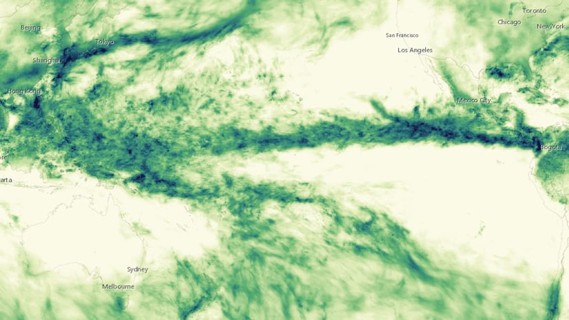
Living Atlas live feeds like the National Weather Service 72 Hour Precipitation Forecast shows accumulation totals in six-hour intervals. Below, see how the ninth and final atmospheric river battered Northern California over the weekend of January 15th.

Tools like these, providing near real-time weather forecast updates to a wide audience, will become increasingly relevant as our climate becomes more extreme. A recent Nature Climate Change article describes how intense West Coast winter storms could see a 40% increase in precipitation by mid-century. To investigate these trends yourself, you can look to historic data available in Living Atlas. The NOAA Storm Events Database 1950-2021 is the most comprehensive account of U.S. severe weather. Within ArcGIS Pro, you can filter event type to heavy rain and from there create a chart to visualize the trend by year. Since 1996, the number of heavy rainstorms has increased by about 44 events per year, which tracks with longer term trends.

Turning to future climate, ArcGIS Living Atlas has its own resources, with multi-model ensembles including multiple emissions scenarios and decade ranges, to help understand these trends. Here we will pull out some clear and interesting stories in the data and provide context for how to best interpret it.
More rain, nearly worldwide
Climate change means more heat. And while you may tend to associate heat with dryness (drought), more heat really means more evaporation, especially when that heat comes in the form of warmer oceans. Hotter air can hold more moisture, which means more rainfall. Think of this like the water cycle on steroids, dumping and evaporating more water at a faster rate.
Let’s take a look at some of the stories that emerge when we investigate the Living Atlas climate data. Once a subset of data is selected, you can perform raster algebra to look at absolute and relative change in variables compared to historic baselines. A previous blog explains in detail how to analyze multidimensional climate models, but the maps below serve as inspiration to see what stories emerge from the data. All analysis and layout was performed within ArcGIS Pro.
Annual changes
This hyped-up hydrologic system culminates with 93% of land surface getting more rain compared to historic baselines (1970-2000). The only notable precipitation decreases are in North Africa, the Amazon, and Central America. The greatest increases in annual precipitation occur in South Asia, a region that already sees heavy monsoon seasons, and (curiously) the Sahel region of Africa (a region that suffers from drought and desertification currently).

As explained in the heat component of this series on climate extremes, annual averages may conceal the potential impact of increasingly frequent, intense storms. In fact, most of the heavy precipitation by midcentury may not come in peaceful, quotidian showers but rather more dramatic, irregular events.
Seasonal variation
Though global climate models cannot show with precision when extreme events can occur, we can look at seasonal changes in precipitation to get a rough idea.


In Living Atlas, bioclimatic variables 16 and 17 show precipitation by wet and dry season, respectively. The percent difference against a historical baseline for wet season shows that most of the overall increase in precipitation is concentrated during the wet season. However, even in the dry season, over 80% of land could actually see increases in precipitation.
Taking it LOCA(L)
In Living Atlas, downscaled LOCA climate model ensembles from NOAA provide not only US-specific data but even more granular variables for which to analyze precipitation extremes. Living Atlas has these variables for several emissions scenarios and years.
Annual Precipitation (USA)
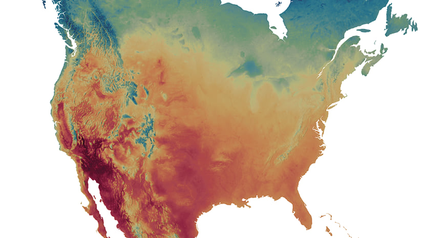
To get us acquainted, let’s begin with the same annual precipitation variable, but this time calculated using 32-model ensemble tailored to the United States. This ensemble shows a similar trend compared as the global predictions. This data is reported by county, and the associated attribute table contains demographic information, allowing us to filter and perform calculations on affected populations. In deriving such statistics, you will find that 78% of Americans could see more rain by 2050 under the high emissions scenario.

The LOCA data really gets into the details, which is where the most acute climate impacts are found. The annual data tells us that Texas and Southern California may continue to dry out. Annually averaged, this may be true, but when you look at the annual number of days with high precipitation (2+ inches), a more nuanced story emerges…
Change in extreme precipitation frequency

The mid-century high emissions ensemble predicts that every part of the U.S. could see more extreme precipitation events. Even in areas with less rain overall (predicted decreased annual precipitation), storms could be more frequent. They may be as rare as one more every 8 years in the Great Plains, but an increase nonetheless. In other places (looking at you, Pacific Northwest) these heavy storms could happen more frequently (multiple additional storms possible every year).

The really interesting part is, if you zoom in to the West Coast, those California counties with more frequent heavy rain are the same counties that got absolutely inundated over the last month.
Change in consecutive wet days
.")
Change in consecutive wet days is another neat variable that helps you parse out extreme risk beyond the annual and even seasonal averages. By county, LOCA ensembles show current and predicted length of precipitation in days. The county-level change in this variable indicates how much longer or shorter rain events may be. In most of the country, these events may actually be shorter, but in a few counties, mostly in lower Appalachia, there is a strong increase in storm length (in some cases days longer).
A closer look at watersheds

In all of these maps, we have included drainage watersheds also known as hydrologic units. Hydrologic units are nested features defined by hydrologic and topographic criteria are available in Living Atlas at the region, subregion, basin level, and so on. Hydrologic units provide useful information about flood risk since catchment shape influences how quickly storm runoff is accumulated in a watershed. Above, see a more detailed view of subregion watersheds.
Bivariate maps give us the ability to look at this risk intersection…
However, longer storms do not necessarily indicate more risk. In fact, it can be the shorter duration storms that dump more precipitation over a shorter period of time that can cause the most danger. Therefore, the most risk exists at the intersection of more frequent precipitation and shorter duration storms. To figure out where this risk exists, we can invert the change in consecutive wet days (this time focusing on shorter periods) and combine that with change in precipitation frequency.
More intense, more frequent

This map shows where storms will be both shorter in duration and more intense. These heavy and increasingly common storms can cause destruction quickly, making flood preparedness essential.
Only two regions stand out for having more frequent and intense storms. The Mississippi Delta region where the river meets the Gulf is an area known for its destructive hurricanes and could see more intense rainfall. The second is the Pacific Northwest. Again, those recent Pacific atmospheric rivers may be just a sign of future weather trends to come.
Other Living Atlas resources for precipitation risk
When there is rain (and lots of it), there is flood. Therefore, any good storm preparedness is flood preparedness. The Flood Risk Index series within Living Atlas is a set of maps that show how different interventions could improve flood resilience. These layers focus on improvements to flood awareness, evacuation routes, open space, and impervious surfaces, among others. They tie in demographic data at the census tract level to provide socioeconomic context and information about disadvantaged communities.


Article Discussion: