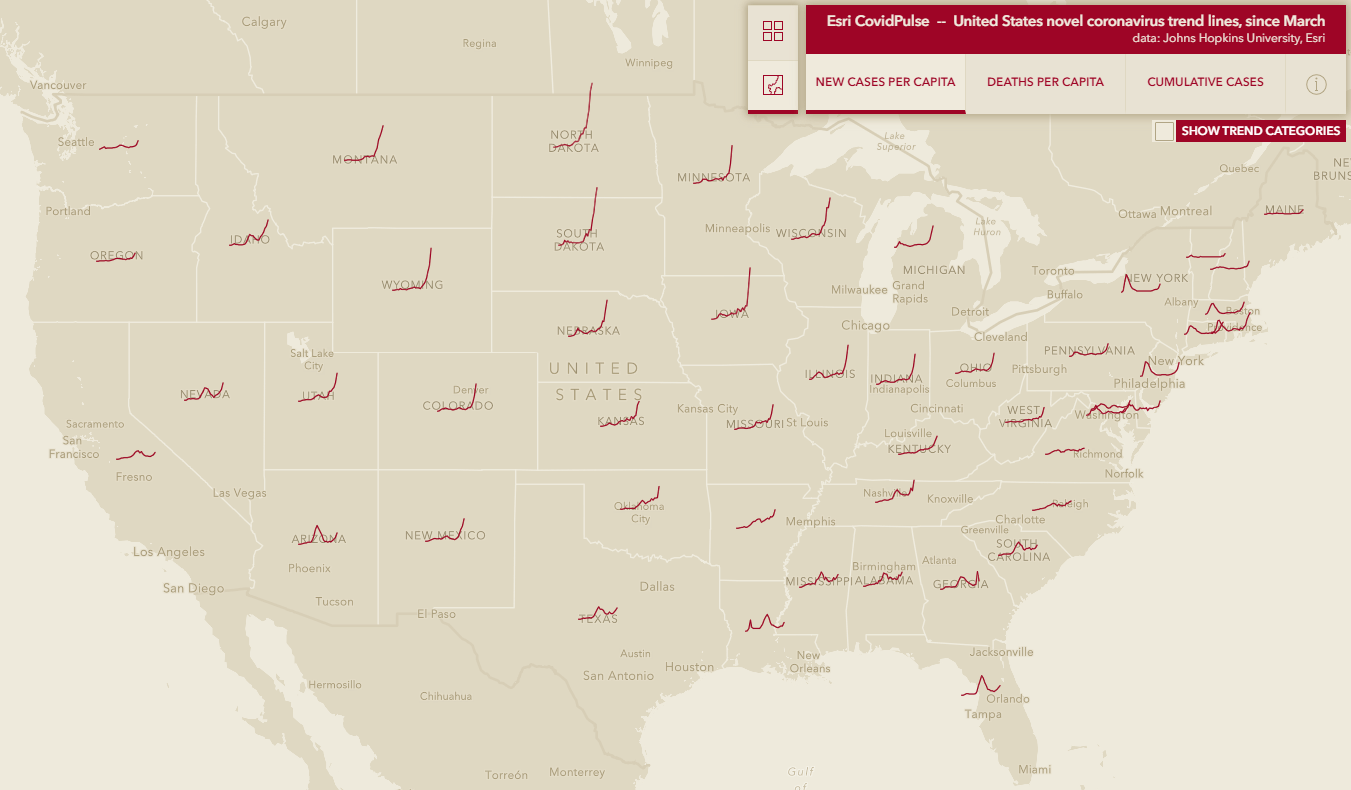
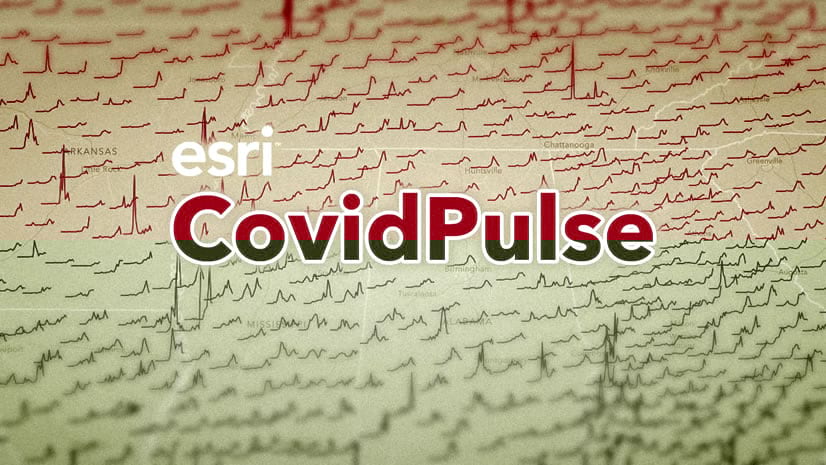
CovidPulse has been updated to provide additional context and value for those looking for local and national trends in the ongoing pandemic. CovidPulse illustrates the local rises and falls of Coronavirus throughout the pandemic via sparkline map symbols, at state and local levels, but now it more readily provides a comparative sense of local rates. In recent weeks we’ve experienced yet another wave of infections in new, and seasonally-driven, parts of the country.
But how do we compare these places to other places? Or how can we discover places where the relationship between cases and deaths is low or high? My colleague, and CovidPulse collaborator, Jinnan Zhang was asking these questions and proposed a solution.
Grid View
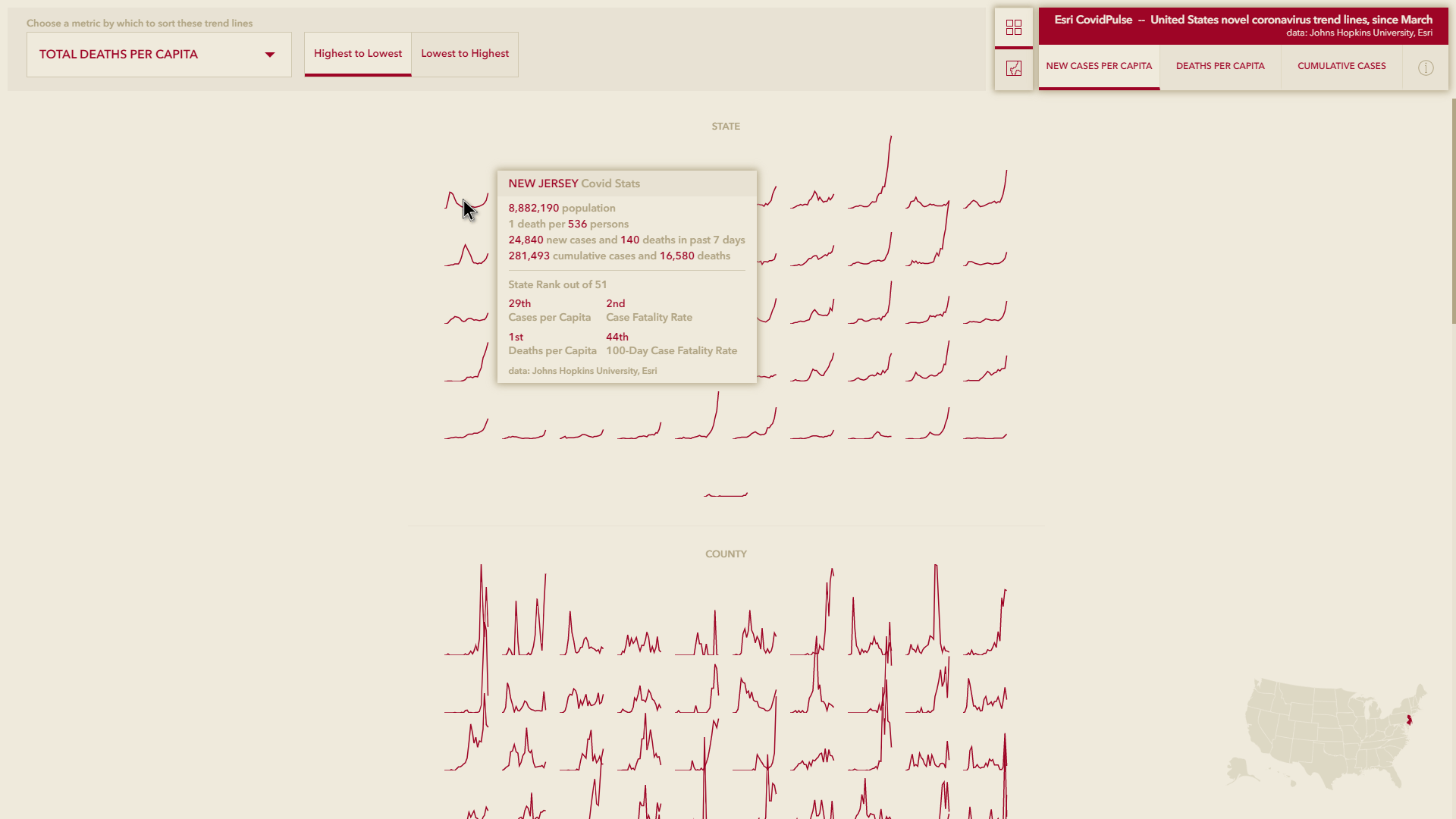
We all know that where is a critical component to understanding the waves of the Novel Coronavirus virus infections. But sometimes a purely geographic perspective can have a limiting factor in identifying how states and counties stack up compared to others. We’ve added an alternative to the map: a Grid View that orders state and county trend lines by any of six measures.
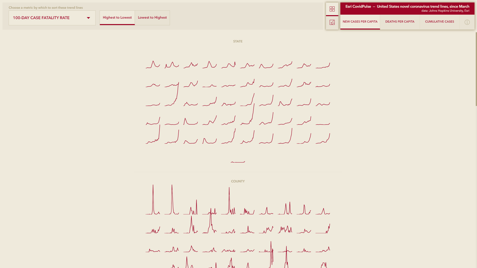
In the Grid View, the trend line graphic options remain the same (new cases per capita, deaths per capita, and cumulative cases), but we’ve provided six ways to sort them:
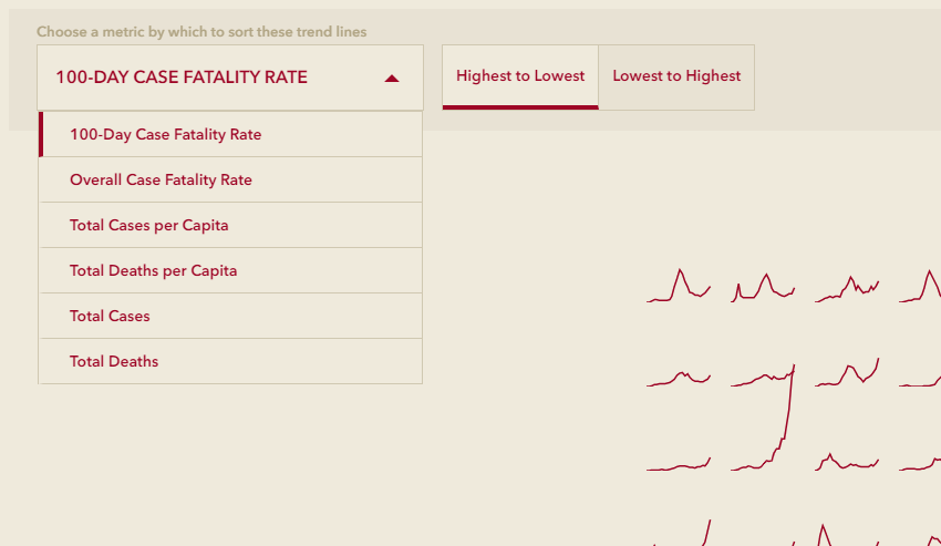
100-Day Case Fatality Rate: The simple ratio of deaths to cases over the past 100 days.
Overall Case Fatality Rate: The simple ratio of deaths to cases since March, 2020.
Total Cases per Capita: The ratio of cumulative case counts to population.
Total Deaths per Capita: The ratio of deaths to population.
Total Cases: The total number of cases since March, 2020.
Total Deaths: The total number of deaths since March, 2020.
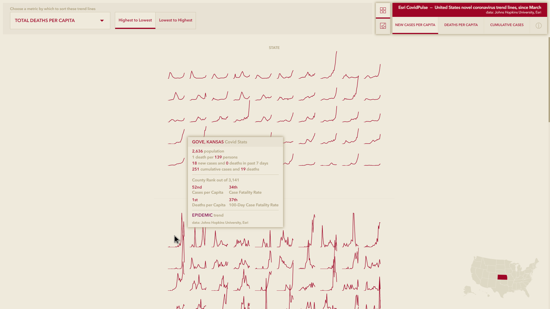
This allows us to pop out of the spatial arrangement of a map and sort the trend lines by any of these options (or the reverse) to get a sense for where states and counties rank. A small state map shows the location of interest on mouse-over so you aren’t ever totally without spatial context.
A couple of examples…
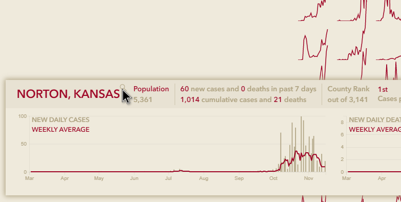
Gove County, Kansas, has the highest proportion of covid-related deaths in the country, claiming 1 out of every 139 people there.
In the state of New Jersey, covid has claimed 1 out of every 536 people.
Grid view allows that sort of ranked insight.
Rankings in the Tooltip
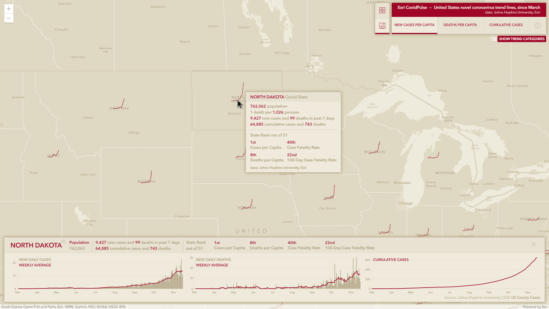
This line of thinking got us to wondering about the tooltip. If it’s valuable to see a state or county’s ranking among their peers, then maybe it’s a good idea to go ahead and list those rankings in the tooltip, to provide a comparative sense of context. There is now a small statement saying where each state or county ranks out of 51 (well, we’re calling DC a state) and 3,141 respectively. These tooltip rankings appear in both the map and the grid.
We’ve also cleaned up the layout of the Charts Panel and included these ranking statements there as well.
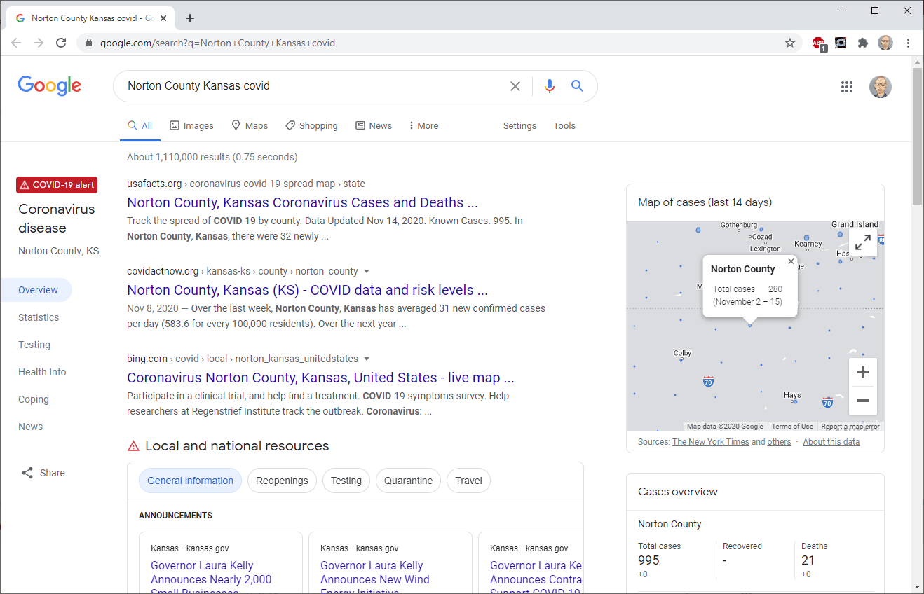
Auto Search
One of the more useful features of the Wildfire application has been the automatic search links provided for fires. We’ve taken that lesson and applied it to CovidPulse. When a state or county is selected, a search button launches a Google search about covid in that area.
Build Your Own
If your organization is interested in making a CovidPulse-like site for your area, or if you want to use this trend symbology technique for altogether different data, here are a couple resources to share with your developers (or you, if you are a developer!).
Understanding sparkline symbology: https://www.esri.com/arcgis-blog/products/js-api-arcgis/mapping/how-to-create-a-sparkline-map-with-the-arcgis-api-for-javascript/
The full code on GitHub: https://github.com/vannizhang/covid19-trend-map
Best Regards
I wish you well in these tough days and hope that you are able to remain healthy and helpful. It’s an honor just being a part of this field, where I see all the good work that you are doing to push good information and to provide insights and confidence in such an unsteady time. I’m blessed to be a part of the mapping community with you, and hope that this small visualization can help you and your family and your organization make informed decisions. Until we’re out of it!
Be Well, John


Article Discussion: