Recent improvements to the rendering capabilities of ArcGIS Pro and ArcGIS Online have been a bit of a ‘game changer’, and you are now seeing the results of that in a lot of the maps that we produce. This extends to the building of what I’m calling ‘Map Bases’ here, because the traditional ‘basemap’ is now only the starting point for what we, and you, can do.
In recent Conference presentations on working with basemaps, Emily Meriam has talked about how she is layering imagery, hillshade and vector basemap layers to create subtle and interesting foundations for her work. John Nelson has also been experimenting with basemaps in his usual inventive way. With that in mind I thought it was a good time to look at the possibilities, benefits, and potential pitfalls of this approach in a bit more detail.
What are we working with?
Well, any vector tile or raster layer you have available is the short answer, but in terms of what we provide for you these are the most practical items (Use the ArcGIS Living Atlas of the World to find these and other alternatives):
Imagery
Any of the raster image-based products that we produce. The most generic would be World Imagery. The Firefly option is a good alternative if you want a more neutral look. Take this a step further by trying other specialist products such as Land Cover.
Hillshade
Again there are many alternatives. World Hillshade is the generic option. We have a Vector Tile Hillshade layer too, giving you more options for customization.
Again, go a bit further by looking at other elevation products such as Slope, or Aspect
Contours
Another recent addition is the vector tile world contour layer, giving you the option to adjust its symbolization before you combine it with other information.
Vector Tile Basemaps
We’ve got many options, so I’m not going to itemize them. Any of our basemaps will work, but the more neutral ones are probably easiest for merging with other content.
The ‘Sandwich’ option
These are basemaps that are split into separate base and reference layers. The reference layers are particularly useful for combining with other features.
Where are we working?
ArcGIS Online Map Viewer
The inclusion of blends and effects in the Map Viewer is the key here. There are near-unlimited possibilities for combining layers, and for this discussion it is great for creating new and interesting map bases.
ArcGIS Pro
… is not as sophisticated as the Online viewer in this respect, but it does have a blending option. There’s a lot you can do here if you intend to keep the map in ArcGIS Pro or print it (and of course you are releasing the power of Pro in other respects). If you intend to publish the map online it’s worth considering more rendering work after it is uploaded, using the additional options available.
Some fundamentals
The key functions for doing this are the ‘Blend’ tools, available in Map Viewer and ArcGIS Pro. The most useful is probably ‘multiply’. This blends 2 (or more) layers at full saturation – a great starting point for using other blends and effects (and even transparency) to get the right balance for you, and the key to avoiding that ‘blandness’. The ‘Effects’ tools available in ArcGIS Online are great for subtle adjustments to contrast and hue that can make all the difference.
Don’t ignore other options though! Some of the combinations can be a bit weird, but you never know what result you might stumble across.
For more precise work on vector tiles (and it may be needed), the Vector Tile Style Editor (VTSE) is really useful.
Here are some common combinations:
Imagery and Hillshade
This is the ‘World Imagery’ layer showing Yosemite Valley:
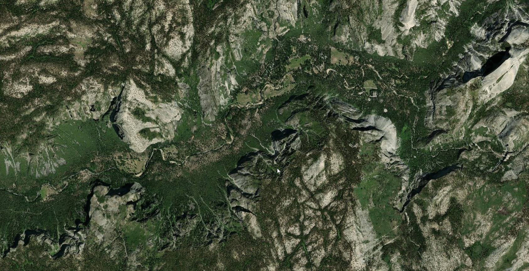
As Emily and John have demonstrated, Hillshade can add a level of depth and interest to an imagery base. Here I’ve set the multiply Blend setting, then applied a combination of Effects to adjust brightness, contrast, saturation, and color hue in both layers. Now the valley itself is much more prominent.
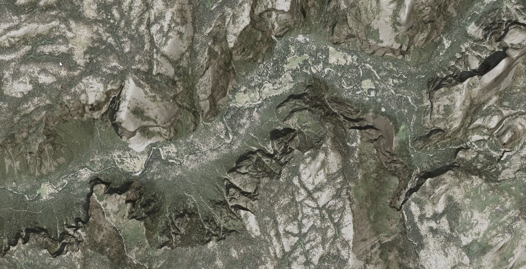
We can reverse that as well – use imagery to enhance hillshade. Here The Luminosity blend is applied to World Hillshade sitting on top of World Imagery. In this blog John Nelson goes into this in a bit more detail.
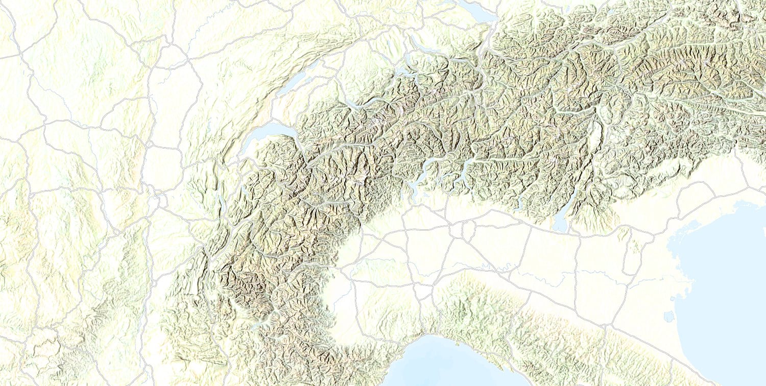
Other interesting looks can be achieved by blending multiple levels of hillshade to get colored or duotone-like effects. Here two hillshade layers are combined, with brightness and contrast Effects used to isolate the steeper slopes:
Imagery, Hillshade and Basemap
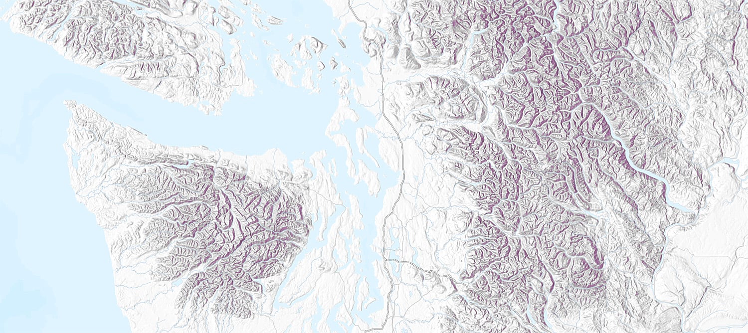
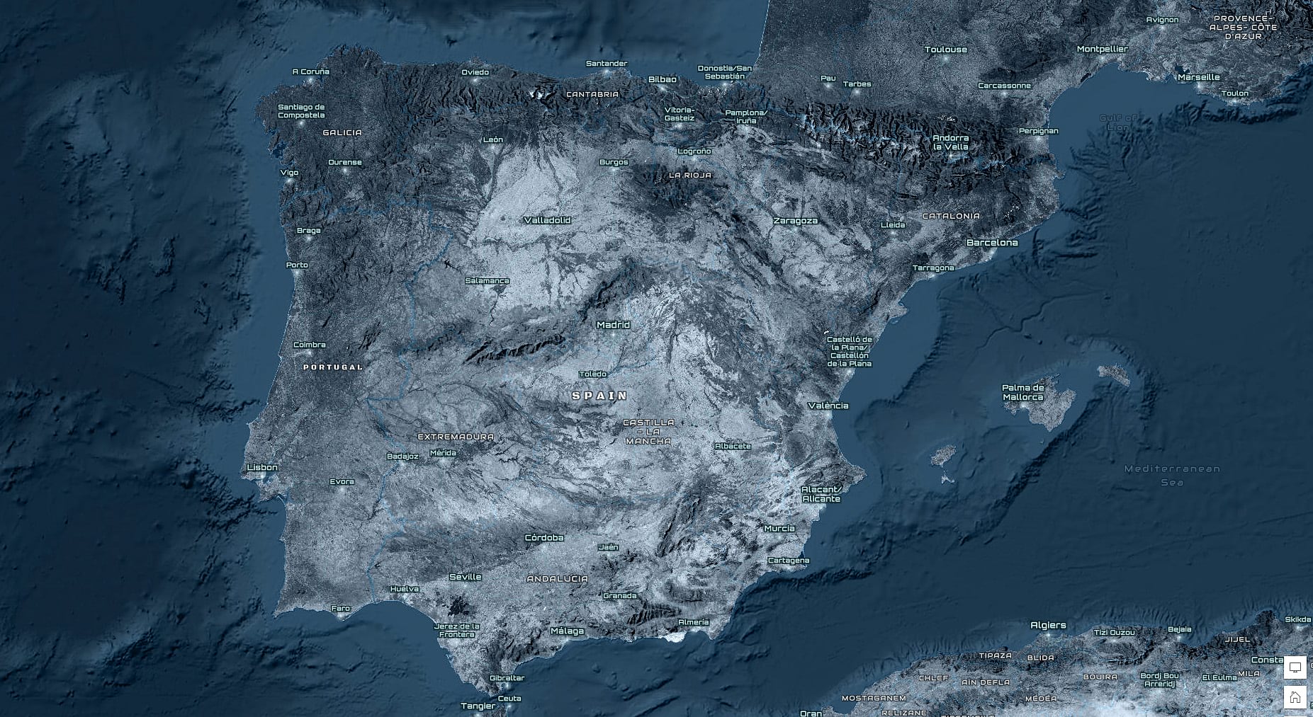
Using the Imagery/Hillshade combination with other basemap layers can throw up some interesting ideas. Here three layers are combined: A custom ‘Nova’ base, Firefly imagery (with Luminosity blend), and World Hillshade (with Color Burn blend). A custom Nova ‘reference’ layer is on top.
Human Geography basemap and any base material
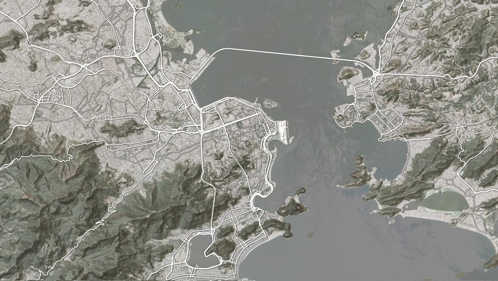
The Human Geography basemap has one advantage over others, which is a separate ‘Detail’ reference layer. This is designed to place map detail over your content, but it’s relatively low density of information makes it good for combining with other bases. I’ve used it here in Rio with the ‘luminosity’ Blend and a touch of transparency, to enhance the road network and subdue the water detail. A subtle ‘drop-shadow’ Effect helps to lift the roads out a bit more.
Any ‘Label’ reference layer and any base material
A number of our basemaps have separate label layers, and with a bit of care, these can be combined with any other base. So, for example, if you want a focus on cities and administration, consider ‘Canvas’ or ‘Human Geography’. If you want more physical information, consider ‘Terrain with Labels’.
With a little bit of effort…
Basemaps can be used as they are, and many of them can be combined with other content. However, as I did on a couple of my examples above, you can create custom versions as a starting point. Using the VTSE, hijack the labels to use as a reference layer, or remove them for a base layer. (See this blog for more information).
Here I’ve removed the labels from the ‘Colored Pencil’ basemap, combined it with the World Hillshade, and added the ‘World Terrain Reference’ layer.
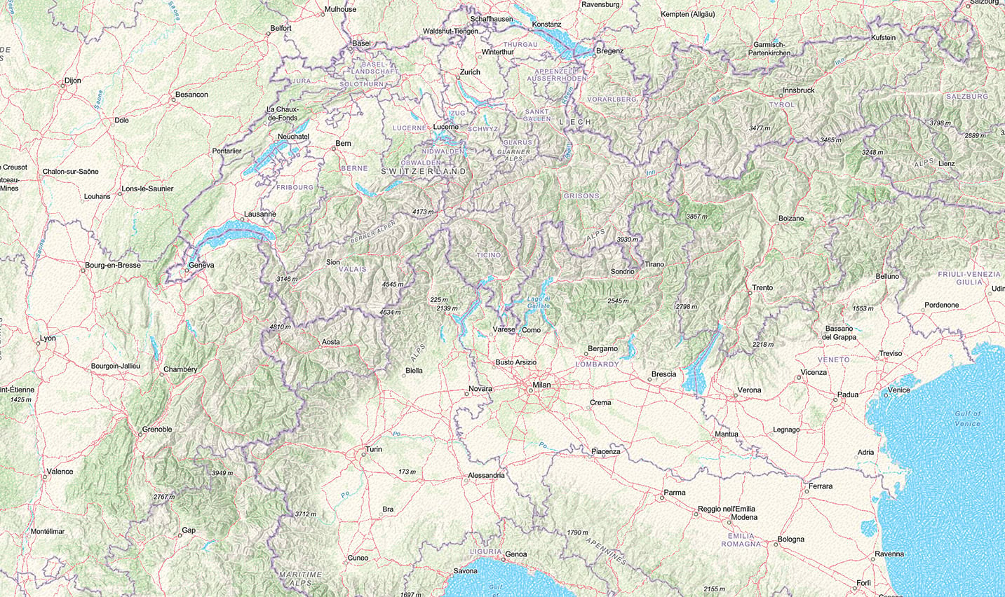
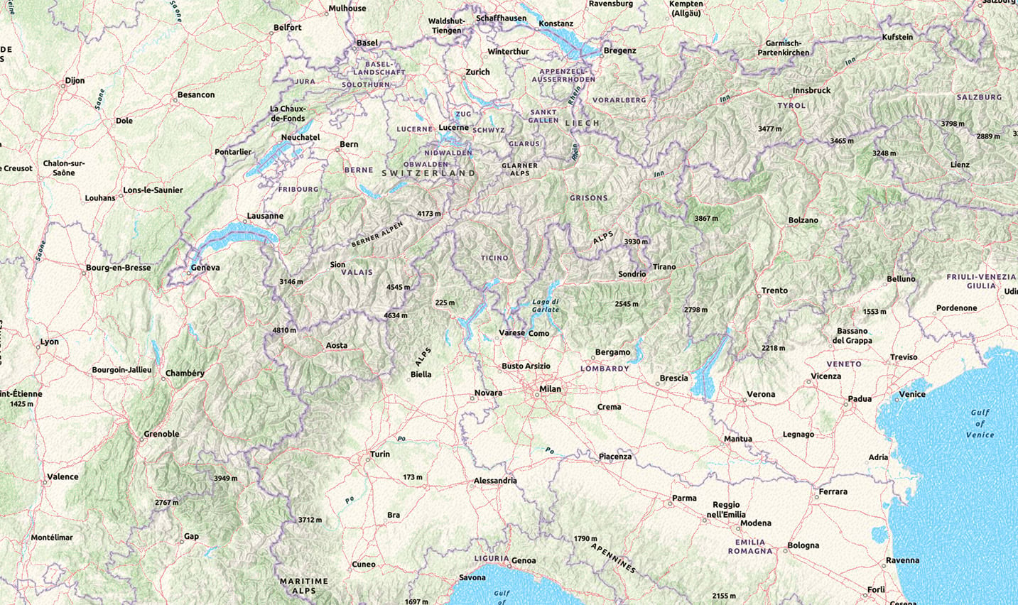
The labels are a bit weak though, so I’ve opened the reference layer into the VTSE and saved a copy. Then I’ve used the font option in ‘Quick Edit’ to change to Ubuntu Bold. Most of the label haloes have the same value, so I’ve enlarged them a bit, and used the ‘Edit by color’ option to change them to something more neutral. To finish off I’ve made some custom adjustments to the remaining labels and haloes. It’s up to you how much work you want to put into this.
Now let’s take our meddling a step further…
Going Local
Our basemaps are necessarily worldwide, but what if your interest is restricted to a specific area, and what if some of that ‘worldwide’ content gets in the way? For example, that particularly annoying label that has no relevance to what you are showing, sitting right in the middle of your area of interest.
If you want a quick fix, and you don’t care about what happens in the rest of the basemap, use the offset tools in the VTSE to move it to a better spot. This is my imagery/hillshade composite zoomed-in on Mount Kilimanjaro. The label is not really necessary in this context, and it is right over the summit. Using the ‘Translate’ option in the Style Editor, I’ve moved it out of the way:
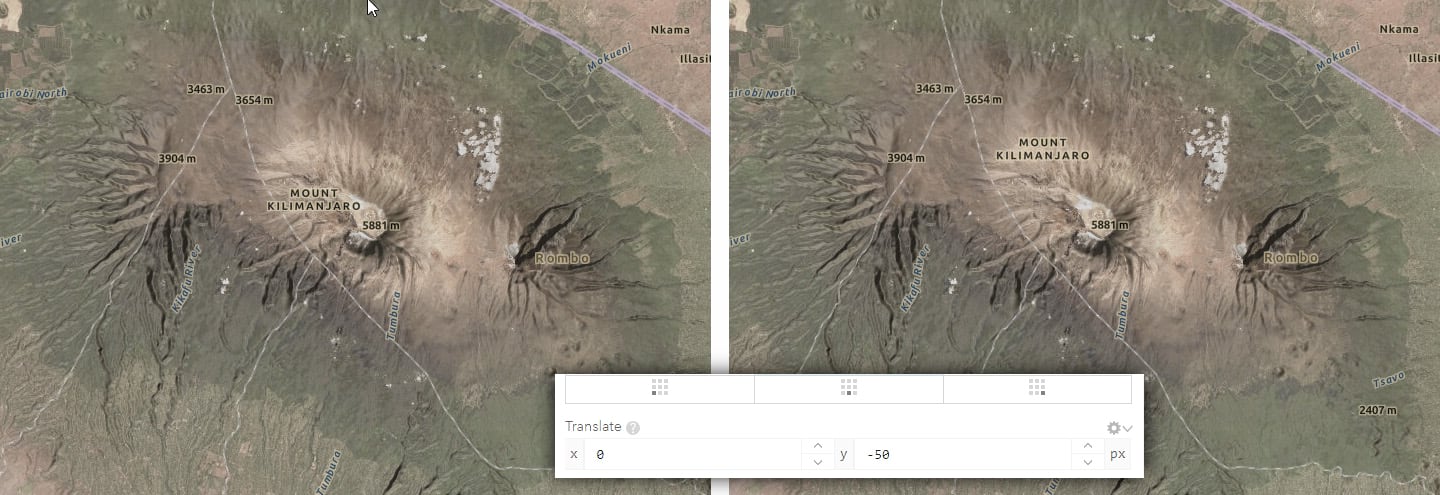
Of course, all other labels on the layer will have moved as well, so that the map is only functional in this small area. Alternatives are to adjust the scale range so that the offending label only appears at smaller scales… or switch this label layer off altogether. If you have more time, and access to the VTSE, this blog demonstrates a way to remove individual labels
And those pitfalls?
Nothing is ever completely straightforward, but the potential problems are not too extreme:
Loading the map up
The more layers you add, the more you are straining the rendering capability. You’ll know in real time what damage it is causing in Pro, so you can adjust accordingly. The online environment is a lot more responsive and forgiving than it used to be, but not everyone is going to have fast internet, so bear that in mind. Adding a layer to make a miniscule adjustment may be great for the cartographic purist, but if it effects performance, consider going forward without it.
Getting the perfect fit
We didn’t design our reference layers for use with anything other than their relevant base layers, so don’t take it for granted that they will work out-of-the-box. It’s not too much of a problem with neutral basemaps, but you are not guaranteed a great result when using other layers. Look carefully at label haloes for example – they may be colored to match the original base. Use the VTSE to adjust your own copy of the layer if necessary.

Article Discussion: