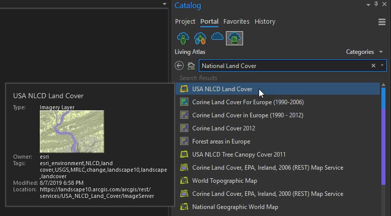
Did you know in ArcGIS Pro you can clip an image service from ArcGIS Living Atlas?
Think of the possibilities!
Shown here is a way to take an image service/raster, slice out a shape you determine, save it, and then run a frequency analysis to calculate change over time.
Next, we take the results and visualize them in a way that beckons our viewer to pause and dive deeper…hopefully in the way that a good piece of art can do. We will be using a Picture Fill and a Tint method on a downloaded drawing of a seamless crowd of faces.
Please keep in mind that any layer you use in Living Atlas will have licensing terms and restrictions, so reviewing and respecting those are an important part of any GIS project you have, but I’m sure you already know that.
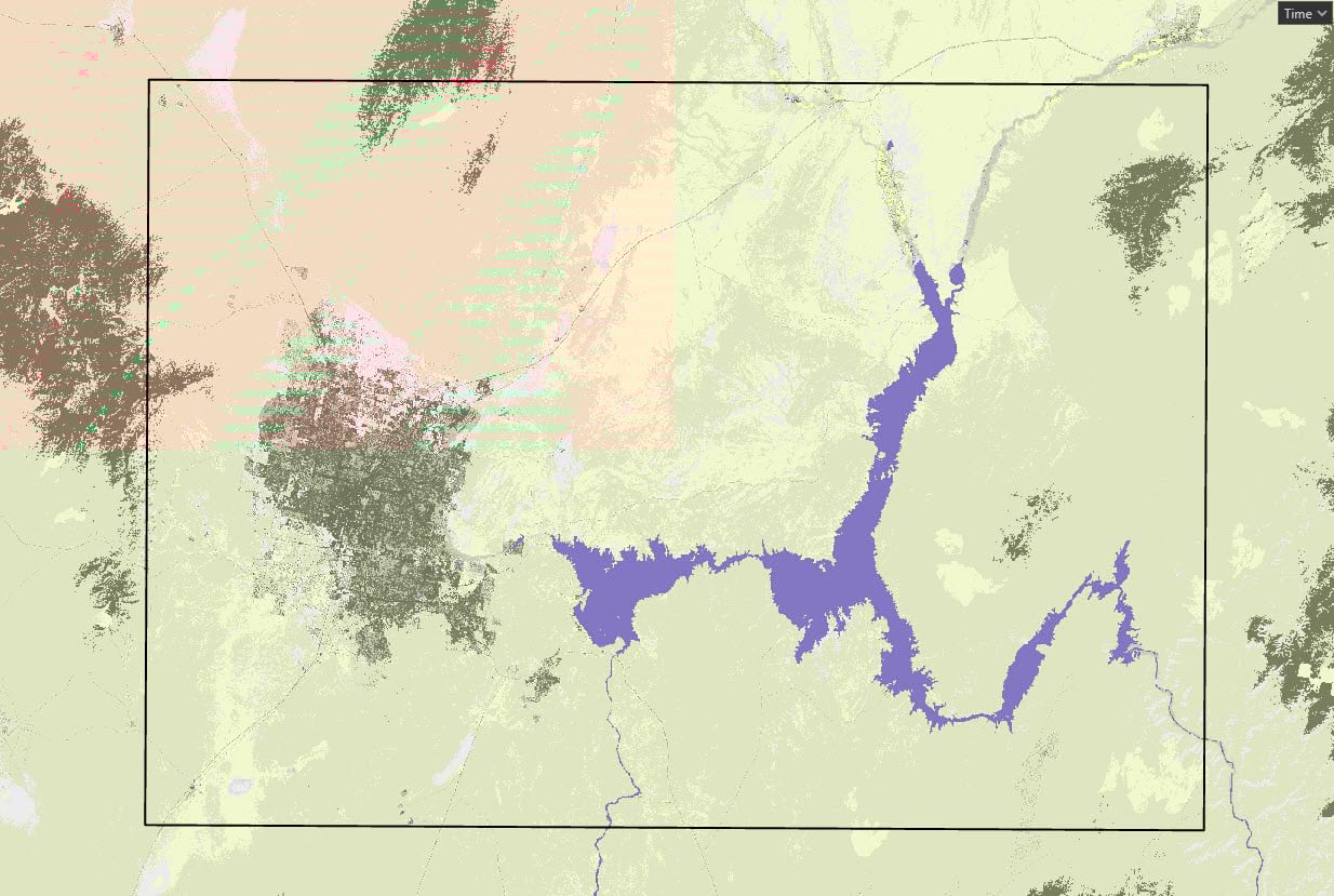
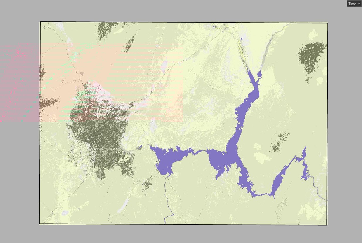
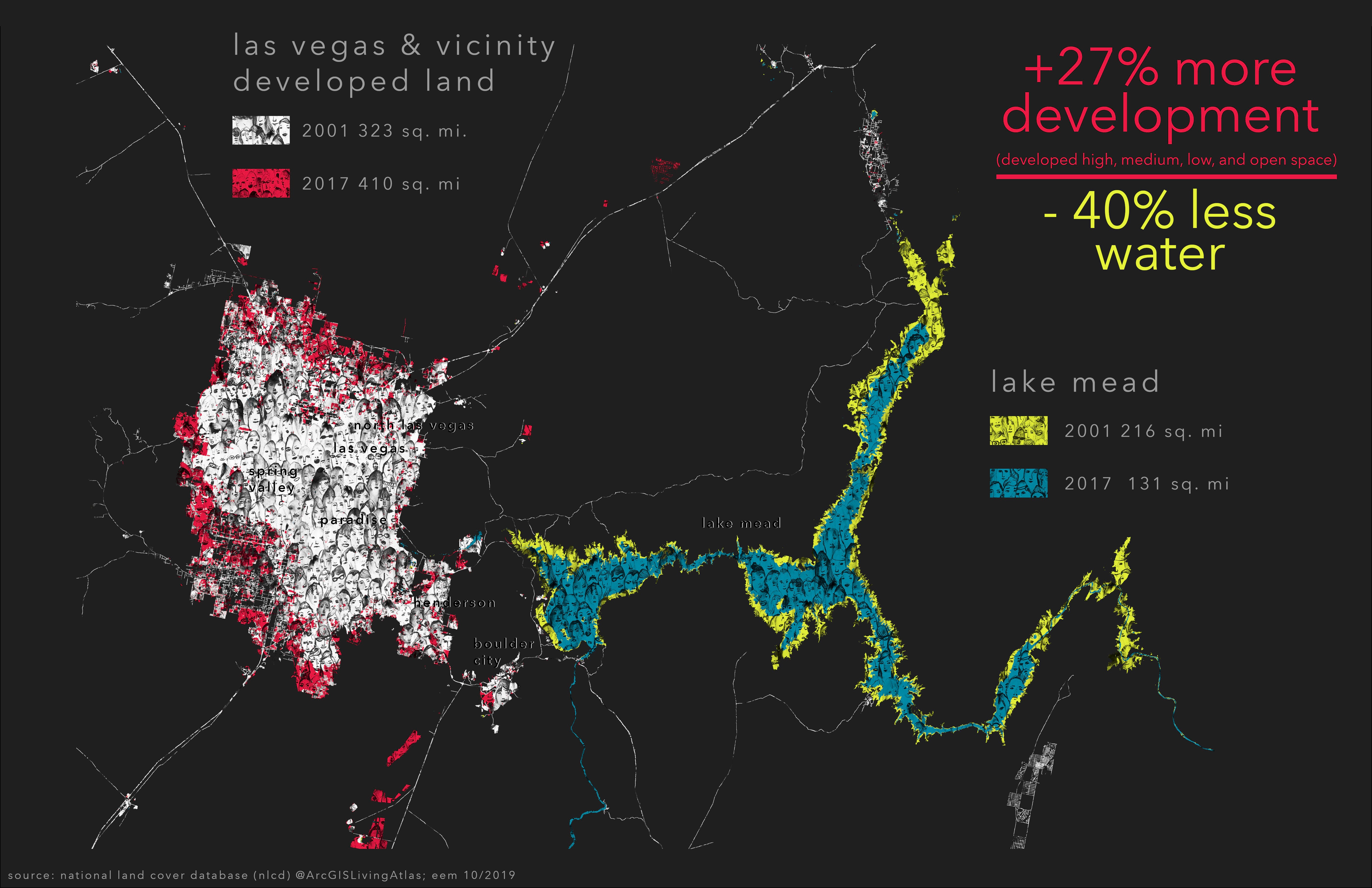
Mapping Loss: Las Vegas and Lake Mead
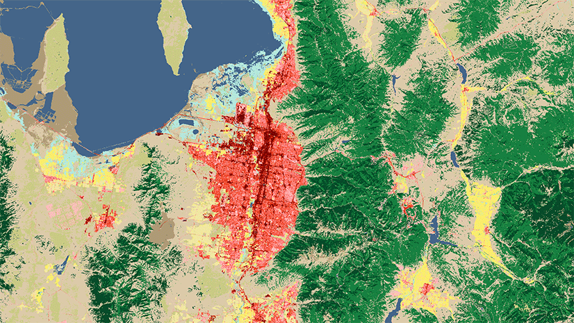
I kept thinking about this blog highlighting a new time series layer available in Living Atlas (displayed this way for the first time ever) the 2001-2016 National Land Cover Database (NLCD). There was a flashing sequence of Lake Mead shrinking with the growth of Las Vegas and vicinity.

That got me thinking to the times I’ve been in the middle of the desert where it’s just so desolate, dry, and expansive…and then driving and making my way into Las Vegas which just suddenly seems to appear in context of all of that.
In the way that Las Vegas rises out from all that vastness, I am always struck by its geography and access to drinking water, and where that’s all coming from. Water is so precious in this landscape. Seeing it quantified in GIS like this over 16 years was remarkable.
(NRCS_Photo_Gallery).jpg)
Setting the Area
In ArcGIS Pro zoom to your area of interest and add the NLCD layer.
Play the time series that’s docked at the top of your map. It will flash through the different years.

This is for the entire United States with a pixel size of 30 x 30 meters. Wow right!
Create a New Polygon Feature Class and add it to the map (or you can use an existing boundary that you have like a parcel, county outline, district, etc.).
For this project use a Rectangle polygon shape to create your new feature.
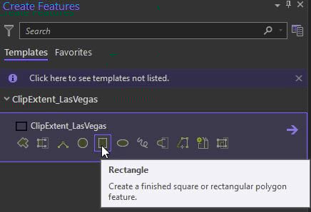
Draw the polygon and save Edits.
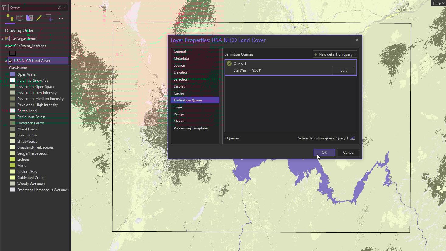
This data spans 16 years. We only want to compare the first year 2001 with the last year available 2017. Each year will have to be individually extracted.
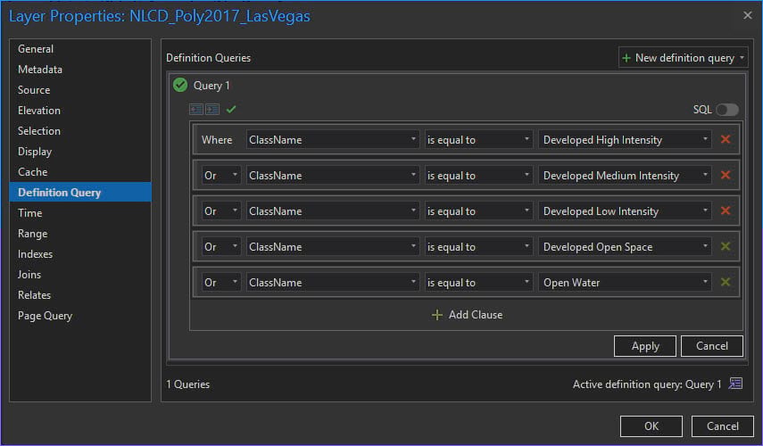
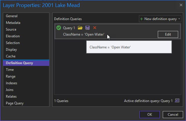
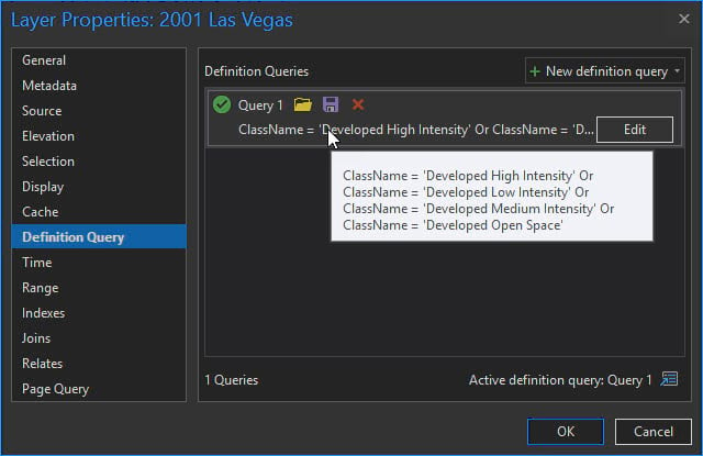
Right click on your NLCD layer and open Properties and select Definition Query. Write an expression where: StartYear = ‘2001’
We now have two clipped rasters representing 2001 and 2017.
Clipping Rasters
Open the Geoprocessing tool Clip Raster.
Under Parameters:
Input raster is the NLCD layer
Output extent is the polygon we just created
Select the Environments tab and Snap Raster to the NLCD layer.
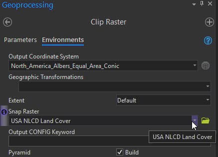
Repeat the above steps starting at the Definition Query section except change the expression to: StartYear = ‘2017’.
Raster to Polygon
Open the Geoprocessing tool Raster to Polygon:
Input raster is the one we just created for 2001
Field is Landcover
Make sure that Simplify Polygons is NOT checked.
Select the Environments tab and Snap Raster to the NLCD layer again (we could use the clipped raster we just made, but I tend to snap everything to the parent raster).
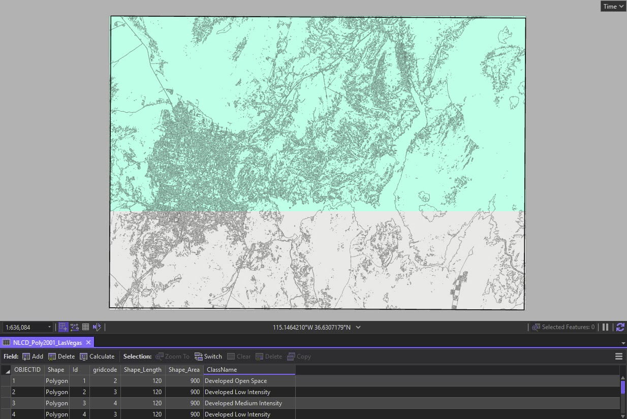
Check out the attribute table. We now have our NLCD raster values as a polygon feature class. Take note that the land cover field has been placed in a new field called ClassName.
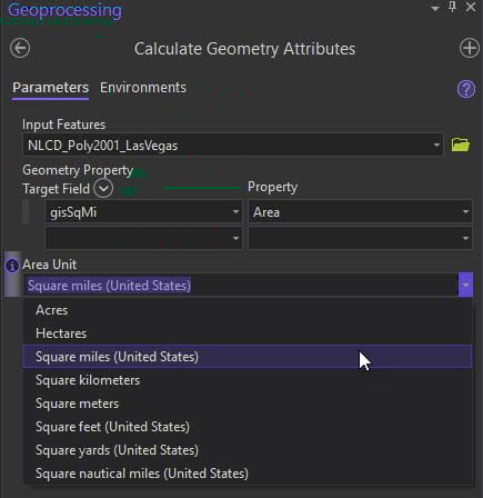
Open the polygon feature class and create a New Field with a Data Type of Double.
Run Calculate Geometry on this new field with an Area Unit of square miles.
Follow this same workflow of Raster to Polygon, adding a New Field, and Calculate Geometry to create the 2017 polygon feature class.
We now have two polygon feature classes, one for 2001 and one for 2017, and each have a new field calculated by square miles.
Calculating Frequencies
The frequency tool creates a new table containing unique field values and the number of occurrences of each unique field value.
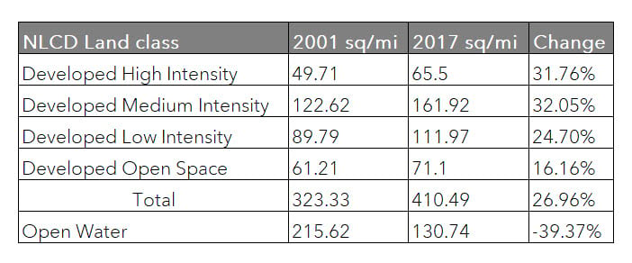
For this project we are only interested in frequency of five NLCD types:
Developed High Intensity
Developed Medium Intensity
Developed Low Intensity
Developed Open Space
Open Water
Hide all the other land cover types with a Definition Query on the 2001 and 2017 polygon feature classes so that there are only these five shown.
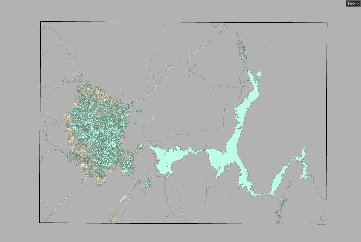
Now we only see the land classes we are interested in.
Open the Frequency tool:
Input table is the polygon feature class for 2001
Frequency Field is Classname
Summary Field is the one we created and calculated in square miles.
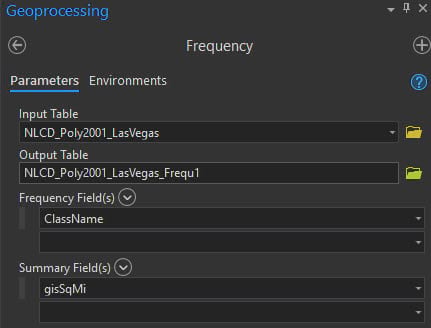
The table is added by default. Run the Frequency tool on 2017.
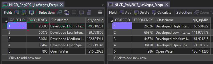
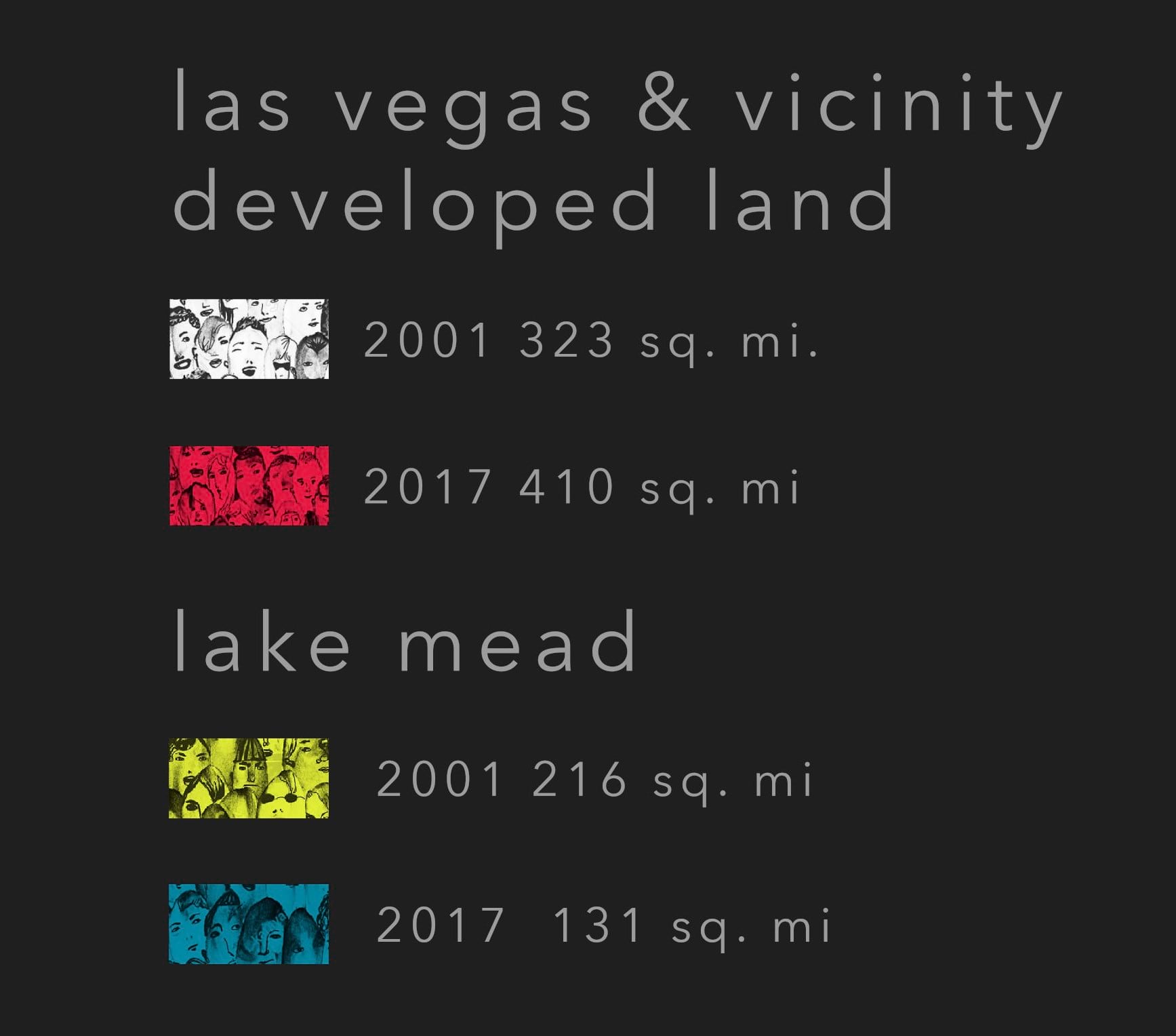
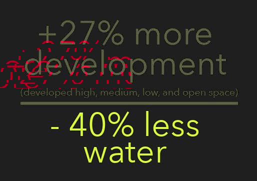
Comparing the two years there has been significant decline in the surface area of Lake Mead.
We now have two new tables of our specific land class frequencies.

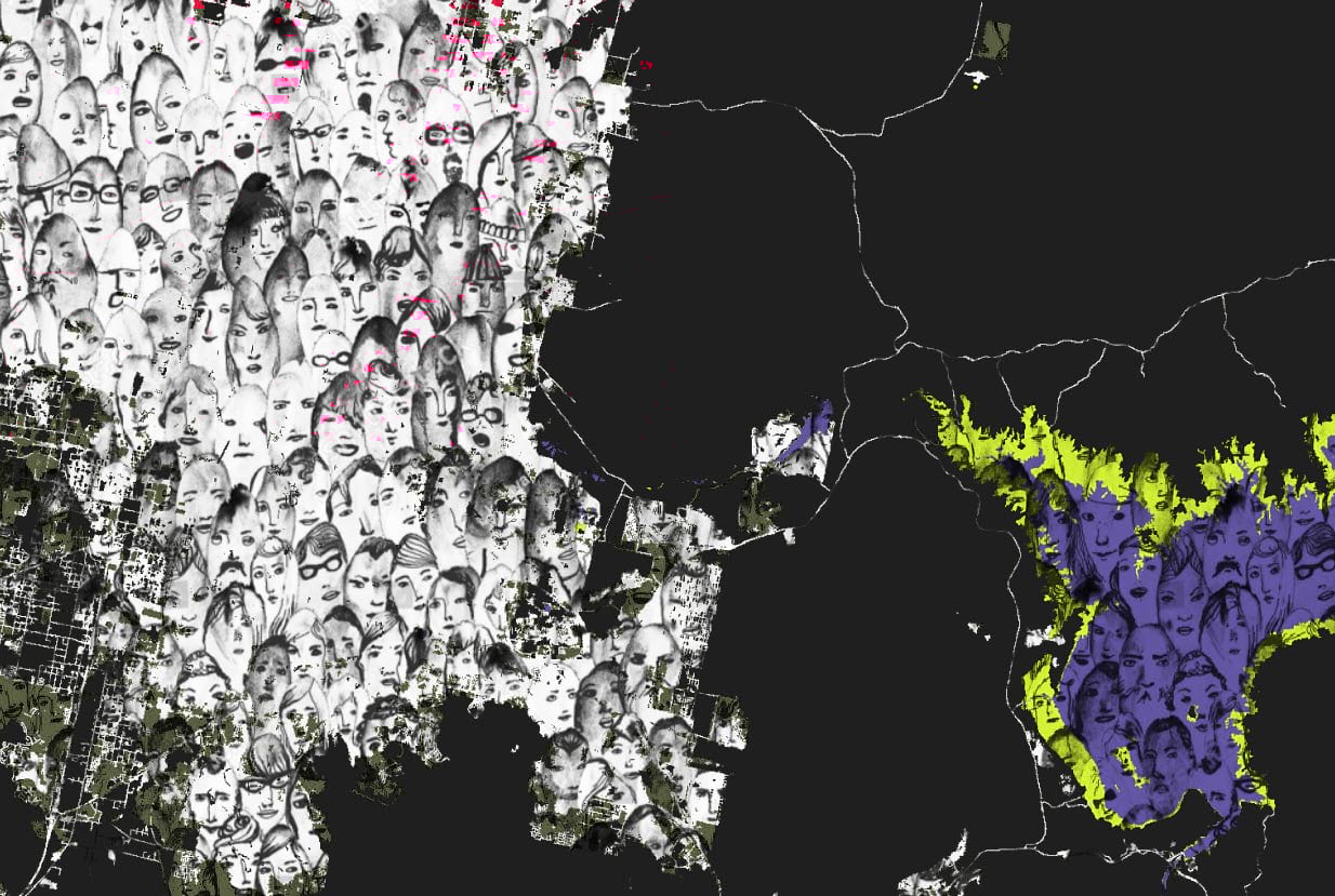
The Art of Mapping Loss
This map needs something different.
I see crowds of people and the thirst for development representing water loss. How can our analysis and map migrate into a thought-provoking image telling the story of Lake Mead?
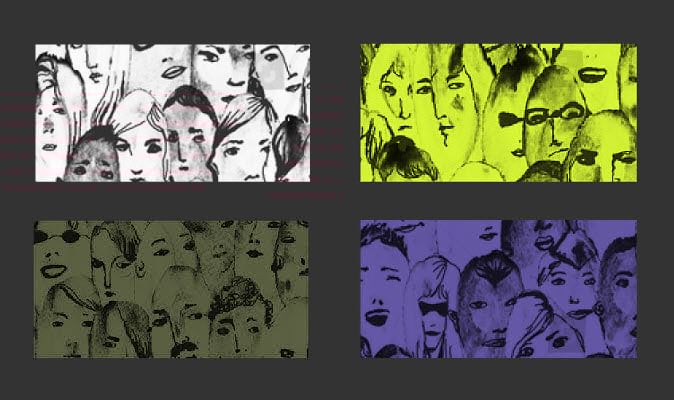
I found this awesome seamless crowd picture on Shutterstock (download for purchase only). It will tile well as a Picture fill, it’s black/white, and is perfect for this project.
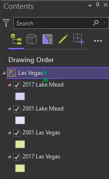
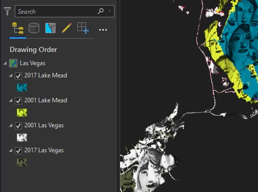
Replicate the feature class layers (you will have 4 in total: 2 x 2001 and 2 x 2017) and then modify EACH with a Definition Query.
2017 Open Water and 2001 Open Water
2001 and 2017 High, Medium, Low, and Open Space Development
It will look like this in the Table of Contents.
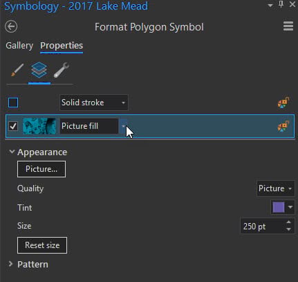
Picture Fills and Tints
Open the Format Polygon Symbol and under Properties and change the Solid Fill to Picture Fill, then navigate and select the crowd picture you downloaded. Format all four layers with it.
Using 2017 Open Water as an example:
Quality is Picture
Tint is #008CA8
Size 250 pt
Here are the tint HEX values.
2017 Open Water Lake Mead – #008CA8
2001 Open Water Lake Mead – #E6F237
2001 High, Medium, Low, and Open Space Development Las Vegas – #FFFFFF
2017 High, Medium, Low, and Open Space Development Las Vegas – #ED1944
Our map story art is taking shape!
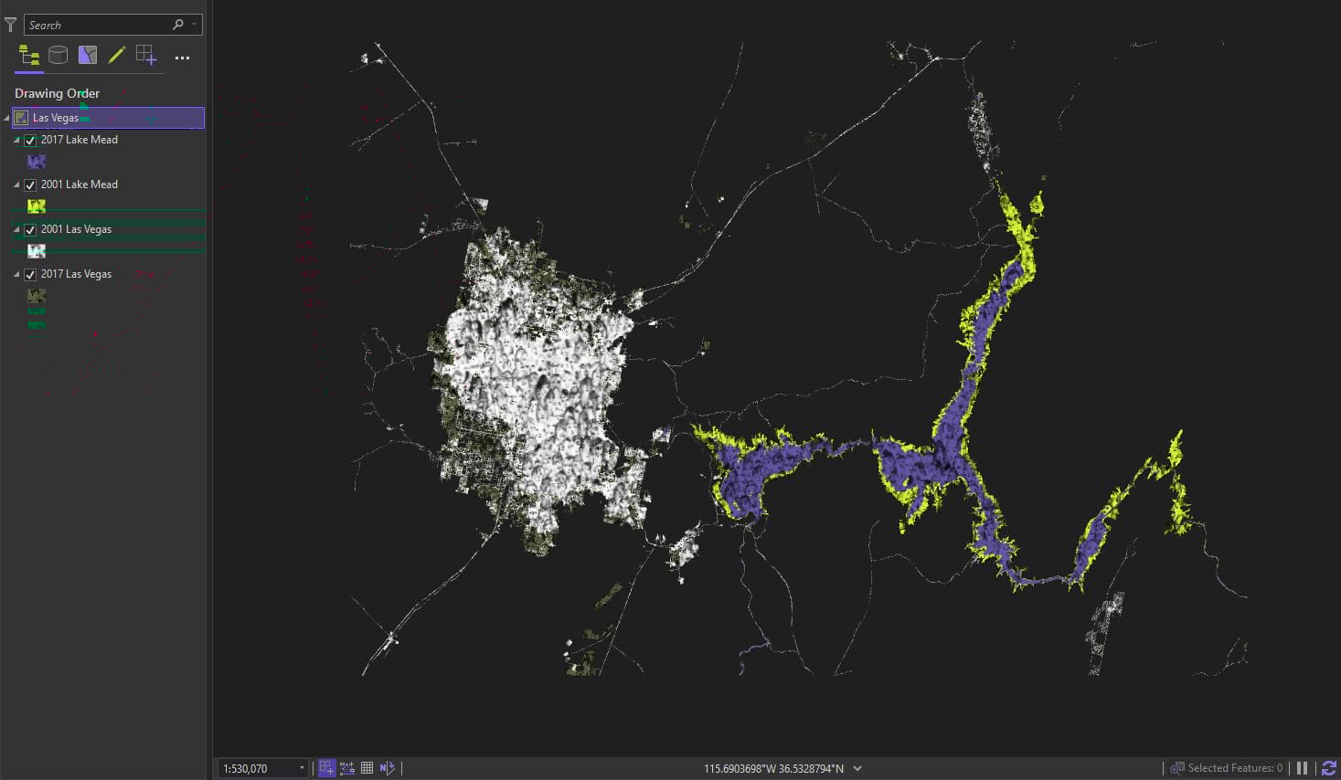
It’s fantastic, look how Pro it’s tiling the image. All four of my layers tile the image seamlessly across ALL of them.
Add the Final Map Elements
Always cite your source.

Place city labels (Avenir Next LT Pro 12 pt in white with .50 pt X offset in black) and go with all lower case to further the message of abstract representation.
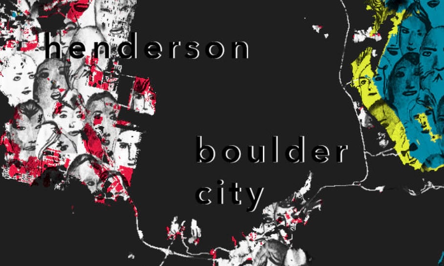
Create a legend and break it into two sections.
Notice how each of the legend boxes show different portions of the crowd image.
I’m so pleased it’s naturally rendering them like that!
Lastly display the frequency results in an informative and meaningful way as a statistic title.
Here’s the final map in all its grim glory.
Thank you
I hope you use the NLCD layer to calculate change within your own community. Right now there are 16 years of land cover for use at your fingertips!
Using Picture Fills adds texture and meaning to your map, and their use can change the life of your polygons forever.
For questions or comments on this blog please visit our GeoNet.
Special thanks to Mark Rosenberg : )

Commenting is not enabled for this article.