For decades, Indonesia has been one of the fastest growing countries in the world. The scale of this growth is actually quite easy to analyze and visualize with data from the European Space Agency’s CCI Global Land Cover product that was recently updated in ArcGIS Living Atlas of the World to extend from 1992-2019.
So how was this map made? Unlike most cooking recipe blogs, I’ll cut right to the chase (instead of 8 paragraphs of inane babble).
Prepping the Layers
Living Atlas provides some incredibly useful content – simple things like the Provinces of Indonesia that would otherwise take time to find and download shapefiles from some random website. There’s also the complex imagery layers like the ESA CCI Global Land Cover that can be used for a variety of mapping and analysis applications. I simply dragged both into ArcGIS Pro.

I duplicated the ESA layer, went into the layer properties, and applied a definition query to one so it only shows 1992, then repeated that on the copy for 2019. Rename each so its easy to track.

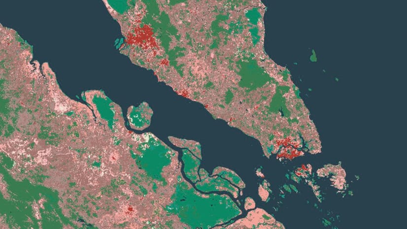
Next I went into the Processing Templates portion and chose the Converted Lands renderer. This applies a raster function to select only the pixels that have been converted from natural (forest, grasslands, etc) to human modified (cropland, urban).

Running the Analysis
Since my goal was to calculate how much land area was converted between the two years, the easiest way to do that is to use one of my favorite tools, Zonal Statistics as Table. It calculates a statistic for an area (could be borders, could be any other geometry). In this case I chose sum (could’ve chosen anything since all I really needed was the count of pixels, which is a default output).

After repeating that with 2019, I could join the resulting tables back to the Provinces layer using the common field ISO_SUB (the province’s ISO). Since Indonesia straddles the Equator, each satellite pixel of the raster is 300m x 300m, so I could calculate a new field that converts 90,000 m2 into km2, then calculate another field which divides that area by the province’s area (which was conveniently included in the layer) to get a percentage change.

I symbolized that layer with some classes to show areas that converted to human modified as scaled yellow circles and areas that actually returned to a natural land cover as scaled blue circles.
Next, I used the two raster layers with some contrasting colors to show the area that was converted prior to 1992 in a dark purple and the areas converted since with a hot orange-pink. Urban areas were colored with grey and white, respectively. By having the 1992 layer on top, it shows only the areas in 2019 that changed from 1992 without having to run a more in-depth spatial difference (sneaky!).
The final map also brings in the World Database of Protected Areas from the UN Environment Programme. Interesting how the southern islands mostly converted back to natural habitat while the northern, more developing islands became more human modified. And check out those protected areas…they really do work!

Article Discussion: