An interesting way to look at a community is to map various measures of the value of its parcels, including a measure called the land to improvement ratio.
Many cities, but not all, tax their parcel owners based on the value of the land contained within the parcel boundaries, and the value of any improvements built upon that parcel. The ratio of the improvements’ value to the land’s value is referred to as the improvement ratio. It’s inverse is the land to improvement ratio.
Why do people map these things? One reason is that a thematic map of improvement ratios in your area immediately reveals which parcels are under-utilized, from a development perspective. Some use it as an indicator of properties that are likely to be redeveloped. As you look around town, patterns may emerge.
How to Make A Map of Improvement Ratios
How can you make a thematic map of improvement ratios for your city, or a city you’re interested in?
In the U.S., many local governments publish parcel boundaries online, so data is often easily available. For example, in my area, San Bernardino County government publishes its parcel boundaries to open data here.
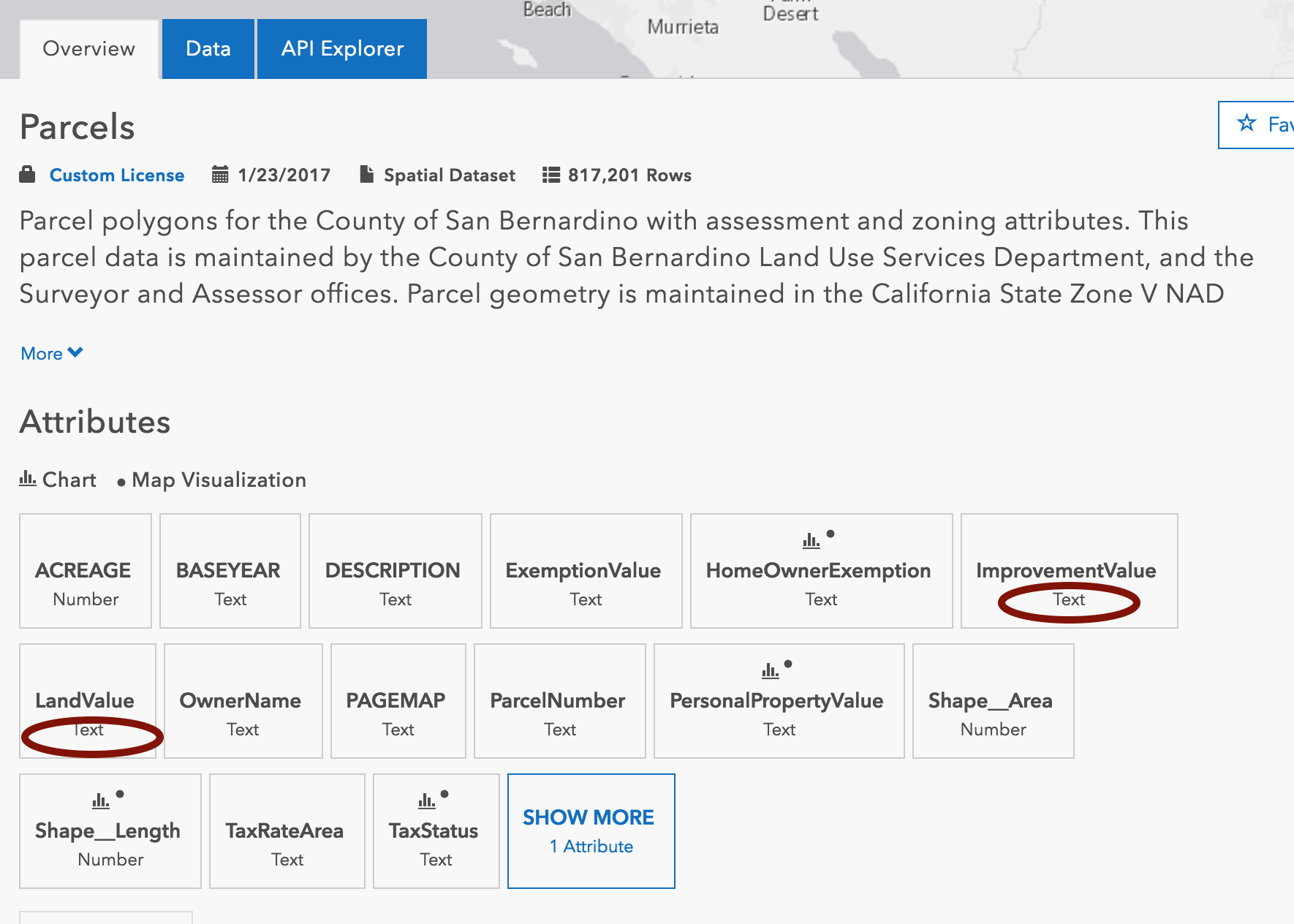
But they don’t publish anything called an improvement ratio map. In fact, looking over the attributes of their data, you won’t find an attribute called “improvement ratio.” How can we map something that doesn’t exist explicitly in the data?
An exciting new capability was released in ArcGIS Online in December 2016: Arcade expressions. As explained here, Arcade is a scripting language. But it’s much more—Arcade transforms the world of open data so that you can map your ideas, not just the data.
I’ve been looking for a real-world test case to try Arcade out. At the Esri GeoDesign Summit this year, speaker Candi Millar from Billings, Montana showed a map depicting her city from an interesting perspective. Her map was shaded based on the ratio of improvement value to land value in each parcel. Her team calculated that information and mapped it, allowing her to tell a story about what policy makers in Billings are doing about redevelopment there.
I thought to myself “that would be an interesting map to try out with Arcade expressions and smart mapping.”
I might have chosen to follow a traditional GIS project workflow: go download some parcel boundaries, and hope that they had attribute data containing land values and improved values. If they did not, I’d need to download some attribute data and join it myself, and hope that a significant portion of records joined successfully. I would then fix any issues with the data: many parcel data sets store interesting numeric data, like land value and improved value, as text strings.
In ArcMap or ArcGIS Pro it’s easy to add a field, and calculate that field by converting each text value to a number. It just takes time. Lastly, I would need to add a field called “Improvement_to_Land_Ratio” or similar (shorter) name and calculate that, and handle any divide-by-zero issues and null values.
And then, I remembered it’s 2017 and there’s this thing called open data…
I searched the open data site to look for parcels in Redlands. Good news! I found the parcel service hosted by San Bernardino County in open data. It took about 1 minute to find and examine.
But… like many parcel services I come across, this one stored all its numeric data as text fields. Normally, this would be a showstopper, since most GIS software are insistent that if you want to make a map from numeric data, you need to provide it with, ah, numeric data.
ArcGIS is a little more forgiving than other GIS software in this regard, due to Arcade expressions and smart mapping techniques. I thought to myself, “I wonder if Arcade can convert text to numbers, just like Microsoft Excel …”
I dropped the parcels layer into my ArcGIS Online web map, and it drew the parcels. Performance was great for the scales I wanted to map the parcels. I don’t need to see the entire county’s 817,000+ detailed parcel boundaries. I need to look around at neighborhood scales.
I chose the Change Style option, and scrolled past all the known attributes of this layer to see if Arcade expressions are available for an open data service. They are. This was starting to look very promising, that I could write an equation to convert the strings to numbers and do some math on those numbers… but being new to Arcade expressions, I kept my hopes in check.
Didn’t need to. I needed to convert the strings to numbers. I looked in the list of functions for something that converts text to numbers, and found it: NUMBER. So I tried out this expression:
var land = number($feature.LANDVALUE);
return land;
It failed when I hit “Test,” returning “NaN” which means “not a number.”
I clicked on the sample value (see arrow below)…
…and saw why: the LANDVALUE data had commas in the number string, so it was not able to convert those strings. Wait – could Arcade help me strip out the commas?
Yes: the REPLACE function finds occurrences of a character or string and replaces it with another character, string, or nothing. So this worked:
var land = number(replace($feature.LANDVALUE,",',"",true));
return land;
I hit Test again, and it returned a number this time. I hit OK and the map drew the parcels based on their land value, even though that data was stored as a string. Big data needs big functions. Arcade turns text into numbers on the fly and smart mapping shows the results.
Total time to this point: <10 minutes, including me descending the learning curve, poking around the list of functions to see what else Arcade can do.
Map? What map?
Knowing that my web map had a pulse, I went back to my inspiration: the Billings, MT land to improvement ratio map. The point of that map was to show parcels where the land value was the majority of the parcel’s overall value, as an indicator of where future development was likely.
I was envisioning a simple version of this concept, expressed as a “land value as % of total value” map. While the schema was telling me “no” to that vision, Arcade was telling me to look more closely. We all need to look more closely at our data to find the maps that matter. So I wrote just these four lines of code:
// convert string to a number
var land = number(replace($feature.LANDVALUE,",","",true));
var impr = number(replace($feature.IMPROVEMENTVALUE,",","",true));
var answer = land / (land + impr) * 100
return answer;
It would be great if just this little bit of code were needed to make the exact map I envisioned for understanding land values and improvement values. I showed it to a stakeholder and he noticed that some parcels were not being drawn at all. How’d I miss that?
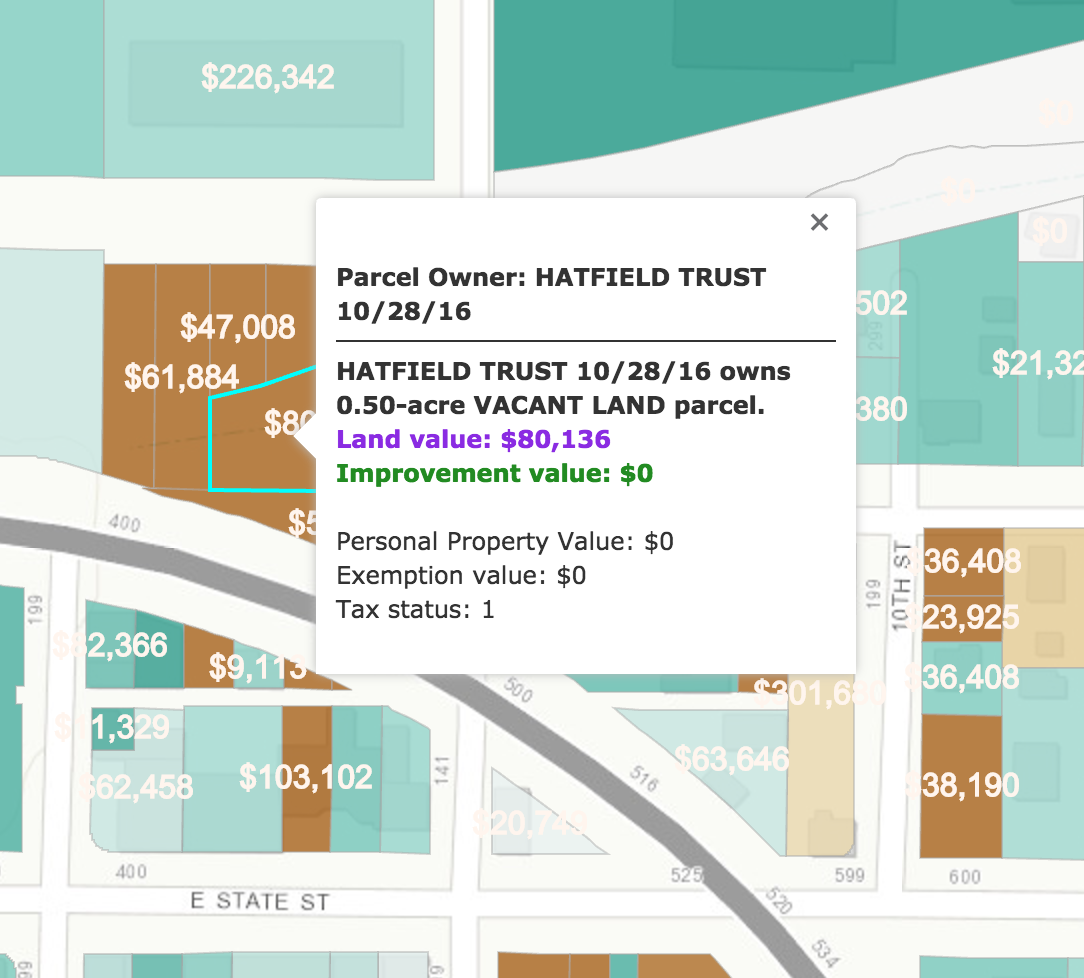
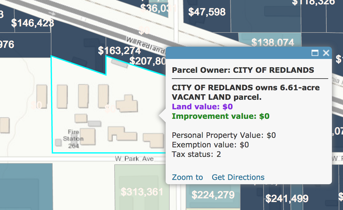
This is where a good popup can really help. Upon inspecting some of the missing parcel (see above), I realized I needed a little more code to dictate what the map should show for divide-by-zero situations, null values and other situations. Or, I could call the county GIS department and ask them to change their schema, add this attribute, calculate the formula below, and handle all the null value and divide by zero cases.
Instead, I decided to phone a friend. Literally.
My colleague Kristian Ekenes on the ArcGIS API for JavaScript team introduced me to the WHEN statement in Arcade. WHEN is like a multiple IF statement… WHEN (this condition, do this), (that condition, do that), else just do the other. If only my kids could interpret my WHEN conditions so well. That led to this expression:
// convert string to a number
var land = number(replace($feature.LANDVALUE,",","",true));
var impr = number(replace($feature.IMPROVEMENTVALUE,",","",true));
var answer = When(
land == 0 && impr == 0 , 50,
land != 0 && impr == 0, 100,
land / (land + impr) * 100
);
return answer;
When land value as well as improvement value are zero, I have editorially decided to assign the value of land to be 50%, since both are contributing half of nothing. When land value is NOT zero, I have editorially decided the land is 100% of the value if improvement value is 0. All other cases where land and improvements have value > 0 get the original equation.
It worked. I guess if it hadn’t, no map, and no blog about how to make this map.
Finishing the map
Now all I had to do was make the map. I hit “Change Style” and chose to make the map using the “Counts and Amounts (Color)” option.
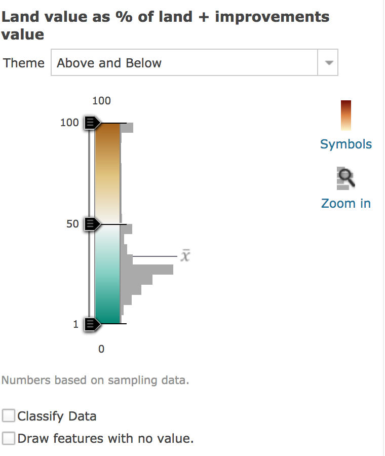
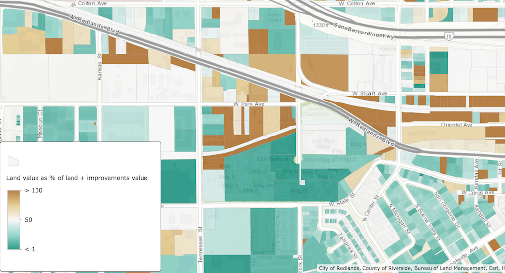
I chose the theme called “Above and Below” because I wanted to use two colors on my map. The “Above and Below” theme always helps thematic maps become more clear, because you as the map’s author have to choose where to “anchor” the color ramp. In my case, I anchored my color ramp at the 50% value, meaning any values below 50% would be one color, and any values above 50% would be another color, increasing in intensity as they head toward 0% and 100% respectively.
I figured my audience would appreciate a straightforward approach: shade the parcels whose land value exceeds improvement value in brown (like dirt), and shade the parcels whose improvement value exceeds the land value in green (like the color of US currency, historically). A continuous color ramp, applied between these colors, really adds some depth to the visual display, especially when you place 50% squarely in the center of that color ramp.
The resulting web map is below and here. I also dropped it into this story map so that I could take people on a quick map tour of interesting areas. It has generated a lot of positive feedback from people who know the area, or know real estate, or know parcel data. Check out the Labels on the layer to see how I used an Arcade Expression in my map’s labels.
Thanks to the ArcGIS software, I was able to get this done in under an hour for the initial draft, and each additional hour was spent fine-tuning the Arcade expression, adding labels using the same expression as a starting point, and polishing the story map. I probably have, at most, 3 hours’ total time invested in this.
I particularly like the fact that this map leverages the county’s GIS services effectively, without requiring them to change their service to accommodate my particular need. I save all those hours previously needed for web search time, FTP or data download time, data processing time, time spent re-hosting a copy of the county’s data on my server or cloud.
As a result, my time was focused on the map, not the data. The secret sauce for this particular map is simply an Arcade expression, plus a call to the smart mapping capability to align the colors to the meaningful values in the data.




Commenting is not enabled for this article.