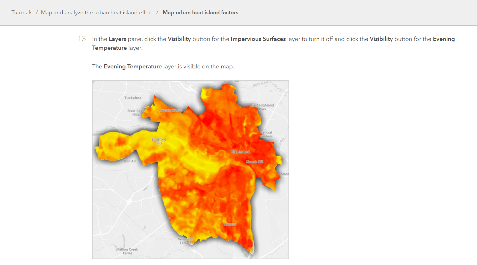
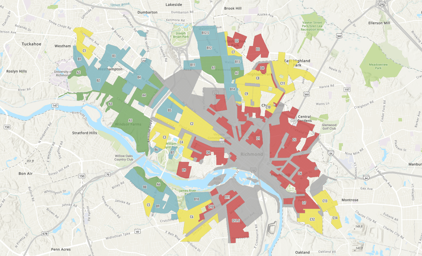
At the 2023 Esri UC plenary highlighting What’s New in ArcGIS Online, you might recall the Map Viewer demo that showed the power of GIS in revealing the impact of urban heat islands from an equity perspective.

Now you can make that map too!
A new ArcGIS tutorial, Map and analyze the urban heat island effect, was released last month based on the 2023 UC plenary demo workflow.

In this tutorial, you’ll use new spatial analysis tools in ArcGIS Online to map equity indicators then create an interactive dashboard to visualize heat islands. The dashboard is a great example of using GIS for climate action, and it can be shared with community members, policymakers, and other stakeholders to build understanding and inspire change.
The problem
Heat islands are places in cities with significantly higher temperatures than more rural surrounding areas. This phenomenon, known as the heat island effect, occurs more intensely in places where greenspace has been converted to pavement and other human-made materials. These surfaces, such as roadways, parking lots, and buildings constructed using concrete, brick, and metal, excel at absorbing and retaining heat. They are also impermeable, meaning they don’t absorb water.
When areas have an abundance of impermeable surfaces and are lacking in trees, plants, and other vegetation, which provide natural cooling through the process of evapotranspiration, temperatures remain high during both the day and nighttime.
Other human activities, such as driving cars and running air conditioning units, compound these effects, creating conditions that are not only unbearable but deadly. Heat islands can lead to heat-related illnesses and place additional stress on vulnerable populations, including older individuals and those with pre-existing health conditions such as diabetes.
Urban heat and equity
These conditions also disproportionately affect low-income neighborhoods and communities of color where green spaces, tree cover, and access to cooling infrastructure may be limited or absent due to historic underinvestment. When overlaid with historical redlining data, these patterns of disinvestment are put into a temporal context that can be traced back over generations.

As with so many sustainability challenges, knowing where these conditions occur and who is disproportionately affected is essential for implementing solutions that promote racial equity and social justice. When we can see and understand the spatial distribution of heat, we can more effectively intervene and influence policies that address the roots of health, housing, and infrastructure inequities.
GIS for climate action
Whether you’re building a heat risk index for local climate planning in ArcGIS Pro or exploring temperature anomalies in a subset of cities across the U.S., there are ways to engage with and address urban heat islands regardless of your familiarity with GIS and spatial analysis.
Start by working through the Map and analyze the urban heat island effect tutorial to see how you can use GIS to build tools that help foster community engagement and guide equitable climate adaptation strategies.
For more information about mapping heat islands and using spatial analysis to address equity challenges, check out the following resources:
- Applying an equity lens to your index – ArcGIS Blog article by Koya Brown
- The Urban Heat Paradox and the Power of GIS: A National Heat Awareness Day Special – ArcGIS Blog article by Este Geraghty
- Build A Heat Risk Index for Local Climate Planning (Part 1, Part 2, Part 3) – ArcGIS Blog articles by Mark Gilbert

Hi