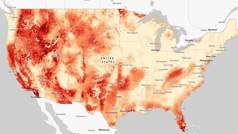
Earlier this year we updated the symbology of the wildfire layer hosted in the ArcGIS Living Atlas of the World. This helps to differentiate between the types and sizes of fires. However, when zoomed out to the entire western US, I find the large number of fires showing on the map to be overwhelming. While new fires (Past 24-hours) do not always become large fires, they do stay on the map until they meet fall-off rules. This sometimes results in making it appear as if the entire west is aflame.

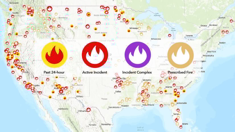
As part of the Esri Disaster Response Program, I use our Public Information web map and application as a convenient way to quickly share current information about wildfires. I am often asked why there are so many fires visible on this map. Visually, the map can be misleading even though the data is accurate. All of the points shown by default in the layer are considered current. This can be due to ongoing fire management, finance, or reporting actions taking place on the incident behind the scenes. Until these actions are completed, the fires will remain visible as current incidents. The new symbology I mentioned earlier included adds complexity to the view even if those fires are stopped upon initial attack. So how can the visual complexity be addressed for those looking to view wildfire activity across the west?
Rather than falling into despair or changing my holiday plans because a large part of the country appears to be on fire, I have added a few filters to this map to simplify the initial view while still providing more details upon zooming into the map.
Filter to show IMT Staffed Fires
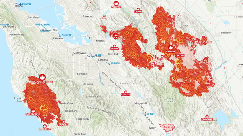
The first filter is specifically for when you are viewing more than one state at a time on the map. At this scale I only want to see the fire locations that are reported to have an Incident Management Organization (IMT) as shown applied on the right. A fire having such a team assigned often means there is a level of complexity that warrants this group of specialized staff to manage the response. This attribute provides a good way to filter away smaller or less complex incidents at this scale.

As you can see, the view on the right has this filter applied and thus is much easier to view and understand. I used the field ‘Incident Mgmt Organization’ to create this filter.

Filter to Show New Fires
As you continue to zoom in while viewing the Esri DRP Public Information map, there is one more filter based on the area visible or scale of the map. This includes the filter above and adds the new fires that have been initially reported less than 24 hours ago. Upon zooming into the map you can see the new fires reported – useful information if you are concerned about a new fire in a specific location.

Create Your Own Filter
You can take advantage of these new filters today by using any of these web maps. You can then remove or add to the filters to find new ways of focusing on the data most interesting to you and your audience.
- Use the new filters in this map from the Disaster Response Program (DRP).
- Use the unfiltered Wildfire and Weather Information map from the Living Atlas team.
- Start with just the data and make your own map.
- Skip the map and use the DRP application.
For more information about GIS and Wildland Fire visit our website.
For more information about using filters visit the help pages.


Article Discussion: