What we’ve learned during the COVID-19 pandemic is that social distancing and stay-at-home policies have saved lives and been critical factors for successfully flattening the COVID-19 curve. We’re also learning about the economic impacts of these policies, as millions of people across the United States file for unemployment amid shuttered businesses and overwhelmed food banks. Governors face mounting pressure to relax, modify, or lift altogether the social distancing and stay-at-home policies imposed to keep people safe. Is there a compromise? Can GIS help find solutions? Yes.
This article outlines a proposed data-driven approach for mapping locations where relaxing stay-at-home measures might be appropriate. The approach is presented in three parts:
- A high-level overview of the proposed workflow.
- An example of applying the workflow to objectives for California counties.
- A step-by-step tutorial, with data, allowing GIS analysts to practice the workflow before applying it to their own data.
Overview
Start at the beginning. What are your objectives and goals? How might they be measured? No doubt you want to protect people, monitor policy impacts, foster equity, respond to consequences, and promote both good health and a strong economy.
- Make a list of your key objectives by engaging with stakeholders, particularly those in communities most strongly impacted.
- Identify data sources and data variables available to track both impacts and progress.
- Standardize, weigh, and sum each data variable to create a score reflecting readiness for modified stay-at-home policies.
- Map the scores to identify where to begin and how to proceed.
- Evaluate the impacts.
- As difficult as it is, you must be able to answer the hardest questions:
- What are the threshold values for COVID-19 deaths and hospitalizations that would trigger reinstating stay-at-home orders?
- What are the tolerable limits for job and business losses that would lead to more relaxed stay-at-home policies?

Example: California
Key Objectives. Governor Gavin Newsom outlined key objectives for California as follows:
(O1): The ability to monitor and protect our communities through testing, contact tracing, isolating, and supporting those who are positive or exposed
(O2): The ability to prevent infection in people who are at risk to develop severe symptoms of COVID-19
(O3): The ability of hospitals and health systems to handle surges
(O4): The ability to develop therapeutics to meet demands
(O5): The ability for businesses, schools, and childcare facilities to support physical distancing
(O6): The ability to determine when to re-institute specific measures such as the stay-at-home orders, if necessary
Before modifying stay-at-home measures, the state will need to reach out to the communities at highest risk, including:
-
- Healthcare and other front-line workers
- Communal facilities such as nursing homes, military barracks, and jails
- Black and Hispanic communities to ensure equitable access to testing, treatment, and other vital resources
- School staff working in the classroom and cafeterias
- Small businesses, especially those providing services requiring face to face contact with clients
Key to a successful outcome is understanding the daily challenges of those hardest hit by COVID-19 and its economic consequences.
Data: A data-driven analysis means converting objectives into metrics for use in assessing, monitoring, and tracking impacts and efficacy. California’s objectives above, for example, might be converted into the following list of potential data variables. The variables in bold font are used for demonstration purposes in the tutorial that follows.
Monitor (O1):
- Testing: Number of tests performed, number of people active with the virus, confirmed cases, deaths, new cases, new deaths, and percent of the population who have recovered or have tested positive for antibodies.
- Access to testing (promoting equity based on need).
Protect (O1):
- Contact tracing: Trained staff available to perform contact tracing or percentage of the population participating in automated contact tracing.
- Ratio of public health staff to total population.
- Number of people with employer covered job protection and paid sick leave.
- Availability of economic and other supportive services for families with sick individuals.
- A measure of the impact and effectiveness of economic stimulus programs.
Prevent (O2):
- Availability of personal protective equipment (PPEs).
- Effectiveness of programs to prevent and contain infections across healthcare facilities, such as nursing homes, hospitals, jails, and shelters.
- The number of people in the highest risk categories (seniors, black and Hispanic populations, those suffering with chronic illnesses and other underlying health conditions, families living in poverty, the unemployed, people experiencing homelessness, multi-generational households, group housing residents, and so forth).
- A measure of the progress made surrounding sanitation and deep cleaning efforts.
Respond (O3):
- Necessary hospital resources: Healthcare professionals, staffed beds, ICU beds, ventilators, respirators, pharmaceuticals, training,
- Epidemiology model predictions for COVID-19 surges and capacity requirements.
Treat (O4):
- Percentage of population with health insurance coverage.
- Availability of effective antivirals and other therapeutics.
- Availability of a vaccine.
Comply (O5):
- Measures of social and spatial interaction.
- Percentage of employers implementing prevention and containment measures (practicing social distancing, requiring employees to wear masks and gloves, taking temperatures, allowing employees to work from home, and so forth).
- Percentage of schools and other childcare facilities implementing protective strategies (practicing social distancing, regular hand washing, staggering classes, remote education opportunities, and so forth).
- Percentage of families with access to computers and broadband.
- Percentage of population working away from home.
- Percentage of the population working in essential capacity jobs (unable to stay home).
Evaluate (O6):
- The number of new cases and new deaths.
- Changes in social distancing and spatial interaction.
- Changes in unemployment.
- Measures of economic prosperity.
You won’t have access to every piece of data listed above, and there will undoubtedly be other variables you’ll want to include in your analyses. The variables for California’s objectives focus on health, safety, and protection. Other states might want to include additional economic variables (such as employment data for the industries and occupations most critical to the economy). Move forward with what you have, making improvements as additional data becomes available.
Standardize, weigh, and sum each variable: For some of the variables you collect, high values are better than low values (available hospital beds and social distancing scores, for example). For other variables, low values are better (new confirmed cases and health facility citations). In addition, the variables you collect may have different units of measurement (counts, percentages, dollars, and so forth). By standardizing the variables, you address both issues: you reclassify the data so all values range from 0.0 to 1.0, and you ensure consistency so low values always reflect the best/desired situations and high values always reflect the worst scenarios. While standardizing the variables gives them an equal scale and direction, it doesn’t deal with differences in variable importance. For this, you’ll assign a weight to each variable. You may decide, for example, to assign weights between 1 and 5. The least important variables would then be assigned weight values at or near 1, while the most important variables would be assigned weight values at or near 5. To get a single score for each county, you’ll sum the standardized, weighted values.
Map the scores: Mapping the final scores will show you which counties are most prepared for relaxing stay-at-home measures. Once you begin lifting some of the stay-at-home restrictions, you’ll want to evaluate the impacts by tracking the number of new COVID-19 cases, new deaths, and changes in social distancing. You’ll also want to track changes in unemployment, and other economic indicators. Monitoring this data will help you decide if you need to reinstate, or further relax, the various stay-at-home measures.

Tutorial
The variables used in this tutorial are by no means complete. They were selected primarily based on availability. While insufficient for a thorough analysis, they are effective and sufficient for demonstrating the GIS workflow to the analysts who will have access to more complete data.
- Go to the CA County Assessment item on ArcGIS Online.
- Click Download.
- Double-click the downloaded project package to open it in ArcGIS Pro. If prompted, sign in to your ArcGIS account.
- In the Contents pane, right-click the County Data layer and choose Attribute Table.
The table appears. The variables available for this analysis include the number of confirmed cases, COVID-19 deaths, susceptible populations, and so forth.
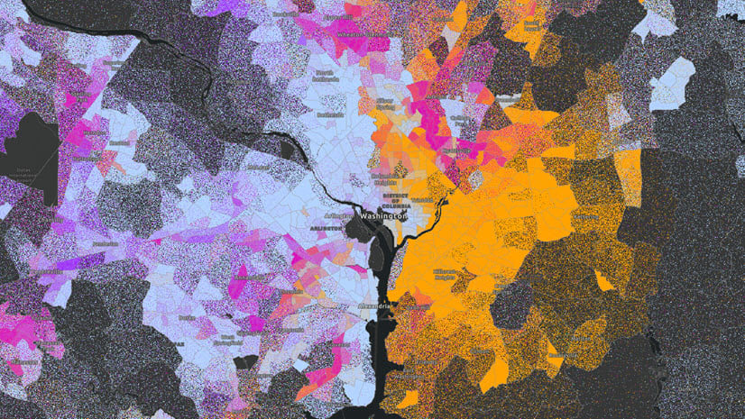
Maps for COVID-19 deaths and the percentage of the population without health insurance are shown in the following image. A complete list, with links to all data sources, can be found at the end of this document.

- For each variable, create a table in an external text program that indicates whether a high or low value is most desired, what the minimum and maximum values are, and the weight for the variable’s importance.
The following table reflects the variables used in this tutorial:
| Variable | Best | Min Value | Max Value | Weight |
| Confirmed COVID-19 Cases | Min | 0 | 13823 | 4 |
| COVID-19 Deaths | Min | 0 | 619 | 5 |
| Ratio HC workers to Total Population | Max | 0.03455837 | 0.08254008 | 2 |
| Susceptible Population | Min | 296 | 5086751 | 3 |
| Num Nursing Home Infection Prevent/Control violation | Min | 0 | 891 | 4 |
| Num staffed hosp beds | Max | 0 | 22002 | 3 |
| Num ICU Beds | Max | 0 | 2285 | 3 |
| % Pop without Health Insurance | Min | 0.0311534 | 0.15660051 | 2 |
| Unacast Social Distance Score | Max | 2 | 4.5 | 3 |
| Households with 0 Vehicles | Min | 13 | 44706 | 2 |
Tip: In the attribute table, you can double-click a field name to sort from smallest to largest. Double-click again to sort from largest to smallest.
Next, you’ll modify the variables so that they are standardized and weighted appropriately. You’ll modify them using the Calculate Field tool.
- In the attribute table, right click the field name of the field you want to standardize and choose Calculate Field.
- In the Calculate Field tool, for variables where the desired or best value is the minimum value, create an Expression based on the following formula: ((field – minValue) / (maxValue – minValue)) * weight.
For example, the expression for the Confirmed COVID-19 Cases field would be ((!ConfirmedCases! – 0) / (13823 – 0)) * 4. Using the table you created, you can quickly find the minimum and maximum values. To add the field to the expression, double-click the field name under Fields.

- For fields where the desired/best value is the maximum value, create an Expression based on the following formula: 1.0 – (((field – minValue) / (maxValue – minValue)) * weight).
By subtracting the ratio from 1.0, you reverse whether minimum or maximum values are best. That way, all your fields have minimum values as the best.
For example, the expression for the Ratio HC workers to Total Population field would be 1.0 – (((!HCtoTotPop! – 0.03455837) / (0.08254008 – 0.03455837)) * 2).

Next, you’ll add the standardized, weighted variables to create a composite score for each county. To do so, you’ll create a new field to hold the summed variables.
- In the attribute table, click the Add Field button.
The Fields view appears.
- For Field Name, type SWSum. On the ribbon, on the Fields tab, in the Changes group, click Save.
- Close the Fields view. In the attribute table, for the SWSum field, right-click the field name and choose Calculate Field.
- In the Calculate Field tool, create an Expression that adds all of the standardized variables together.
For example, the expression for the analysis used in this example dataset would be !ConfirmedCases! + !NumDeaths! + !HCtoTotPop! + !SusceptiblePop! + !NumCitations! + !NumHospBeds! + !NumICUBeds! + !NoHealthIns! + !SocDistanceScore! + !NoVehicles!.

Lastly, all you need to do is symbolize the layer by the SWSum field to identify where relaxing stay-at-home measures is most appropriate.
- In the Contents pane, right-click the County Data layer and choose Symbology.
- For Primary Symbology, choose Graduated Colors. For Field, choose SWSum.
- Set Method, Classes, and Color scheme as you think is most appropriate for displaying the data.

The symbology is updated on the map.

The map that you create, based on a more complete collection of data variables, will help you decide where to begin relaxing stay-at-home measures.
The final, very important step, is to monitor the impacts of any actions taken to modify stay-at-home measures. This process will include tracking the number of new COVID-19 cases and deaths, as well as tracking changes in social distancing, unemployment, and other health and economic indicators. These metrics must be gathered, assessed, and validated in conjunction with the communities they are meant to serve. Assessing progress isn’t possible without a sincere desire and diligent effort to understand the daily challenges people face and the underlying inequities compounding them.
Recognize that retaining, or even increasing, stay-at-home policies isn’t a punishment. These policies are designed to protect the communities who need it most. Economic recovery cannot take place until people are healthy and well-protected. Don’t forget, however, that these measures have a disproportionate impact on different segments of the population: people working in the healthcare and service industries, those disadvantaged by years of societal inequities, the unemployed, and the poor. Monitoring these inequities and prioritizing resources to communities disproportionately impacted by COVID-19 will ultimately benefit everyone.
Best wishes and please know we are here to help!

Resources
The demonstration variables used in the tutorial are listed in the following table:
| Variable | What it measures | Data Source |
| Confirmed COVID-19 Cases | Represents exposure risk. | Source |
| COVID-19 Deaths | Represents disease severity. | Source |
| Ratio HC workers to Total Population | One measure of an area’s ability to protect its population. This variable is the number of healthcare workers divided by total population. | Source |
| Susceptible Population | One measure of the severity risk and capacity to protect the most vulnerable populations. This variable includes:
· All seniors age 65+ · Blacks and Hispanics (at higher risk resulting from complex societal and economic inequities) |
Source |
| Num Nursing Home Infection Prevent/Control violations | One measure of our ability to protect a highly vulnerable population. Number of patients, if available, would be a better metric than the number of citations. | Source |
| Num staffed hosp beds
Num ICU beds |
Ability to treat severe COVID-19 cases. | Source |
| % Pop without Health Insurance | Ability to cover the costs of COVID-19 treatments and therapeutics. | Source |
| Unacast Social Distance Score | One measure of social interaction exposure risk. | Source
|
| Households with 0 Vehicles | One measure of reliance on public transportation and, consequently, higher exposure risk. | Source |
Please visit the Esri COVID-19 Hub for additional resources, data, training, and applications.
The authors are immensely grateful to Margot Bordne and Clinton Johnson for their feedback on this lesson. For next steps, they suggest a tract-level, rather than a county-level, analysis incorporating gaps between the most and the least prepared tracts in each county.
Photos:
COVID-19 Dashboard: Image by Markus Spiske on Unsplash.
Closed Business: Image by Queven from from Pixabay.
COVID-19 and the Economy: Image by Gerd Altmann from Pixabay.
COVID-19 Data: Image by Gerd Altmann from Pixabay.
Additional Resources:
Artiga, Samantha, Orgera, Kendal, Pham, Olivia, and Corallo, Bradley. Growing Data Underscore that Communities of Color are Being Harder Hit by COVID-19. KFF Disparities Policy.
Benfer, Emily A. and Wiley, Lindsay F. Health Justice Strategies to Combat COVID-19: Protecting Vulnerable Communities During a Pandemic. HealthAffairs, Health Affairs Blog. March 19, 2020.
Bennett, Lauren and Geraghty, Este. Models and Maps Explore COVID-19 Surges and Capacity to Help Officials Prepare. ESRI BLOG. April 07, 2020.
Brumfiel, Geoff. To End the Coronavirus Crisis We Need Widespread Testing, Experts Say. NPR Health News, March 24, 2020.
Cachero, Paulina. New Yorkers have been told they need a car to get tested at city drive-thru sites, but more than half of residents don’t own one. Business Insider. April 15, 2020.
Carfagno, Jack. Healthcare Worker Shortage Due to COVID-19 Pandemic. Docwire. March 26, 2020.
Centers for Disease Control and Prevention. People Who Are Higher Risk for Severe Illness. 2020.
Cenziper, Debbie, Jacobs, Joel, and Mulcahy, Shawn. Hundreds of nursing homes with cases of coronavirus have violated federal infection-control rules in recent years. The Washington Post, Business. April 17, 2020.
Hao, Karen. Here are the states that will have the worst hospital bed shortages. MIT Technology Review, Biotechnology. April 7, 2020.
Hughes, Trevor. Poor, essential, and on the bus: Coronavirus is putting public transportation riders at risk. USA Today, Nation. April 14, 2020.
PACT. Private Automated Contract Tracing. 2020.
Powell, Catherine. Color of Covid: The racial justice paradox of our new stay-at-home economy. CNN Opinion. April 18, 2020.
Roe, Mike. California Reveals 6 Parameters for Lifting Stay-At-Home Orders, Reopening Economy. LAIST, Latest. April 14, 2020.
Seville, Lisa Riordan and Lehren, Andrew W. Got Coronavirus? You might get a surprise medical bill, too. NBCNEWS. April 22, 2020.
Subbaraman, Nidhi. Why daily death tolls have become unusually important in understanding the coronavirus pandemic. Nature news, April 09, 2020.
Wikipedia. Shortages related to the 2019-20 coronavirus pandemic. April 17, 2020.


Article Discussion: